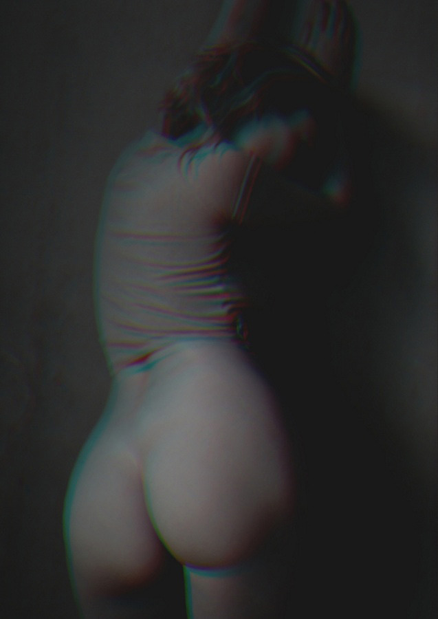
Erin Elizabeth Kelly – Untitled (2017)
It’s perhaps apocryphal, but on several occasions hardcore Aimee Mann fans (& in fairness: is it possible to be a Mann fan without being a hardcore fan?) have shared her apparent admission that for every 1 song her audiences hears, there were 99 songs that ended up in the trash.
Whether or not she ever actually claimed this, I savor her framing of the matter. Partly because it speaks to the importance of doing the work, of laboring; while also reminding us that Art is extravagant AF.
The other part which fascinates me is the question of how you know which 99 efforts to scrap and what 1 to keep. There’s the notion that you keep on the best and brightest. (This is something I have a tendency to do in my own work.)
However, I think some of the most interesting work that any creative person is ever likely to do (both for themselves and in terms of their audience) tends to be returning over and over to work that doesn’t squarely fit in either the 1% or the 99%.
That’s my feeling on the above image. It’s a bit cliché–nude standing against the wall with back turned to camera. The original exposure was entirely too dark. Yet… there is something about the sense of the moment capture that is not easily shaken off.
Thus the question becomes how do you take something that has inherent merit but doesn’t really fire on all cylinders.
In the case of this image: Kelly introduces a RBG offset to the monochrome. The effect is understated psychedelia–just subtle enough to contribute a supple softness as well as an enigmatic tinge. And an image that doesn’t or shouldn’t work does–maybe not in and of itself but through contemplative highlighting of what about it the viewer is supposed to attend.
The other thing that interests me with this pertains to my own work. I’ve learned that although I categorically prefer analog B&W to any other medium, working in analog color is a bit like a whetstone to the blade of B&W. In other words: I’m more likely to notice improvements in my B&W work as a result of things I learn working with color. (There’s the added benefit that it also works the other way around: improvements made working B&W also filter over into color stuff.)
Alas, in the art world, especially in fine art photography–there is a tendency to segregate B&W and color work. I remember seeing the Leica anniversary exhibit at C|O Berlin several years back. It was fascinating because while the exhibit was entirely too crowded, viewers spent more time with the color images even if over all the merit of that part of the exhibit was less consequential than the rest. (It’s similar here on Tumblr and social media–work in color gets roughly 3x the attention that B&W/monochrome work does. And as far as my own work: it’s closer to a factor of seven to one (color to B&W).
Something I’ve been considering is since I work roughly 50/50 between B&W and color these days, how the hell am I ever going to be able to have my work all sit comfortably together. (Interestingly B&W and Color will sit side by side in a photo monograph–it’s the only means of exhibition that allows for it, to my knowledge. But I’m not as interested in the artists’ books trajectory.)
The idea that hit me recently–which this image has reinforced–is that finding a way to create photographs that are black and white and a single third color or B&W with a sort of dreary fog bleached landscape mess of muddy hues instead of any true white. (My feeling is this is actually probably a pretty good way of reconciling B&W and color across a single body of work in a gallery installation context.)
The effect of the work above wouldn’t fit my own work but I am very curious about the process that went into making it. If there are any Photoshop Wizards reading this who have an idea, I’d be interested in the process that went into making this so that I could reverse engineer it for analog application.
