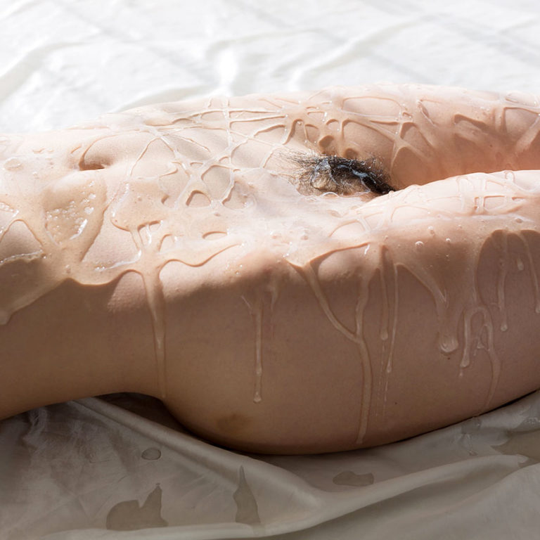
Legs JapanLiquid Masturbation feat. Shino Aoi (2018)

As an image, this is unqualified rubbish–it’s overexposed (the white of the drop cloth is so hot it blows out most of the dimensionality of Aoi’s left side) and other than depicting a naked body covered in goop there’s no readily discernible point to it. (You can click on the link to more of the pics from the series but even once you find out that Aoi lays down on the drop cloth and then is showered in lube and ‘masturbates’, knowing what’s going on and what the goop is honestly adds nothing to the proceedings.)

Why post it then?–Well, it got me thinking about texture. (Or, more accurately: I’ve been thinking more than usual about texture since this post back in June.)

For some reason: the notion that texture in photographs is a kind of sum greater the the total of the parts. This was around the same time I happened across this video from Wired where a musician explains the concept of harmony in five different levels of difficulty.

The musician starts off asking what this obvious bored kid think harmony is. He explains that it’s when two people sing together and it sounds nice. The musician tells him he’s right and the proceeds to use Amazing Grace as an example. He plays the melody with one hand and then askings leadingly if it doesn’t sound lonely. He then brings in his second hand to harmonize and asked the kid which one he preferred. The kids says the one with two hands. And the musician says that’s exactly right because with more notes we can communicate how more emotion with the melody.

The second person is a teenager. She defines harmony as when two people–usually a high and a low tone voice–blend the two voices together to sound better. The musician repeats what she’s said but adds that harmony is a melody played with feeling and a sense of some sort of story from where it begins to where it returns home again. (I really think that’s more of a revelatory way of framing it than I can accurately articulate.)

He then does something interesting. He noodles through Amazing Grace purposely hitting a sour note. But he backs up and then shows that by knowing you want to hit that note on your way home, you can surround it by notes that actually make it make sense in the given the context.

The rest of the video is great but I don’t pretend to understand the more complicated music theory stuff–once you get into add 9 and suspended notes, my eyes cross and I start to drool. But it’s amazing to watch the way that Herbie Hancock and the musician can just communicate with musical language like two old friends who haven’t spoken in a long while.

I’m less inclined to say that texture necessarily works the same way as harmony does in music; yet, to the extent that we can say that a 2D photograph or image has dimensionality and/or texture, it’s as a result of a confluence of factors designed to emphasize visible textural cues.

Yulia NefedovaUntitled (201X)

Nefedova’s style is akin to what you’d get if you locked the guy who made Where’s Waldo in a room with nothing except Toilet Paper Magazine back issues, American Apparel catalogs and reams of blank paper.

In other words: casually irreverent, audaciously transgressive and charmingly warped.

Yet, what makes the work singular is its curiosity. I don’t think I’ve ever really seen people doing most of the things Nefedova documents hers as doing. And there’s this wonderful ambiguity about whether she’s asking herself I wonder what this would look like vs. I know what this looks like because I’m just drawing from what I see in my own life–an ambiguity frequently complicated by her tendency to draft her own likeness into her visual experiments. It’s not always easy to determine whether these self-referential flashes are tongue-in-cheek jokes or confessions.

Nagib El DesoukyArtemis (2018)

Every time I’m cruising through my liked posts, I always pause over this photo.

It’s not just this picture, everything El Desouky posts is quality and every third post or so is freaking brilliant. However, there’s something about this photo in particular that I find captivating.

I think it’s mostly the spot on-ness of Artemis’ daydream-y expression. Still, there’s something weird about the composition.

One of the things you learn when you’re studying photography in academia is that one of the ways you can balance a composition is to use the subject’s gaze to draw attention to negative space.

Think of it this way: imagine a photo of someone standing near the rim of the Grand Canyon–given that the camera is set up so that the edge of the canyon runs more or less diagonally from the lower right frame edge to the middle left frame edge.

You take two pictures. In the first, the model–let’s call him Edwin–is standing just back from the edge of the canyon at the left edge of the frame. He’s looking out beyond the left frame edge.

For the second, keep Edwin’s pose the same only move him so that he’s positioned in the right third of the frame.

In Photo #1 you’re seeing Edwin but you can’t see what Edwin sees. You might wonder if he knows he’s missing the view. Or, conversely, maybe he’s got a better view than you, the viewer. (Also, the human eye is generally more immediately interested in people over landscapes–thus: there’s a tendency to focus on Edwin without fully grasping that Edwin is standing in the landscape, due to photographs predominantly scanning from left to right.)

In Photo #2, his positioning dictates that you aren’t seeing the same view but there is at least overlap. It’s possible to follow the angle of his gaze and infer something of what he sees.

In the photo of Artemis, you can somewhat follow her gaze–there’s a bright circle of light (presumably from a gap in the trees foliage about 1/5 of the way down the left most frame edge that is more or less where she’s looking, although her gaze is at an angle that is slightly turned towards the focal plane).

Normally, this would be a trap for the gaze while scanning the photo. It’s not here. I’ve been trying to figure out why and here’s my best guesses:

First, there’s some interesting stuff with triangulation. That little black sprig sticking into the lower left of the frame? It forms a natural triangle with Artemis’ eyes and the aforementioned bright dot in the background tree. This pushes your eye left.

Then there’s the upward oriented triangle suggested by Artemis’ arms–this draws attention to her face but it also echoes a larger triangle between the three darkest points in the frame: the sprig at frame left, her hair to the right of her face and the area in the thicket of flowers near the lower right edge of the frame.

That thicket of flowers is rowdy and cluttered, but the slightly soft focus renders them a decorative anchor to the foreground without distracting our attention from the subject.

All of this is executed in a style reminiscent of the way Renoir tends to give solidity to objects in the foreground while rendering the background in a sort of teary eyed blur.

Source unknown – Title unknown (201X)

I really wish I knew whose image this was–it’s freaking fabulous.

Reminiscent of both Terrence Malick’s Days of Heaven (in palette, costume and context while still feeling divergent w/r/t POV) and Weronika Izdebska (murky underexposure).

I love the fecundity of the moment. It’s a bit like one of those hooks that always emerged to try to fish hacks off stage in Looney Tunes, also suggestive of opening a curtain or movement in a dance performance. It even kind of reminds me of Lot’s Wife from The Bible story (this being the moment she looks back, frozen before she is transformed into a pillar of salt).

Source unknown – Title unknown (201X)

I’m not entirely sure if this is an actual instant photograph or if it’s one of those Photoshop jobs where someone takes a Polaroid mask and overlays it against another image.

The reason I’m not entirely sure is because this acts like a Polaroid–the compressed tonal range (essentially slight overexposure on the model’s stomach, the rest of the skin tone is more mid-tone and then everything falls off to black except for the back of the couch in the upper left third of the frame and the edge of the couch on the lower right), slight chromatic aberrations at the left and right edges as well as the almost selenium-ish tone.

I’m generally not fond of work that decapitates and amputates limbs but with this there is a sense that less was intended as more. (I’m not sure it completely works from the standpoint of eschewing the problematics of depicting women nude as a coding for presenting them as sexually available but the composition is self-consciously voyeuristic enough that I suspect this was made in such a fashion to at least implicitly complicate notions of sexual availability as necessarily passive.

Carrie LingscheitMomento No. 5821 {pull} (2010)

The poses in this reminds me of choreographer François Veyrunes‘ piece Close Up to the World–which has some mind boggling movements in it.

Dance was something I knew literally nothing about until 2009. I collaborated with a dancer on a photo project and she dragged me kicking and screaming to several performance. I didn’t take much for me to stop kicking and screaming and instead start offering to attend shows.

I never got to the point where I really felt I got a feeling for the form but what I did discover is that I sincerely think that choreographers belong in MFA Art programs more than photographers. Or to put it another way: you put a choreographer and a photographer in a room together and interrogate them on matters of conceptual art, it’s a rare photographer that’s going to be able to even pretend to keep pace.

Man RaySelf Portrait with Dead Nude (1930)

Excluding the eleven years he lived in Hollywood to wait out the Second World War, Man Ray was an American artist living in Paris.

He moved in the same circles as Picasso and the two were well acquainted. I mention this–less to try to suggest any stylistic overlap in their oeuvres and more to distinguish between the degrees of overt sexism in their respective work.

By now, you’ve probably already seen Hannah Gadsby’s Netflix comedy special Nanette. If not, you should put a pin in this and go watch it now. (It’s exceptional on virtually every level imaginable but it’s act to is a brilliant riff on art history–specifically Picasso.)

Gadsby notes that Picasso offered this perspective on how he felt about women after breaking up with him:

Each time I leave a woman, I should burn her. Destroy the woman, you destroy the past she represents.

“Cool guy,” she follows up.

This isn’t even close to the worst shit Picasso pulled. But in so many ways, Picasso was a colossal, inexcusable and monstrous misogynist. Yet, much of his latent sexism is just as visible in other works of the time. This, for example: not only continues the art historical tradition of presenting female bodies in only specifically proscribed poses.

For example: Duchamp’s Nude Descending a Staircase, no. 2 was rejected from the 1912 Salon de Indépendants with the following note:

A nude never descends the stairs–a nude reclines.

(This anecdote was brought to my attention by PBS Digital Studios’ The Art Assignment’s The Case for Nuditywhich is a bit uneven but by and large worth keeping up with.)

In Man Ray’s photo above, the nude is once again reclining. She’s portrayed as dead–a chest wound ostensibly bleeding out onto the bed.

The photo is indicated as a self-portrait (and in that identification the identity of the artist is reaffirmed while the woman is little more than a placeholder) and it’s uncertain whether Man Ray found her already dead and then felt the need to embrace her one last time (a necrophiliac connotation) or perhaps he killed her and is now grieving her demise (a vampiric connotation).

Neither of these are particularly encouraging interpretations with regards to inherent sexism. However, whereas Picasso uses stylistics to bend, break and otherwise deface women in his work, there’s an honesty about what Man Ray is doing here that–while it does not absolve it of fault, it at least self-implicates the relationship between the author and the problematics.

For example: I read this now as a sort of inverted pieta. This in turn invites a reading of the manic pixie dream girl narrative–that, unfortunately, still exists. Also, you don’t have to stretch it very far to push this into feminist criticism territory–the way that men seek in female bodies, some semblance of salvation. (I’d argue that this lines up especially well with the history of pieta as religious symbol and the way modern pietas interrogate the problematics of Xtian history and the way the form is now moving towards being a trend welcoming of appropriation by sensualist humanists.