Source unknown – Title unknown (197X)
I am half agony, half hope.
— Jane Austen, Persuasion
Source unknown – Title unknown (197X)
I am half agony, half hope.
— Jane Austen, Persuasion
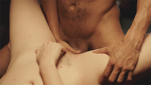
Erika Lust – An Appointment with My Master (2015)
You know that feeling you get when the idea behind something is solid but the execution just isn’t up to snuff? That’s how I feel about Erika Lust.
Take her It’s Time for Porn to Change TEDx talk: a feminist/sex-positive vision of a new porn with an emphasis on characters presented in context and diversity in depicting modes of sexual expression. Awesome. A+ I’m 120% on board sign me up.
Completely discounting my opinion of TED (hint: it’s hardly rose colored), it’s an awkward, halting ramble/rant all but devoid of any dynamism.
That’s not to say I dislike her videos. The concept underlying her XConfessions series–of which the above scene is a part–invites folks to share their fantasies with the video makers. Subsequently certain fantasies become prompts for explicit enactments. (I’ve featured another XConfessions scene I Wish I Were a Lesbian previously.)
And I wanted to draw attention to the above scene. I love the way in muddles the line between mutual masturbation and frottage–both masturbating as foreplay but edging perpetually closer towards engaging sexually. Further the fact that both are using their right hands and the balance between one visible hand each in the foreground and one mostly obscured hand in the background is deftly balanced from the standpoint of composition.
The thing that bothers me–and I haven’t seen the entire scene but I’m guessing from my reaction to I Wish I Were a Lesbian, I’m almost certain my instinct is on point: it may be pretty and resonate with me but Lust demonstrates some astounding technical lapses.
Back to the above scene. It’s pretty–nice warm light. I’d like to have seen this same shot in a wide master, but I’ll grant that’s a matter of personal taste. It’s the fact that this embodies a style of lighting that I detest. A set lit with stylish practical lighting and then a super hot theatrical spot overhead which emphasizes the action.
It’s this sort of hyper stylized lighting focused on cheap and easy effect. And it’s becoming endemic. (Netflix Daredevil is an–what’s the opposite of glowing?–opaque; what the fuck were they thinking shooting some of those scenes so goddamn impenetrably dark. It’s awful.)
As a counter point–Blade Runner presents an endless stream of pitch dark vistas–but unlike most of the lighting in Hollywood fare these days–what light there was was always thoughtfully shaped/sculpted so as to be legible to folks sunk into their seats in darkened theaters.
It’s like I teach my students in lighting workshops: you know the classic quip where the petulant veteran actor demands the hotshot young directory what’s my motivation? Good lighting is–more often than not–logical motivated by the augmenting of existing, naturally available light or illumination provided by extant light sources.
To preempt the standard objections, no David Lynch isn’t a fucking excuse, shit bird. You clearly haven’t watched his films with any sort of detail oriented eye because that man is a goddamn master at selling hyper stylized lighting and the reason he’s so good at it is because it’s logically motivated by light sources you can see in the frame.

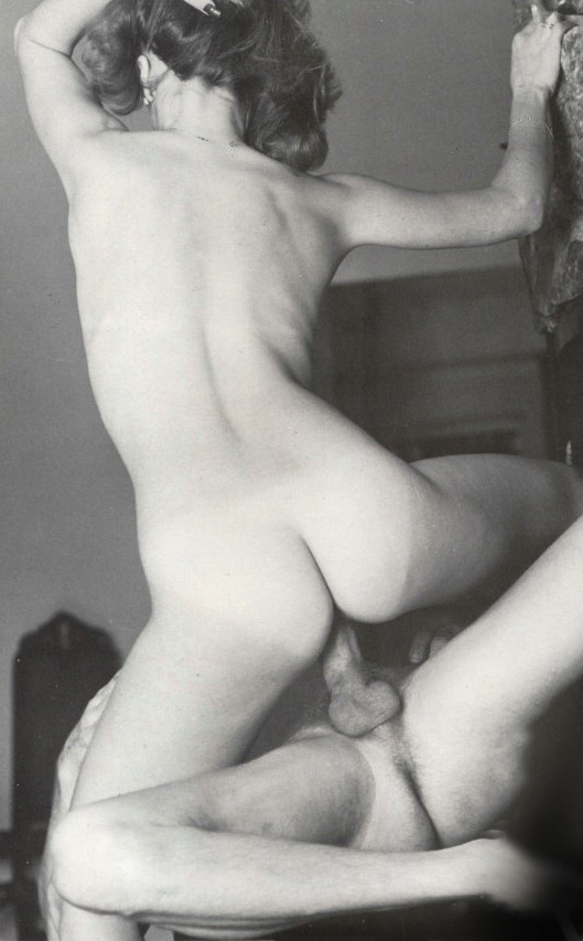
Source unknown – Title unknown (188X)
One thing you learn very quickly studying visual art in academia is the liability that is sentimentality.
The two exceptions I can think of are Nan Goldin–who, while her work is unsentimental, the raison d’etre for her work is fundamentally sentimental; and Sally Mann, whose work frequently borders on inexcusable sentimentality but always manages to maintain a rigorously formal foundation w/r/t to conceptual complexity and masterful execution.
I’m not arguing that the above image is sentimental. It is, however, very earnest and I think all too often that disqualifies certain work from being considered as art.
There are certainly compositional flaws that detract from this. The entire frame is left heavy. As all the elements either shift the eye left or are gathered at the left half of the frame. The “24.” along the right frame edge is placed as if to counter-act some of that off kilterness–but it hardly makes up for it.
Additionally, the lower frame edge cutting at the knee is just inelegant and jarring.
Yet, there is a lot to praise here. The skin tone is lovely–the subtle gradation between the curve of his body and the backdrop, the way her skin is so much lighter than his.
The backdrop borders on ridiculous; however, with the careful drape of the rug and the position of the bodies with the aforementioned gradation, it all suggests a familiarity with classical modes of visual representation.
I also adore the way her arm is bent back and she’s looking directly into the camera. There’s something calculated about it–part defiance, part fascination. Also, the dirty soles of her feet splayed in the air is inspired.
It feels to me like the photographer wanted to make images of people fucking but didn’t want it to read as frivolous. Thus, there’s an attention to detail that although it doesn’t entirely work, it adds a ring of truth to the scene.
I have no idea about the origins of this image. But there does appear to be a scratch on it–bifurcating it more or less horizontally at the center as well as a dogeared corner. It may not be accurate but it’s possible to imagine someone keeping this photo secreted away in a coat pocket.
You are an aperture through which the universe is looking at and exploring itself.
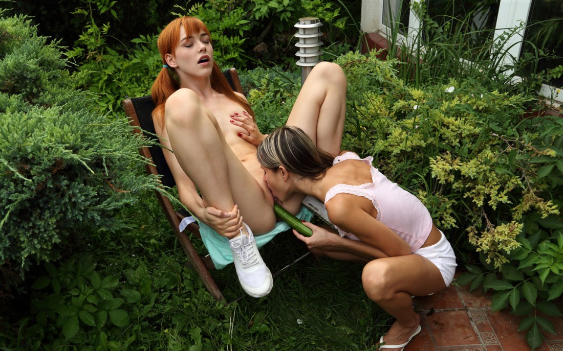
Source unknown – Title unknown (201X)
Unlike most of the porn I post–which tend to be images with a certain audacity I appreciate, honest immediacy I crave or a libidinous savoir faire that resonates strongly with my own weird desires–I think this image ticks all the right boxes but also suggests something about the nature of the question of pornography vs art.
This image is constructed to convey context. I love that with the exception of the woman in the pink blouse’s left flip-flopped foot, both women are presented in their bodily entirety within the frame.
It’s not just my own personal preference here. Pornography–and especially pornographic moving images–there is this tendency of embodying the laziest and worst short cuts offered up by cinema. Establishing shots that suggest the scene is in a famous city that then later cuts to environs built up in sterile soundstage; or, worse, the excessive use of close-up inserts (a tact which only works when kept to a bare minimum since each instance is intended to cause the viewer to take special notice of the object or action depicted, porn tends to gravitate towards something on the order of 65% inserts–pun intended, sorrynotsorry.)
From the standpoint of form, it’s sloppy technique. But, since the advent of DVD players–if not before–a viewer has been able to zoom in on a portion of the frame at will. With the telescoping of increasingly absurd resolutions, there’s really no reason to have a scene play out in extreme close-up. With moderate thought given to composition and blocking, a wide shot could be filmed in such a way that it could subsequently be parsed by the viewer to focus on what interests them.
Back to the question of pornography vs art. I think a better dichotomy might be questioning whether the image is a document or a product. Let’s use the above as an example to show how such an analysis might go.
This is clearly someone’s back yard. And that invites questions of public vs private–in this case a private space that verges on public. The down tilt of the camera emphasizes this. It’s not quite high enough to be the view of a neighbor looking over their fence–but it’s still not entirely possible to shake that feeling that the camera is a stand-in for a voyeur. (In and of itself, the camera functioning as a voyeur does not exclude the the image from being a document. However, in this case, the fact that the woman in the pink top has carefully pulled her hair over her right shoulder so as not to block the camera’s field of view.
Given the absence of body hair, my gut is that this is intended as less a document than a product. Yet, I’m not completely willing to disqualify it from being a document. The use of color is mad on-point. The spectrum of reds–hair, lips, respective skin tone, bricks; greens–bushes, grass, cucumber; the pastel magenta shirt and the aquamarine cushion. There’s also that super-saturated, contrast-y color you get when it’s overcast.
Also, the composition doesn’t quite work–the brushed nickle lighting pylon and the windows and bricks, skew the balance so that frame right is almost twice as heavy as frame left. Still, it’s a solid idea with better than average execution.
Given the opportunity this is exactly the sort of scene I’d like to use as inspiration for a fine art image.
 https://embedr.flickr.com/assets/client-code.js
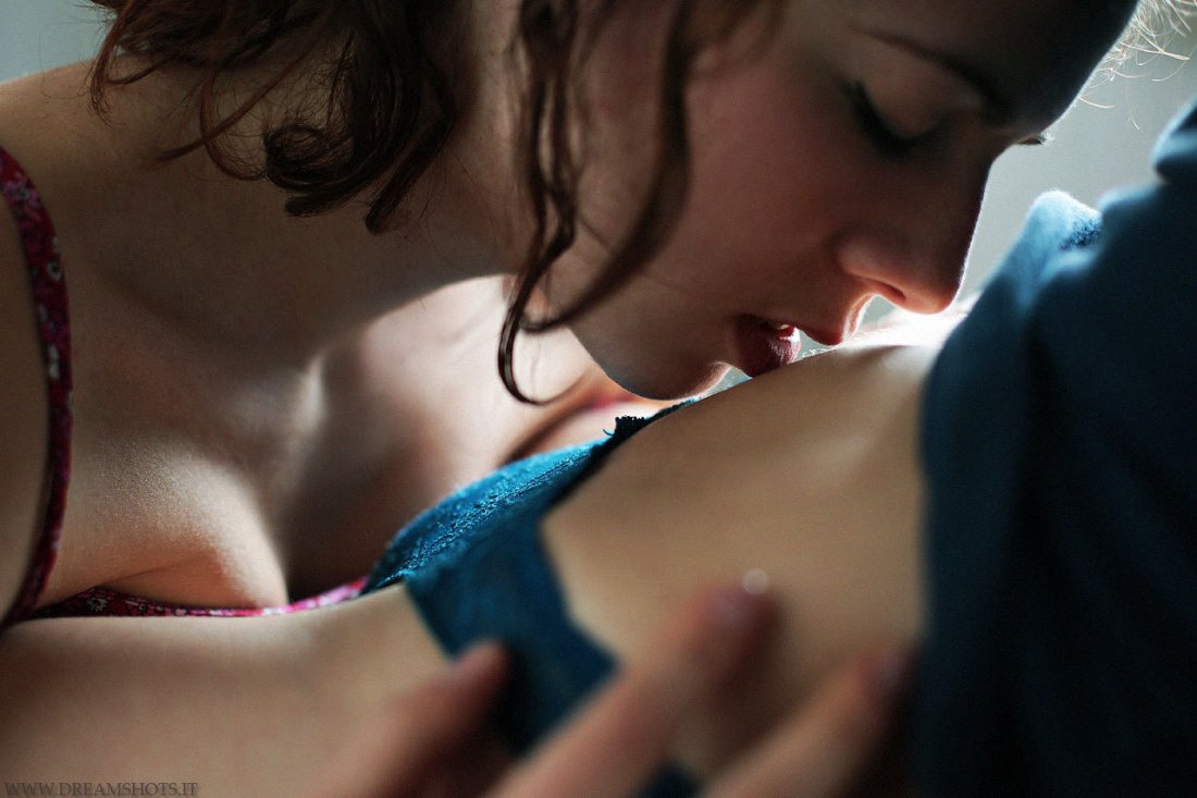
Camilla Cattabriga – Untitled (2015)
I’ve said it before but it bears repeating: if you are a young photographer who wants to work in B&W, invest the time and energy necessary in learning to use analog.
Digital is garbage when it comes to B&W–especially at higher ISOs. (If you only have a digital rig, then you should unequivocally set it to some sort of monochrome setting before firing the shutter. Desaturating in post is always going to produce a tonally muddled image; monochrome settings aren’t much better but every little bit helps.
Also, an image maker it smacks of lazy, knee-jerk, half-assery when you stamp your work with a text-only watermark. I mean, an image maker is ostensibly a visual artist, so it’s just a wasted opportunity. (And that’s completely glossing over my rabidly anti-watermark idealism.)
Still, overlooking those concerns, there’s something fascinating about Cattabriga’s work.
She uses what I’d term wide or establishing shots and extreme close ups. With both, she pursues relatively flat compositions–alternating classical one-point symmetry and more minimalist, De Stiji at a cant asymmetry.
I could point to dozens of young, internet famous image makers she riffs off. But I think what’s most interesting about her work is the aforementioned alternating between wide vs tight shots.
I like her wide shots well enough. They demonstrate a rare contemplative patience. These type of shots tend to outweigh the closeups by a rate of about 4 to 1. This allows the close-ups to convey an unusual immediacy.
As much as I think that like the term post-rock is generally (and rightly) derided by the bands whose music is so labeled, it does at least point to some incredible music.
I feel similarly about the oft touted term ‘female gaze’. Generally, the people who embrace the term are full of shit. (Looking at you, Masha Demianova.) But I can’t look at Cattabriga’s close-up work and not be 120% convinced it applies.
And I’m not sure she sees it in her own work. The above image does not feature in the Nicole E Flavia series of which it is a part. I think generally a tighter edit would’ve added punch to the images but there is something to this image that pairs a little too well with some of the other close-ups, primarily I’m thinking of this one (which is effing incredible).
Also, I love how the image above depicts a state of eroticism that is independent of the audiences experience of titillation. The image doesn’t exist as any sort of invitation, it’s merely a record of white skin, touch and the proximity of bodies in a confined space.
I don’t think there’s ever a justified reason to decapitate people when making an image, but here’s a case where it almost works as long as these images are considered within the context of the entire series.
Dreamshots – Girls (2014)
“Being with you and not being with you is the only way I have to measure time.”
— Jorge Luis Borges, “The Threatened”, The Book of Sand [El Libro de arena] (1975)

Emmet Gowin – Edith, Danville, Virginia (1973)
In speaking of his work, Issac Newton famously asserted if I have seen further it is by standing on the shoulders of Giants.
It’s one of those famous quotes that much like the ubiquitous inclusion of Robert Frost’s The Road Not Taken in graduation speeches doesn’t quite mean what most people think it does. For example: people cite Frost because the feel the poem celebrates the worth of the difficulty and hardship of taking the less traveled path, when in fact, the narrator is expressing regret over his choice.
Similarly with Newton, the quote is less the by product of reverent humility and more history’s most notable humblebrag. (Newton plagiarized at least half of the revolutionary ideas history now attributes to him.)
That’s a super pretentious way of introducing the idea of influence on creative endeavors.
I find Gowin absolutely fascinating. His early figurative work is among my favorite photographic work. Conversely, there’s little canonical fine art photography that I detest more than his late-career aerial landscapes.
I can’t look at Sally Mann’s work without seeing the debt she owes Gowin. (It’s no accident that her son is named Emmet.)
And I can’t look at Gowin’s work without thinking of Harry Callahan. (No accident either given that Gowin studied under Callahan.)
All three–Callahan, Gowin and Mann–work competently by envisioning a hybrid of genres; they all focus on family, lovers as well as work that symbolically alludes to existential concerns.
Yet, the small variations in approach and execution speak volumes to the ways in which personal perception affects creative output.
It’s dangerous to deal in generalizations but although Callahan clearly loved Eleanor, there’s something cold and clinical to his images of her. It’s an issue I feel Gowin addressed fabulously–so well, in fact, that it makes me hate his later work even more; he’d figured out how to present something between portraiture and erotica, full of pathos and vitality, yet simultaneously devoid of an sentimentality. Whereas Mann is always working expertly to upend the notion that sentimentality–in and of itself–is anathema to art.
Also, I really love how this is almost certainly a reverse angle featuring the same shed in this stunning photo of Edith pissing–my second favorite Gowin photograph ever.

Gerard van Honthorst – The Incredulity of St. Thomas [detail] (1620)
