[↑] Jesse Herzog – Loving Cup (2018); [↓] Zbigniew Łagocki – Akt from Poliformia series (1968)
Juxtaposition as commentary
[↑] Jesse Herzog – Loving Cup (2018); [↓] Zbigniew Łagocki – Akt from Poliformia series (1968)
Juxtaposition as commentary
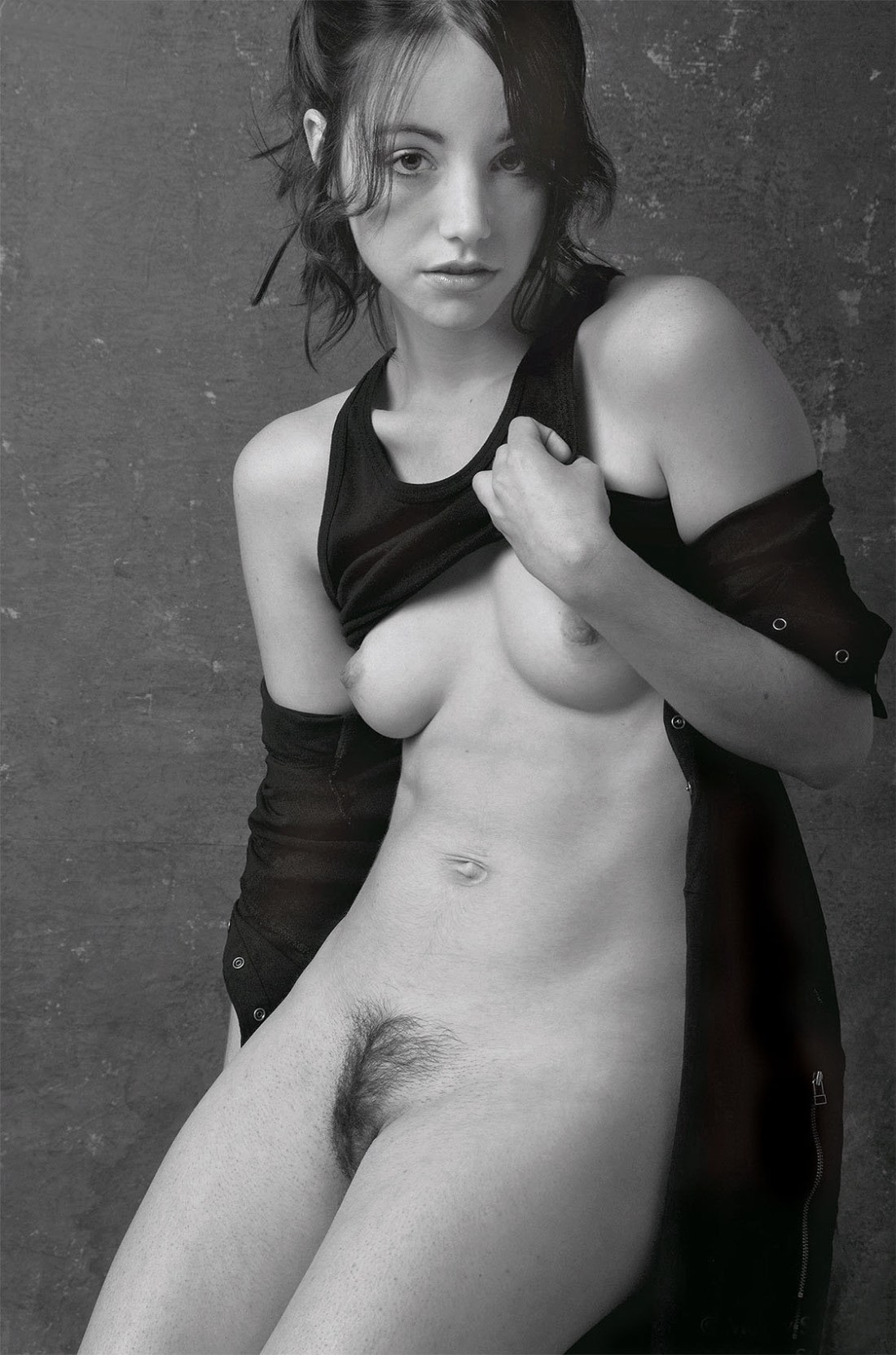
Craig Morey – Christelle (200X)
I see Morey as being of-a-kind with someone like Petter Hegre–folks with a quality stable of gear who generally toe a quantity as quality line in terms of their voluminous output.
You can split hairs; for example: Hegre has a better facility with color management (although his compositions, editing, conceptualizations and general familiarity with the history of photography seems knee-jerk at best); Morey, on the other hand, likely has an assiduously cultivated preoccupation with Jan Saudek (yes, Saudek would never get as close to his subjects as Morey but Morey favors imperfectly textured backdrops with little if any apparent separation between the subject and the background–which is all very Saudek-ian).
Honestly, the pose above is awkward AF. There’s a tension in the way the drape of her jacket is falling down her shoulders. It looks as if she’s doing the sort of thing where you rip off a bodice and stand their open to the world bosoms heaving. Except… her shoulders are not wide and squared, they are folded in. (I do this instinctively when folks stare at my chest, tbh.)
Also: you wouldn’t pull your shirt up like that. It’s likely that she’s hooked her thumb in the arm hole of her top but it looks as if Christelle is closer to trying to pull her tank down to cover herself.
This awkwardness would be distracting if it weren’t for her expression: it’s 100% what do you think you’re looking at? But that mien could cut either way: accusatory or flirtatious.
I’m not familiar enough with Morey’s oeuvre to definitively state that this is either/or dichotomy is a recurrent feature; however, based on what I have seen it seems plausible that it is.
If so, I think that’s actually something worth thinking about as far as making portraiture. In a lot of ways, taking a picture of someone the audience already knows is easier. Think pictures of celebs–we know them already so we’re filtering what we see through a prism of what we already know about the personality. It means that the portrait in a moment in time is designed to contribute to something that is already fully featured in the viewers’ minds.
And of course the photographer/image make knows the person they are portraying. But if the audience doesn’t–there’s a far greater burden for the author to use the scant space of a frame to convey some sense of the person. And I think this capturing the tension between experiential polarities is actually a damn fine tactic for accomplishing this. (It reminds me of the debate about whether or not one of the great portraits of all time Vermeer’s Girl with the Pearl Earring is turning towards or away from the viewer.)


Brooke Didonato – [↑] Temporary view (2016); [←] Still pulling cactus needles out of my ass (2018); [→] Closure (2016); [↙] Self portrait outtake # 9,777 (2018); [+] Title unknown (2017); [↘] sinking in pink (2017); [↓] Title unknown from Quiet Places (2016)
There is something special about Didonato’s images; and it’s less to do with anything tone or style (her closest contemporary corollary is likely Ben Zank, but she’s also seemingly constructing her scenes with similar playfully confrontational absurdity to Yung Cheng Lin, echoes of questions regarding how humans perceive bodies in relationship to the environments they inhabit and how those relationships can provide uncanny fuel for surrealist interpretations (reminiscent of Evelyn Bencicova).
It’s even possible to step back even further and trace a direct lineage from the above group of artists to someone like Josef Koudelka.
I think what makes her work arguably better than any of the folks I’ve compared her to is that Didonato is also disrupting the tradition of which her work is a part. You can’t have looked at much of Stephen Shore’s work without seeing deft homages (Temporary view is almost certainly referencing Shore’s famous South of Klamath Falls, U.S. 97, Oregon, July 21, 1973); the way she prefers to present scenes with a mind toward a wider perspective, while also moving in close in a way that amplifies a sense of location while also preserving context is an insightful response to Uncommon Places and although I can’t point to an indicative example, the way light tangles in Didonato’s pony tail in Still pulling cactus needles out of my ass is both a visual rhyme with Shore’s sensitivity to yellowing light but also an adept encapsulation of Shore’s criminally ignored, irreverent sense of humor.
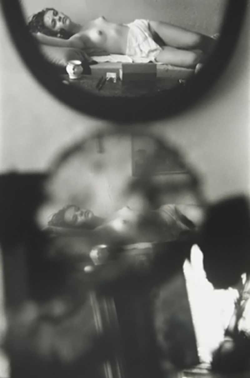
Saul Leiter – The Young Violinist {Young nude on bed, reflected in mirrors} (195X)
If Leiter came up in conversation, I would probably think: Leiter? Leiter… mid-century American photographer, maybe?
In other words: I know little about him or his work. So little, in fact, that I don’t know whether the photo above is more authentic than the one I first encountered:

The landscape orientation is more even handed. (There’s a better exposure balance across the frame–pay close attention to the reflection of the bedside table and the detail in the subject’s coiffure; also: the sepia-like toning contributes a nostalgic softness that resonates with the content in a flattering fashion.)
The horizontal frame is noticeably less contrast-y, however; this additional contrast contributes to the skinny frame both a sense of solidity and dramatic immediacy.
Which variation is more effective?–Well, I’m going to surprise myself by bucking my own generaized antipathy towards #skinnyframebullshit and side with the the vertical orientation.
Why?
I think it’s better to start off with the fact that we are accustomed to conceptualizing the orientation of a frame in terms of portrait (vertical) vs landscape (horizontal). Usually, one of my objections to this is that it suggests too much of a paint by numbers approach to composition. What is the photographer/image maker trying to depict? Grace Hartzel? Portrait orientation. A scene in nature? Landscape.
It’s not that it’s bad advice, necessarily. It’s that it begins from an unconsidered assumption–and thus the basis of the composition is taken as given. (Also: considering that as far as I can tell the portrait vs. landscape dichotomy is largely a function of standardizing output that is then retroactively applied to the creation of the photo or image.
I think it’s better to make a decision with regard to orientation based organically on the scene at hand and what of it you want the viewer to see (and subsequently how you want an audience to see what you are showing them).
A vertical or portrait orientation is naturally predisposed to drawing the eye of the viewer up and down over the frame; whereas, a landscape or horizontal framing creates a side to side visual flow. (I haven’t actually tested this theory but I suspect that if you were to divide art history into works that are explicitly spiritual vs work that is secular. The former would favor vertical orientation and the latter would favor horizontal orientation by–I would guess–at least a 3:1 ratio (e.g. if x is the number of spiritual works that are vertical and y is the number of spiritual works that are horizontal, then X:Y).
In this case the sepia horizontal frame does a better job of moving the eye over the work. Unfortunately–and this is another of the issues I normally associate with #skinnyframebullshit: there’s a self-consciousness with regard to the composition. Like, yes–the eye does move over it better but in scanning it you are faced with questions of what sort of gravity is acting on this scene? Oh, wait: the photographer is fucking with perspective. OK, but to what end? And that’s where a common sense question begins to lead you down a path away from anything suggested by the work itself.
Additionally, the less-contrast-y sepia version doesn’t clarify anything pertaining to what is too close in the foreground to be in sharp focus. My eye tracks right and gets trapped in the mirror frame in the horizontal version.
The vertical version opens that up a bit and because my eye enters the frame from left to right and then drops, I find myself scanning the image up and down across the entirety of the composition instead of getting stuck on one facet.
Lastly, I feel it’s relevant to add–I am more than passingly irked by the use of ‘young’ in the title. I get that it’s a clever way of echoing the two reflections in the frame–reflections which are in themselves already doublings. It reminds me of the way that men tend to refer to women they find attractive as ‘girls’. I’m of a mind that when men do this it is always a red flag. But I’m especially attuned to this because I watched Hannah Gadby’s Nanette last week and it shook me. I suspect if you were to watch it and come back to this photo, you’d have a pretty good idea what I’m trying to get at. Unfortunately, I’m not sure how to articulate it yet so you’ll have to accept my inarticulate pointing for now.


[↑] Zeitgeist Photography – Ceiling Fan Halo feat. Desalle (2013); [+] Tommy Nease – Untitled (2013); [↓] Source unknown – Margo Amp (201X)
Follow the thread.
Source unknown – Title unknown (201X)
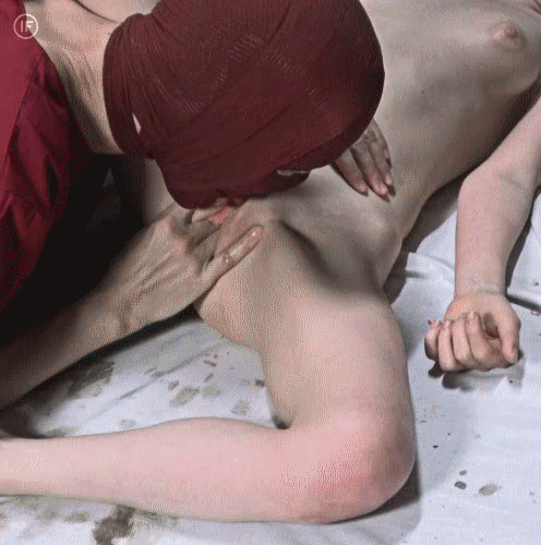
insideflesh – tight spaces (2018)
Is it my imagination or does this recall both the look and feel of Sergei Parajanov’s The Color of Pomegranates?


Everardo García González – [+] Re-nacer (2016); [↖] La Espera (2018); [↑] Tu cruz (201X); [↗] Desprenderme (2016); [-] Proceso (2018); [↙] S’Acrofa (201X); [↓] Title unknown (201X); [↘] El deseo de… (201X)
The aesthetic of González‘s work feels like a deconstruction of fantasy art from the late 80s/early 90s steeped in sci-fi/survival horror video games then filtered through a metal-culture inflected preoccupation with the subversion of Xtian iconography.
I’m not entirely comfortable with the male gaze-y-ness of the work from a macro perspective–there’s an inescapable vein of feminine embodiment with death/apocalyptic tropes as well as a sense that as the viewer you are a party to a sort of theater of the vaguely macabre/unsettling in a way tending more towards authorial, marionette like control of elements than a sense that what is seen is authentically correspondent to any sort of lived experience on the part of the women depicted; the religious icon side of things pushes it decidedly towards objectification.
But with regards to the more post-apocalyptic goth tone and the impressively faux photorealistic rendering, this actually overlaps with something I’ve been thinking about a lot lately–namely: I’ve realized that I am increasingly disenchanted with contemporary photography/image making. Usually, I encounter something a couple times a month that becomes a mini-obsession; those hat stick around for longer than a week or two go on to become things that I come to love.
I’m finding stuff I dig still, definitely. But either I’m no longer tapped into the right Tumblr realm or there just isn’t as much top notch work getting out lately? Mostly, the stuff that is meshing with me tends to be older stuff that I somehow missed out on and am only know digging into.
Being the type of person who needs constant input, I’ve been delving–increasingly–into the work of illustrator. This isn’t entirely surprising. I was a huge comic book nerd in the mid-90s. Sadly, I wasn’t into the artier stuff then and preferred the more blockbuster fare.
But I’ve actually dived fairly deep into Geof Darrow’s back catalog and am finding a lot of ways his work is illustrative of discrepancies/shortcoming between my personal vision and my creative output. (González illustrates the connective tissue between a rather outlandish notion I have for installing my work at some point in the near future and reinforces the value of the time I’m spending with Darrow’s drawings.)