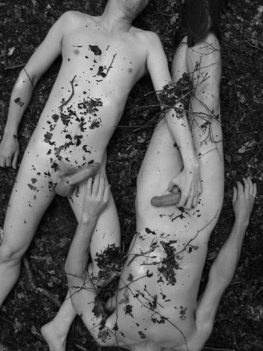
Grit Siwonia* (2010)

Siwonia work is squarely fashion/editorial as far as genre goes. But it takes the genres recognizable sensibilities and steeps them in a sort of Shutterstock vision of better living and then filters it all through a precocious awareness of how the Flickr Explore algorithm functions.

Not to knock those skills–they are as scarce as hen’s teeth–but if that were all there was to see, I wouldn’t be arsed with it.

There’s an underlying vitality to the work, though. Something to do with texture, gesture, expression and reverence–all deeply felt/experienced and manifested incisively.

Source redacted – Title Unknown (2010)

I’m into this for reasons.

It is far from perfect. The key light is set to accentuate his skin tone. The magenta and red in his face and chest, respectively are nice and all but the end up getting diminished by the bristling red of the chair. Also, while from the standpoint of color theory blue recedes and red approaches, without balanced dimensional lighting design the effect won’t read in the frame. And that’s not even getting into how the two black voids from the strobe enhanced cast shadow of the chair arm and his left knee are extremely distracting from a compositional standpoint.

This set up could have theoretically worked if only the chair had been rotated three degrees clockwise and the camera retreated two feet.

I lean towards thinking the cum shot freeze frame is Shopped–his pose/muscle tension aren’t in keeping with orgasm. Further, I’m reasonably certain that it should appear more globular and dispersed, not to mention have more of at least a slight arc to the trajectory.

Still the inclusion of a cast shadow from the stream at least demonstrates some thought.concern for continuity.

Unfortunately, the site from which this image emerges creeps me out. (I’ve chosen not to reference it her–but a Google reverse image search will turn it up easily.)

Nate Walton – Alex Papa in Malibu (2014)

Echoes of Nan Goldin’s Kathe in the Tub, Berlin, 1984.

I effing love this image. The way the back lighting creates such stunning separation between the background and Papa’s body–especially her face, neck and torso. The tension between her stillness and the dynamism of spattered droplets frozen in the air–how they convincingly resemble the grain in high speed color negative film.

Ariel RosenbloomUntitled (2011)

I can’t endorse Rosenbloom’s work across the board. Her use of color is slap dodge–running a gamut from dull to loud-mouthed gimmickry. Her B&W work is better–but still telegraphs a blueprint-rather-the-building awareness.

However, short falls aside, there is at least three consistently challenging aspects to her work.

  1. She thinks a lot about how framing transacts with her images,
  2. She favors portrait orientation (and I will extend her a free and clear pass as far as #skinnyframebullshitery goes since even though some of her stuff definitely is, she demonstrates a hyper self-consciousness in how she deploys it and situates her subject in the frame quite a bit like Ryan Muirhead),
  3. Although she’s struggling to bring it fully to bear on her work, she has a similar based-upon-how-I-show-you-this-thing-what-can-I-get-you-to-imply-about-what-you-aren’t-seeing impetus to Yung Cheng Lin.

The framing in this image doesn’t exactly fail but it’s clunky. What works is the meditative expression and drape of the skirt over the edge of the cellar door.

Source unknown – Title unknown (201X)

When an image is founded upon a solid idea, it’ll with stand a great deal in the way of poor execution without losing efficacy.

This is total #skinnyframebullshit and the production design was clearly meant to be Botticelli-esque but ends up looking half-assed. Further, even though equipment limitations probably resulted in both boys being decapitated by the frame and I’m guessing preserving anonymity was important, lopping off their heads is just ugly.

What I like is the intimacy of it even though it is very much in public. But what really flows like an electrical current through this image is the way they are both almost grasping each other. :::shivers:::

Jacs FishburneAnd the stars falling cold in the river vales where we found ourselves again (2015)

We need to talk about how absolutely in-fucking-credible the work Jacs has been doing lately is.

‘Breathtaking’, ‘spectacular’, ‘the level beyond the next level’: pick a top shelf superlative and fill in the blank. I promise no matter the word, it won’t be overstating the matter.

Miguel VillalobosDeer Slava (2008)

Like anything else photography has loosely defined genres, i.e. street photography, fashion photography, landscape photography, etc., etc.

There’s Ansel Adams–a stollid landscape photographer; your street photographers–Cartier-Bresson or Winogrand; and portraitists a la Arbus.

Additionally there are those artists who migrate between genres over the course of their career–probably the best example being Emmet Gowin, who started out as a portraitist who subsequently took up aerial landscapes of the American west as area of focus. Similarly–and ultimately unsurprisingly given her noted affinity for Gowin, Sally Mann has sort of been all over the place.

What’s interesting about these authors whose work shifts over time is that although the approach and overall aesthetic remain more or less constant, there’s always a lot going on between how they see and how they represent what the see. In other words, we recognize them by their creative trajectory rather than their constancy of vision.

What I find stunning about Villalobos–besides his bold use of dynamic black and white with a downright confrontational use of flash, is that although he favors edgy portraiture… there’s a consistency of seeing across his work regardless of genre.

His work seems to exist as if perpetually experiencing the trough between crests on a slightly sinister acid trip.