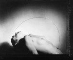

[↑] Pavel Banka – Nude with metal arch from Figuration series (1985); [↓] Ben Rains – Untitled from Somnio: The Darker Parts series (2014)
Juxtaposition as commentary
[↑] Pavel Banka – Nude with metal arch from Figuration series (1985); [↓] Ben Rains – Untitled from Somnio: The Darker Parts series (2014)
Juxtaposition as commentary


[↑] Cassoday Harder – Untitled (2017); [+] Source unknown – Title unknown (201X); [-] Marina Choy – Untitled from Road Trippin’ (2017); [↓] Source unknown – Title unknown (201X)
Follow the thread.
Günter Brus – Selbstbemalung (1964)
Viennese Actionism is something I’ve only come into contact with in the last several months.
Loosely: it’s less school or group and more a collective of people with similar ideas and therefore a similar approach to art making praxis and therefore also producing similar results.
In 1964, Otto Mühl summarized Actionism thusly:
…material action is painting that has spread beyond the picture
surface. The human body, a laid table or a room becomes the picture
surface. Time is added to the dimension of the body and space.
Consider Brus’ Selbstbemalung I (Kopfzumalung) from the same year:

Interestingly, in 1967 Mühl revised the statement from his manifesto to read:
… material action promises the direct pleasures of the table. Material
action satiates. Far more important than baking bread is the urge to
take dough-beating to the extreme.
With that in mind, direct your attention to the notorious Kunst und Revolution in 1968, where:
Gunter Brus, Muehl, Peter Weibel and Oswald Wiener staged a violent and
multiple taboo-breaking takeover of a student gathering at the
University of Vienna. The participants broke into a lecture hall before
whipping and mutilating themselves, urinating, covering themselves in
their own excrement, masturbating, and making themselves vomit – all
while singing the Austrian national anthem.
(For context: Chris Burden’s Shoot wasn’t executed until 1971–three years later.)
There’s ample criticism to be foisted against Actionism’s reactionary underpinnings–however, at the very least it took reaction to a place of visceral extremity. (Most of the stuff considered edgy and avant these days is blazing a very similar trail. Here’s a passable chronology of actions as well as the equivalent of a curated Greatest Hits collection.)

Emmet Gowin – Edith, Chincoteague, Virginia (1967)
From a macro perspective Gowin’s work—and excluding his travel/photojournalistic dabbling—features three distinct phases: the photos of his wife Edith and her family (early), the aerial landscapes (mid) and his more experimental work (recent)—which take Edith as subject once again and involving photos of her taken in Panama printed in experimental fashion on handmade paper produce a photograph/gram hybrid, i.e. this print of a photo of Edith including the outline and veins of a decaying leaf.
The more recent work is completely new to me despite being made almost 15 years ago. My initial thoughts are that it is understated and prescient in a way that would be completely unrecognizable as Gowin’s work if drastic reinvention weren’t Gowin’s exact bag.
After the early work, he took just about the most unexpected left turn imaginable and began to make aerial photos. As I recall, it was something he did just because that’s just what he did when something caught his interest—took pictures of what interested him. And while conceptually, I know that part of the consideration with the aerial photos was to contemplate at what point a the representation of a landscape tilted (on balance) over into abstraction.
The truth is the aerial stuff just isn’t very good (subjectively). It’s accepted because Gowin is an established name and the interrogative focus of the work is valid. But I just think that although he was—to the best of my knowledge—the first to contextualize these sort of photos in terms of fine art practice (and is therefore the progenitor), I’ve seen it done better–it’s not photography, it’s sculpture but Susan Hammond comes to mind, just off the top of my head.
I was actually thinking of Gowin due to a conversation I was having with a friend about the relationship between art making and audience, i.e. there is this balance between where your interests lead you and where your viewer or audience will follow you.
The prejudice is that great artists make work for themselves and therefore are attempting to converse with folks 100 years down the road instead of those in the hear and now. Except: that’s kind of elitist and untrue. I mean for all the intensely specific aesthetic considerations of the great Renaissance artists, there work was something that even someone completely uneducated in the ethos and techniques of mastery in various forms of visual representation, were still very much able to approach the work and get something out of it—whether identifying the characters in a Biblical story and associating them with famous wealthy patrons or just appreciating the way the artist envisioned the tableau.
The distance between the present and the future has grown exponentially more compact—the future isn’t 100 years away, it’s now measured in months and years at the outside.
Despite the surfeit of art makers, it’s difficult-to-impossible to make a living making art. More and more of us are working shitty cubicle jobs to keep a roof over our heads, clothes on our backs and food in our bellies. We work when we have the resources (infrequently) and hope for the best.
And I think that’s the lesson that Gowin has to teach us that is so important: I think if you see his model of producing work that attracts people to it, interspersed with deeply, personal, abstract and largely unapproachable work—there is a balance between the two.
I think that’s the most important lesson you can teach up-and-coming art makers: balancing personal passions with work that is universally accessible and empathetic. The dialectical exchange between the two efforts strengthens both immeasurably.


Ho Yan Pun Nicole – [↑] Hand 1; [↙] Hand 2; [↘] Hand 3 from In & Out series (2014)
As a lesbian artist from Hong Kong, I choose lesbian’s hands as a
site of resistance. Through photographing and exposing different
lesbian’s hand gestures in public, I am making a political statement to
show the existence of the lesbian community, that has been invisible in a
lot of Asian countries. Under the British colonial governance, Hong
Kong had a criminal law against male homosexuality before 1990s. Any
male to male homosexual behavior were banned. In 1991, the Legislative
Council decriminalized the private homosexual behavior. These law
address specifically to male homosexuality. The society largely believed
that only the male homosexual behavior involved the act of insertion.
It was considered indecent and would cause diseases. On one hand, the
legislation oppressed the right of male homosexuals. On the other hand,
this oppression reveals the existence of this marginal group. Their
voice and desire of fighting for their right becomes more and more
explicit nowadays. Lesbian’s voice is always hidden. In Hong Kong,
lesbians do not have a clear social space. Even in the US, when it comes
to bars, the number of lesbian bars can hardly match up to that of gay
bars. This community is always invisible, especially in Asian culture.
Obviously, there are body politics involved. The society presumes
lesbian sex do not have the insertion as sexual activity. Their hands
are not regarded as “sexual organs”. As a lesbian, I believe hands are
precious sexual organs, just as how penis signifies male power. Lesbian
hand embodies lesbian phallus, power, fantasy, erotica. Therefore, by
showing intimate hand gesture, it is a sign of revolt, a sign of
recognition of this community.
source (via @lesbianartandartists)

Alex Soth – Untitled from Looking for Love (1996)
I saw Blue Velvet for the first time over the summer of 1997; I was 19 and I HATED it.
I was somewhat familiar with Maestro Lynch at that point; I’d seen The Elephant Man, Dune and Twin Peaks: Fire Walk with Me–I enjoyed the former, was underwhelmed by the second and the sequence from the latter in The Pink Room is one of my favorite scenes in any Lynch film.
And even though I disliked Blue Velvet, I could admit that my issue with it had less to do with it’s quality and more to do with it’s tropes.
The primary reason I loathed was more a function of my perception than anything on the part of the film itself. By that I mean: I saw Pulp Fiction something like seven times while it was in theaters. It had thrust me deeper into ‘art house’ fare and I watched everything (not an exaggeration) that had any sort of link to either Tarantino himself or was categorized as being Tarantino-esque. (I spent a lot of time watching a lot of rubbish.)
My quarrel with Blue Velvet was that I had seen almost everything in it in other things. I felt that it was unoriginal.
I know, I know… it was partly because it looked so thoroughly modern and fantastic, I failed to realize it predated most of the stuff I thought it was ripping off by almost a full decade.
Luckily, I was forced to watch Eraserhead for a class and was thoroughly transfixed by both how weird it was/how beautifully it was made to look. I saw Wild at Heart (mixed feelings), The Straight Story (I feel like this and Eraserhead are the most truly Lynchian as far as it pertains to aesthetic vision), Lost Highway and Mulholland Dr. (LH and MD both share the same structural form–a Möbius strip and I’ve always felt like in the context of the latter that Adam Kesher is a stand-in for Lynch himself and that LH is the movie that The Cowboy insists Kesher make but MD is the film he really wanted to make in its place.)
(We don’t discuss Inland Empire–I have interacted with Lynch twice in my life and both times I’ve started arguments with him; the second time I may have told him the second hour of IE was entirely unnecessary and that had he still shot on film he would’ve made a better project for having to make decisions instead of throwing things at the wall and then leaving it up to the audience to decide whether or not they stick…)
Anyway–and I swear this all pertains to Soth (which he says rhymes with ‘both’ but why would you not say rhymes with ‘oath’, I mean really…)–I actually did go back and watch Blue Velvet again. The second time I was blown away by it. I may be partial to Eraserhead and Mulholland Dr. will likely go down as his crowning achievement but really, Blue Velvet is a cinematic masterpiece of truly rare acuity.
How all this relates to Soth is: I am not a fan of his work. But I try to remain mostly civil as far as this project–like I despise the work of Gregory Crewdson (spoiler alert: he’s not particularly well liked by those who had a hand in training him or who are his ostensible peers) and Fox Harvard and Brooke Shaden are godawful… but mostly I keep it constructive.
I have actually changed my opinion on Soth. He work doesn’t especially resonate with me but I now see that what I read before as vapid vacuity, is actually much closer to the form of fine art photography rendering meditations on disaffection and loneliness banal. I don’t really think this is exactly the best tact but it is a code I can read now.
And I think that’s really what I’m getting at: if you are doing the work you are supposed to be done correctly, i.e. with the appropriate degree of rigor and attention, then you are going to realize frequently that you’re wrong more than you are right.
I know this blog comes across as persnickety and I realize there are things I say that seem preposterous–but this is a way I’ve found of pushing myself to do the work.
I was wrong about Soth. It doesn’t mean I’m gonna rush out and buy his work it just means that I had not yet found the right photo to draw me into his work. The photo above was what I needed.

Zackary Drucker & Manuel Vason – Untitled from Don’t Look at Me Like That (2010)
In nature there are neither rewards nor punishments; there are consequences.
—Robert Green Ingersoll

Anna Cladonia – Nude (2011)
TFW you find out that two photographers you adore have worked together: 🙂
The photo above is by Anna Cladonia–who I’ve posted about previously–of Julia Klem, who I have also posted about.
In fact, both earned a favorite tag. (Which by the way is a thing–if you know, you’re in a mood to mainline the creme de la creme.)
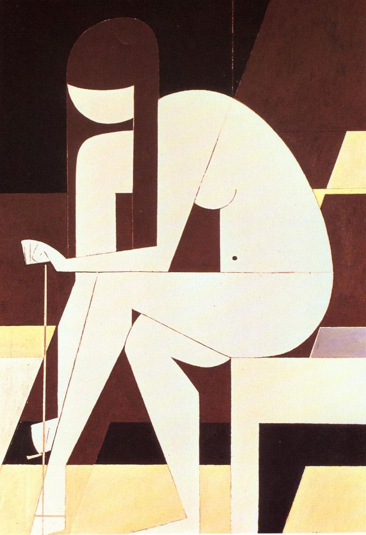
Yiannis Moralis – Girl Untying Her Sandal (1973)
You know that thing you do where you find a nice green grassy area in a park, lay on your back watching the clouds shift overhead and try to see the clouds as shapes other than clouds–an elephant, a steam train the Buddha? (See also: pareidolla.)
Call me sentimental if you must but I think that sort of thing is a good creative practice to encourage.
What does that have to do with this painting? Well, I think first of all the instinct of an art historian is going to be to term this as cubist in nature. I’m not entirely sure I’d agree with that.
By and large: cubist work has a sense of multi-planar dimensionality–most cubist painting ends up looking like fragmented origami with enough of the original form to allow for general identification or one of those foil, fabric and paint mixed media collages.
This takes a single view and more or less sticks with it. I know very little about Moralis other than he was Greek and dabbled in a shit ton of different styles–yes, including cubism. But he was also interested in mosaics and I think that it’s better to view this in that context.
I feel like mosaics are sort of the best way of teaching people to see both the forest (or to re-embrace my original metaphor: clouds) for the trees (the suggestive shapes the clouds take on).
Let me attempt to clarify what I mean. Consider this design:

It’s a standard checkerboard–big whoop. Well, what if I told you I see a flying saucer. I’ll understand if you are quizzical but the important thing is that given this I can show you what I mean in a way that I cannot with cloud watching.

In effect a mosaic is a means of teaching how to see less what is than what is possible to see.
And that’s really the brilliance of this painting. It instructs not only in how to see but via that teaching allows the viewer to witness something beautiful in a task that is usually so mundane as to not receive the attention of creative reverie–untying sandals.


