caitiborruso:

writing end of year blog post, feeling funny and sad sort of, grateful for this picture of me from May ish

Caiti BorrusoSelf Portrait (2017)

I’m intrigued by Borruso’s work.

It feels to me like there’s substantial overlap with both Mark Steinmetz (careful control of contrast to enliven drama and emphasize tone).

There’s also a similar haunted, elegiac tone to the work of someone like Allison Barnes.

(This photo–presumably of Borruso’s best friend, were it an orphan work is one that could be thought to have been made by Steinmetz or Barnes, actually.)

Her more conventional ‘landscape’ work reminds me of Sarah Muehlbauer; compare this exquisite photo of an open gate by Borruso with this picture of dumpster in Queens by Muehlbauer.

I actually adore the way Borruso sees landscapes. I see landscapes in much the same way she photographs them–but I’ve found in my own work that when I see something in the landscape that interests me, I get the slides back and think why did I fucking take a picture of that? That’s not how it is with her–you know why she took the picture. (Whether or not it always works is another story but from the standpoint of light and form, it’s there clearly demonstrated in the work.)

But what impresses me the most about her work is the way that when she combines her sense of location with unselfconscious presentation of those she photographs–including herself–there is often a sense that her subjects are almost like aliens in their environment. They always look like they belong there but there’s always something searching in their expression. As if they know why they are where they are and how the are expected to act but they’re caught in a moment of wondering if maybe that’s not the way things really are or even should be.

I’ve never seen anything quite like it. It’s incredibly impressive.

Fan Ho – [↑] Title unknown (19XX); [↓] Sichen Concubine (19XX)

I had never heard of Ho until he passed away in June of 2016.

Above are his two most recognizable photos [left] Private (1960) and [right] Approaching Shadow (1954).

I could go on for the better part of the afternoon about all the little things which distinguish his work as simply effing extraordinary. However, for the sake of brevity–which they tell me is the soul of wit (perhaps they are implying I am witless)–I’m going to mention two things and before scooting along to my primary point of order.

First off, both of these photos have a similar quality to Vermeer’s best paintings. What I mean is when I look at a Vermeer canvas I have this tendency to forget that I’m standing in a crowded museum to an extent and I get this weird feeling that I’ve been strolling around Delft and while passing a window in the street, I catch a glimpse of this scene before me and I am frozen watching it; it always feels like at any moment the frozen people are going to resume whatever they were doing–and probably very soon after realize I’m staring out on the street staring at them through their window.

I feel that about these too. Like what are the man and the woman talking about in the stairwell. The location seems to suggest it’s a conversation they want privacy to conduct. (This is–of course–emphasized by the word private inscribed on the sign.) The wash of white on the exterior wall is almost perfectly identical in tonality through the entirety of the picture plain. (That is unbelievably difficult to accomplish in a traditional darkroom, y’all.) But the fact that the only shadow tones are at the base of the frame and through the window–there’s a sense that the conversation is a bit sordid. This is emphasized by the gender of the two conversants and is further tweaked by the way he stands over her and leans in toward her. The way the slats from the window in the background behind them physically separates him from her–so the sense of something potentially sinister is slightly diminished. We’re supposed to think that it’s probably a dicey situation but that she is safe.

In Approaching Shadow, there is a sense that the woman is experiencing a moment of quiet reverie and is unaware of how the world around her is drawing attention to her. (It’s worth mentioning that apparently Ho added the shadow via darkroom trickery–an easier feat than the white facade in Private but no less impressive in its execution.) When I’m looking at this one I figure if I just watch her long enough the shadow will move and she will eventually walk away. (Interestingly with this one I do wander how the shadow will move–will it cover her or creep slowing away from her; also, which way will she walk away–left, right or towards the viewer.)

The second thing I want to point out is that virtually all of Ho’s work features vertically oriented composition none of it is #skinnyframebullshit.

Interestingly, Ho was not only an acclaimed photographer. He was also a notable filmmaker. (As someone who came to photography via studying filmmaking, this is probably yet another reason why his work resonates so much with me.)

Bonus thing: he considered himself a street photographer but I suspect he meant that less in the sense of Henry Cartier-Bresson or Garry Winogrand and more in line with Atget.

Anyway, the above color photos are interesting because Ho worked almost exclusively in B&W. There is some color work available–most slide film from the look of it, that despite having chunky, ungainly grain, demonstrates a sensitivity for color and light that is truly rare to encounter.

Of the two photos, the bottom one is definitely Ho’s work. The top one–although originally posted by someone who is generally very careful when it comes to attributing work to the correct artists and also appearing to be shot on positive stock–could be Ho’s work but also it seems a bit too modern for me to comfortably state that it is his.

If it is, I would be incredibly interested in knowing if there’s more work that he did in this less street photographic style, more off-the-cuff manner.

Christer Strömholm – [from first to last] Suzanne and Mimosa (196X); Suzanne and Mimosa (196X); Cobra and Caprice (1961); Narcisse (1968); Soraya and Sonia (1962); Cynthia (196X); Gerdy (196X)

Apparently Strömholm moved from Sweden to Paris towards the end of the 1950s. He took up residence in Place Blanche, at the heart of the red light district.

During his time in this locale, he befriended a number of the trans women sex workers in the neighborhood. (Many of who were working to save up money for gender confirmation surgeries.)

In 1983, he published this photos in a book entitled Les Amies de Place Blanche–of the work, he wrote: It was then— and still is— about obtaining the freedom to choose one’s own life and identity.

Thy Tran – [↖] Untitled from Cacher series (2016); [↗] Untitled from Cacher series (2016) ; [↙] Untitled from Cacher series (2016); [↘] Untitled from Cacher series (2016)

When I saw Tran’s work, my first thought was: wow, there’s A LOT of overlap with Kim-Ngân Ao (aka yatender). Both filter elements from Lina Scheynius and Ren Hang through a stubbornly lo-fi analog aesthetic.

However, after sitting here suffering from that oft reported feeling in police procedurals where the unorthodox detective feels like she’s missing a piece of the puzzle that’s right there staring her in the face, I figured it out: Tran and Ao almost certainly know each other.

Consider: this self-portrait from Tran’s Flickr account and this photo made by yatender–the tattoos are the same.

Initially, my thought was that I favored yatender’s work but I’m not so sure that’s the case any longer. Yes, both are working in very similar veins but I think yatender is more audacious in the risks she takes as well as being decidedly on the take photos vs make photos end of the spectrum; Tran is more reserved and contemplative as well as being decidedly on the making end of the aforementioned spectrum.

Also, being that Tran’s Cacher series is focused on interrogating her identity as a lesbian and the visibility vs invisibility that comes part and parcel with that–her work resonates more with me as a fellow queer person.

Anonymous – Two women engaged in oral sex (c. 1895)

With the invention of the daguerrotype in 1839, photography was
enlisted in the production of pornography. By the 1880s, when
developments in photographic technology brought cameras into the
middle-class home, amateurs could produce not only their own portraits
and snapshots but also the means of their own arousal. This pocket-sized
photograph is one of some 50,000 erotic images – professional and
amateur – that pioneer sexologist Dr Alfred Kinsey began to collect in
the late 1930s, working with difficulty around obscenity laws and codes
of ‘public’ morality. Taken not in a conventional studio but in a homey
Victorian bedroom, this representation of cunnilingus was probably
intended for illicit heterosexual male consumption, though one hopes
that at least a few women managed to put it to good use. The woman
sitting demurely on the bed wears an apron, indicating that male
fantasies about the sexual availability of domestic servants was
operative in the production of the image. Unlike in most erotic
photographs of the period, the face of the sitting women has been
crudely blacked out.

Catherine Lord, Art & Queer Culture (New York: Phaidon, 2013), 59.

(via @lesbianartandartists​)

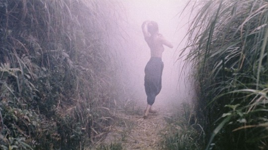
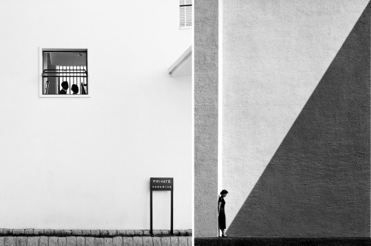
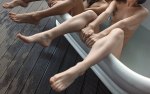
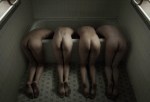
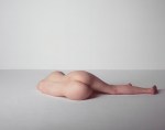
Bill Durgin – [↑] Nude-8 from Figure Studies series (2010) [-] V with Plywood and Mosaic from Studio Fantasy series (2015) [↓] Untitled from Nudes and Still Lives series (201X)

Truth told: I don’t get nearly as much hate mail as other similar Tumblr blogs–but I do get it.

Lately there’s a theme which you can essentially summarize as follows: you think you are being ‘deep’ but really you’re just showing yourself to be an idiot.

This sentiment is usually appended with evidence of my idiocy–which 9 out of 10 times demonstrates the anon to be incapable of fifth grade reading comprehension. (Seriously, though: if I had a nickel for every time some fuckwit represented what I actually wrote as stating the opposite of what I actually wrote, I’d be dead.)

I swear I am bringing this round to Durgin, please indulge me a little bit longer…

I’ve spent the last 7 weeks or so pulling together materials and doing so writing towards the end of :::deep breath::: trying to see if I can maybe get my ass into a graduate art program.

It has been a very slow, largely unpleasant process. I’ve found that–while I would never say that putting comments together for these posts is “easy”, per se… it’s not something that usually stresses me out. (Sometimes it does but that tends to be the exception that proves the rule, honestly.)

On the other hand, it is ridiculously time consuming… but I digress.

Anyway, what working on these applications has shown me is that while I am sure there are more than just the two forms of writing I am now going indicate, for me, writing seems to come in two flavors: exploratory and clarifying.

Exploratory means something like following a path for nothing more than curiosity w/r/t where it ends up. Clarifying means something more analogous with showing your work while solving a math problem.

The first one is more or less what this blog entails. Grad school application writing prompts are my in line with the latter.

All five of the applications I am in the process of completing are fixated on the ability to clearly and concisely explain my creative process in writing. You’d think I’d be really goddamn good at that by now. Alas that’s not the case.

The difficulty I’m having–and it has taken a positively stupid amount of time to get clear on this–is, simply: as much as I am interested in process (hell, this coming from the girl who wants to travel all over the face of the earth and do video interviews with creators I fancy about their respective processes…), I am EXTREMELY resistant to the framing of process first-and-foremost in terms of questions-of-how and secondly (or, perhaps not at all) in terms of questions-of-why.

The best way to render this abstraction concrete is to think of questions-of-how like a recipe–say for chocolate cake. You have your list of ingredients with respective proportions for each, a summary of implements required to prepare it and instructions on how everything is combined.

And here I should stop and point out that this is an appealing notion from at least the perspective of inclusion–it makes art seem like something anyone can do. The problem with that is at the same time it makes art making seem easy: and that is a mistake of enormous magnitude.

Art making is damn difficult. And whereas you may go to make a cake and find out you don’t have eggs–there is rarely an equivalent in art making for getting in your car and scooting to the store to buy eggs.

That’s why questions-of-why matter–because it’s the answer to the question of why that’s going to sustain you when you see no possible route forward in your work.

The way I think of it is: the recipe is not the cake it makes and a recipe does v. little to fill an empty belly.

How does all this relate to Durgin’s work? Perhaps, I’ve been gazing at my own navel for too long with this applications but I feel like there is a way in which he has systematically fetishized his process in his product.

I mean any time you’re dealing with studio work, you are dealing with de-contextualizing environment in an effort to focus with less distraction on the subject. In a way this work is a deconstruction of studio practice–wherein the relationship of the subject to the studio is emphasized over and over. And the subject emphasized is frequently abstracted to the point of being a place holder or a suggestion of form.

Durgin is exceedingly adept in his use of color–it’s very different, however, than most of the folks I usually name check when on the topic. It’s not like Amanda Jasnowski’s impeccable sense of the interactions between colors or Laurence Philomene’s color as signifier (this is not entirely the way I want to say it but ‘form’ is too heavy handed and ‘tone’ is too innocuous) or Prue Stent, who is one of the few people I know of whose work seems to aspire to interrogate color as Platonic forms.

Instead, Durgin seems impressively attuned to the way the directionality and intensity of illumination affect color fidelity. (He straight up references this is several of his pieces by including those ubiquitous color charts in the composition.)

There’s all sorts of commentary on mass digital consumption, boundaries and glitches in the work. And this makes me think it’s perfectly suited to addressing questions-of-how with regard to process.

And not to slight the work, but I’m not able to grasp from reading the work, any sort of clue as to the questions-of-why. The work is exquisite and technically refined to a level that is extraordinarily rare. I just don’t understand the drive to get to this level merely to exercise mastery. There is something profoundly lonely about this work–all of it. That’s interesting and I think I for one would be interested in seeing what transpired when the work was allowed to interact with that emotional resonance in a less coded, more straightforward fashion.

But to circle back to where we began–the asshats who write in criticizing me for think I am ‘deep’ are correct on at least one count: more often than not I am being entirely superficial in my comments on here. I’d like to go deeper more often. And there’s not always the available time or energy to allow for that. Unfortunately, it’s also sometimes down to the fact that no matter how much I want to, my brain won’t cooperate.

Igor MukhinKsenia, Moscow (2011)

I’m sure there are more technical photographers out there–but for my money, Mukhin is unrivaled.

Take this photo, for instance; it works because he seems to have obvious thought forget about shadow detail in her hair, I need something to anchor the composition. (This decision has the added benefit of emphasizing the way the light on her hair to the left look exceedingly sultry.)

He realize that the rest of the room is going to blow out and opts for an aperture that will give him just enough of a slice of in-focus depth of field that the sharpest focus begins just in front of her right knee and grows ever so slightly shallow just ahead of her face–which is tilted forward slightly. (Again, every so flattering but it also serves to separate her from the table she’s leaning against.)

And Oh My! but look at the same the entire frame demonstrates what Leica optics with do in correlation with film grain w/r/t over and under exposure and shallow depth of field.