Knowing your own darkness is the best method for dealing with the darknesses of other people.
Category: Uncategorized
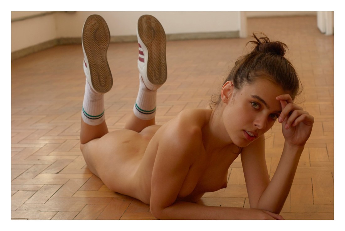


Daniel W. Coburn – Untitled from Becoming a Specter series (201X)
“Attention is the beginning of devotion.“–Mary Oliver

Blake Fitch – Julia on radiator from Expectations of Adolescence series (2005)
There are at least three other bodies of work I can think of that cover similar ground to Expectations of Adolescence.
Conceptually, Sally Mann’s At Twelve–with its 8×10 portraits of several dozen twelve year-old girls–is the clearest antecedent.
There’s also Anna Grzelweska’s less polished (but no less fantastic for that it) Julia Wannabe series–where a mother documents her daughter’s transition from a girl into a young woman.
And don’t forget Siân Davey’s series focused on her daughter Martha.
The two young women in Expectations of Adolescence are the younger sister and cousin of the photographer.
Here I want nothing more than to dive into an examination of the questions as to where excessive stylization begins and where is crosses over into a kind of over hyper-realism–however, benevolent Satan must be smiling down on you tonight because you are saved due to more pressing matters.
See: I was moderately squicked out by this–at least initially. I mistook Blake for a masculine first name–it’s feminine here.
(And it’s not only me–several people I’ve showed this to had the same reaction.)
Interestingly, not an hour before I found discovered this huge piece of information I had carelessly missed–I had been screaming about that change.org petition demanding the NYC The Metropolitan Museum of Art remove Balthus’ Thérèse Dreaming from their collection.
I wasn’t going to read the petition but I went and did it just now and I was wrong to give it the benefit of the doubt–it’s 100% grab the pearls reactionary concern fapping.
And I just so happen to have a previous version of of this post with my approximation of what the gist of the petition: in the wake of the #MeToo movement, the petitioners view this work due
to it’s ‘voyeuristic’ nature as well as it’s ‘sexualization of young
women’.
I am going to just skip over the part about taking a gallery to task for exploiting voyuerism–it’s a bit like saying: that new pope sure is great except for that whole Roman Catholic thing.
I’m curious how many of the folks signing on for this petition have actually engaged with the work in good faith?
I mean–yes: Balthus was almost certainly an hebephile. I’m with Dan Savage on this one: it is absolutely possible for someone to have a fetish that they cannot morally sate. And there are such things as gold star examples of those folks who–due to the inability of the other party in their desire to consent to sexual contact: they abstain.
So the question is: if Balthus did have a thing for adolescent girls but never acted on it–in part because through art he found a means of transferring his fantasies–are his works more or less socially acceptable due to their being less morally bankrupt?
Are we–through the act of viewing–also rendered guilty by osmotic association?
Lastly, the notion that the work glamorizes the sexualization of young girls is maybe even more offensive. The semiotics of the composition from her expression to her pose to the behavior of the cat all communicate an inaccessibility. Or to put it another way: it takes some work to look at that picture and think I want her even though she very clearly does not want me? And that makes you a creep. (There’s this whole thing akin to that whole thing about whether the angle of the dangle in Vermeer’s Girl with the Pearl Earring’s bauble indicates whether she’s looking towards the viewer or away from them.)
I mean full disclosure: it’s one of one of my all-time favorite paintings. So–of course I’m going to defend it; but am I wrong, too? It’s something I’m mulling.
This post brought to you but the letters T, H & C.


[↖] Hans Breder – Ana Mendieta, Coraville Studio (1970); [↗] Heidi Systo – Title unknown (201X); [←] Laura Kampman – Untitled from self-portraits series (201X); [→] Zanzib Art – Etude with a tired model (2017); [↙] Tamara Lichtenstein – Untitled (2016); [↓] Sohei Szincza – Contact (2017) [↘] Mike George – Title unknown (201X)
Follow the thread
Ian Reid – Amanda Marie & Molly Ace (2017)
There are about 15 different things about this image that leave me with questions. Foremost: yes, clearly the focus is what’s going on in the foreground but what I notice and what keeps claiming my attention is the reflection of the script tattoo across the Ace’s upper back.
Backing up: I didn’t know who any of the folks in this image were upon first encountering it. I knew I’d seen Ace before in an image by @vk-photography and another by @crosxsover. I followed model mayhem through a series of defunct Instagram aliases to an actual Twitter account back to an Instagram (linked above) that is–at the time of this writing–active.
All that was a bit more work than I was expecting just to you know offer proper attribution. However, then things really took an unexpected turn: as far as I can tell there’s not a picture anywhere that has the entirety of the tattoo visible and in sharp focus. (And let me just cut off any objections ahead–given the above resolution, which is the highest res version available… the ubiquitous police procedural motif of enhancing a digital image infinitely just doesn’t work here.)
So then I pulled out a fine tooth comb and went through the pictures I could find. The bit on the right shoulder is easy enough–there are several snaps with it in sharp focus. It reads: ‘these been’
Also the script on the other shoulder is relatively clear in a couple of shots: ‘Quid a’
The middle of it is the problem. In one picture you can make out ‘insolitus’ and something that I’m pretty sure is ‘trinus’. In another shot at another angle it’s Quid a p-something?
By using Google and Google translate to attempt to reverse engineer something I realized that there is a fish called the Mangarahara cichlid, or Ptychochromis insolitus. They are critically endangered and were thought to be on the verge of extinction when one at the Berlin Zoo was killed while attempting to mate. Later, a small school was discovered in the wild.
Looking back though it’s definitely ‘quid a p(o- or e-something) so no dice on an elaborate Douglas Adams joke.
Best I can tell it reads ‘Quid a po-(something illegible) insolitus trinus is these been’
It’s weird because ‘is these been’ is not Latin. The rest is more or less a way of saying ‘what a long strange trip its been’ but in a way that is not the standard way of translating the Grateful Dead title into Latin–so I suspect there’s some kind of pun I’m too dumb to understand.
Anyway, this was not the direction I wanted to go with this post. I’d originally intended to find out what the tattoo said and then use one of those online tools that mirrors text so that you can post text backwards and just post that.
But I guess now you’ve at least got a wacky story to go along with a really goddamn interesting picture.


[↑] Eric Marrian – Untitled from Broken series (2017); [↓] Francesca Woodman – Untitled (1979-80)
Juxtaposition as commentary


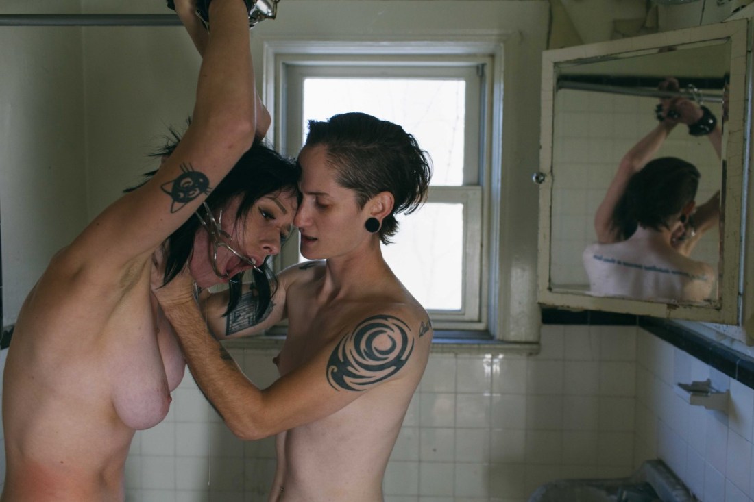
Snapchat: TiffanyNacke
Patreon.com/tiffanynacke**Do not remove my text.
There’s quite a bit going on with these two images.
I’d term it a self-portrait, not a selfie–partly because Nacke is framing her shot so that it including two mirrors featuring her reflection, instead of using her phone as if it were a mirror to find and capture her shot, partly because unlike the ubiquitous me-nude-in-my-bathroom mirror trope, the reflection of the nude subject is not ostensibly the only subject.
Here, there’s a sense of both space and light. In effect, by using the reflection a very flat image is given surprising depth–this comes a result of the magnification built into the round mirror (as well as it being on a different plane than the medicine cabinet mirror).
The reflection in the round mirror in the left frame is the better of the two and the reflection in the cabinet mirror on the right is definitely better–the hand reaching up to hold the shower current is both compositionally astute as well as strangely functional in a naturalistic way–hand seek out something to hold (that photography is so often opposed to this notion is where the challenge presents itself).
If the framing had been consistent between the two images, it would be fascinating to matte the round reflection on the left in the round mirror on the right–to further draw attention to the way reflections both mirror and distort. (That’s not a criticism AT ALL; despite the ridiculous amount of cold brew I drink every day, my hands are surprisingly steady and I can’t ever get two shots this close to being the same ever. So mad props where they are due.)
Still, there’s a coyness in the image on the right that works regardless–the magnification of her chest in magnification vs her right eye being visible is just really freaking inspired.
Awesome work from a model who is really doing some fantastic work of late.

Arvids Strazds – [←] Untitled from Desires of My Wife series; [→] Untitled from Desires of My Wife series (2017)
Strazds is a Latvian photographer who pictures his wife with various paramours.
The work suffers from a cloying veneer of legitimacy–and by ‘veneer of legitimacy’, I mean to indicate creators who attempt to head off any repudiation of their content by pointing to the demand for technical expertise required by their preferred production medium as proof of intrinsic artistic merit, i.e. these appear to be tintypes (although I am not convinced they are/it appears they may depend upon some post-production digital intervention).
The clearest corollary is likely Jock Sturges, who uses his preference for 8×10 analog view cameras in the creation of his work as a means of dodging valid questions/concerns over the sexual/voyeuristic propriety of his work. (That this has flaccid proposition has succeeded in short-circuiting debate for decades represents an incontrovertible failing on the part of the critical establishment.)
Still, I think there’s more to it than that. The focus on square compositions–a format typically most readily applicable to portraiture, and therefore front loaded with a certain innate intimacy’ is definitely enhanced by use of tactful vignetting and reliance upon the same principle those of us with a ton of freckles have known for years–that any three non-linearly plotted dots will, when connected, form a triangle.
Strazds work works due to these reiterative triads. For example: in [←] the two erections and the the way the rim lighting accentuates her left eye’s acknowledgement of the lens (and implicitly both the photographer and the audience). This scalene imposition renders the composition easily parsed and effectively guides the eye over the scene.
[→] is a bit more complicated. Her downward gaze reinforces that the vertex of the triangle is the site of erotic penetration. This leads to questions over whether the other vertices are her breasts, their faces, or the solarized area under her left breast and the hallow between her armpit and his chest. (This is not necessarily something I would’ve picked up on had I not simultaneously been struggling with how to talk about this absurdist gif while also tentatively engaging with Lucinda Bunnen’s work.)
Another point of convergence with Strazds work is Chloe des Lysses’ erotic self-portraiture. I’ve always had reservations about Lysses’ work–I wouldn’t label it narcissistic but there is an element of narcissism to it. Strazds, on the other hand, seems more collaborative. And although it’s entirely possible that there is a narcissistic cuckold adjacent motivation for the work–he does allow his wife a meditative joy of expression in many of his frames that I find entirely appealing.
Lastly, although I generally frown on watermarking your visual art, I absolutely understand the impetus for doing so. My rule is that if you’re going to do it, keep in mind that one is a visual artist and therefore the water mark should be more than just typeset. (Scott Worldwide is the exception that proves the rule–but again, his logo involves solid graphic design.) Strazds has a superb watermark–riffing off of Albrecht Dürer’s signature and mixing in a bit of the sensibilities from the Japanese tradition of Zen paintings.

Source unknown – Title unknown feat. Tomoka Sakurai (201X)
…and feel within me uprush some wilder, darker violence,
–Virginia Woolf from The Waves
