
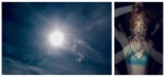
[←] David Stewart – Title Unknown from Teenage Pre-occupation series (2013); [→] Martin Sanchez – Untitled (2017)
Juxtaposition as commentary
[←] David Stewart – Title Unknown from Teenage Pre-occupation series (2013); [→] Martin Sanchez – Untitled (2017)
Juxtaposition as commentary
Care is not grounded in time; it is time.
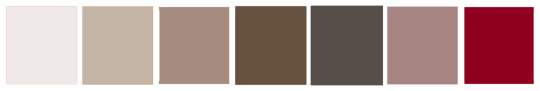
Author unknown – Title Unknown (192X?)
Things I like about this:
Lastly, a counterpoint on the why the eye parses this frame: there is no sense that there is a continuity beyond the edge of the frame, thus the exclusion of the woman on the left’s right forearm and hand represents an amputation, a symbolical removal of autonomous agency. (Her foot is similarly maimed.) No matter the cleverness of the way the work cycles the gaze–these women are definitely meant to perform for the male gaze.)


Cocky Boys – Colby Chambers, Mickey Knox & Levi Karter (2016)
Heavy breathing, exaggerated moans, skin impacting skin percussively. A focus on the extremity of action–one body disappearing into another, the gaping void of a mouth/orifice, carnal fondling of erogenous zones.
At most, pornography can appeal to only two senses: seeing and hearing. The exaggeration of these aspects is, ostensibly to make up for an absence of other sensory elements–touch, smell and taste.
I think this both tangibly and intangibly contributes to porn’s tendency to preference pleasure as the impetus for sexual expression.
This drives a one-dimensional perspective with regard to sexuality.
What I find intoxicating about this clip is that sans audio and with the additional of subtitles, these clips take on greater richness. There’s a give and take, an effort to communicate not only just with regard to pleasure but also the extremity of emotional presence that can come with intense sexual experiences. (Also, the subtitles really hammer home the power dynamic that can sometimes be at play in sex, in a way that I can’t recall seeing before.)
Plus, this is just super hot to stare at.
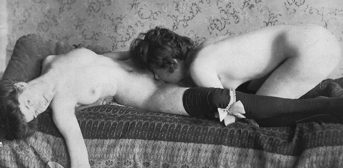
Robert Mapplethorpe – Cock (1985)
Ever since the Venus of Willendorf or Lascaux paintings–or, as I refer to it, tongue-in-cheekily: prehistoric Instagram–visual art, as such, has been preoccupied with ontology of representation.
There has been–and as far as I’m concerned, continues to be–resistance to photography/image making as capital A Art. Although I am decidedly on the photography can absolutely be Art side of things, it does occur to me that there is a fundamental conceptual rift between other forms of visual art and photography; namely: painting, sculpture and architecture are arguably not primarily but intrinsically decorative, too.
Painting, sculpture and architecture proclaim look at this here in this specific place, i.e. the location of the canvas, the relationship of a sculptural object to its surroundings, architecture as the physical manifestion of space as decoration.
Photography/image making starts from the same impetus–the hey, look at this! exclamation. However, it does not have the same relationship with location in place, space and time. (Thus, I think, the fixation in fine art photography on conceptualization and installation–whether that be in a physical/virtual gallery or increasingly in the making of artists’ books.)
In a sense–presentation becomes part of what activates the photo/image as Art.
(I don’t have time to tease out the implications in this forum, but I do think it would make an excellent interrogation to expand this notion using Benjamin’s rt in the Age of Mechanical Reproduction viewed through the prism of @knitphilia‘s thesis on the deeply misogynistic history of distinguishing (and through distinction, diminishing) forms of creative expression normally associated with femme creators as ‘craft’–as opposed to ‘art’.)
Strangely, it was this thought that led me to a ‘discovery’ (of sorts) in the above photo It seems this was never something Mapplethorpe printed during his life. A print was made in 2010 and gifted by The Robert Mapplethorpe foundation to LACMA .
The digital print was clearly made by someone intimately familiar with Mapplethorpe’s work–the balance and interpenetration between highlights, mid-tones and shadows with the sort of atmospheric haze (sfumato) despite the razer sharp focus, couldn’t be more Mapplethorpe if it bore his signature.
Yet, knowing all that about the work there is still something about it that makes it Art–I think–even before it becomes physically instantiated: yes, the work (just like all visual art) says hey, look at this! and like all photography/imagery it (implicitly) states this is how I see this thing! Mapplethorpe takes things a step further and says: by looking at this it will be clear to you why I think this is beautiful should be appreciated.

Pola Esther – Selections from Mutual Attraction series (201X)
The artist on her Mutual Attraction series:
A single photograph tells a certain story; I like to expand that story
by adding a second image. I play with these two images, juxtapose them,
connect them and check if they are able to attract or distract one
another. I often change the positions of the images. The dialog I’m
attempting to initiate is supposed to provoke a more abstract thinking
about common objects or situations. I try to transition them into a
fantastic universe. I want to share my fascination by pairing images
with the elements of nature like flowers, fruit, vegetables, trees,
animals with images containing human forms that can express human
desires, hidden intentions, intimacy and sexuality. (via Metal Magazine)
‘Story’ is the wrong word. ‘Idea’ might be better.
What’s interesting about these is the way they function both individually–each image warrants attention in and of itself; while they also interact with each other (as well as other images within the same body of work, not to mention within Esther’s oeuvre taken as a whole).
I choose the above images because of the way they use color and tonality to unifying the images. (Esther also has an unrivaled eye when it comes to texture–even if that’s not as readily evidenced in these selections.)
Yet, with regards to color specifically, it seems to me that you could do a lot worse than analyzing the relationship between colors in the above work within the context of this diagram from W. H. Smyth’s 1864 Sidereal Chromatics:

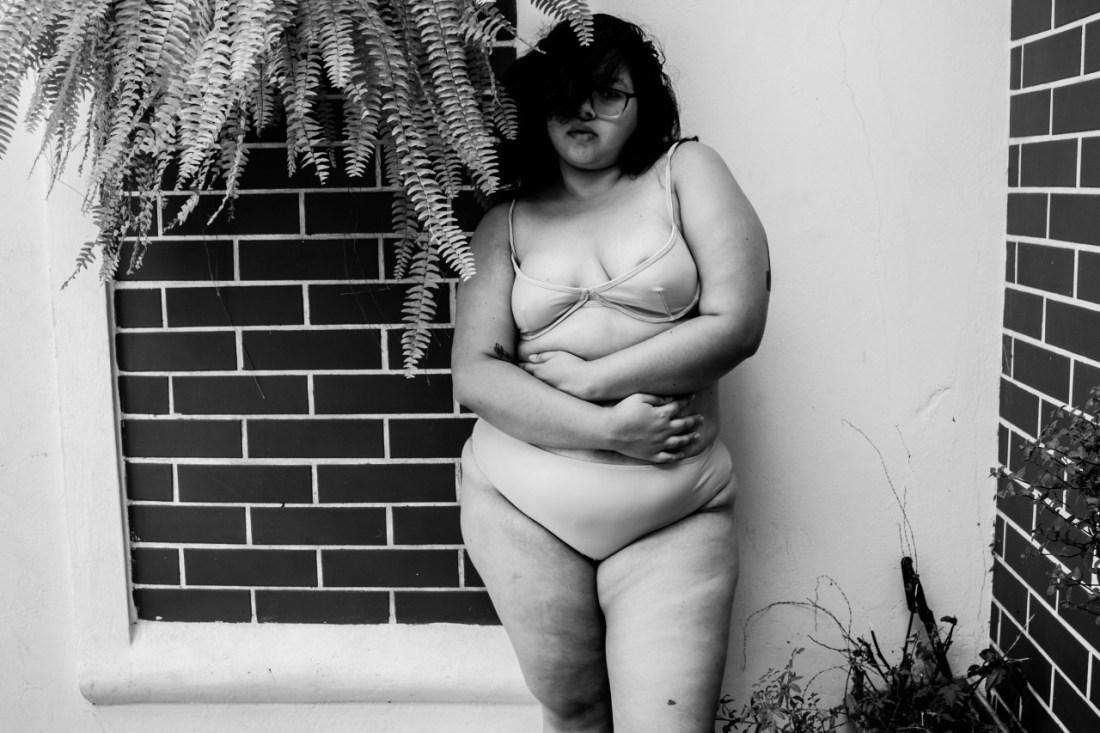
Jacque Jordão – Untitled (2016)
As best as I can tell, Jordão is a Brazilian model with a killer fashion sense with an impressively varied range of projects in her portfolio.
Her Tumblr usually credits other photographers–there this is likely a self-portrait.
Technically, this makes a number of ‘mistakes’. For example: the reason that so many photographers and image makers prefer to work with seamless backdrops is so that the location becomes less of a consideration that the subject. (Also, you can light the subject in any fashion you choose with much less effort than working in an actual real-life environment with light shifting over time, physical obstacles getting in the way, etc.)
This notes he contrast of the bright white wall and the less brilliant white mortar and dark bricks as an astute backdrop for a monochrome image.
This is actually underexposed–likely a feature of this almost certainly being taken with a kit zoom lens, wherein the fixed aperture limits exposure adjustments to ISO and shutter speed. (This is almost certainly a lower ISO–as there really is very little noise.)
I haven’t actually opened this in Photoshop to check the histogram, but my gut says there’s probably 2/3 of a stop before the highlights well and truly blow–and you can usually pull them back just enough in post so they aren’t pure white.
Objectively, it likely would’ve been preferable to figure out what you’d need to set the shutter speed at to show detail in her hair, then split the difference between that and the settings which produced this image.
Yet… I can’t really fault things too much–because although the choices that went into producing this are arguably less than pristine, they do actually work. For example, I’d usually complain about the failure to align verticals with the left and right frame edges. Here, I can’t.
The downward tilt of the camera suggests that the viewer is roughly the same height as the model but is looking down in a submissive fashion. There is–fundamentally within the image at the level of visual grammar: a sense that the subject is intimidating.
In tandem with the way Jacque is standing in the shadow of the potted fern, with her hair swooping low over her right eye–there’s an added layer of enigma in the way her expression and even whether or not she’s looking at the camera remain inscrutable.


Aeric Meredith-Goujon – Titles unknown (200X)
Tumblr has it’s problems. However, in at least one regard, I think it’s actually better than a museum.
When I go to a museum: I’m in a public place–which makes me uncomfortable to begin with. Short of seeing something that makes such a profound impression that I lose track of time and physical embodiment, I’m always super vigilant about monitoring my anxiety levels, hunger, do I have to pee and if I do which bathroom can I use with the least fuss.
All these factors preclude my not fully engaging with the majority of works I see.
Tumblr–until they made their asinine best stuff first option (which you all should disable this feature, double pronto)–is sort of wonderful with the way it both introduces you to stuff you wouldn’t have known you loved but also forces you to reconsider work you’ve previous passed on.
I’ve been in the anti Aeric Meredith-Goujon camp for years. He’s completely revamped his website, though; and his editing is better–although I do think he’s lost some of his early edginess in favor of making his bodies of work more accessible.
Either way, the above two images are fan-effing-tastic.