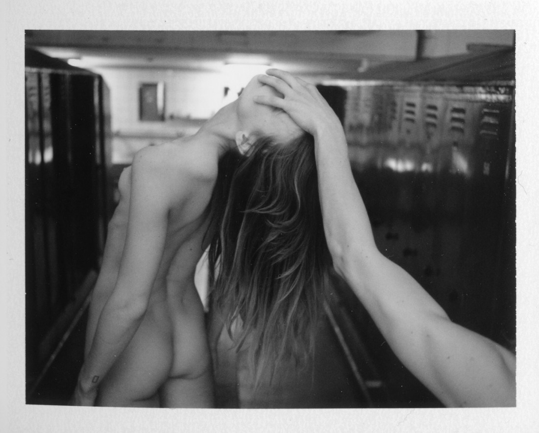
Akuma Aizawaexplanation (2014)

Truthfully, I know fuck all about collage as a form–thus I won’t be able to address this as directly as a photography.

What does interest me about this (besides getting the giddy feeling in my tummy that always accompanies finding work that resonates with me), is the conceptual praxis.

The text reads:

This is to my absurd trying/of intending anything/AT ALL Example:/I’ll try to remember the/sensation of imagining you/missing/me

I’m not sure quite how the text interacts with the image yet–although I do think the example is the image and not that statement beneath the image.

I am more comfortable with the text, so let’s stick with that for a minute. The first block of text mentions the absurdity of trying to intend anything at all.

It reminds me of that famous line Yoda utters in The Empire Strikes Back. Luke Skywalker is trying to use the force to life his X-Wing out of a swamp on Dagoba. It seems like he’s making progress and then the vehicle sinks back. Yoda chides him and Luke whines that he’s trying as hard as he can. Yoda snaps back: do or do not; there is no try.

It’s a very Zen sentiment. Essentially, what Yoda means is doing the thing, you either do or do not do it. But by trying to do something the effort of your action is focused not singularly on the doing of it but on the trying to do it–the question of whether or not it can even be done.

The distinct Yoda is pointing toward is the same thing Wittgenstein is getting at in his Philosophical Investigations–only Wittgenstein is concerned with how language means instead of lifting a vehicle out of mire with nothing more than the power of the mind.

Essentially, Wittgenstein says hey, as long as your talking–language isn’t at all difficult for you. You just talk. It’s when you start thinking about how you language works, that you begin to run into problems. Because instead of doing, one begins to think about how one does what one does and that’s where trouble creeps in at the seams.

The philosophy of language questions how words mean. And that question is already off on quite the wrong foot. Wittgenstein proceeds systematically to poke holes in the notion that words mean via some sort of mental process as opposed to meaning as use in context.

The last stand of the person intent on language being a mental process clings to the notion of the possibility of a private language.

In order to demonstrate what this would be like, Wittgenstein conceives the staggeringly brilliant metaphor of The Beetle in the Box.

Say there’s a group of people somewhere and everyone of these people has a box and in that box is what is called a ‘beetle’. There’s a catch: no one can look in anyone else’s box. So there’s no way for anyone to check what anyone else’s beetle looks like. This begs the question does Jethro have an ant in his box while Marieanne has a mosquito, or perhaps her box is empty. Thus ‘beetle’ can only mean nothing or what the group agrees it means independent of whatever is or isn’t in their respective boxes.

(As an aside bad artist, racists and mansplainers are always whining about how they didn’t mean it that way, their intent was different. But that’s the thing, it doesn’t matter how you meant it, there’s a generally agreed upon external context and whether or not you meant it that way, that’s how it functions in the external context. Do or do not; there is no try.)

So what I dig about this is the way the top text cancels itself in a similar fashion to the way the bottom text does the same thing. In the top portion the speaker is trying to intend which is decidedly not doing or meaning–thus, I would assume the absurdity of the undertaking. In the lower portion, there’s again a trying–in this case a trying to imagine the sensation of you missing me. Trying imagine the feeling of something that will never happen.

There’s something profoundly lonely about this but in an unusual and I would argue defiantly feminist way. I feel like this is supposed to look like it’s about a relationship. But I think this is also on a meta-level about the relationship between an artist and their art as well as the relationship between women and the art historical male gaze.

AdeYdependency (2015)

I think it was in third grade where we learned about the five questions a good reporter always answers when relaying a story: Who? What? Where? When? And How?

This isn’t exactly a shabby mode of approaching art, come to think of it. Except, there’s perhaps a proscribed order (at least as far as visual art goes).

I suggest you start by asking: what is this, what am I looking at?

In this case, it’s a stereotypical locker room–rows of lockers on either side of a central bench running along an aisle. A woman (nude) is standing on top of the bench leaning backwards in a manner that has to be both uncomfortable and precarious as far as balance goes. A male arm extends into the frame from the lower right corner; its hand holding her face not unlike a basketball superstar slam dunking.

The lighting in the locker room indicates that it is currently unoccupied and the lighting on the interaction in the foreground has a sort of cinematic flare that is suggestive of a nightmare tableau or horror film. (I can’t look at this and not think of the penultimate scene in It Follows–where they fight the monster at an indoor pool.)

What is seen speaks to viscerality/physicality but in a fashion that is unsettling/menacing/sinister.

Now–if this we’re in hanging in a gallery–there would be some placard someone explaining that the artist’s name, the title of the piece (if there is one) when it was made, where the nationality of the artist, perhaps (I’m pretty sure he hails from Sweden). Astute galleries will address the how with notes on media (in this case medium format Polaroid), the size of the work, provenance and ownership/bibliographical information).

And here’s what I think people who think art is dumb mean when they criticize it. If you’re going to understand what you’re looking at, you often have to conduct the same operation multiple times. In this case, when you get to the title, i.e. ‘dependency’, you are forced to ask yourself what that means in the context of what you’ve already figured you’d gotten super clear about.

The first thing I think of is that dependency can indicate something suspended–like a pendulum or the Sword of Damocles hanging by a single hair from a horses tail. (The position of her head to his hand is in keeping with this reading and it further strengthens my original notion that there’s something malevolent happening here.)

The second thing that pops into my head is this woman I walked by two mornings ago. She was speaking loudly on her phone to someone and I heard her say: I’m not going to waste my time on you, ‘cause I can’t depend on your ass for nuthin’.

I think there’s a tendency to view dependence as a bad thing. But I’m a dependent upon food, water, shelter and clothing (alas, we have not yet returned to the naked idyll of Eden). I depend on my job to pay me for the work that I do so that I can trade the money I earn in order to survive and exist in the world. I–personally–am also dependent upon a steady stream of illicit substances to counter the stress of functioning somewhat normally in this completely fucked world.

In other words, there are degrees of dependency and degrees of acceptability of various forms of dependency which general relate to whether they serve society or the individual.

Yet, my gut is that the sinister tone is a projection I’m placing onto the image–and it’s a strange feeling. I’m not used to it. And when I poke at it a bit more things shift for me.

My BFF and I have been talking recently about how depression–despite being awful and numbing–is actually sometimes beneficial.  When you’re numb the generally awful stuff has a muted effect and things need to be really horrendous to register. That’s a defense mechanism, of sorts. I think this photo functions similarly.

For me it’s about the fact that her face isn’t so much held as covered–the proceedings the viewer witnesses here are reasonably anonymous. And anonymity is a concept without a point unless the one who wishes to be anonymous is likely to be seen.

It feels to me like this is–in a fumbling way–trying to get at the dichotomy wherein the voyeur watches in order to see/understand and the subject wishes to both be seen and unseen at once.

And if this is more than just pedestrian hearsay, which equivocation muddles meaning more–that of the voyeur or that of the subject?

Ryan McGinleyOliver (2005)

With how much I take the piss out of him, it would be easy for someone to conclude that I hold McGinley’s work in contempt.

It’s altogether more complicated than that–and the above image has shifted my opinion some.

He works primarily in color–and has a damn solid eye for it. For all that appears to be going on above and all that those appearance suggest and elide w/r/t what happened prior to this/after this moment, the more I look at it the more I’m convinced that the instinct behind this is the orange polish on her toe nails outset against the tiles.

McGinley is not just associated with color work–he work is entirely preoccupied with youth–which leads to a potent and frequent criticism of his work as an uncritical, inherently ageist and cliche celebration/commodification of younger being better if not at least more attractive.

It’s a critical tact with which I agree. However, I think my mixed feelings on his work up to this juncture, have more to do with the fact that I don’t think I’ve ever really felt the criticism is necessarily supported by the work and more that the work seemingly goes out of its way not to acknowledge that such a reading is possible.

It’s something that has always bugged the fuck out of me. I mean: I’ve always read it as McGinley’s work being about immediacy; photography is a medium heavily steeped in immediacy so what would you put in front of your camera if you wanted to focus laser-like on immediacy? What’s more immediate than being young?

However knee-jerk, it makes sense conceptually. But it feels to my as if an artist can grasp that, then he ought to also be able to preempt an obvious criticism by varying the work in such a way so as to complicate facile criticisms. And that just isn’t the case.

My reaction has always been–we’ll that’s lazy/sloppy. Except neither of those words really fit the work.

I also struggle with his editing. Once you’re attuned to his obsession with immediacy, his work clearly turns a very tight orbit around that fixed point. Beyond being in color, his photos/images almost always feature motion–which can run a gamut from 2011′s phenom Parakeets to pieces that seem haphazardly composed, poorly focused and motivated by capturing an unrepeatable moment.

That’s the other thing that I’ve had trouble working out–there are scads of photographers doing more groundbreaking things with color. I can’t think of anyone working with a body of work as thoroughly singular as McGinley. (And by that I was brought up that one of the things that makes a work of art such is a nearly impossible degree of difficulty in recreating it by a similarly able technician–for as much as I loathe the unrefined aspects of his work–I would not want to be tasked with recreating it.)

Back to the orange toenails for a minute: if you buy that the work hinges on immediacy then perhaps color is largely the impetus for the work–since working via photography and putting young people in front of your lens pretty much ensures the result will suggest something about immediacy of experience. (It also reconciles a lot more of the otherwise questionable editing choices.)

I recently encountered 2005′s Kiss Explosion for the first time. It’s almost certainly that prank where you take a swig of soda and then kiss someone while spitting the liquid out. The image definitely evokes that but it also evokes, well, snowballing. (It’s most likely not snowballing as that would be rather a lot of semen, methinks.)

And it occurred to me that perhaps the criticism about deification of youth is camouflage.. or perhaps, stated a better: a red herring?

It feels to me as if sex is always hovering just beyond the periphery of the work. Yet, when it does enter the work head on, it’s presented as interesting but no more privileged than anything else presented as interesting in the work. Further, sex as presented as sex regardless of the gender presentation/identification of the participants.

In other words: it’s all queer af.

But go back to the photo above: I’m arguing that it’s about the color of her toenails. The title is Oliver, though… and you sort of have to believe Oliver is holding the shower head against his abs. Is he getting ready to join in the action behind him? And if so, how? Or has he already participated? And if so, how has he participated? Or, is this all staged for the camera?

Either way it is interesting how often in his work, McGinley seems to be hiding queer coded sex positivity right there in plain sight.

Evgeny Mokhorev – [↖] Marina near the forest bath, Lagoda (2013); [↑] Anna (2016); [↗] ***, Baltic Sea (2017); [←] Anna and Yuri, Tichino, Italy (2015); [+] Katya, Kronstadt (2016); [→] Yuri and Anna, Tichino, Italy (2015); [↙] Alexandra (2010); [↓] Anna, Crimea (2015); [↘] Anastasia from The 26th Element series (2001)

I’ve featured Mokhorev’s work at least once before. (I’m almost positive it’s twice but since Tumblr now hides NSFW content blogs, I have to rely on my own tags to find anything. Alas, I haven’t always been vigilant with regards to tagging, so…)

In the 1990s, Mokhorev was focused on youth culture in St. Petersburg. It was a rather different species than the bohemian, hipster rock n roll rebellion of his compatriot Igor Mukhin; There’s none of the trappings of counter culture and things seem to prosaically orbit the fact that it’s one of the most heavily populated cities nearing the Arctic Circle. Winters are bitterly cold and summer is a time people revel in. As I understand it, getting blitzed on vodka, stripping down and swimming in the Neva is a fairly commonplace occurrence.

There’s a sort of feeling of everlasting summer, of primordial pagan sunworship to his work. It also frequently features folks unabashedly cavorting around in the buff.

Some of his earlier work was a bit disconcerting–frequently featuring nude pre-teens and teens. I’ve spent the morning revisiting his work and what impresses me is that although it is ostensibly interested in nudism, it avoids the trappings of the other two prominent artists interested in nudism, Mona Kuhn and Jock Sturges (in the case of the former, the works remain antisepctic and are less concerned with the conveyance of an sort of concept beyond a sort of idyllic reverie and instead pivot upon questions of form, representation of space and color; whereas Sturges is a perverted hack who dresses up his pedaphiliac ideation in the trappings of fine art legitimacy–I was at one time a fan of his work but increasingly it creeps me out and the work itself relies more on the perception of technical mastery, while demonstrating no such acumen in point of practice.)

I’ve been wary of his work before. Unlike Sturges, however, I have always been fond of it–and suspicious of that fondness. These images make me feel more justified in my admiration.

Here’s some things I noticed about his more recent work. [↑] bears more than a passing resemblance to Mark Steinmetz’s Jessica, Athens (1997); Steinmetz is objectively the better photo, but it feels as if Mokhorev only fell short because he was more ambitious in attempting to convey a similar feeling but also opening up the frame more. (I’d bet $20 that he’s very familiar with Steinmetz.) [↗] I like this because it’s a fundamentally intriguing image but also I’m curious what it is he’s holding and he looks a bit like a hedgehog; [+] between the watch on the necklace and the smoke stack behind her (which reminds me of the scene in Mark Romanek’s music video for // | /’s The Perfect Drug, where there’s a funerary urn that has crushed someone leaving only a pair of legs in riding breaches reminiscent of the Wizard of Oz; [↘] this might as well be channeling Rodchenko from beyond the beyond.

The last thing is a technical note. I am certain Mokhorev favors Ilford film stocks. And I am reasonably convinced he uses HP5 pretty much exclusively. While it is absolutely better than the comparable Delta 400 Pro–which is garbage, fwiw–it’s a finicky stock. It’s impressive that he’s getting these kind of results from it. Damn impressive actually. I’d have said that it wasn’t possible prior to seeing these. Also, another little known analog tidbit, there are subtle differences in the emulsion between different formats. The grain is usually more or less the same but there are differences in contrast, dynamic range and tonality. But the backing is always different–especially with Ilford. All the above are medium format except [↓], which is 4×5 sheet film–it’s possible this is not HP5 but in my experience 4×5 has a completely different feel to it than the 35 and 120 formulations of the same stock.

Dan KitchensChanty, NYC (2014)

This is quite nice.

As far as light’s concerned that’s a balanced gamut from shadow without detail (beneath Chanty’s hands), shadow with detail (the lower left edge of the frame), midtones, effing fantastic skin tone, highlights with detail (her shirt) and highlight without detail (most of her left sleeve).

If this were any other image on Tumblr, you’d see the white edge of the window that’s illuminating the room. Compositionally, it would be a terrible decision, distracting from the dynamic tension between light and dark. Instead, the window is excluded and instead the only hint of it besides the light it’s introducing and subsequent shadows cast, is the left arm of her top. Along with the chair favored slightly to frame left and angled ever so slightly toward the window, the frame is well balanced. (I can’t remember ever seeing this before but it’s a great notion–in traditional photography, if anything too near the edge of the image is blown out, you actually have to increase the amount of light it gets when making a print in order to burn it in so that it does not appear to be the same color as the paper.)

I’m pretty sure this has been edited post-capture–the left chair arm appears to have been dodged and the right chair arm appears to have been burned in to increase the sense of dimensionality.

Taken together, this creates an aesthetically pleasing image that is rich with texture: carpet, chair, wallpaper and curtains–not to mention Chanty’s hair and skin.

I’m not 100% sure about the lampshade behind her head. The shadow cast by the lampstand is super obvious and I think that distracts. Also, her expression seems less expression than transitory shift between expressions.

My gut instinct if it were my image and I was editing it, would be to go back and try to pull some texture out of the lamp shade, or just darken in in a fashion not unlike the lower left corner of the frame has been burned in

Li HuiTitle unknown (201X)

Hui’s work feels to me like what you would get if you crossed Lina Scheynius’ work with Paula Aparicio’s–except that pollination (I’m sorry, sometimes I can’t help myself), would result in something significantly flatter than either of their either of their respective work taken independently.

Scheynius is ostensibly concerned with light and identity politics as they regard  the visual representation of self and the female bodied.

Aparicio, on the other hand, focuses on bearing witness to the beauty that comes part and parcel with trust, vulnerability and intimacy.

Both feature shades of documentary. Scheynius is more of a lifestyle/editorial/fashion subversive. Aparicio has more in common with Nan Goldin (although she works through a vastly different set of filters) and Scheynius is closer in pedigree to Cindy Sherman.

This is to say if Hui merely opted to borrow style and substances from both, it would likely be a mess; and–at best–a third rate homage to both.

What distinguishes Hui’s work–and I’m not sure I’m quite ready to commit to this completely, but I suspect her work might be better than both her progenitors–is that she’s using many overlapping tools to a very different end.

I’m friends with one of my favorite photographers, Lynn Kasztanovics–thanks Internet! We frequently discuss our frustrations with the rigidity of the current world of fine art photography. Specifically, the accepted wisdom w/r/t genre, i.e. street photography, landscape photography, portraiture, etc.

We don’t feel our work fits the framework because we’re less interested in dictums of genre and more interested in using photos the way a poet cobbles words together into a poem.

So while Hui is maybe not better than Scheynius or Aparicio–and I don’t completely think I’m being fair to the latter here (I do think that when her photos work, they are highly poetic)–I’m just more interested in the direction she’s headed.