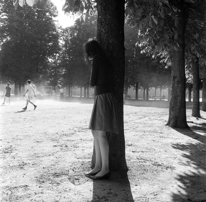
Source unknown – Title unknown (201X)
Usually, I’m a hard pass when it comes to close-ups.
It has to do with a certain lack of subtlety–like an insert shot in a movie where a character is shown gathering her things in order to leave the house and we see a shot of her grabbing her phone off her nightstand. It’s a knee jerk way of saying PAY ATTENTION TO THE PHONE, IT’LL TURN OUT TO BE IMPORTANT LATER.
A better example might be the detail in insert in an Art History text. You see Van Eyck’s Ghent Altarpiece in all it’s grandeur and then a close-up examination a of the strange fruit Eve is holding in it. Essentially, a close-up only really works/is necessary when it is presented in spatial and temporal context–i.e. cinema; or, it is intended to draw the viewers attention to something they might not otherwise notice.
And therein lays my beef with close-ups in still photography/digital imaging: unless the author is using polyptychs (and I can’t picture a way that would work off the top of my head), the close-up only functions when it conveys both its own context as well as clearly depict that to which the viewer is supposed to attend.
I like to think this is what Baudrillard had in mind when he noted (in Why Hasn’t Everything Already Disappeared?): “Behind every image, something has disappeared. And that is the source of its fascination…“
In the case of the above image–the scene has been reduced to two hands and –while I try very hard not to comment on the attractiveness of genitalia, these are some effing gorgeous gonads. (In the interest of equal representation, I’ve had this image sitting in queue for months. It’s a bit on the nose with the flower tattoo echoing Bailey Rayne’s labia–but it’s also an example of aesthetically breathtaking nether bits.)
What’s interesting here–at least for me–is that when you see ostensibly one body (the dangling balls and spread legs) with two hands there’s a tendency to attribute the scene to one person. And, actually, that isn’t the case here: this image shows a minimum of three different people.
It reminds me of the only David Foster Wallace book I’ve ever attempted to read. No, not Infinite Jest–I’m the only trash hipster girl who has never so much as pretended to read that one. I’m talking about Everything and More: A Compact History of Infinity.
The first 100 pages are breathless in their lucidity, wit and intrigue. The between the theoretical math and the footnotes I get completely lost.
But one of the things I learned is that we think of infinity as n+1 where n is any positive integer. But infinity is also n-1 where n is any negative integer. And! there is an infinite number of intervals between 1 and 2 and between -1 and -2. Infinities upon infinities.
Hold onto that bit for just a second. I’ll be getting back to it in a second.
I’ve also talked before about how there are times when the composition and order of a frame call for the viewer to consider what’s beyond the edge of the frame. Others, less so.
I’d venture to say that an effective close up is almost required to cause the viewer to consider what was cut out of the frame. (The above does this with aplomb.)
So I guess a good close up is kind of like infinity in that it finds a way to point to both the macro and micro. So, like David Foster Wallace, it’s not only interested in large and small, it’s interested in the infinite number of ways you can slice up the space between any two numbers.
Really, it’s not that close-ups are intrinsically bad–it’s that it requires a great deal more work to get them to operate with sensitivity, grace, subtlety and nuance.