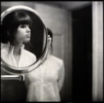
Prue StentUntitled from Four (2015)

I’m enormously fond of Stent’s work; although–I have to admit–the image above surprises me.

I think of Stent as working exclusively in color. Almost by definition, fine art photographers tend to work in B&W or color, rarely both.

Perhaps that’s not an entirely fair characterization: most fine art photographers make a name for themselves as a color photographer (i.e. William Eggleston) or B&W (i.e. Mark Steinmetz). [If Eggleston has worked in B&W, I haven’t seen any of it. Steinmetz does have color work but I tend to agree with him that it’s nowhere near as accomplished as his B&W work. The only photographer I can think of who I’d be hard pressed to pick just B&W or just color from their oeuvre is Jeff Wall–and I might end up picking the B&W with him, actually.]

That’s why Stent working in B&W surprises me: one would expect the results to be more of a curiosity; whereas her B&W tends to be audacious in it’s formal innovation as well as incisive in scope and execution.

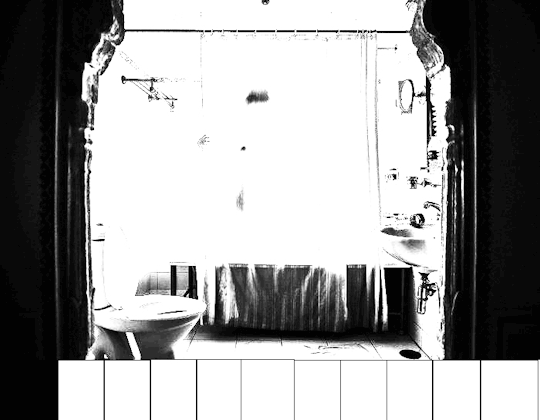
What’s even more impressive is that–unless I’m mistaken–Stent is working with digital exclusively. I took the above image and parsed it according to Ansel Adams’ Zone System (much as I did with this image by Davide Rossi).

The way she’s using light and shadow to create depth and dimension is straight out of classical oil painting. (For example: I’ve only been a photographer for eleven years now. It’s just within the last year that I’ve begun to understand the interplay between light, shadows and depth of field used in combination to create the illusion of dimensionality in otherwise 2D representational spaces. In other words: Prue Stent is actually a good bit more brilliant than I initially assumed.)

Yan BertoniEmma #3 (2017)

This is a visually arresting image–without a doubt.

Were one so inclined one might talk about color (The palette of red hair to ochre lichen to the brackish algae tinged lake) or about texture (the lack of texture in Emma’s skin and the surface of the water vs. the abundance of texture in the wooden dock).

I–for my part–can’t look at it and not compare it less than favorably with Chadwick Tyler’s effing exquisite image of Cora Keegan from back in 2014.

The fact that I prefer one to the other probably won’t surprise anyone who has been following this project for any period of time. The reason why I prefer one over the other almost certainly will: I think the above image is over-composed to the point of sterility.

What do I mean? I mean this isn’t strictly governed by the rule of thirds. I charted it for you to peep:

What is interesting is that if you zoom in a bit and ignore the water the dock conforms to the rule of thirds:

This sort of nesting of for frames within frames reminded me of the Golden Ratio. So I diddled around with that for a bit. The image in no way conforms to it but imposing the spiral in on particular way does illustration something about how the image is arranged to cause your eye to track back after it has moved all the way from left to right:

Well, I mean… that all sounds pretty sophisticated when I lay it all out there. So why do I prefer Tyler’s image?

Well, I don’t think the golden ratio overlay is a function of calculations in the making of the image. More: I think that the golden ratio is everywhere. Yes, it’s rare to find an image that conforms to it to a T but I think the rule of thirds works because it takes the ordering principles of the mean and parses them in such a way that you can achieve a similar effect without measuring with painstaking exactness. I’d wager there’s very few thoughtfully composed images that can’t be argued demonstrate some implicit reliance on the golden ratio.

What makes Tyler’s image better is that well–there’s little if anything to stop someone with a decent camera, time and a little bit of money from recreating Bertoni’s image. While I will grant that the model will be slightly older and the reflection of the sky and the weathering on the dock might have changed slightly–it’s not a question of whether or not it can be done, more a question of whether or not the person doing it has the patience to do it.

How would you even begin to go about recreating Tyler’s image. Go ahead, I’ll wait.

When I say sterile that’s partly what I mean. Bertoni’s image has been so rigorously balanced it has no life left to it and as such there’s nothing distinguishing it as singular or unique. (Also, I’ve seen other pictures from this series and the dock here is like six feet off the water–which you can’t tell given the image.

Also, what is Bertoni’s image about? A model posing for a photographer. There’s little else as far as suggestion of a narrative.

Whereas with Tyler’s image: why the hell is she smoking with her head hanging off the dock? Does she not want her face int he shot. Is her hair in the water? Is this a model posing for a photographer or is it two friends hanging out one with a camera and another just fucking around and then there just happened to be this wonderful accident of a masterpiece of a shot.

teendreamsAnjelica (2013)

From the top: this is 100%, Grade A #skinnyframebullshit–there is literally no justification for this frame. (Yes, the image maker was probably thinking the top-to-bottom echoes and as such ‘enhances’ the sense of visual dynamism surrounding the act of anal penetration; I do not agree–since the downward slide on the thrusting phallus is damn near primal in it’s archetypal formation.)

Otherwise this is a reasonable well-exposed frame. Typically, for something so porn-y, there’d be a surfeit of light. And there sort of is–with the strong backlight coming through the window behind them. Still the light falls off in more or less the way you’d expect it to. (Unlike most porn, the dirtiest part of the act is not flooded with the most light… so that the viewer can discern all the graphic details. Not that you can’t see graphic sex but the image maker here trusts the viewers ability to read the image on their own without any unnecessary added direction. I like that.)

In effect, what’s been done here is this is probably still some high-end rented property in The Valley. But it’s set up to look more like a random capture from the head cheerleader and the quarterback fucking on her parents couch–while her parents are on vacation in the French Riviera or some other such shit.

I’d have preferred a wider frame to firmly ground the proceedings in a sense of place and time. Further, I think her left knee and his left knee–when not amputated–create an implicit triangle which I feel is much better at emphasizing the act of penetration.

This image also made me stop to think about the relationship between stylization in art-making vs. fueling a fantasy in pornography. Perhaps, it doesn’t really work but I feel like in any form of art making there is a degree of stylization in representation. Things are included, other things are excluded. Of the things included, there are questions about how it appears and how it will be read by the viewer, e.x. is it easier to see what he’s doing if he’s seated like this or would it be better if he were standing and turned slightly away from the viewer?

Porn on the other hand seems to universally and to a fault prioritize the presentation of the specific sex act as the top priority. And ultimately what I like so much about this image is that although I definitely do not agree with all the creative decisions–and certainly think it can be better. It does seem to at least be driven by an interest in how the image is going to be read on more or less an even field with making sure the sex act is clearly presented.

Jordi Gual – Untitled (200X)

I have posted one of Gual’s photos before. I’d link to it except after Tumblr’s NSFW schism, Google searches are no help in tracking down previous comment anymore. (And they were never exactly steller, if we’re honest.)

It doesn’t much matter. The post–as I recall–was not able to provide attribution for this photo. At the time, I posted it because I admired the subject’s fashion sense (being similar to my own with an emphasis on comfort and sumptuously soft textures).

I still love the photo. In fact, it’s grown on me since I last saw it.

Now, as I’m re-encountering it in the context of proper attribution I’m a little unnerved at how prescient my reaction was to the work.

See: Jordi Gual is an analog photographer born, raised and residing in Spain. His work focuses on his family–his wife and his two daughters, predominantly.

His oldest daughter, Natalia, was born blind. She is the subject of the photo I posted previously and it appears to be she who is the focus of the upper five photos here.

Beyond traces of his work work that are still floating around the digital aether, he doesn’t seem to have an online presence. That’s unfortunate. He’s not as technically accomplished as someone like say Patricio Suraez; and he’s no more effective at creating moody portraits than some pretentious jack ass hipster shooting in B&W because it’s ‘artsier’; however, what he does have in goddamn spades is a preternatural knack for facilitating unsettled tension.

What little is left of his work on-line sports all sorts of folks imposing their reactions to the work as it’s impetus–oh, it’s ‘sinister’, ‘disturbing’ or ‘sad’. I–for one–reject such facile efforts to pin the work under the viewers finger.

Even I referred to the work as ‘unsettled’ but that was an effort not to project my own view onto the work merely point to the thing about it which I think is crucial and absolutely vital in a way that few things being made these days have even the vaguest ability to imagine in their wildest dreamings: Gual feels like a madman architect who builds ornate structures on shifting sands. He’s studied the sands enough to know that what he builds will stand the test of time but acknowledges that the shape can be–ultimately–maleable beyond his control. In effect, he is walling off an sort of dialogue the viewer can have with any sort of notion of the image being a decisive moment; instead, the viewer is given a moment that is unknowable with regards to any definitive resolution.

I don’t know really know how to say it any better than that but if you understand what I’m pointing toward and squint a bit, you’ll likely start to discern the outline. Even if you don’t, this is some extremely next level shit right here. I hope this guy is still shooting because the B&W stuff of his that you can still find is exquisite and his color work (1 & 2) is also fucking stunning.

Matthew Draw – Multiple colors of love. (2016)

I’m writing this post while in Reykjavik. Technically, this is my vacation–and I’d hoped to have things sorted in such a fashion that I could just let the queue run. No such luck, sadly…

I’m posting this for you mostly because I like the line work. Everything is rendered with intensity of purpose–efficient, no wasted effort. Still there’s a sense of Michelangelo-esque discovery of the form hidden within the blankness of stone. (The thickness of the lines in certain areas seems but tentative and studied; the lighter lines on the ring and pinky finger de-emphasize their importance as anything but three dimensionally orientating facets of the composition.)

But the real reason I’m offering you this is because I’m sort of blank brained right now–it’s weird to travel to a beloved local while brutally depressed and to feel like the volume on your negative thoughts is turned down a bit due to a better environment but to then feel like the positive experiences that manage to creep in are happening to someone else separate from you?

Anyway, last night, I was rather stoned coming back from a tour. It had been one of those textbook clear Icelandic days that you are extraordinarily rare and the clouds were being rushed in by high winds and the sun was doing it’s slow setting thing that it does this time of year.

It was like the dome of the sky was having blankets slowly pulled over it, essentially like the world was being tucked in to bed for the night in slow motion.

The western edge of the horizon looked like lava was lighting the clouds from the inside. At one point there was a cloud that was shot through with this etheral blue–a color I don’t think I’ve ever seen anywhere else before.

I tried to take a picture of it with my phone but speeding through the growing dark in a charter bus; alas, that’s really not the best sort of vantage for the task. So I decided to watch and realized that the blue was a feature of the refraction of light. The outer edge of the cloud–the side closest to view–was this fantastic blue but the inner edge the side closer to the retreating sun was actually a vivid chartreuse. It made me think of the old masters with their oil paints–how they sculpted rich, super saturated colors by layering paint on their canvases.

So yeah, I dig this image. But! I also enjoy it because the use of color reminds me of the relationship of surreal colors I saw last night in the skies over the south coast of Iceland.