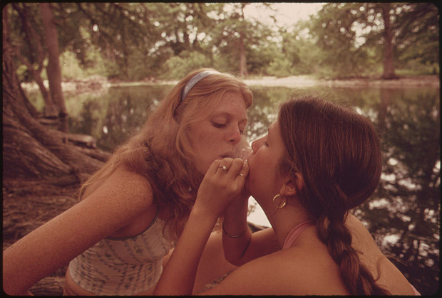
Marc St. Gil – Two Girls Smoking Pot During an Outing in Cedar Woods near Leakey, Texas (1973)
I kissed her and forgot death.
–Jeanette Winterson, The Stone Gods (via blackshivers)
Marc St. Gil – Two Girls Smoking Pot During an Outing in Cedar Woods near Leakey, Texas (1973)
I kissed her and forgot death.
–Jeanette Winterson, The Stone Gods (via blackshivers)


Steven Meisel + Bruce Weber – Safe Sex Is Hot Sex campaign (1990)
Generally speaking, I am loathe to take taxis. My legs aren’t broken and with enough time I can walk just about anywhere I’m inclined to go. (Or, I can walk to a subway that will then take me to where I want to go.)
Recently, thought my flight got in super late and I had to be at work at 7am the next morning–so I cabbed it. Since I don’t take taxis, I don’t know if it’s just a NYC thing but the cab played this like 7 minute loop of commercials again and again.
One of them was an anti-drug campaign encouraging parents to talk to their kids about drugs. The premise was these teens in idyllic teen settings being–ostensibly–teens before asking the camera overly earnest questions about drugs.
The only reason I even noticed the commercials was because I was seeing it for like the fifth time. And like the third time I saw it, I’d remembered how it occurred to me late last year exactly how appallingly racist a lot of the anti-drug propaganda was in the mid-to-late 80s.
So it was through that filter that I saw the commercial and I realized something about almost all anti-drug adverts: their bread and butter is conflating drug use and drug abuse (two linguistically distinct terms–and that’s for a reason).
When you see things that way there’s only one option: eradication and selling that entails an abstinence only message. (Anyone who’s bothered to do any research into methods of decreasing drug use and abuse, knows the only statistically proven means of accomplishing this is through emphasizing harm reduction/education.)
But there’s more to it than all of that. The thing that struck me about the commercial I saw in the cab was that the kids in it were impossibly uncool. Like I remember seeing ads of this ilk when I was a teen and I just thought they were normal kids like me.
Yet watching the commercial I was like–these kids are lame as fuck. There’s this charmed naivete that each almost certainly had to be coached by the director to achieve. The notion that nothing bad ever happens in this world, nothing ever hurts and that if you trust in society’s virtue, you will be rewarded. And that’s just–such bullshit.
It’s not that abstinence (whether referring to drugs or sexuality) is a bad thing, it’s just how folks are or aren’t wired. The notion that if you teach someone about something they are more likely to do it is such rubbish. Education allows you to make more informed choices–it’s that simple.
And that’s what I love about these ads. Instead of being like sex is scary and should be avoided their like: sex is awesome, have as much as you can but be safe. It’s refreshing to see someone get it right for once.

Source unknown – Title unknown (201X)
One cannot think well, love well, sleep well if one has not dined well.
–Virginia Woolf

Source unknown – Title unknown (201X)
My thought with this was originally merely to add one of those diagrams of what areas of the tongue register what kinds tastes. However, as it turns out, that notion has been thoroughly debunked.
First off, there’s no longer just bitter, salty, sour and sweet. There’s umami–which refers to something that is savory (I always think of it as the craving you get for a veggie burger cooked exactly to your preference.
Also, apparently these days they are thinking that fat may actually be a sixth factor contributing to taste.
Interestingly, it’s theorized that receptors designed to register sweetness are binary–they only register whether something is sweet or not? Whereas something that is bitterness has a vast spectrum of distinct variations.


[↖] John Hanson – Untitled (2012); [↗] Source unknown – Title unknown (2008); [←] Eternal Desire – Candy feat. Alla B (2017); [→] Evil Angel – Heather Starlet (2015); [↙] Stephanie Sarley – Untitled (2017); [↘] Source unknown – Title unknown (201X)
Follow the thread

Source unknown – Title unknown (201X)
This is not a good image. It’s a victim of shitting lighting in a small bathroom and being taken on a front facing camera phone propped up against a soap dispenser or tooth brush caddy. (I wouldn’t say it’s #skinnyframebullshit, however.)
But there’s something that ought to be a greater concern than whether or not an image is good. This is poignant and brave and because of those two things it’s also true and alive in a way that few things in life are.
Or to put it another way: this goes a lot deeper than your usual camera phone in front of the mirror in a state of provocative dress or undress, that have become de rigeur among mid-to-late teens and twenty somethings. It says I wasn’t sure I wanted to know but I decided that not knowing was worse than knowing. (If there’s a prerequisite for being an artist, it’s probably that.)

Falk Gernegroß – Twister (2014)
If I weren’t feeling as if–perhaps–I have insisted on being a bit to solipsistic and autobiographic in responding to stuff recently, I would likely talk about how I relate to the awkward girl to the right. (That was totally me at ten.)
But I think there are more interesting things to interrogate here–like how color adds to the sense of the painting.
You’ll note that the left-most young woman, the stripe on her socks is color coordinated to her cami. The middle young woman’s skirt matches the stripe of her socks. Whereas the girl who is my surrogate is purposely isolated not only by her position in the frame, her being blocked by the stretching leg of the young woman in the middle, but he outfit purposely doesn’t coordinate–she’s wearing white socks, one of which is up to her knee; the other which is pushed down to her lower shins. Further, her skirt is more orange the the yellow circles on the Twister board and her knickers are far more pink–the sort of bubble gum hot pink that you only find in juniors sizes.
There’s also the way that the two older girls are intertwined. They are positioned in such a way that they can’t really see anything of each other. (The angle of view offered the audience is what’s suggestive not what we’re seeing. I mean it’s clear that the young woman in the pink top can’t really see up the skirt of the young woman in the yellow top. She also can’t check out her figure because the girl in the yellow top’s right leg is blocking things.
Similarly the young woman with the braid can’t see up the young woman in the pink top’s skirt either. The situation is suggestive upon first glance–until it’s not.
The boy peering over the fence Wilson from Home Improvement style could be a surrogate for the audience or the painter. I’m inclined to believe it’s the painter. What makes me think that is that the women/girl in this are presented in a typical short hand: blond, brunette, redhead. Also: bun, braid, pony tail.
Still, I’m not willing to dismiss it because the colors and subtle gradations are just punchy af and the tableau is resonate.
This is the second time I’ve featured Gernegroß’s work. And I think what I’ve gotten a little bit better hand on is how he’s combining the tool developed over time in the pursuit of figurative painting and giving it a pop art nodding/Balthus inflected spin.

rosewatergoats – cramps (2017)
There are so many things that are extraordinary about this, I really don’t even know where to start.
I guess you really have to start with the lighting. I’m not fond of the glut of photographers & image makers who pose models right next to the freaking windows.
Yes, it contributes about an extra ¾ of a stop to your exposure. And if you’re shooting handheld, that can mean the difference between a usable shot and something ruined by motion blur.
Frequently, that light is rather hard and unflattering–plus: there’s rarely any sense of the context. Like why this room? Why is this person in the room? What’s the motivation? It’s all just so lazy. It’s like if you want to shoot studio-esque shit, set up a daylight studio or rent studio space. Doing it like you’re doing it is just inexcusably unimaginative and lazy.
This differs greatly from that tendency. First of all the light is at least somewhat diffuse. We see the curtain not the window. The frame is a bit over-exposed but on a partly sunny day with high, rapidly drifting clouds, the exposure can shift drastically in several seconds. This is clearly within an impressively controlled range.
And the richness of detail: the radiator with the shelf topper (I did not know such things existed! this new awareness will almost certain inform further nesting endeavors), the dried flowers, the armchair demonstrating heavy wear, the faux antique lamp, the table and the ottoman. (Note also: the textured wall; yes, I’m a sucker for texture but you can’t look at this and argue that it adds a captivating extra layer of visual intrigue.)
The light comes left to right, after the Dutch tradition. (I’d wager the author is familiar with Vermeer–in this case, this photo suggests a hybridization of The Procuress and A Girl Asleep.)
Initially, I didn’t like the fact that the subjects left leg is amputated by the frame edge. I’m still not 100% convinced it was the best decision but I can’t posit a better alternative.
And the way that it is presented–i.e. a 35mm negative has eight perforations per frame. The image we’re presented includes 8 frames, but with 2 from the leading frame and then two perf are amputated from the primary frame the viewer is show. It’s self-consciously preoccupied with truncation. But what I think is interesting is the mise-en-scene suggests an implicit continuation between the boundary of the frame edge; what we’re shown speaks not only explicitly but implicitly–there’s a feeling of being more that the viewer can probably guess reasonably accurately at given the available contextual clues.
I’m generally against cropping. Primarily because precious few people add anything interesting to the work by doing it. But this? This is freaking ingenious. Definitely, check out this woman’s blog. A lot of it is grimy and lo-fi but her conceptual chops are mad on point.
EDIT: Apparently, she’s been accepted to the ultra prestigious photography program at FAMU in Prague and is trying to crowd fund her tuition. If you can consider donating to her GoFundMe campaign.

Mike Steegmans – Katrin Tonin (2016)
This was labeled as a Polaroid–but it’s not: Polaroid only made 1:1 and 1:21 aspect ratio instant film.
This is a 1:1.6 and change, making it Fuji Instax Wide.
Instant film (Polaroid/Impossible and/or Instax) is… well, let’s call a spade a space: a right royal pain in the arse to use. With Instax you’re talking roughly $0.75 cents a sheet and Impossible Spectra film is approx. $3 per sheet.
The Spectra gives you a bit more control but is EXTREMELY finicky; and as long as the flash doesn’t fire and you’ve positioned yourself to account for the shortcomings as far as the Instax Wide’s fine focus capabilities, it’s slightly more forgiving. (A caveat is that while I’m uncertain if they’ve fixed it in the new 300 model, the 210 featured one of the most lamebrained design snafus I’ve ever seen: the camera doesn’t have an off switch and as such it’s very easy for you to accidentally activate the lens without meaning to and if the lens cannot extend or retract unimpeded, it takes like ten seconds for the gear and groove mechanism to strip.)
All things being equal: it’s really a trade-off. Spectra can be much sharper than the Instax. But part of the allure of Instant formats is their limitations–a plastic lens is only gonna get so sharp. But that same plastic lens causes color diffusion–one of the reasons that a well executed instant film photo looks like nothing else.
(I used to say if cost weren’t a consideration, I’d use only instant film for color work. I’m learning that’s not entirely how I really feel. A well executed instant film photo presents color the way I personally see it–I tend not to notice color individually, I notice it in terms of opposition to or compliment for other colors. Yet when it comes to looking at representations of color, I’m more interested in conveying something experiential to the viewer (slide film is the better vehicale for that, I’ve found). A less abstract way of saying it might be to say that instant film always feels to me like This Is What I Saw vs slide film as this is what I saw joined with how what I saw made me feel.

Author uncredited – COS PRIMAVERA/ESTATE (2017)
When you start learning photography, you’ll have a lot of maxims thrown your way:
The premise behind both of this isn’t nefarious. I mean the 400/320 thing actually was a huge benefit for certain Kodak B&W stocks–all of which are no extinct (to my knowledge).
But you’ll have someone like me who rates a a half dozen rolls of 400 speed stock at 320 ISO and is subsequently displeased with the result so then goes on to shoot another half dozen rolls at the 400 box speed and is equally dissatisfied and only then realizes that maybe it’s the film stock that’s not working for me.
The expose for shadows; develop for highlights is useful. But I’d rather teach someone how to actually use the Sunny 16 rule to shoot without a light meter and then teach the expose for shadows and develop for highlights after the student has spent a year or so honing their dark room chops saving overexposed prints.
There is one thing I heard Mark Steinmetz suggest in a lecture that is actually indi-fucking-spensable. He talks about how in the afternoon, you’re walking down the street with your camera loaded with B&W film and you find that walking on the side of the street in shade, everything looks flat and muddy but if you cross to the sunny side of the street, shit just pops off your negs.
The reverse is true of color. Too much light is a bad thing but if you cross over to the shady side of the street.. bingo, your colors look better. (And, in truth, your colors are never going to look better than golden hour or for like three hours after its rained in the spring but the clouds are still hanging around and the grey against the green just super saturates everything. Swoon.)
But the point is well taken here. There’s entirely too much light for this image to have worked in color. This is likely digital–but it’s smartly executed–the gray scale grade of the background means that you can actually let the white of the suit blow out completely at points but the lost detail in the highlight tone just conveys a brighter white. (With only a few exceptions the only folks doing anything interesting in digital cinematography are actually exploiting this same trick.)
