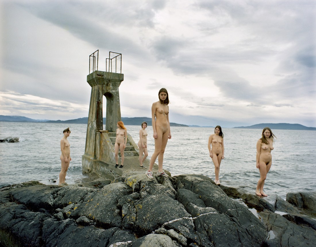
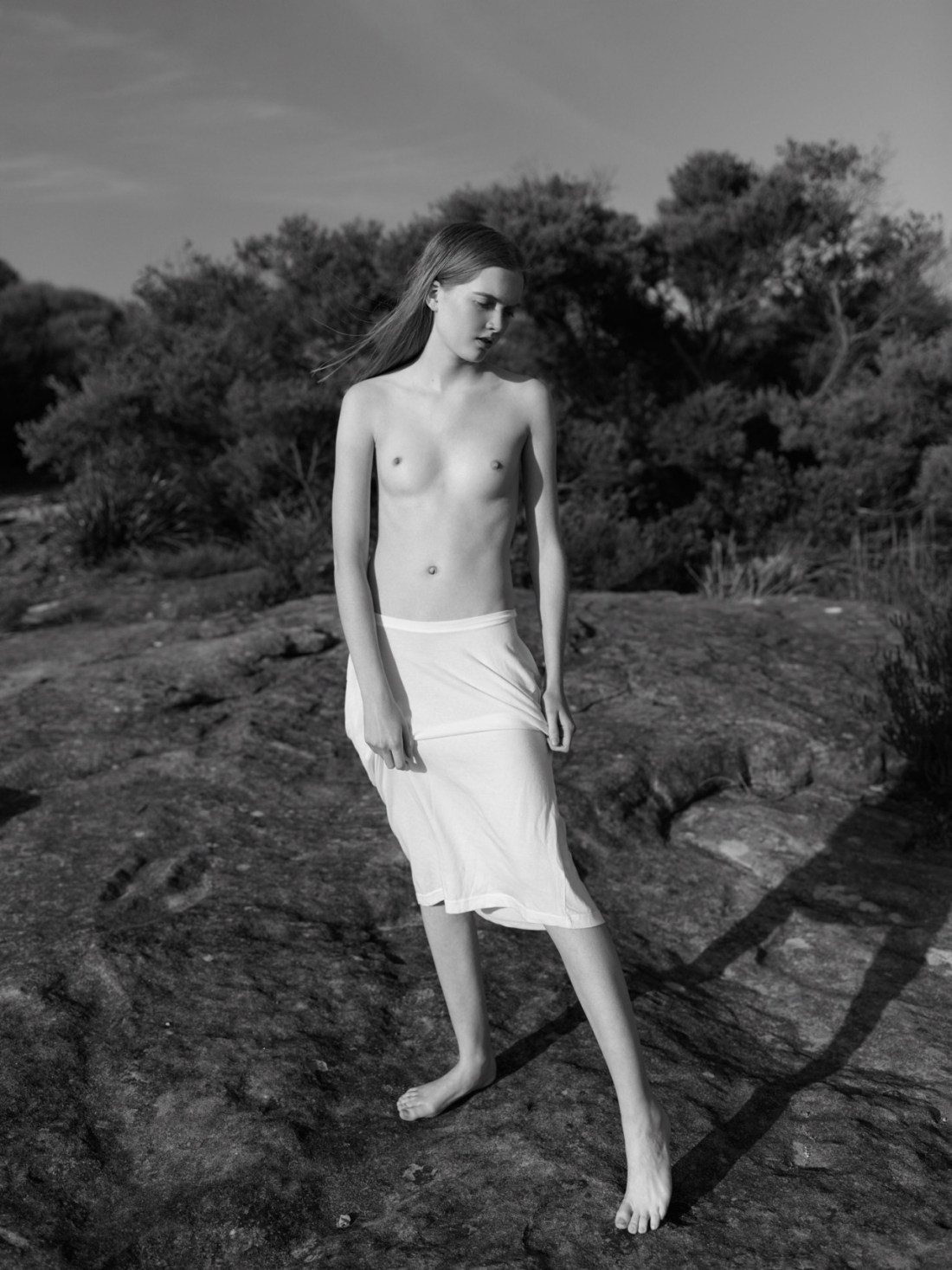
David Cohen de LaraRuth Bell at Curl Curl (2015)

There’s exquisite range between the brightest highlights (Ruth’s slip) and the darkest shadows (the dark niche at the edge of frame if you extend a horizontal line running left from her right shoulder).

Ruth’s pose–left foot forward, her body leaning back (ever so slightly) and to her left–casts just enough of a shadow to balance the frame.

It’s a compelling image. (I adore it.) But to beg a question I normally detest: is it art?

I yammer on and on a lot about things. I throw around various notions willy-nilly. In the interest of being clear, when I’m talking about fine art photography, I mean something–I think–not unlike this:

For the sake of this blog a ‘photographer’ is any one working primarily with analog processes; whereas, an ‘image maker’ pursues digital processes. (I never use the terms interchangeably–to do so, I feel, is one of the greatest failures of contemporary criticism.)

Essentially the photographer or image maker facilitates two relationships one between the subject and the photographer or image makers intercessor, namely: the camera and another between the photograph (or image) and the audience (or viewer).

There are as many different processes and approaches as fish in the see. But generally speaking, if one is an artist the relationship between subject and media is understood in terms of technique; the relationship between the media and the audience is the realm of the conceptual.

I’ve set it up this way very specifically. I loathe when photographers (and honestly, it’s more often than not image makers who make this argument, again digital is the bane of the evolution of visual grammar) suggest that their intention matters. Fuck you. The only thing you can do is anticipate the audiences reaction give social cues, cultural context, etc. (The better the artist, the better such things can be anticipated.

Similarly, the subject relates the audience and the photographer–they have a view to the conceptual but they don’t really exert influence on it. (Unless there’s a situation where the the subject is also the audience (thinking her of Traci Matlock and Ashley Maclean and their insistence that the first edit is offered to the subject by the photographer.)

(I also dig this paradigm because it cancels out folks who maintain that they do not make work for anyone else but are just pursuing their bliss. I hardcore support you and the purity of your mission–but you’re not an artist. To be an artist there must be a relationship with an independent viewer or audience. No two ways about it.)

About two weeks ago, I was on enough drugs to kill a rhino when I had this realization: the frame is essentially a portal and the way you see it changes depending on whether you are outside the frame or have stepped within it.

Several days later, the latest Cinefix listicle featured an interrogation of what the grammar of the cinema teaches us about the way we interpret different modes of shooting people conversing. (I have mixed feelings on Cinefix–they are neither bad nor good. I appreciate the way that they try to shine a light on the accepted canon of film nerdry. At the same time they have been gallingly sexist in the past and are frequently short sighted in their analysis.)

The point that I’ve made a number of times is that I find the establishing shot, shot-reverse shot mode of conversations jarringly self-conscious inducing when the shots are over the shoulder of someone with their back to the camera talking to someone the viewer can see and then we switch suddenly to the shot in reverse–over the shoulder of the person we were just looking at. No one moves that way. Not even in dreams–at least not in mine. (Cinefix wisely refers to this as being outside the conversation, whereas shots inside the conversation generally play like you–the viewer–could be sitting there and swiveling to focus on whomever was talking. Interesting, the swivel doesn’t need to be shown for you to get the gist. Ellipses and all…)

I would argue the above isn’t, in fact, art. It’s lovely–it really is, but…

It’s #skinnyframebullshit. Not in the usual way I mean #skinnyframebullshit, either–as in badly composed or composed without any kind of logical consistency; this is well composed.

de Lara has truncated the triangle I suggested and created a situation where the photographer is also the audience. That’s one of the hallmarks of work that fails the art scratch and sniff test.

Everything about this image suggests a one on one relationship with Bell. That’s not inherently problematic in and of itself. But, putting this out into the world, if you apply the notion of stepping into and out of the frame. Standing outside the frame it’s easy to wonder is this a fashion editorial, is it a portrait or is a ‘fine art’ nude. One of the baseline features of the conceptual relation is for the artist–given the context–to anticipate questions and render unhelpful/unproductive questions moot. There are two many questions I have about this, too many hinge on my not knowing what the relationship between the photographer/image maker and the subject.

But there’s also the fact that while de Lara is standing at a respectful distance from Bell. When the view steps into the frame, the viewer does so without a camera separating them from the subject. We naturally scan–in almost every situation–left to right, not up and down. The up and down, portrait or skinny frame orientation is an approximation of turning your head sideways to better see something up and down continuously.

I don’t know what de Lara’s relationship is with Bell. It’s probably fine that he’s taking a picture of her in such an objective fashion. But there’s a problem in positioning the camera the way he does: it encourages the viewer to also objectify someone they do not know.

Imagine stepping into the frame and having her open her eyes while you have your head sideways checking her out. As long as you see yourself as a stand-in for the photographer, that’s fine. But to be art, the audience cannot stand in for the photographer because they enter the scene from a completely different vantage point.

Linn Heidi StokkedalHaunting Hertevig (2017)

I have all sorts of #feels for Stokkedal’s work.

She hails from Scandinavia–specifically northern Norway. She favors film. (The above is Kodak’s ubiquitous Portra stock.)

In the course of this project, I’ve encountered her work on three separate occasions, each years apart.

My impression upon first seeing her work was–to borrow from Minkkinen’s ingenious Helsinki Bus Station theory–that she’d returned to the station a few too many times.

At first, her work was a mix of the sort of thoughtful but not necessarily innovative work of initial exploration upon picking up a camera for the first time. (What I’m beginning to refer to as the honeymoon period of learning the art of photography.)

Her work was a mix between fashion/glamour inflected editorial, portraiture and travel photography. The conceptual facet of the work was far more interesting than the execution–the fashion/glamour work evincing an unusual empathy, her portraiture suggesting a beginner conversant in both canonical luminaries like Robert Frank and Richard Avedon as well as crucial outsiders like Catherine Opie.

I browsed on–more or less forgetting about her until I stumbled onto some of the photos from her Felipe’s Cabin series. And while I’m generally not one to prop up the trying-too-hard-to-actually-be-a-thing notion of The Female Gaze ™–not because I don’t like the work that’s come out of such consideration, more that the notion is recursively self-justifying and as such tends to produce work that is limited in vision, execution, scope and impact. (Another way to say it, might be to note the work to which the term is applied and notice what artists reject it and which wear it like a gold medal–the former are almost categorically the only work of any lasting merit or consequence.)

There was a way in which Stokkedal growing interest in female nudes came across as authentic and ingratuitousness in a way that I’d not really seen before. Almost as if nudity wasn’t so much the point as just another possible fashion decision–I’d say another outfit but that would seem objectifying in a way that clashes with that to which I’m trying to point.

Her editing was super off kilter, ; with a fixation on self-conscious awkwardness. A diminution of technique and form in favor of immediacy of mood and tone.

Returning to her work now, I’m struck by a number of things. Her editing is still something I consider so endlessly bizarre as to be counter-intuitive. However, I’m beginning to see hints that there is a method informing the madness–a rejection of accepted norms with regard to posing, gesture and expression. (Something I relate to as a photographer who always wants the people I make photos of to act normal, not always point their toes and maybe even slouch a little–being themselves instead of stand in for some arbitrary at best socially accepted ideal.)

Stokkedal also has a rare knack for posing groups. (The above is a stroke of genius, actually–clustering the three women farthest from the camera together with the structural element in the background and then spacing the three other women who are more in the foreground closer to the camera, against the more prominent negative space of the landscape. Whereas normally you’d by more inclined to group the three women who are closer together more in the foreground to balance against the dominant concrete structure. This works partly because of the line of the clouds which drives the viewers eye left to right; also: there’s an understanding of the way the eye naturally interprets the six figures in different triangular relationship groupings given where the eyes is within the frame. It’s an attention to detail that very few people possess.)

Further, I’m intrigued by the fact that Stokkedal has an advanced degree in art history. I’m not surprised. No one with this level of attentiveness is ignorant of art history. But whereas most folks slavishly recreate the wheel–it seems as if she’s striving to strike out in her own direction.

Of particular interest is the fact that the title of the image Haunting Hertevig, as best I can tell is a reference to Norwegian painter Lars Hertervig. The difference in spelling seems like a deal breaker until you actually consider the paintings. In which case, there’s definitely overlap.

Here my brain sort of jumps the tracks a bit. Because I actually sort of dig Hertervig’s work. It reminds me of the Hudson River School (especially Thomas Cole) with a great big old caveat: the Hudson River School bores the crap out of me. Hertervig and Stokkedal are captivating.

This has been an issue with my own work. For years, I’ve resisted the label of my work as landscape–simply because landscape work tends to be an eyes glaze over rapidly, immediate turn off.

I think Stokkedal’s work has actually showed me a bit of why that is. It has to do with the argument John Berger makes in the first part of Ways of Seeing, where he talks about how there’s the first time seeing the Grand Canyon. But that for someone who has been there, in fact, lived there their whole life–it becomes mundane, regular and every day and the only way to reclaim that experience of seeing it for the first time is to watch someone else share it for the first time.

I’ve always struggled with this suggestion. The metaphor doesn’t completely work. It’s great for illustrating the relationship between the maker of a work of art, the subject of the work and the audience. Yet, watching someone else experience something for the first time is something in so far as we replacing seeing the thing with seeing someone else’s reaction to the thing–which is hardly the same.

Yes. That seeing for the first time–seeing as it were with the Eyes of God is indispensable. We need it for the total experience of art. But I’d rather go for a hike than look at paintings hanging in some stuffy gallery. I’d rather see it myself than experience it via mediated forms.

And I think that’s what Berger misses and I think why landscape work made by non-Americans does hold a big more interest for me: there’s a way in which boredom and the tomb of habit are an obstacle to my own creativity. The work that I make that means something to me is the work that manages to harness some bit of the initial magic of seeing with my own eyes for the first time. And it’s something I see in both Hertervig and Stokkedal’s work, actually.

(Lastly, writing this post has been the first time in years I’ve missed the peer mentorship of studying photography in academia. I’d do just about anything to have someone who made work like Stokkedal’s in my cohort–straight up.)

Roxann Arwen Mills – Self-portrait with blue neon in bathroom from Influences of Blue series (1998-2004)

EDIT: Apologies. I completely fucked this one up. The above images have
been viciously de-saturated by some internet asshat. You can see the
full color originals here. (Thanks as always to @sporeprint​ for the eagle eyed correction.)

One of the things I was told very early on post-buying a 35mm SLR and focusing on shooting B&W stock was that to do B&W right/well I needed to invest in a bunch of color filters.

A yellow filter will famously make blue skies really pop. (If you understand the inter-relationship between the RGB (additive) and CMYK (subtractive) color models, then what filters do what can be easily decoded. If you’re like me and understand the theory inside and out but have a bit more trouble when it comes to practical application: here’s an indisipensible intro.

I knew all this but still one of the only things that’s every truly surprised me as far as how I thought something would would appear photographed and how it actually appeared on the film was a snapshot I took in The Met of Ellsworth Kelly’s Spectrum V. (Rendered in B&W, the panels are indistinguishable from one another.)

My suspicion is that this is one of the things Mills is up to with these images–interrogating the subtle ways that the color subtly shifts the way that a B&W emulsions registers light.

Eber FigueriaLeonard Lucas (2016)

Be careful. The moment
you start talking you create a verbal universe, a universe of words,
ideas, concepts and abstractions, interwoven and interdependent, most
wonderfully generating, supporting and explaining each other and yet all
without essence or substance, mere creations of the mind. Words create
words, reality is silent.


                   –Nisargadatta Maharaj (via emergentseas)

There is a voice that doesn’t use words.
Listen.
                   —
Rumi (via blackshivers)

Hans BellmerDe Sade Corselet (1950)

Wieland Schmied aptly states that ‘for Bellmer, the realm of Eros and
its artistic renditions provided the only possible rebellion against a
world careering
[sic] down a false trail by its reliance on rationalism and
causality
. His work and beliefs revolted against an existence that
struggled under the oppression of reason. As he himself explained, “If
the origin of my work is scandalous, it is because, for me, the world is
a scandal”. In a life constrained by prejudices and prohibitions,
erotic experience in the realm of art became an outlet of unconditional
truth
. If Paul Cézanne claimed that art is a harmony parallel to nature,
Bellmer exceeded him with a more radical epigram: art is a revolt
parallel to eroticism
’ (ibid., p. 24). The clean, controlled,
and minutely executed lines constituting the shape of the corset, an
emblem of female subjugation and heavy with erotic associations, almost
hypnotise the viewer through movement and transition. Bellmer departs
from the imagery of a restricting corset, exploring the boundaries of
the theme by contradicting its original function as an object through
its blown-up form. With a Minimalist twist, Bellmer seems to prefigure
the popular Op-Art of the Sixties and sexual undertones in which he
successfully reveals ’the desires of Eros as a parable of creativity’ (ibid.).

–exceprt from the Sotheby’s catalog note on the work [emphasis added]