There was an episode, one of my favorite moments in Star Trek, when Captain Kirk looks over the cosmos and says, ‘Somewhere out there someone is saying the three most beautiful words in any language.’ Of course your heart sinks and you think it’s going to be, ‘I love you’ or whatever. He says, ‘Please help me.’ What a philosophically fantastic idea, that vulnerability and need is a beautiful thing.
Category: Uncategorized

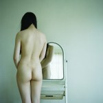
Source unknown – Title unknown (20XX)
Writing for this project, I frequently feel like my primary form of interacting with images is a this-isn’t-a-good-photo/image-but…
I mean beyond my generalized feeling that I am a bit of a broken record sometimes, this this is something about which I’m always very self-conscious.
But…
I mean I think one of the disservices we do in teaching photography (or, hell, more broadly any creative discipline) is that there’s a laser-like focus on the canonical.
It’s not that I don’t think that shit is important. It absolutely is–indispensable, in fact.
But…
It’s all sort of incestuous–in a biblical sense: the genealogies of influence flow in a clear, unbroken fashion back through history. It’s clean and full-up-to-the-gills with masterpieces of unadulterated genius.
So what’s the downside? I mean if one is trying to learn, the presumption is that one wants to learn from the best. Unfortunately, in my experience this has a limiting effect in a number of ways. If I study only greatness and my own work isn’t great (yet) then I either to be a total asshole narcissist or suffer from a certain degree of oblivion. (After all, when comparing your work with canonical masterpieces, your work begins at a stupendous disadvantage. And that disadvantage can cause you to lean on the work that’s already been done (I know so many emerging artists who view certain artists in such an uncritical light, that it’s almost as if their relationship with the work is less hippie looking to expand their mind and more blasted addict chasing the next crest.)
Truthfully, I’ve learned just as much from perusing shitty work as I have from obsessing over the greats. And it’s for that reason that I think every serious photographer should make a point to critically interrogate bad work in the same fashion they do good work.
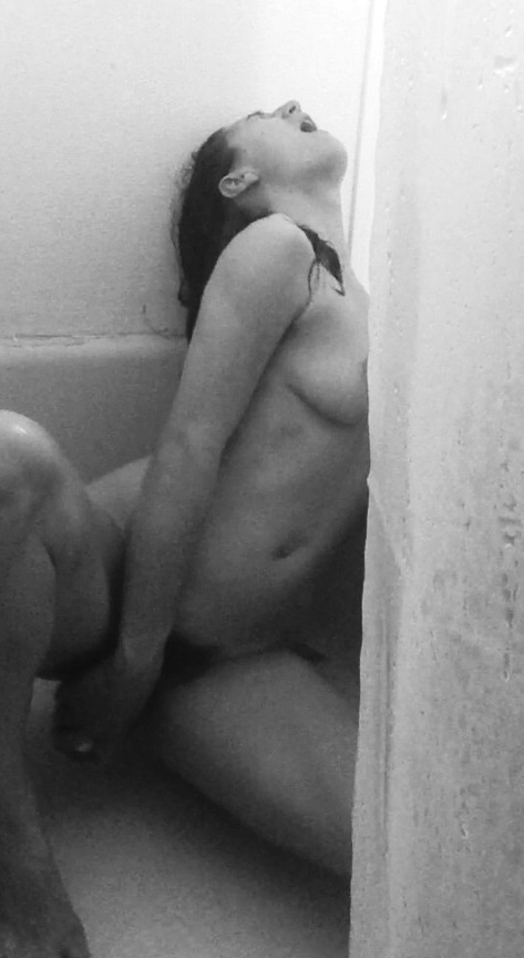
I mean the above is not a good image. It’s been blown up far beyond the point of disintegration. It’s blotchy and ugly. Yet, even if I knew where it originated, the original is probably not that much better. Unless you’re going to go to the trouble of setting up highly precise, orchestrated lighting–or you’re one of those lucky shits with a bathroom that has a window (and therefore: some natural light)–then the light is going to look like shite.
Despite looking awful, this does do a number of things extraordinarily well. First, according to the letter of Instagram law, this is an image that is Instagram safe. (Though, I’ll admit it would probably be taken down.)
Whether or not the intention of the author was such is immaterial–and given how bad the image is, it’s unlikely that the motivations approached anything like I am about to suggest: but it doesn’t matter because if the images reads a particular way, it reads a particular way.
It reminds me of the line teachers always used to throw around to my classmates about dressing in a fashion to leave something to the imagination. the idea was you’ll be more attractive/alluring if you show off less instead of more. (The creepy implication being that how you dress is an open invitation for others to imagine things about your body.)
The same mentality is frequently utilized in distinguishing porn from erotica and erotica from art. Porn tends to leave little to the imagination; whereas erotica is somewhere closer to the middle and art allows for the assumption of chastity.
For the record, I’ve always instinctively objected to this framework. I think it’s all a great deal more muddy (and therefore more interesting) than that.
But there is something in the whole admonition to leave something to the imagination that does actually inform as to the essential nature of pornography: it’s like they teach you in Writing for the Screen 101–unless you can see it on the screen, it doesn’t go into the script.
This relates to the ‘visual’ nature of the ejaculatory orgasm (and why most porn centers around male arousal and sating)–it’s visibly demonstrable. (Here we run into the inverse of my previous argument that art students should study shitty images, pornographers should study art history, as well: because you can actually depict non-male ecstasy.)
(As a tangential note although I can’t find them now: there are a handful of popular tumblr porn gifs that I do think are exceptions to this notion: despite being close-ups–which I’m not especially fond of–they focus on the pulsing muscular contractions associated with orgasm. In one, a hand stimulates the clitoris of an Asian woman. She audibly squeals as her anus and perineum spasms. In others, ejaculatory contractions can be seen at the case of the erection.)
Now–lest anyone forgets–this isn’t a good picture but the decision to present it in such a way that it is both entirely clear what she is doing but the viewer is not afforded an unobstructed view of the typical erogenous zones. Also, the fact that we don’t do the coded porn thing of zooming in on the woman’s oh-face (a la Albert Pocej’s staid Orgasm series) and instead are presented with the tableau sans access to erogenous zones and within context, this scene is decidedly about female masturbation via orgasm.
In other words, there’s no way the viewers can make this about themselves. Unless they think that perhaps she is fantasizing about them–which is, in itself, radical as to do so demands the recognition that she is not an object and has her own individual agency, volition and inner life (to which the viewer has no immediate access.)

Donatas Zazirskas – Untitled (2016)
It occurs to me that one of the things which hinders the teaching/creation of art is placing too much of an emphasis on originality.
I am honestly not sure where I personally fall on the whole spectrum of innovation is still possible vs it’s all already been done; however, I do know that focusing on whether or not something is original is just about the quickest death that the momentum of doing can die.
Consider Zazirskas–who favors either highly, manicured, even lighting design which restricts most of the tonal range in his scenes to Zones IV through X (a la this, also this) or a darker, moodier chiaroscuro where there’s very bright light, truncated mid-tones and very dark portions of the frame (as above).
Unfortunately, his work rarely fires on all cylinders. (And I do not mean for that to be a dismissal; I think he just needs to keep working, pick one tendencies and explore it instead of trying to embrace and enact three very different approaches to scene setting.
I don’t think this is an especially original picture. It trades in the same fierce backlighting that folks like Paul Barbera have expanded into a wistfully sensual, visual nostalgia kick-to-the-head. There’s also similarities to Hannes Caspar and STOTYM–less stylistic more in tone and content, respectively.
Point is: what interests me about this is the equivocation in Zazirskas’ handling of poses and gesture. His most technically astute image (here) is too tied to a rigidity of conceptualization, i.e. the subject’s reflect vs her poses that the rest of the image–no matter how interesting the setting, details or color (I mean god that eggshell blue is to die for)–the frame hanges loosely around the insistence on a pose that doesn’t work.
Yet, with the image above all the elements–the composition, the lighting, the floor, chair and board behind the chair with faces cut from magazines and glued to it presumably, all gathers to suggest a fluid unity of concept and execution.
Back to my point about originality, though: all the photographers/image makers I’ve linked with Zazirskas are all folks whose work I think is more prescient and refined. The thing that distinguishes Zazirskas, however, is the fact that he is very much not doing fly-on-the-wall work like the others.
The angle of the model’s left leg in this is actually both demurely shielding while also being a provocation–exercising agency over what is seen and what remains discreet while complimenting the lighting (the darker portions of the outside of her left leg contrasting with the hot spots on the outside of her right thigh).
For as much as I like the other work, I feel like this is at least more honest with itself about what it’s essential nature is. That’s rather something, actually.

Sam Cox – Miss Mac (2017)
A bit of a disclaimer to start off with: Cox’s work is FAR more hardcore than I’d normally showcase.
That being said: although his work is over-the-top as far as raunchiness goes, he is innovative.
As a rule, I am dismissive of TTL metered flash-driven, ultra-contrastiness (regardless of whether it’s color, a la Ren Hang, or B&W).
Cox, however, does use it consistently to facilitate a disarming immediacy. For example, I have mixed feelings about the framing here. On the one hand, I can’t really accuse it of the usual dismemberment although there’s very clearly no sense of extension beyond the borders of the frame. The orientation of the image, very clearly implies that although we don’t fully see the handstand’s foundation, it is clearly supporting Miss Mac’s full weight. Conversely, I do appreciate the sense of hurry up and get the shot because this is an ephemeral moment. (That’s another thing for which Cox does have quite the knack.)
What I love the most about this is the way the flash casts a shadow that–in turn–creates a sense of increasing separation between Miss Mac and the wall against which she’s bracing her feet–it’s exquisite.
Penthouse – [↑] Stacey Cameron (1974); [↓] Kava Gorna – Zippora Seven (201X)
Juxtaposition as commentary
It is okay to be at a place of struggle. Struggle is just another word for growth. Even the most evolved beings find themselves in a place of struggle now and then. In fact, struggle is a sure sign to them that they are expanding; it is their indication of real and important progress. The only one who doesn’t struggle is the one who doesn’t grow. So if you are struggling right now, see it as a terrific sign — and celebrate your struggle.

Claire Laude – Untitled from Upward on the Streaming It Mooned (2016)
My immediate reaction to encountering this was: It reminds me of Stanley Donwood and Thom Yorke’s work on the album art for Radiohead’s OK Computer.
Actually, it took me a bit to figure out why in the hell I jumped to that conclusion. See I read the line work to the right of the figure as De Stijl-esque.
As–I’m sure–most of you know, De Stilj was essentially a form of abstract art based in Amsterdam, interested in reducing representation basic forms and colors. One of the key practitioners being Piet Mondrian. (It’s interesting to note that Mondrian fled mainland Europe for London to avoid the advancing tide of fascism that served as a prelude for the Second World War.)
The lines run off the wall onto the body and in so doing becomes less abstract.
There’s also the way in which the square and above the figure and the crude right arm, suggest a sort of robot personae. It’s as if an automation and abstraction flow together into a body rendered penitent through connection.
And if there was ever an album that dealt whole cloth with the topic of alienation in a historical context, it’s OK Computer. (Of which–confession: I appreciate only reluctantly. Radiohead has never and from all appearances will never be my bag.)
But I do think it’s interesting that OK Computer was released right around the same point into Clinton’s second term as we are into the current ‘president’s’ first… Although there isn’t much separating Clinton’s neo-liberal globalization vs 45′s nativism, there is a means in which abstraction as a trend has been co-opted and employed as a means of perpetuating these varied flavors of fascism.
It feels to me as if Laude is trying to harness the lightning of understated menance for the purpose of questioning the invisible effect rules and codifications of form have on shaping not only the relationship with the viewer but history itself.
If sexuality and representation are mutually constituted, then it cannot be possible to discuss them as two discrete entities, one existing before the other. Representations do not merely reflect sexuality but play an active role in its production. Sexuality is always mediated and it is through representations that our bodies, and our fantasies, come to be sexually organised.
Wingla Wong – [↖] Untitled (2015) ; [↗] Untitled (2015) ; [↙ ] Untitled (2015); [↘] Untitled (2015)
Usually when I reference other photographers/image makers, the implication is two-fold:
- Art does not come about ex post nihilo, from a void; work is understood–or, misunderstood (you can’t have the possibility of comprehension without the equal and opposite possibility of confusion)–as a result of context, i.e. how the work is displayed (captions, artist’s statement(s), etc.); also: historical (art and other) positioning and theoretical conscription/rejection.
- Typically, I’m pointing to artists who was–in effect–the progenitor.
Things are a bit different here.
Wong has clearly drawn extensive inspiration from the catalogs of Akif Hakan Celebi (the fuss and bustle of post industrial Hong Kong, confrontational interrogations between notions of public vs. private), Yung Ching Lin (oneiric surrealism wed with a sublime perversity) and Ren Hang (the beauty of bleak sky lines in Asiatic megalopolises.)
And although she lacks the technical acumen of these artist’s (she never manages to juggle super saturated colors with anywhere near the aplomb of Celebi; tonally her work not only lacks the winking coyness of Lin, it very much heads in quite the opposite direction–alighting closer to symbolic coding than the fevered logic of a Jungian sex nightmare; and there’s a celebratory awe to Wong’s work that is absent from Hang’s sacred cow slaying provocations), she does create work that has some uncanny observations about feminine desire and physical embodiment.
Also, it’s interesting to me that all these easy influences that I’ve named use affect to concerted effect; whereas Wong adopts the effect in hopes that you presume an affectation, allowing her to hide in plain site.
It’s all rather clever and for that reason, I’m incredibly fond of her work.
Reasons to move away from a space: there’s no need to stay—I’ve left something there, outside, that used to be here, inside—I’ve left something there that can grow, develop, on its own.


