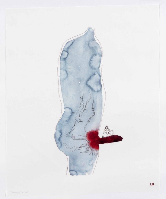
Louise Bourgeois + Tracey Emin – A Million Ways to Cum from Do Not Abandon Me series (2010)
[L]iving is like licking honey off a thorn.
— Louis Adamic (via fernsandmoss)
Louise Bourgeois + Tracey Emin – A Million Ways to Cum from Do Not Abandon Me series (2010)
[L]iving is like licking honey off a thorn.
— Louis Adamic (via fernsandmoss)

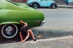
Karen Kuehn – Untitled from MetropoLOVE (2010)
Confession: I find this ineffably effing sexy.
It’s really all the little things in concert that get me worked up into a lather. The texture–his pants (the bunching of the rolled down waist band against the velveteen texture of the rest of the garment), the thickness of the cotton of the waistband and leg holes of her panties (and the visible stitching!!!) vs. the busy pattern on the thinner, inner cotton. His skin against her skin (the sheen and grain of it so tactile.
I love that the picture in and of itself communicates–without a single word–some of the truth underlying the image. The illumination as well as the background (what you can see of it) is very clearly arid and dry. And it turns out that Kuehn is a burner and travels to Burning Man every year with her camera gear.
But it’s really the intimacy of it. His thumb is clearly inside her underwear but the position makes it clear that it’s in the crack of her ass. Further, his index and ring finger are positioned in such a way that he’s almost certainly touching her anus through the material.
Given a wider frame, you would’ve lost the emphasis on the graphicness of the touch while–presuming nothing in the background–contributing a sense of two lovers alone in an empty world.
But the close up here in combination with the gesture, brings in questions of public vs private. With this frame there’s no way to know if anyone else can see this but given that the photographer can, we presume others can but since we don’t see others in the frame, they are both engaging in amorous foreplay with a potential for the behavior to be occurring simultaneously private and in public. (It’s a clever way of invoking the thrill seeking mind set that drives most people to attempt to have sex in public in the first place: the balancing of the risk of being caught with not actually being caught.


[↑] Helen Levitt – Squatting Girl / Spider Girl (1980); [-] Valeria Lazareva – 4950212141_148b6fe702_z (2010); [↓] James de Leon – Title unknown (2013)
Follow the thread.
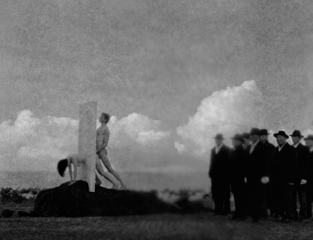
Hsieh Chun-Te – The Romance on the Stele from Raw series (1987-2011)
The images in the Raw series are intended to be narrative–yet what the narrative entails remains muddled due to how little is available on the artist in English.
For example: an image titled Bitches was, according to Chun-Te inspired as a result of: “overhear[ing] a journalist
friend of mine who got beaten up during an investigation of human
trafficking of a prostitution ring. Girls were captured then sold, some
of them tried to escape.”
I was not able to find the creative impetus underlying the above image. In fact, I discovered very little of merit beyond this blurb from the 2011 Venice Biennale. I agree that themes of desire, eroticism and death permeate his work. But, he’s clearly working within the Surrealist tradition. (I feel as if this is so apparent as to not need comment but to put to fine a point on it, he makes a point of telegraphing this affectation via his inclusion of bowler hats–a reference to Margritte’s seminal painting The Son of Man.
I’m inclined to disagree with the aforementioned blurb w/r/t what the above image depicts. It takes the easy route of correlating death and eroticism and suggests the image depicts a scene of capital punishment by means of being fucked to death. (The pose of the woman in the image suggests she’s still very much alive.)
And that is definitely an interpretation in keeping with the tone. Except, I read this as a far more nuanced examination of punishment in society. The relationship between the person receiving punishment and the remove at which the person who inflicts the punishment must be placed in to avoid sullying polite society by association.
I look at this and see it point to an irony. We’re not okay with this because of the context–restraint as a means to facilitating punishment and punishment as a means of retaining social control.
But this can also be read as an allegory of the relationship between pornographic performance and consumption within a capitalist, hetero-patriarchal system.
And really one of the reasons this works so well is that the author is clearly far more interested in pointing to a slippery corollary than passing any sort of judgment on it.

Paola Acebedo – Tiran Como Conejos (2012)
I’m of the mind that anyone/everyone is capable of making an objectively good image.
This begs the question: if anyone can do it, does that preclude lens based work from consideration as art?
Well, if you’re a photographer or image maker you already know the answer: of course not! There’s more to photography/image making than producing an objectively good image.
First off: you have to know a successful photo or image from an unsuccessful one. And this is one of the things with which photography/image making will forever struggle: each and every one of us has been inundated with lens based visual culture since birth–as such, everyone thinks they’re already a subject matter expert. (I’ve been running this blog for 5 years and I was a freaking MFA Photography student for a bit before I got seriously disenchanted with the whole charade and dropped out; point being I’ll be the first one to admit that my knowledge on the subject is found–more often than not–to be lacking.)
But distinguishing between a successful photo or image and an unsuccessful one isn’t always straight forward. Much in the way that you can ask a room full of 18 undergrads to define love and receive 36 different, often conflicting responses, show a group of folks an array of 36 different photos/images and while there’s likely to be more overlap than you did asking them to define love, there will be no immediate agreement.
I think: a lot of people privilege their own perspective. (And I do not mean that pronouncement as an implicit value judgment–only insofar as one is aware of and takes account for this bias; I will not abide blissful ignorance or arrogant equivocation.) Most beginning photography students believe themselves to be the next Cartier-Bresson just by virtue of the ontology of their status as a photo student. Hell, I did too when I first started.
The difficulty with that perspective is that you tend to use your misguided belief in your own creative infallibility as a means of justifying the importance of your Perspective. Yes, there is value in those truly outstanding makers who teach us new ways of seeing. However, of those, truly great visionaries–and pro-tip: a true visionary isn’t going to dub themselves as such (sick and tired of advertisements for hacky visual crap by the likes of dimwits like Zach Snyder and Gore Verbranski being termed ‘visionary’)–the ones who never bothered to scuffle along, stumbled and fell repeatedly trying to learn both the basics of visual grammar and the grown more intimately familiar with the history of the form, are the exception that proves the rule.
It’s dumb (again not a value judgment, more a noting of self-imposed limitation) to think you know better just because you’re doing the work.
Second, being able to distinguish between an objectively good image and an objectively bad image is one thing. Much in the same vein that we teach children to choose between right and wrong only for the child to grow up and realize that decision making in the real world rarely affords such simplicity. Frequently, you’re left with work that isn’t exactly bad but isn’t actually good either. (This is actually something I’m struggling with in my own work: the hard wired urge to include the objectively good over the technically muddled but luminously singular work.)
I’m not controverting @reverendbobbyanger‘s recent Sunday Post reminding that: good enough is not. I’m merely saying that photography and to a lesser extent image making–due to the rapidly advancing technology available for digital intervention/manipulation–WYSIWYG… it’s not like a painting where you can shift things around to suit your purposes after you’re well and truly off down the road.
But I’ve danced around enough the reason I’m getting into all of this is because I think the above image is a stellar example of reclaiming an image that was objectively muddled.
The image itself does not work. Yes, the compression of color is interesting–the cabinets, tile and dishwasher create a palate accentuating the skin tone in such a way that it sort of permeates the scene–much the way the smell of sweat and sexual effluvia swirls around the entwined bodies of spent lovers. There’s also something to the staging that seems exaggerated and awkward but at the same time conveys something of the experience of saying to a new love, I’m not sure I can get off again but maybe let’s try anyway.
Note how the camera is askew in alignment with the back wall–i.e. the right side of the camera is angled back and away from the wall, as opposed to being on a rigorously parallel plane to it. Further, the vertical frame edge is not squared with the seams of the cabinets/tiles in the backsplash; the slight uptilt only serves to exaggerate these flaws. (Emotionally, this was the right choice and it opens up the frame, providing more context; conversely, the dishwasher and the area in the top, right hand corner really screws with the visual flow as the eye scans the image.)
In other words, there are interesting things about the image. But it doesn’t exactly work. How do you solve a problem like that?
Well, Acebedo, broadens the context but presenting the image as if it were pinned to a page in an old album with yellowing scotch tape. It renders the image more inherently visceral. (Also, mysterious.)
But the thing I like most is how it preserves the anonymity of the participants. I cannot even begin to articulate how adamantly opposed I am to decapitating anyone in an image to preserve anonymity. There is always a way to include the head in the frame and then to–if need be–creatively obscure it. This is a great example.
Finally, I love that this adopts the fine art photographic tendency of naming a picture in such a fashion where the title merely describes the image. (A great way of underscoring that the image speaks for itself.) Here, you don’t have to have taken a day of Spanish to be able to perfectly translate the title: They fuck like rabbits.
Also, you really should check out Acebedo. There is something profoundly lonely about her work but it replaces sadness and longing with the feral possibility inherently in being alive and breathing.
Rodolfo Asin – Noelia (2013)
A black and white photograph (and I say photograph specifically because no matter what your opinion on digital, there is no damn reason anyone should be working in B&W in digital–it’s just poor form) can convey a lot of things. It can be sinister, moody, clinical, severe, etc., etc.
In other words, a B&W photograph no matter the concept or execution carries a sense of shining a light onto a scene in a such a way that allows the viewer to discover the foreign in the familiar.
Color just doesn’t work like that. A photo or image can be in color and be good and important and sumptuous without really even being about the color.
So every B&W image is at a certain level monochromatic in the same way and every color photo or image appears in color in a different way.
Loosely speaking, when we are interrogating color images there are two sorts of photos/images: those in color and those about color.
To my mind, William Eggleston is really the only photographer who ever managed to cobble together a body of work managed–largely–to accomplish both.
Eggleston established a beach head that allowed other photographers–like Stephen Shore, Jeff Wall and Joel Sternfeld to emerge. These photographers were interested in trying to bridge the gap between color as facet of the image and color as intrinsic to the images manifold meaning.
Yet, most work post-Eggleston color work seems less interested in solving a problem like color than dealing with issues of color fidelity, depicting mundane normalcy (for some reason B&W always seems more immediate and authentic, even though it’s not how we naturally perceive the world) and the employment of color as a means of orchestrating emotional response.
Whereas, folks like Harry Gruyaert, focused on color itself.
Now what I find interesting is that to a certain degree Shore, Sternfeld and Gruyaert and desaturate their photos, the images lose some of their punch but they still work. (With Gruyaert, you have to bear in mind that he titled his images. Also, I’ll concede that this might be splitting hairs since both Shore and Wall both work in both color and B&W.)
Eggleston desaturated is just fucking pointless–the color is effectively the glue holding everything together.
These days–sadly–most of the raft of internet famous photographers & image makers produce images in color or B&W and more likely a combination of the two. But I’m hard pressed to name anyone who like Eggleston is making work that only works in color. @pru-e is the first person who comes to mind. (But that’s also not entirely fair since she’s arguably one of the best up and coming image makers in the world.)
Asin, like Shore, Wall and Sternfeld, loses a good bit of his punch in a desaturated reimagining of his work. But he is doing some extremely exciting things with color. The work absolutely loses some of its punch in B&W but it also loses a vitality that the color contributes to the scenes.
I’ve featured another of his images several years back and I was just as taken with his use of color then as I am now.
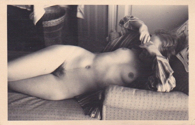
Source unknown – Title unknown (19XX)
There are just scads of similarities between the above and Modigliani’s Nu Couché au coussin Bleu.
I’m much more interested in the differences, however.
The above is firmly contextualized within a room. A fainting couch, a table covered with a cloth, a wastebasket, wallpaper and what could be wainscotting or a closed door.
Modigliani, on the other hand, moves from left to right through most detail–the texture of the couch–to less detail (the subject) and then to least detail (i.e. the background that shares both the color scheme and a Rorschach-esque feel of the cover art for the latest Cobalt album Slow Forever).
Also, the subject above has her right leg over her left thigh, effectively the opposite of Modigliani–where the subject is depicted with her top leg pushed back and her lower leg forward; to me this suggests a sense where in the image above the subject is either waking from a nap, except for the way she’s covering her eyes–which is clearly more coy and playful given her smile.
Whereas with Modigliani, there’s a sense that this is a post-coital scene and the subject is trying to leave the suggestion that she’s ready for round two open.
To me that’s one of the most exciting things about photography. To an extent–greater than with painting but with less rigidity than sculpture–you are limited to what is physically possible. Modigliani was shit at depicting bodies. His most famous painting Reclining Nude (1917) is a great example of this. As anyone with breasts knows when you lay flat on your back, a great deal of the volume of the breast pushes into the armpit area. Actually, I’m making it more difficult then I need to just compare the above image with Nu Couché au coussin Bleu and you’ll clearly note how the pose looks IRL vs in a painting.
I actually prefer the above to anything I’ve ever encountered of Modigliani work. I especially like the way she’s wearing the vertical striped shirt and how that both compliments the wall paper and creates dimensionality against the pattern of the couch.
But both the photographer her and Modigliani make the same mistake. There’s no sense of extension beyond the boundary of the frame edge. The glimpse of the world we’re provided is purposefully bounded. We see what we are intended to see and nothing more.
Physically, both models legs are amputated just above the knee and as such they cannot leave the scene where they have been splayed for the viewer.
Nicolás Uribe – Sunday Conversation (2008)
I really love this guy’s work.
But this one in particular has a lot of meaning for me.
My life has been a living hell for the last five months. My partner is dependent, at least, in all likelihood addicted to pain killers. She’s fine as long as she can get pills but when she can’t she becomes profoundly emotionally abusive, manipulative and suicidal.
For the longest time, she was the only person who wanted me and more than that wanted to be with me. But at the end of May last year, I went out to the Bay Area for the first time and spent 48 hours with my friend Amadine (not her real name).
It was maybe the best 48 hours of my entire life. I have only ever felt so completely connected with one other person in my life.
Anyway, the first night I was with her we ate edibles together and sat on the couch in her living room talking. As those of you in California already know, the CA medical edibles tend to come in a bit higher in THC concentration than they are advertised. For example: at that point I was consuming around 35mgs on a two days on-one day off rotation. I ate something like 65mgs that night and I’ve only been that stoned maybe three other times in my life.
Amadine was outline three projects she wants to work on, one involving animation.
Unlike this painting, we were fully clothed. In fact, her partner was in the other room. We also were not sitting side-by-side. She was sitting with her back against the arm of the couch, with her legs crossed, her knee touching my thigh.
The only light in the room was a lamp on Amadine’s desk–her desk being in a recessed work space divided off from the main room by one of those antique dividers with the carved wooden arabesques. As my eyes scanned between her eyes and the room–I have trouble with eye contact and while that trouble is almost non-existent with her, I had to keep shifting my gaze because the urge to lean forward and kiss her was so overwhelming.
The light through the carved gaps seemed like it was rotoscoped, it kept undulating and shifting slightly distracting me. Amadine stopped talking and we just sat there looking at each other for what felt like five minutes. She finally giggled and smiling broadly said, wow, yo, that was super intense.
It’s taken a while but we’ve finally gotten around to talking about our experiences of that weekend. And it turns out that we are both insanely attracted to each other but that due to a number of factors in her world right now it’s not something that those feelings aren’t something that can be acted upon just yet.
So yeah, this painting perfectly captures the feeling of sharing space and time with a dear friend that I love and am devastatingly attracted to…
It’s probably not realistic and I know we won’t hook up when I see her again next month, but I stupidly have in mind that we might be able to share space again like before, perhaps more inline with this painting. (We both have a pronounced nudist streak, so it’s not impossible even if it is unlikely.)


