Folks always give me shit about how I fixate on the framing/composition of a photograph or image. Yet, framing/composition contribute or detract immeasurably from the legibility of a photograph or image.
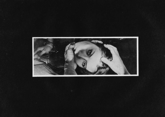
Take this, for example: it reads vertically and thus represents a rare instance where a skinny frame is logically consistent composition decision.
I’m fairly certain that this is not a panoramic photograph. (I’d wager it’s been cropped from a wider scene and digitally desaturated.)
Under normal circumstances, this is the sort of thing I avoid showcasing–except this is remarkably well-realized on two counts:
First, the affected white border around the image giving it a lurid news paper clipping/traditional dark room work print feel. (Both contribute a tactility to something that emphasizes the extremity of touch.)
Second, note the way different parts intersect in the space delimited by the frame–his hands, her face and handcuffed hands.
It’s partly the juxtaposition between the highlight detail of skin against the impenetrable background shadows, partly the way each feature converges at right angles to each other within the frame.
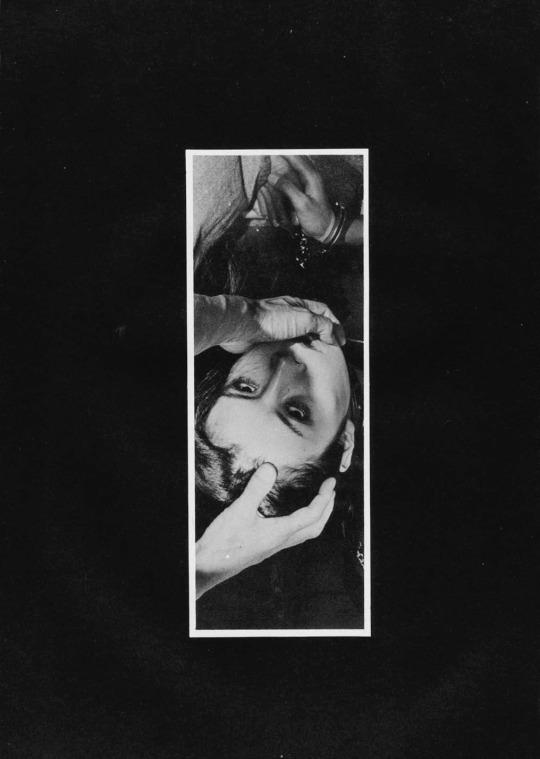
It’s also the way the camera is a witness as opposed to an intercessor. For example, rotate the image 90° clockwise gives you this:
Now maybe it’s just me but there is a certain way that with this orientation and hands entering the frame from the lower half (such as this) suggests that the hands belong to the photographer/image maker. Many folks are rightly criticized for this tact–looking at you Insuh Yoon. (Alternately, I did see this image made by Bang Sang Heyok, that while not a good image is–as far as I’m concerned–a successful proof of concept that there may be situations where the image maker/photographer insert themselves into the scene may actually serve a non-creepy purpose; in this case I appreciate that the image maker is attempting to preserve the anonymity of the subject in such a way that doesn’t not require decapitating them with the frame edges.)
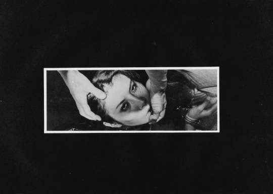
Let’s take it another step, actually. Here are the same images rotated 180° & 270° degrees respectively.
To my eye, the 180° rotation doesn’t read as well. I see the handcuffs before the hands. With the mass of negative space at the bottom of the frame, your eye immediately retreats and locks on the handcuffs.
The 270° one is more surreal–how are the hands at that angle unless there has been some sort of gravitational trickery with the staging/positioning of the camera. In other words, this orientation undoes the physicality established by the original orientation. And, given that this is ostensibly a BDSM image, that exact physicality is the raison d’etre of the image.
Lastly–and this goes out to the naysayers who take issue with my #skinnyframebullshit ethos: the argument that you employ to dismiss my objections is that there is fundamentally no difference between the way you read the original and the 270° rotation. And you aren’t wrong. You encounter the same information in the same order with both orientations but the logical consistency of the composition and conceptual interpenetration given the various orientations not to mention the shift in psychological impact is the reason I harp so much on the fact that image orientation matters a whole lot more than I think you’ve really bothered to stop and consider.
I effing love this. Part of it is the color–that red is to die for and there’s just enough pale magenta at the edge for the frame to de-emphasize the garish tapestry-esque table cloth.
And while everything in the frame–decor, the dark liquor in an ornate rocks glass, the CRT television set–screams 1950′s housewife fetish, I’m more into the sheerness of the material.
The first nude photo session I ever did was almost two decades ago, now. The model was my significant other and she was interested in posing nude but had some reservations about what might happen if the pictures got out into the world.
She had this silk scarf that was enormous and actually more like a shawl that was see through. I suggested that perhaps she use that to cover up if it made her feel more comfortable.
She loved the idea and the pictures ended up being far more revealing that I ever expected them to be. It was as if that thin piece of fabric was like some sort of armor that allowed her to feel empowered and invulnerable.
The pictures weren’t especially good and I’m uncertain whether I still even have them. So much in erotic image making depends on what is shown and what remains hidden. I humbly submit that perhaps what you can see but not completely or clearly is arguably more sexy than either of the aforementioned extremes.
There you have it folks. @suspendedinlight took the helm of the good ship Acetylene Eyes for a week and based on the insane influx of new followers, I’m taking it y’all really liked it. And how couldn’t you? Lyndsie is the cat’s pajamas, the bee’s knees; just the dreamiest dreamboat that ever sailed the beautiful blue seas. Heart Eyes Emoji.
I’d hoped to have things squared away to announce our next guest curator. I approached two folks that I would nearly die to have on board but have yet to hear anything definitive back from either. You’ll know as soon as I do, tho.
I did manage to get a bit of a queue started. Should be two weeks lined up as of tomorrow. So stay tuned for that.
These are so painterly and warm, and pull again at that yearning to be
care-free and vulnerable. I love the splash of water in the bottom right
quadrant of the first one, and what the fabric looks like in the second
one, meandering up and across the frame.
I’m choosing this one as a meditation on vulnerability, intimacy,
and trust. I think a certain amount of neediness isn’t so bad if you can
own it and ask for what it is you need.
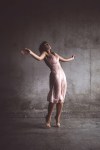
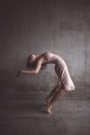
I’m obsessed with the mood of this set. With the second photo
especially, I can *hear* the echoes of the cold concrete, I can feel the
chill of the wet fabric and hair. There’s something athletic and
dance-like in these movements, but they aren’t ethereal
levitation jump shots. This is someone violently throwing themselves at
the floor, the walls.
As someone usually preoccupied with stillness, my favourite thing about
Alveoli Photography’s work is actually how it always feels on the verge
of coming to life. I can look at his images and feel that they are
moving and breathing. Also I genuinely think
Tiffany Helms is one of the most talented faces out there right now.
Her expressions are so genuine, she can tell an entire story, sell an
entire image with her eyes. I can’t decide with this one whether she
might be inviting the viewer in or walking them
out.
When I was first asked to do this
guest-spot, I was unsure I’d be a good fit due to the ratio of erotica
presented here. But when I started to whittle down my photo choices, I
was thinking instead about something I’ve been trying
to better understand and become reacquainted with in my own life:
desire.
This image appeals to the melancholic part
of me, leaning more towards yearning than desire. I remember the first
time I saw it, wishing the depth of field hadn’t been so shallow. But if
you look closely, it seems as though the
little quiff of hair is the center of focus. Maybe it is about the
tactile little things you notice when you desire someone. Or maybe you
want to comfort the subject. There’s something reminiscent of a marble
statue in this image for me, too. Is it possible
to desire someone without objectifying them?