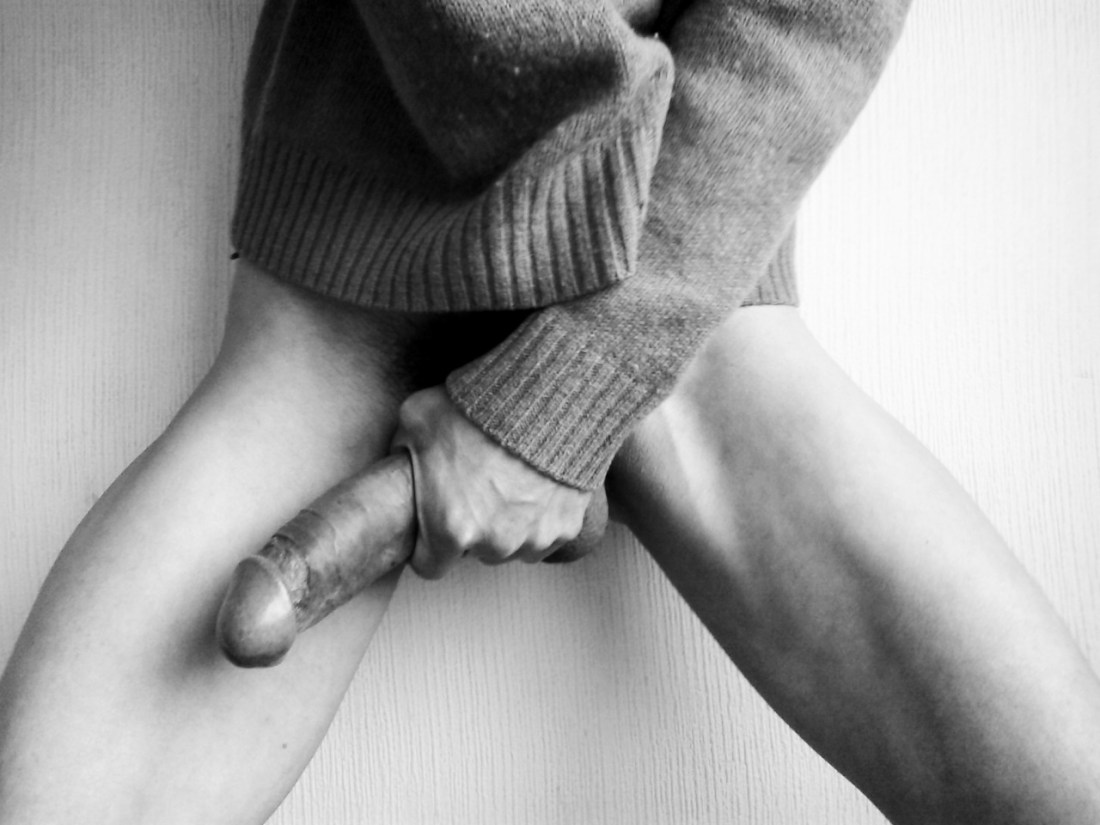
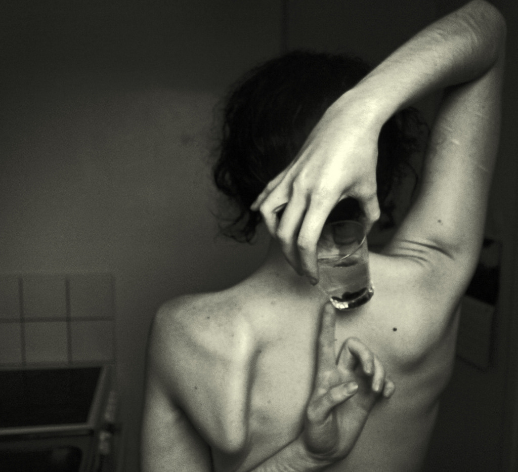
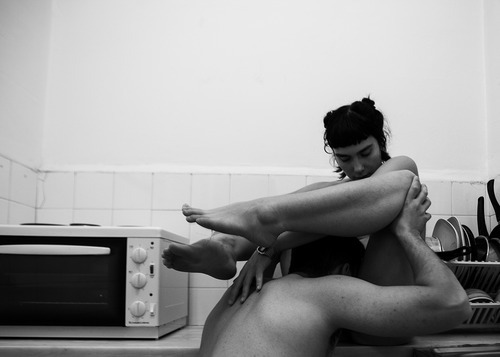
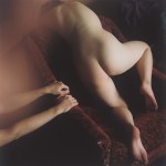
Henry Gaudier-GreeneEdward Weston and the Origin of the World (iii) featuring Kelsey Dylan (2014)

Early this year Gaudier-Greene was asked whether he had any New Year’s resolutions; he announced his desire [t]o develop a better working relationship with midtones.

It struck me as an odd self-deprecating joke–coming from someone virtually unrivaled in the using color photographically to claim controlling B&W midtones to present a challenge after he’s used them to stunning effect (thinking specifically of his collaboration with Tanya Dakin: The Beginning of Mod, emphasis on this gem).

I suspect it is largely just that but it’s also an interesting and probably entirely unconscious framing device. Let me see if I can show my work for that assertion.

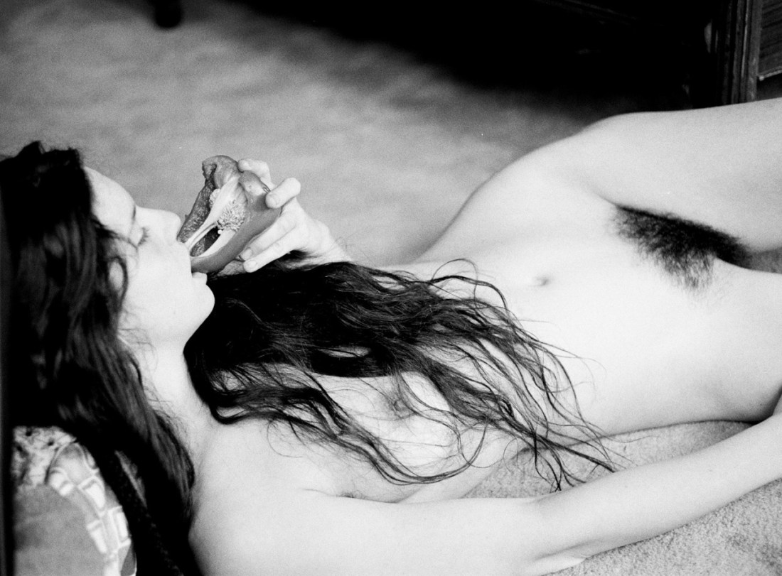
Looking at this gorgeous photo oblivious to the title recalls Goya’s La maja desnuda and Modigliani’s Reclining Nude.

Now, when I look at the title I dart in the opposite direction–away from painting as a means of transcending the ephemeral one-to-one nature of sensuality and towards the physicality of father shot/son printed green peppers and graphic nudity, i.e. the visual documentation of explicit bodies as a means of exploring the erotics of metonymy.

I don’t think such misdirection is misplaced. But I also don’t think it’s accidental. I’m not quite sure how to ground a further explanation of what I mean in Gaudier-Greene’s work, so let me take the half-assed route of the intellectually disingenuous: I see a number of parallels between Gaudier-Greene and Edgar Degas. But for the purposes of this explanation, I’ll limit myself to one. Degas set out to be a historical painter, he is now lumped in with the Impressionists–despite wide variance and in some cases outright antagonism to their practices.

In truth he was both a historical painter and an Impressionist; at the same time, he was never truly either. He was more radical and subversive than any category. It seems to me that in an effort to fit within the photographic tradition, Gaudier-Greene tends to point to the less obviously discernible influences he’s pinned to his sleeve while the audience fawns in awe over the calm and stubborn purity of beauty in the work.

Gaudier green is a photographer par excellence and a capital A artist. He has on at least three occasions made me swear to give up photography and on half a dozen others caused me to swear eternal fealty to it.

Source unknown – Title Unknown (201X)

I have objections to this–namely, the camera’s proximity to the action implicates it as a participant/not strictly an observer. The image would’ve been improved dramatically by moving backward say two feet. (Further, you know, DoF could’ve been a little more thoughtfully implemented and a series of unfortunate Photoshop decisions might’ve been avoided.)

Still, the image is super hot and not just because of the graphic penetration. (Also, it bears mention that I am super supportive of this as a depiction of safe sex that doesn’t come off as perfunctory, forced or trite.) I think it appeals to me because there’s enough context to suggest that this is a public environment. But something I’m realizing more and more about myself is depictions of sex that are salaciously focused on reproductive organs just do not do it for me. I want to see an effort to communicate physically the unsayable intensity of passion. Her the kiss is what sells the image and it in no small part reminds me of another equally arousing (though non-pornographic) photograph by Lina Scheynius.

Yesterday’s PornTitle unknown (2014)

Puritanical responses to nudity and/or sexuality are an enormous pet peeve of mine.

But I have a very special hatred setting reserved for failing to inquiring as to whether the pic was requested or consent was sought and received before it was sent and instead applying the default, knee-jerk response: no one wants to see that.

Um… saying no one wants to see peen is completely fucking untrue. What no one wants is seeing shitty picks that involved little thought beyond having a hard on and a camera nearby.

(Also, while we’re on the topic bear in mind saying no one wants to see that not only implicitly dictates (pun semi intended) an insanely narrow view of sexual propriety but is also hugely problematic as this is entirely disproportionate to the typical response when women who post nudes or have their nudes leaked face a staggering gambit of slut shaming, body shaming and myriads of other forms of harassment, not to mention threats and the long term consequences of losing employment or narrowing future options.)

With that in mind I present this as a sort of gold standard template of what a classy cock shot entail:

  1. A dick pic doesn’t have to be fine art but quality never hurts–this image is effective because it presents a decent tonal range between shadow and highlight while also featuring three distinct, effectively rendered textures, i.e. wall paper, sweater and skin. (Plus, the sweater adds a somewhat feminine note which juxtaposes well with the more phallological content.)
  2. Anytime a frame includes genitalia, the inclusion is already charged. Placing the genitals at the center of your frame isn’t just preaching to the choir, it’s screaming in their face while beating them around the head and shoulders. Here: the left hand directs the cock out of the center of the frame. This dodges the common trap of thinking images magically become 3D when others view them or worse the tendency of treating the aperture as little more than another fuckable orifice.
  3. Avoid the oh my god! look at how huge I am trope. This image is preoccupied with that but I am willing to overlook that due to the sublimation and also because the small triangular sheen of reflected light his corona makes my molars feel all itchy.
  4. Another great strategy is decontextualizing the dick or finding a way to present it in a more mundane and natural setting. This image isn’t concerned with that but this does both interestingly.

Thus before you send/post that shot ask yourself how does it compare to the above. If it pales in comparison, maybe think about hitting delete. If it’s on the same level or better, go forth and conquer.

[←] Source unknown – Maximiliano Patane (2013); [→] Source unknown – Title unknown (2014)

The original post features these two images (without attribution) and this accompanying quote:

“The vulgar man is always the most distinguished, for the very desire to be distinguished is vulgar.”

Gilbert K. Chesterton

Before I spent this two hours searching for the sources, I thought these were a breathtakingly fucking gorgeous (and I don’t mind admitting: arousing) photographic diptych.

Alas… although it demonstrates an image sommelier’s sense of pairing, it’s little more than an admittedly most adept effort at accomplishing the same end as a horny teenage boy ‘Photoshopping’ Emma Watson’s head onto Stoya’s body.

I’m hardly saying there’s no place for image mash-ups, adapto’s #comparative tag–for example–frequently spills over into staggering, full-in-the-face brilliance.

The difference is that adapto painstakingly cites his source material. The above can’t be bothered with such concerns, implying a rather disconcerting lack of respect.

A shame really, for–as the saying goes–what shall it profit a man, if he shall gain the whole world, and lose his own soul?

Source unknown – Title unknown (XXXX)

Here’s an example of a vertical frame that isn’t #skinnyframebullshit.

Why? You ask, Isn’t it just echoing form of the subjects?

Well, it is doing that but in this case a landscape orientation contributes little additional context to the image. As it is we can tell it’s a small bedroom, demonstrating exactly how small it is–if anything–belabors an already clear representation.

The trick that makes a skinny frame work here is the narrow triangular form of the overexposed motion blur adorning his hands and her left side would–in a wider frame–be subject to de-emphasis. Further, the vertical framing draws attention to the discarded clothes piled on the bedside table and likely Russian electrical outlet.

Source unknown – Title unknown (201X)

I really, really wish I knew where this is from because it is quite possibly perfect.

Let’s start with the color: the walls are an eggshell that go white in the daylight key lighting, peachy in the spill splashed behind his left hand and hazes towards blue gray as it nears the edges of the frame. His pants and her skirt (?) are black; her top is white and his top is grey. These muted colors punch up the skin tone rendering a spectacular range in both parties skin tone.

That alone would be enough to make me swoon but there’s more: the way his shoulders are cantilevered against the wall as she pulls his center towards her is almost certainly a visual rhyme with one of the most exquisite studies of figuration motion in the western art historical canon–Bernini’s Daphne and Apollo.

Mathilda EberhardUntitled (2014)

Mathilda EberhardUntitled (2014)

Flickr retains little more than a ghost of its late aughts glory.  In fact, it’s pretty much a completely clusterfuck.

There are some notable outliers whose photostreams’ always showcase bona fide next level shit–looking at you: im_photo, chill and 3cm.

I’d include Eberhard to that list except well although I wouldn’t ever suggest that her work is better than those guys, I am just flat out enamored with her work.

This should surprise no one having followed me for any period of time–after all this is the fifth image of hers I’ve posted.

You’ll notice I tend to favor appending quotes to her images instead of commenting on them–partly because I am so awed by them that my fumbled attempts at expression seem entirely cross juxtaposed with the work and partly because I get self-conscious about the fact that I tend to compare things that move me to the very limited set of work I adore (at least initially) instead of come to terms with them on their own ‘ground’.

For example: for as many image makers as will either claim or accept the critical assignment of overlap with Francesca Woodman’s work, Eberhard is probably the image maker who most completely takes up Woodman’s mantle.

But to state that and consider the matter settle is intellectually dishonest. There’s more to it than that it and leaving it there does a disservice to both image makers.

Unfortunately, it’s not something I can express in the positive–i.e. I can say this is what makes Eberhard’s vision singular. However, it did occur to me that there’s a way I can, for the time being, point in the right direction.

Think of the word ‘desire’. We use it primarily as a noun–to describe a visceral wanting. It’s also a verb. I can say to a friend: I desire a delectable brie.–Although grammatically correct it sounds to the ear unbalanced.

In actuality when we desire, there is a tendency to express desire with metaphor–’craving’, ‘hunger’ or ‘thirst’.

Now, consider the qualifications we add to these metaphors when we use them non-metaphorically. We might say her appetite was ‘insatiable’ but we would be much less likely to say his hunger was insatiable unless we are using ‘hunger’ in some metaphorical sense. One eat until one’s hunger is sated.

I’m not sure if it’s just my pushing the point to reach a satisfactory conclusion, but it seems that we speak of thirst differently. Thirst isn’t sated, it is ‘slaked’–implying satisfaction. The space between ‘hunger’ and ‘being sated’–when measured in time–is less ephemeral than the space between ‘thirst’ and ‘slaked’.

I think when you extend this realization of the tendency in the literal to the metaphorical–desire when expressed via a thirst metaphor is more insistent than desire as expressed via a hunger metaphor.

What makes Eberhard’s work so singularly compelling is the way it methodically charts the terrain of thirst as a metaphor for desire.

Joe Swanberg & Adam Wingard – clips from Autoerotic (2011)

Yesterday, I posted this with a plea for someone to help me identify the source. (Credit to Den for the id.)

Alas, knowing the origin somewhat tarnishes my previous sterling opinion of the clip. (In fairness, I am torrenting the movie as I write this.)

So without having seen the entire film, let me focus on what I like about this clip–which essential boils down to production value.

I’d wager the exterior cafe, narrow hallway and bathroom are in three disparate geographic locations; however, note the way the character is blocked in the left third of the frame in the al fresco scene, then moves from left of center to right of center in the narrow hallway. Along with the ambient cafe noises, this contributes the illusion of continuity of physical space that appears seamless.

You can quibble that although holding on the exterior and holding on the narrow hallway contributes a sense of editing rhythm, the hold in the hallway seems to long. Also, although I understand why the character enters the restroom from the right third of the frame–given this is the same position from which she exited the previous frame and matches the angle at which she entered the bathroom, I’d have probably cheated it and had her entering from the left just to continue the movement from left to right in the previous frame.

I have no idea why focus wasn’t pulled to keep her in focus as she approaches the camera on her bike–but then I would have insisted on shooting it as a horizontal tracking master shot.

Despite these admittedly nitpicking flaws and the awkwardly porn-esque alleyway masturbation, I am rather fond of this clip for it’s attention to detail–you know what she’s going into the bathroom to do and instead of going for an explicit close up, the details of her arousal are conveyed through her flushed, sweat glazed face.

I’m pretty sure my opinion will diminish after seeing the full film but on the strength of these scenes, I am intrigued enough to take the plunge and that’s not nothing.

Libby Edwardsthere are no boundaries anymore/just purity/just us (2012)

You know that smart ass quip that there are two types of people in the world: normal folks and then those who separate the world up into two types.

Yes, there’s certainly a kernel of truth there–things in the desert of the real rarely divide cleanly or suggest such neat polarity with easily navigable spectra between.

However, as long as either/or dichotomies are invoked as a genesis point (a means to an end instead of an end in and of themselves), I think they can be useful.

Take this image. It’s crossed my dash probably several dozen times in the nearly two years I’ve run this blog. Technically, it has a heavenly choir of problems: the camera’s slight up tilt combined with counter top reinforcing the lower frame edge draws attention to the asymmetry of the corners where the walls meet on either side; I would wager this was taken with some sort of matrix metering setting–resulting in the skin tone being what I’d call a Zone IV instead of halfway between Zone VI & VII.

In other words, it’s technically flawed.

Now, I’ll be the first to admit that the technical interests me. I would even go so far as to say I consider quality of craft a major turn on. Still though all the technical know how in the world doesn’t count for fuck all if there’s no mojo.

What do I mean by the oh so technical term ‘mojo’; heart, honesty, integrity. For example: I can’t fucking stand Monet but you’ll never hear me question the importance of his work. Just because it doesn’t appeal to me doesn’t mean I can’t be convinced through and through that the way he painted was a painstaking effort to share the wonder he say in the world.

But back to my original notion–for the sake of argument: let’s say that there are two sides of the image making equation; namely, the technical and the spiritual.

This image is off-the-goddamn charts in terms of presenting the truth of a discrete moment. It’s technique could be improved but there’s enough merit to it as it is that it sort of diminishes any potential criticism that can be leveled here.

Vladimir Nechiporenko – [above] *** (2011); [↖] *** (2013); [↑] *** (2014); [↗] *** (2014); [↙] *** (2014); [↘] *** (2014); [below] *** (2014)

“Before I take my last breath, before my last flower withers, I wish to live, I wish to make love, I wish to be in this world close to those who need me, those who I need, in order to learn, comprehend and rediscover that I can be and I want to be better at every moment.”

                     –Ahmad Shamloo