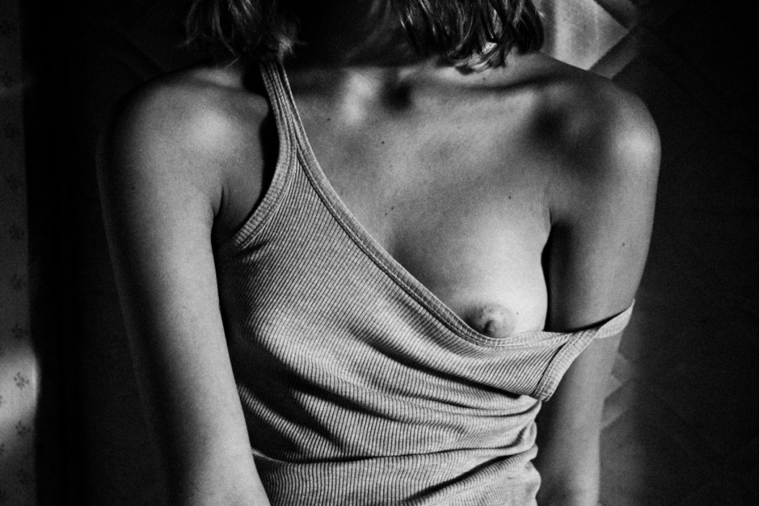
transitofvenus:

Mathieu Vladimir AlliardNicole Pollard (2013)

Such editorial-fashion portraiture is not my cuppa Joe. This though, I can’t get out of my goddamn head.

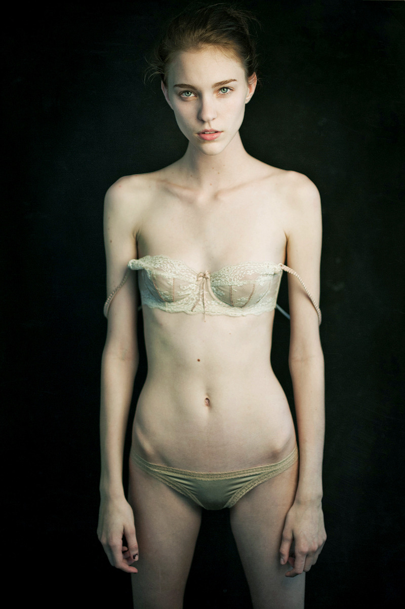
It’s the asymmetrical picked at nailpolish on her right thumb, the textured trim on her knickers, the way the light makes her hipbones look uneven, the mole above her navel, the contrast between the cream color of her bra against the sickly white of her skin somehow balancing against the dark background to create a strange vibrancy.

But it’s really the strangely intense blue-eyed stare somewhere between knowing, asking and boredom that is most captivating. I do not know what Ms. Pollard is thinking but I really, really, really would love to know.

Expressions are what elevates Alliard’s work above the paint-by-numbers editorial-fashion crap. His sitters usually appear edgily defiant and half feral.

A similar mien shows up in Ms. Pollard’s work. It’s less overt but she appears matter-of-fact, in control and as if she is prepared to give it to you with both barrels if anyone so much as thinks about giving her shit.

Somehow what Alliard customarily seeks and what Pollard offers, cancel each other out here. In the resulting void, something unexpected happens.

The single substantial criticism I have is #skinnyframebullshit. The only compositional logic governing the use of a vertical frame is to facilitate slimming–which is unnecessary and fucking stupid. Ms. Pollard is quite gorgeous but she’s fucking skinny. The bra straps hanging off her shoulders accomplish the desired purpose well-enough and do not require backup. Not to mention, the image would been moodier for landscape orientation as well as adding weight to the oddness of the expression.

When I was a student I used a view camera. A 4 by 5 color negative cost three Deutsche Marks, development was another three Marks, and I was able to do the contact print by myself for 10 Pfennigs. That meant that each time I wanted to take a picture I had to very carefully think about whether I could spend the six Marks. I always took just one image. It’s likely that helped me to work very precisely. Now when you work digitally…

Source Unknown

The composition here is certainly not The Anatomy Lesson of Dr. Nicolaes Tulp; but at least it’s thoughtful enough to present a legible staging: 16 seemingly male-bodied persons in 4 groups–3 threesomes & 2 couplings.

There are:

  • 4 instances of fellatio
  • 2 handjobs
  • 1 soixante-neuf situation, and
  • 1 occasion of anal penetration.

It is unclear what the gent whose stroked erection marks the center of the frame is doing with his hands between his two attendants legs. (Cradling their testicles? Fingering their asses?)

And I can’t help thinking that the photographer must have had some decent art historical chops due to the pose of the fellow who is licking the reclining gent in the white shirt’s scrotum, is too much like Velázquez’s Rokeby Venus to be accidental.

Further this isn’t the worst example of the whole proximity/participation thing I am always kvetching about w/r/t close-ups.

Yes, the camera hung back to front load explicit content into the frame. But that’s probably less due to an aesthetic concern than a a necessity borne of limitation– i.e. scarcity of equipment/skill required for its operation.

Take a minute to consider each of the 4 groups independent of the others–again the composition makes this fairly easy to accomplish. What would close-up really add? Reducing the totality to a metonymy of explicit action. Does that add anything? Does seeing the sheen of saliva on an stiff cock bestow some kind of hyper-real synesthetic sensory stimuli?

Whereas in a wider shot bodies not only move in relation to each other, they retain evidence of being ground in their particular form of life.

Source Unknown (There’s an awful bleached version floating around with more recent origin.)

I’d have posted this solely based upon how  pink her cheeks are, honestly. (I’m a sucker for actually physiological discernible cues of sexual arousal.)

But there’s also her mouth hanging slack, half-open–I can almost here her rapid, shallow, slightly raspy breathing.

And despite not really being a fan of close-ups or selfies, this somehow works as an image–if for no other reason than the boy on top seems to be the one taking snapping the picture (therefore justifying participant proximity to the action).

Also, the image implies the explicit without revealing much more than would a skimpy swimsuit. For me that serves to narrow the focus sharply to the passion and immediacy acting in the moment. To me, that’s always haute as fuck.

100+ Followers & a Few Notes

After hovering in the low-to-mid nineties for months, I finally reached 100 followers earlier this week. Of course, within an hour I was back down to 99.

Flattering reblogs by Knitphilia and Emmeroids–from which I am still suffering a residual blush–brought in a baker’s dozen of new followers.

Two other Tumblr bloggers deserve thanks. Wyoh and Boudoirboudoir keep me on my toes.

Also, if you like some of the more porn-y material I post, you should be following Danish Principle and motion detect.

Looking ahead: my hope is that I’ll be able to reach 250 posts before 2014.  This is probably a naively optimistic goal. But I am going to make a real go of it.

If you’ve been here for a while now, thank you for sticking with me. As I am prone to saying regularly: I’d do it regardless of followers; but with you it’s so much better.

And if you are new here: welcome.

Butow MalerLena and Extreme (2013)

This appears to be from Maler’s eMagination 05: Porn Art. (A full, lo-res preview is available on Blurb.)

Here: my gaze enters the frame following the baseboards rightward thrust; the reversed symmetry of her left food to his right foot draws my eye away from the deep shadows dominating the left third of the frame; reverse symmetry is emphasized again by the echoed angles of their opposing, correspondent legs.

Upward trajectory is reinforced by the momentum of his taut musculature–sumptuously rendered in B&W–leaning into her body her body at an angle almost perfectly perpendicular to the baseboard approach vector.

In the gap between their bodies, her right breast is framed and balanced against the dizzyingly sharp focus on her left hand transferring her unsupported weight onto his arm, which in turn pulls her center of gravity towards him; the way his arm hiding her face (LOVE); the nearly seamless skin tone merging between the inside of her left knee and his triceps. 

Lastly, I notice the wall’s texture. (Look closely, the faintest hint of it recurs in the left third of the frame, differentiating between the strobes vignetting and shadow cast by his body.

For all it’s sophistication, the couple’s pose is unwieldy. Yes, it convey some of the immediacy, the laser-like focus on sensation that can mark the initiation of intimacy. All well and good but this doesn’t square with Maler’s subtitle: Porn Art.

Word order is always telling: art appended to porn. On one level, the implicit claim works: the images demonstrate a solid grasp of craft and familiarity with art conventions. On another level: thought the presentation is consummately ‘artistic’–I find it neither especially arousing nor justified in its pretense to Art.

In effect, it has matters turned the wrong way ’round: it’s one thing to make sexuality the crux of one’s creative output; quite another, to create work from a template of what is considered meritorious–it is possible to make Art that is pornographic (Klimt’ll tell you all about it); Porn Art is not nor will it ever be a ‘real’ thing.

Danilo Pasquali – from Bagno (2010)

As far as explicit images go, depictions of masturbation are among my favorites. On that level at least, I find this interesting.

And I’m not sure I want to go full-blown feminist killjoy screaming exploitation every time I run across something sexually provocative but something about this really sketches me out.

It’s partly the composition–was it really necessary to frame the water streaming over her genitals at the exact fucking center of the frame?!?!!

And partly that fact that this is meant to convey the notion of masturbation, it’s clearly staged. Fake–not a problem in itself  I suppose, despite my distaste for affectation.

What irks me is the feeling–despite the compositional flaws, this image is as superior to any of the others in the series as it is more blatantly sexual–that depicting masturbatory tableau was the aim of the shoot but that wasn’t conveyed to young woman.

More likely, during the shoot Mr. Pasquali asked the model to pose as if she was using the faucet to masturbate. She probably didn’t think much of it and may have not been displeased with the final results. To me there is something untoward and skin-crawlingly sleazy about that sort of disregard for personal integrity.

Beyond that it even has an effect on the image. The position of the body reads masturbating with a faucet head. Nothing else about it conveys any sort of derivation of pleasure–except on the part of the person holding the camera.

kindnessinyoureyes:

Adam
London, June 2013

This is a thoughtful way to present a male-bodied nude: soles of both feet exposed, clenched ass, the arching line of the spine and the his right arm covers his face; except for the heavily dangling scrotum and cut definition of trapezius and deltoid musculature, it is an androgynous-to-effeminate depiction– explicit, vulnerable and mysterious.

It reminds me of one of my favorite images from last year. (That post is worth re-reading as it covers ground I’ll be skipping this time around.)

Comparing these two images does Leonidas’ work a disservice. And although I will give him credit for shooting film (Fuji’s Superia color negative, in this case), most of the faults are a result of sloppy craft.

This is the most egregious example of #skinnyframebullshit, I’ve posted. Whereas most people deploy portrait orientation to the end of reifying the verticality of the composition–lame at best as far as justification goes, lazy at worst–the subject here is not vertical.

You can feeling it just looking at the image but to see it visualize the center vertical as a fulcrum balancing the rear leg of the chair (frame left) and the top of the boy’s head (frame right). Notice the rightward thrust. Add this to the light pooling in overexposed puddles on the floor and back wall, the lack of space between the chair and wall and the flow of the composition is decidedly right leaning. The angle of the shot is an effort to use the line where the floor meets the wall as a means of adding dimensionality but this only exacerbates the existing problems with the slant.

Landscape orientation would have made a much more dynamic composition. And while this lacks the audacity of the image of which it reminds me, it might have done a better job standing on its own.

Criticisms notwithstanding, the scarcity of images depicting male-bodied persons in a simultaneously ‘formal’ and sexually charged imagery is such a rarity, that efforts, however flawed, deserve acknowledgement.

danishprinciple:

nicely in b/w

As per usual, I don’t like images that cut off the subjects head to preserve anonymity. There are literally a million more thoughtful ways to do it.

I am, however, enamored with the texture not just of her shirt but the way the light not only adds dimensionality, it gives a papery luster to her skin.

Texture isn’t only an aesthetic interest. I am highly sensitive to tactile stimulation. For example: on a good day so much as the rough seam accidentally sliding over my nipple as it is above would turn me on.

Then there are days–like today–where the thought of it is nearly enough to make me come like gangbusters.

These are the days wherein I would almost prefer to be no more than this goddamn alone.