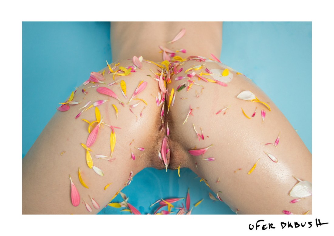
Ofer DabushUntitled (2017)

This is the fourth time I’ve featured Dabush’s work in ten months.

His work emphasizes an astute attention to the interplay between colors, an impeccable sense of composition as a mode of graphic design as well as a stripped bare minimalism as act of visceral confrontation–a confection as intriguing as it is intoxicating.

The struggle that I’m beginning to have with his work, however; is that I see him leaning heavily on experiments other photographers and image makers have already done a lot of heavy lifting on.

We all borrow and remix–there’d be no art or creative expression without those acts. Yet, who Dabush borrows so assiduously from is a bit more problematic.

One of my previous posts was meant to point out that several recent pieces of his might as well be direct visual quotes from Prue Stent. He’s also posted work highly reminiscent of Laurence Philomene’s. The above is of a kind with the predominant thrust of Joanne Leah’s work from the last several years.

I keep thinking of Watson and Crick vs. Rosalind Franklin. If you’re a science nerd, you’ll probably know this story already but Watson and Crick had been researching DNA but were more or less stuck. Someone introduced them to the work of Rosalind Franklin–who had discovered that DNA was arranged in a double helix formation. Watson and Crick realized that the discovery was huge and rushed to publish it, so they could stake their claim to it. It’s only recently that the two thieving bastards are started being treated as such and Franklin is only just beginning to receive her due.

Not saying that Dabush is necessarily stealing. (Correction: he 100% is in the case of Prue Stent, the rest are more nuanced and I believe given the rationale that it’s not stealing if you take something and make it better–I do think he is pushing the things he’s borrowing from other artists in meritorious directions. But it is still somewhat off putting to see a cisgender dude seemingly target the work of up and coming women artists.
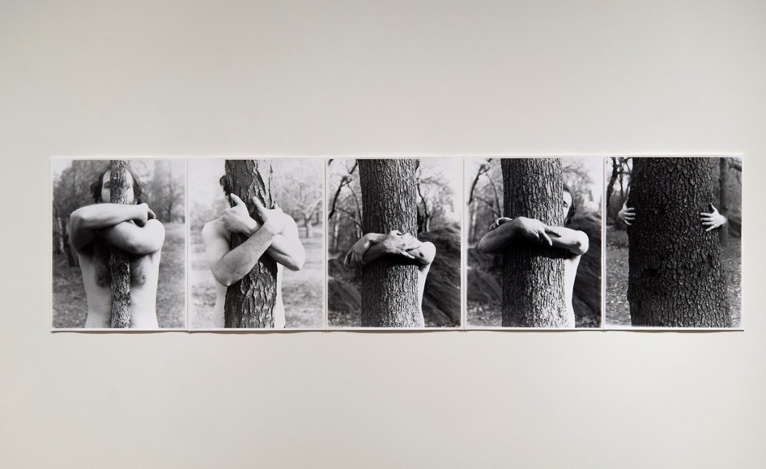
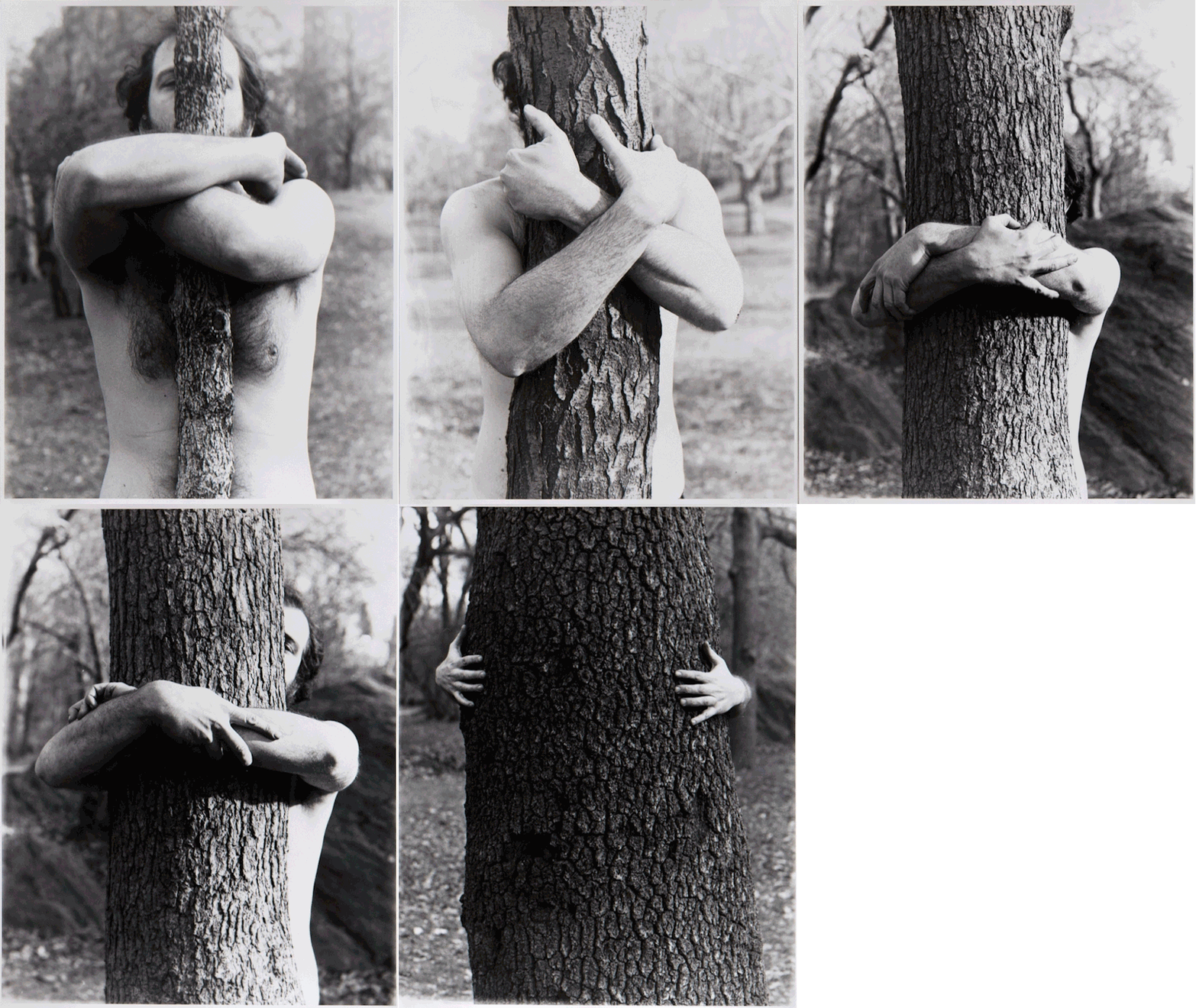
Alan SonfistMyself Becoming One with the Tree (1969)

Me (to myself): this sequence is naturally predisposed to a .gif format.

Myself (to me): you know how to make a a .gif, you lazy ass hussy.

I can’t say the idea of making photo sequences into .gifs was is original. I stole it from this post featuring a .gif of Duane Michals’ 1969 The Human Condition.

But I do sort of take issue with that post because although culture dictates that the .gif is how we are most accustomed to processing photo sequences, the sequences were not originally contextualized as animation. Thus while this is definitely a good idea to get people into work they might not otherwise encounter, you really absolutely must be honest about the intervention upon the work, IMO.

Source unknown – Title unknown (201X)

I always think it’s hilarious when someone like Lars von Trier or Luc Besson are accused of sexual harassment or assault, respectively–and the news is treated as if there’s a real question as to whether the accusations are true. For example: I’ve seen the entire back catalog of both men and given that it’s not actually difficult for me to believe the accusers. (Same with Woody Allen, honestly; like have you ever suffered through one of his preposterous, narcissistic films?)

But there’s also the backlash against these moves toward something more like parity of justice. Reactionaries tend to say things like: so I guess I’ll have to quit being nice to my female co-workers or else I might wind up saddled with harassment chargers. I find that a disingenuous rejoinder–if you are making the remark then you’re both aware that you said something that made someone else uncomfortable and feel that it wasn’t the big deal the other person made it out to be; in other words: you know that you’re behavior can be seen as a problem but you think it’s incumbent upon others to cater to your comfort level even if it means ignoring their own.

The point I’m making and what it has to do with this image is that in the immediate aftermath of #MeToo there were a group of prominent models that wanted to ban photos or images where the photographer/image maker reaches into the frame to touch the model’s body. (The folks in this case were arguing for a de facto ban on such images.)

I was super onboard with the spirit of the law in this case. I mean work by Insuh Yoon and 9mouth are intensely problematic with a lot of the stuff they do.

The letter of the law? Yeah, I’m less on board with that. So much has to do with context and across the board prohibitions tend to be problematic.

I think if you frame things as a photographer or image maker should never touch a model. That’s probably a good rule. However, I can see situations where touching the model is agreed upon. I’m generally very much against touching models in any way shape or form but as I’ve become friends with models and have built a solid foundation with them, things get a little more porous. When I do touch a model it’s usually to brush aside a loose strand of hair or to change the angle/way they are holding something. I’d never be comfortable touching a model as in the above image whether or not my hand was also in the frame.

But that begs the question as to whether or not this is a model. Like if this is two lovers and making images is part of some sort of ritual foreplay, is it wrong for their to exist images like this.

As gross as the trope of photographers and image makers who use their steady stream of lovers as models in their work, I do think there’s likely situations where it’s appropriate for a photographer/image maker to document things in their lives.

I’ve noted before that the bottom frame edge in any photo or image has an intrinsic functionality as a sort of fourth wall. So I think it might be better to first ask whether or not the viewer of the photo/image is a witness or a voyeur? (One of the biggest problems with work that features the photographers hand jutting into the frame is when it equivocates on whether or not the photographer/image maker is seen as a surrogate for the viewer.

The hand here is absolutely a surrogate for the viewer. The composition is voyeuristc and less documentary… except: it’s more complicated than that.

The depth of field is such that both the foreground and background are blurred. (And effect I adore.) In the background, the woman’s face is just enough in focus to determine that her face has taken on blissed out expression but the blurring allows her a degree of anonymity and privacy.

It’s clear she’s reach back to either indicate her anus or most likely to insert a finger to begin to loosen her sphincter for anal penetration. In most cases when a disembodied hand enters the frame if the hand is meant to read as the photographer/image maker’s there’s usually an emphasis on the taboo nature of the touch. It’s a possessive squeeze of a buttock or the spreading of labia, in this case the hand is more about maintaining the explictness of what is being seen while rendering it less graphically illustrative. That taken together with the flash and the ostensible scene of presumably a prelude to coitus–there’s something surprisingly sophisticated about this.

But that’s the other thing: this is one girl’s interpretation. Others’ mileage will almost certainly vary. Which is I suppose my point: I’m not very much in favor of a total ban or total permission. I suspect it’s really more nuanced than that and that given the language and familiarity with social, political and historical context I think the average person can easily learn to identify what’s maybe not ideal but is at least less outstandingly creepy and inappropriate.

Chris BurdenDoorway to Heaven (1973)

Burden is an artist that people know of without really having a clue as to his batshit audacity.

Arguably, the work Burden is best know for is the Urban Light permanent installation at LACMA.

The indelible impact of the work is really the only connective tissue with his early work–for which he is both criminally under-appreciated and simultaneously revered by preeminent tastemakers despite some extremely problematic to unethical pieces.

He carved out a name for himself with early performances at UC-Irvine, including: Five Day Locker Piece (he locked himself in a locker for five straight days), Shoot (a friend shot him in the arm with a .22 caliber rifle) and Trans-Fixed where he himself crucified by having both of his arms nailed to the roof of a VW Beetle.

The picture above is from his Doorway to Heaven performance. In his own words:

At 6 p.m. I stood in the doorway of my studio facing the Venice
boardwalk. A few spectators watched as I pushed two live electric wires
into my chest. The wires crossed and exploded, burning me but saving me
from electrocution.

This was not the first piece to involve the potential of electrocution. In a piece which preceded Shoot, he had himself bolted to the floor and left two live electrical lines spooling into two buckets containing water. The premise of the work was that that no one in the audience would kick them over and by doing so electrocute him.

A documentary titled Burden was made about him several years ago. It’s a good resource if you don’t know much about him and want an engaging introduction. (If you already know about him and his work it’s a little frustrating because while it does collect some great rare reels from performances/interviews, it really is very light on details about his process and they really softball any sort of criticism as far as the more ethical reprehensible aspects of several of his early to late career.

Eleonora Manca – [←] Inventario #659 (2016); [→] Inventario #665 (2016)

Great images have both a history and a prehistory; they are
always a blend of memory and legend, with the result that we never
experience an image directly. Indeed, every great image has an
unfathomable oneiric depth to which the personal past adds special
color. Consequently it is not until late in life that we really revere
an image, when we discover that its roots plunge well beyond the history
that is fixed in our memories. In the realm of absolute imagination, we
remain young late in life. But we must lose our earthly Paradise in
order to actually live in it, to experience it in the reality of its
images, in the absolute sublimation that transcends all passion. A poet
meditating upon the life of a great poet, that is Victor-Emile Michelet
meditating upon the life of Villiers de l’Isle-Adam, wrote: “Alas! we
have to grow old to conquer youth, to free it from its fetters and live
according to its original impulse.”
 
 ―
   Gaston Bachelard, The Poetics of Space
   

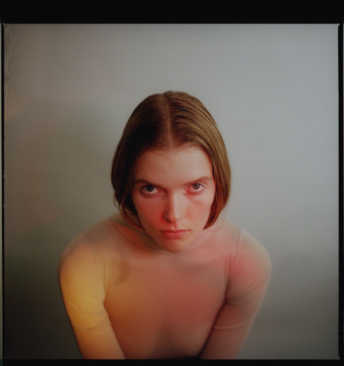
Emmet GreenMailin for REVS magazine (2018)

There’s a great deal I like about this photograph.

The inorganic lighting is reminiscent of Maxime Imbert; except Imbert tends to goose things for stylistic affect whereas Green underscores style with substance.

The Rules of Color Theory ™ instruct: red advances; blue recedes–although there’s not a lot of blue here, there is a mess of red, a pretty decent amount of yellow and then some green to blue tinged hues in the shadow behind and below Mailin’s right shoulder/arm.

The overall perspective is roughly Platon-esque. But whereas Platon uses scale to impose dimensionality (whatever is closer appears bigger than what is further away), this uses color to accomplish a similar mission. Mailin is leaning forward slightly, in a very shallow depth of field. The red pulls her face forward, the yellow on her right shoulder and upper arm gives a solid sense of a mid-ground (and also balances the her blond hair) and the darker colors give the illusion of more space than their really is here.

Interestingly, the positioning of the different colored sources of illumination are such that Mailin is casting multiple shadows. The blue green shadow is cast closest to her right side, then there’s a red shadow and then the yellow shadow–the line of her shoulder separating yellow from green-blue. (Actually the way the shadow appears in relationship to the wall it’s falling upon reminds me more than a little of Laura Pannack’s recent project on what Brexit means for love.)

The other thing I really like about this is the balance between positive space and negative space and how it relates to scale and dimensionality.

(I’m also weirdly interested in the water/oil slick looking mark in the upper left corner–is that on the negative or a mark on the wall. Either way it’s cool AF.)

Feliz PalomaAngyne, Toronto (2007)

Outside of a high school band recital or symphony performance, a French horn is not a commonplace object.

It’s certainly not something you expect to see ostensibly being tooted by a young woman standing nude on her balcony framed against backdrop innervated with faux brutalist high rises and an ocean of murky cloud cover.

The angle of the balcony ledge appears higher on the left than the right. (I do not think this is due to the camera not being level–a similar if not far less successful version of this scenery can be viewed here; it appears as if Angyne has been cut out of another photo and then super imposed over the scenery, honestly; I have no idea why that image is featured in the portfolio while this one is excluded. Anyway, note that in the other photo the balcony ledge is equally askew.)

Strangely the tilt counter-intuitively contributes to the photo. You’d expect your eye to slide from left to right but the magnificence of the sky as well as the hint of the building you can see in the distance just above the rightmost edge of the balcony ledge strangely balances the composition.

Initially, I thought that perhaps there should be some sort of fill light to bring Angyne out of the shadows a little bit. However, on second thought I think that all that needs to have shifted for this to work 120% as is, would be for the horn to be positioned slightly higher so that the shape  of the horn is further emphasized against the backdrop.

wonderlust photoworks in collaboration with @kyotocatAnalog Bath (2018)

Bathrooms are not a great setting for photographs. First, they tend to be small/cramped. Second, they generally have crummy lighting.

This was a lesson I learned the hard way back when I was a film student. Every single project I attempted involved a scene in a bathroom. Without a bathroom with a window–which for those who don’t live in Brooklyn is a truly mythical creature.

But–for once–I have a bathroom with a window. It’s small but it’s south facing and my tub is actually photogenic.

During my last session with Kyotocat, I wanted to try to do something with it, esp. given that I only have this apartment for three more months.

By the time we got to it, the light was all but gone. My instinct was to just ditch the idea and cut things short. I figured that since I had no idea when I’d have someone else to work with, I might as well try.

I metered things and it was super sketchy. The rule of thumb is you can operate an SLR handheld down to roughly 1/30s shutter speed. Anything lower and you’re going to have camera shake. Interestingly, this has to do less with drinking too much caffeine and being jittery. An SLR has a mirror which flips up and out of the way before the shutter opens. The up and down motion of the shutter actually causes more of the shake than your movements.

I’ve all but sworn off SLRs–excepting the Pentax 67ii, I have trouble with fine focusing. By contrast, although rangefingers can be more challenging to find gross focus, fine focusing with them is a breeze for me. But I digress….

With a 35mm range finder I can get down to 1/8 of a second before I start seeing noticeable camera shake. When I first measured the light it was 1/4s (100 ASA, aperture wide open–f4).

It was 1/2s by the time I was ready to expose the first frame. In other words, there’s no way doing this handheld is going to work out.

Again, I thought about scrapping it. Instead I locked my xpan down to my tripod, put the camera strap around my neck, straddled the tub, braced two of the legs against the wall behind me and then treated the camera as if it was my tango partner.

To give you even more context: I’m wearing a long dress and Kyotocat is scootched with her legs halfway up the wall behind me. (She probably looked not unlike the model in this magnificent image by Joanna Szproch.)

I tried to line everything up symmetrically–which sounds much easier than it actually is when you find yourself in such a position.

When I got the slides back I was thrilled with the color. However, the slight angle of the composition bothered me. It wasn’t what I had envisioned compositionally–so I didn’t want to accept it.

I kept circling back to it for some reason. I still can’t decide whether the tilt harms or contributes; I have decided that the symmetrical intention is clear enough as it is and that the angle perhaps doesn’t harm or contribute and instead complicates.

Stepping back from questions of composition: the mood I was chasing is absolutely conveyed in spades. So I’m sending this photo out into the wild as a reminder to others just as much as myself that that adage about crisis being another word for opportunity is correct. This isn’t what I had in mind but I’m pretty sure it’s better than what I originally intended. I’m just not sure how to articulately defend that thesis because it’s more a nascent feeling than any sort of intellectual certainty.