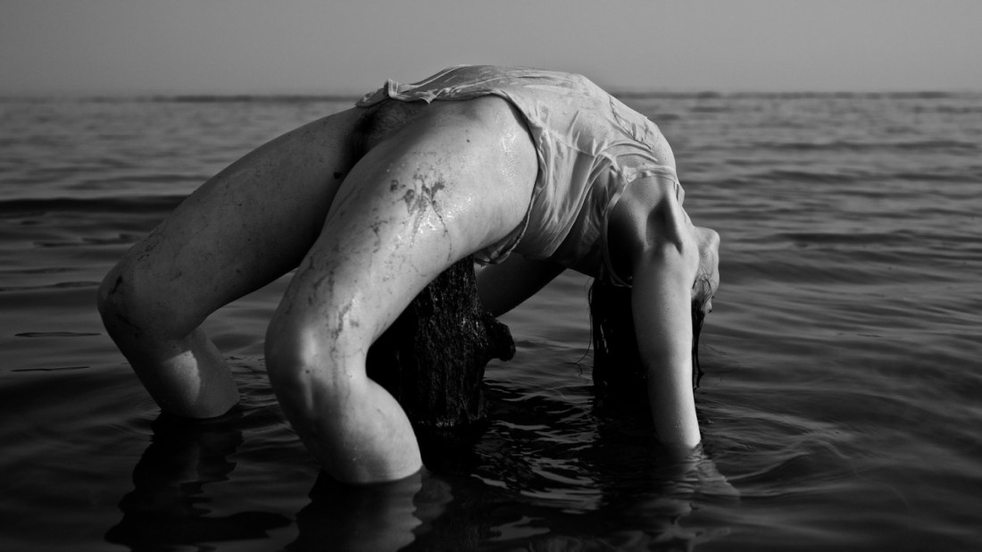
Scott MorganIMG_0283 [1] (2012)

On dry land, even in a studio under canned lighting, this would be a dynamic as fuck pose but orchastrating it so that the pose occurs in approximately a foot of water is inspired.

The problem is that you can’t really appreciate how completely mesmerizing the surface of water can appear when rendered in B&W given this angle.

The better angle would’ve been at roughly the same height as this image, only with the camera angled to see the woman’s face.

Unfortunately that wouldn’t work–since part of what makes this composition work is that the figure is presented off-center and the slanting light capturing glistening skin and taut musculature serves to balance it. Shifting into the better position would black light and in so doing interrupt the carefully positioned horizon (which contributes an oneiric tone) by necessarily including the intersection of water and shoreline from the alternate angle.

Instead, the best course of action would probably have been for the woman to shift 90 degrees clockwise and then to have the camera line up with her face. This would further emphasize the surface of the water and diminish the degree to which the shadows consume her hair, arms and legs.

Although, props to the image maker for having the sense not to make this a full on crotch shot. I know about two hundred lesser image makers who would’ve done exactly that given this pose.

Paola Rojas H. & David PérezVisceral series (2015)

True fact: I was born cross-eyed.

Still being the 70s and with my post-natal health care provided by the US military, I underwent surgery that evens out the eyes by snipping muscles.

The result almost four decades later is that I only truly have binocular vision for a very short time period each day. As my eyes tire, I only use one eye at a time. I tend to prefer my left (non-dominant) eye.

So in addition to having an autism spectrum level aversion to eye contact, most 3D movie spectacle is lost on me.  (Wenders’ Pina Bauch documentary was wonderful because the use is so minimal and used to subtly emphasize depth of field and in Mad Max: Fury Road the 3D contributed an amplified sense of post-apocalyptic setting and therefore rendered the over-the-top color design less obtrusive.)

Visceral‘s palette is two tone: red and blue. As with 3D movies red advances and blue recedes–bestowing an unusual dimensionality to what would otherwise be relatively flat studio work. (I think if you donned 3D glasses, this image would probably even pop a bit.)

@lisakimberly will tell you that I’m a bit of a Rojas detractor. But I should confess a change of heart. Reviewing her work now reveals how she’s pared down her muddled early work, focusing on the more sinister and surreal threads in her work.

On the surface, Visceral hits as a bit of a left turn but the simplicity of it puts a very fine point on her technical chops and finds a way of bridging the gap between fragmentation as literally depicted to a more scientific/poetic/conceptual exploration.

And although I’m not as fond as the rest of Visceral as I am with this image, it’s still exciting work from a talented image maker who appears to be fully coming into her own.