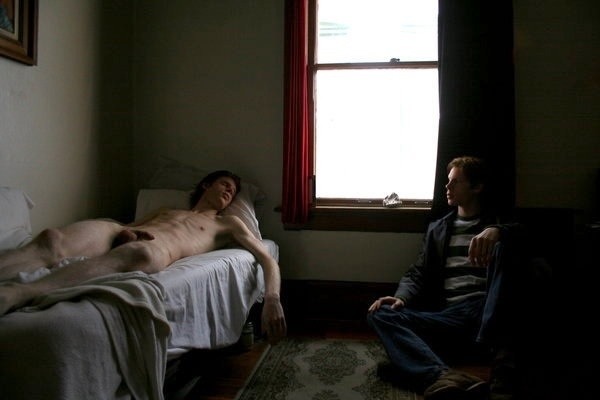
Juan StevensUntitled (2014?)

I feel like I need to say about this upfront that while I think it’s deeply flawed, I do also think it’s a splendid image.

The points of criticism I have are that with the frame of the window in the background and the positioning of the woman, the composition does not suggest extension beyond the frame edges–thus her feet are essentially amputated, relegating her to the position of a signifier for both physical desirability and carnal accessibility. (I also love that the sharpest point of focus is slightly behind her head.)

That being said it is countered somwhat by the backlighting which controls what is concealed vs revealed (identity vs graphic depiction of erogenous zones). That aspect of the image is impressively sensitive and astute.

From the standpoint of visual grammar, this is a mess. The strident blue cast is beyond over the top.

Although that cast does contribute an undeniable tonal immediacy to what is depicted, it’s overly stylized in a way that isn’t justified by the context suggested from the frame.

It’s clearly full day-light beyond the blinds–pro-tip: as much as you think those standard issue Venetian blinds in your suburban cul de sac community can be made to recall Sin City, you’re dead wrong.

But let’s stick with the idea of Sin City for a minute because there’s something worth teasing out there. Sin City hinges on a visual conceit–a world embodying the overly stylized tropes of film noir.

Hollywood studios and backlots allowed filmmakers access to almost unlimited lighting and control over that lighting. So in most B&W movies through the early 1950s, you can tell whether a scene is happening at night or in the daylight just by how it’s shot. It’s not always convincing but it is consistent.

But as people moved towards shooting on location, this shifted. You can’t haul unlimited equipment all over town, obvs.

When I used to teach a crash course in lighting for cinema to undergrads, the question I always got was how to shoot exterior night scenes. And that’s a good question that lacks an adequate answer.

I think when people ask that they mean: how do I shoot something so it looks like Taxi Driver or Blade Runner or Collateral? And the truth is: you don’t shoot something like that because only Scorsese, Ridley Scott and Michael Mann are going to be able to command that kind of perfection in craftand they can’t even pull it off every on every project they complete.

The prevailing idea has been based off the notion that moonlight is blue–it’s not really but it is perceived as such. Thus you had a period of shooting day for night where you shoot something in the middle of the day, underexpose by 2 stops and use a special filter–if you’ve seen an American B movie with exterior night scenes from the 1970s, you’ll know this because while it’s clear that they mean for you to think it’s night, it’s all very heavy handed.

I’m pretty sure it started on TV but the first time I remember seeing it was in an early Guillermo del Toro movie where a lot of bright lights were gelled blue and the scene was flooded with light to suggest night.

Film stocks and sensors have improved dramatically since the early 1990s, though. The issue is that with the move toward digital and the fact that digital formate fundamentally does not have the dynamic range to render vivid much less true black, the blue as indicator for night has become more or less codified.

I’m willing to give this a partial pass, however. I think that you could actually selectively darken the window so that the bed linens are brighter. Point is: that as a sketch this is top notch. I see high end fashion shit that costs thousands of dollars that doesn’t have a tenth of the diamond-in-the-rough insight as this. I just think that a great idea deserves to be revisited until you do the idea justice in execution.

As far as what I told those beginning filmmakers. How important is it that the viewer knows that it’s night. Is that all that matters? If so, then you can absolutely steal a page from Chantal Ackerman’s eternally underappreciated Jeanne Dielman, 23 quai du Commerce, Bruxelles–where mother and sun go walking every day after dinner in the pitch dark night. Or, with the improvements in film stocks you can go murky available light like Kiarostami’s Where Is the Friend’s House? Whereas both David Fincher and Paul Thomas Anderson deploy tactics similar to noir to different effect–the former is all about including practicals in the frame to suggest the source of the light and then using that a means of distracting from the staged lighting that is meticulously pieced together; the latter uses only just enough light to carve the scene out from shadows. (You won’t ever get quite the same effect, but it’s absolutely possible to improvise something in keeping with the principles guiding both of their decisions in your own work.)

Also, although I personally loathe his aesthetic, Hype Williams is someone with nearly endless versatility in his approach to low-light shooting.

Prue StentUntitled from Four (2015)

I’m enormously fond of Stent’s work; although–I have to admit–the image above surprises me.

I think of Stent as working exclusively in color. Almost by definition, fine art photographers tend to work in B&W or color, rarely both.

Perhaps that’s not an entirely fair characterization: most fine art photographers make a name for themselves as a color photographer (i.e. William Eggleston) or B&W (i.e. Mark Steinmetz). [If Eggleston has worked in B&W, I haven’t seen any of it. Steinmetz does have color work but I tend to agree with him that it’s nowhere near as accomplished as his B&W work. The only photographer I can think of who I’d be hard pressed to pick just B&W or just color from their oeuvre is Jeff Wall–and I might end up picking the B&W with him, actually.]

That’s why Stent working in B&W surprises me: one would expect the results to be more of a curiosity; whereas her B&W tends to be audacious in it’s formal innovation as well as incisive in scope and execution.

What’s even more impressive is that–unless I’m mistaken–Stent is working with digital exclusively. I took the above image and parsed it according to Ansel Adams’ Zone System (much as I did with this image by Davide Rossi).

The way she’s using light and shadow to create depth and dimension is straight out of classical oil painting. (For example: I’ve only been a photographer for eleven years now. It’s just within the last year that I’ve begun to understand the interplay between light, shadows and depth of field used in combination to create the illusion of dimensionality in otherwise 2D representational spaces. In other words: Prue Stent is actually a good bit more brilliant than I initially assumed.)

Marat SafinCamapa (2017)

This image has been shuffled around in queue for more than a month.

Initially, I wanted to focus on Safin’s knack for consistently presenting the women with whom he works–regardless of whether or not they acknowledge the camera/viewer–as reveling (for lack of a better word) in their own femininity; since, you know: that is the one consistent piece in his work.

This rapidly degenerated into a morass of attempting to balance an unbalance-able equation of problematics to virtue, however.

Next, I figured it was damn time I called out Brooke Shaden again–seriously her work is fucking inexcusably god awful. (The connective tissue being how both use over-the-top post-process intervention to justify their images’ existence. On the one hand, Shaden guilelessly embraces the Lynchian conflation of the grammar of surreality with the grammar of the oneiric–not that Lynch is inherently bad, it would just be better if more folks considered his work as a cautionary tale warning against any sort of casual and/or unconsidered aping of his style. Safin’s manipulation are similarly egregious but they integrate holistically with the images and never insist on themselves.)

For a while, I had it following this image in an effort to point out backlighting and then present something backlit and subsequently drawing attention to an aspect other than the backlighting. (A good teacher–and what else is a curator?–makes efforts to build occasions into the lessons where the student gets to feel smart but by paying attention/staying engaged.)

Yet… all the time the only thing I want to talk about is the fundamental Russian-ness of his work.

I mention this all the time but I’ve yet to define it in any sort of non-abstracted fashion. I think I may have found a way to do it–not now, but maybe at some point down the road.

See: looking at this image, I’m reminded of Igor Mukhin’s color work with the Leica AG M9 (an absolutely fabulous camera if you can stomach the astonishing cost)–specifically the vivid blacks it renders.

Safin is using a Nikon d700 with a 35mm f1.4g lens–as far as I can tell it’s the lens he’s used for most of the stuff he’s posted in the last year or so.

A good 35mm lens is an interesting beast. It’s wide angle without adding too much unattractive distortion–the wider the lens for example the more unflattering it is to say the dimensionality of the human face, for example.

Yes: Safin is not using it on anywhere near the level of precision and care as Mukhin; but credit is due for managing what he does with a camera that’s a fraction of the cost as Mukhin’s top of the top of the line kit.

An idea occurred to me in the process of unpacking all the above: I began to wonder about respective influences of these two artists.

All I’ve managed to find regarding Mukhin is that he studied with Alexander Lapin and that he cites Alexander Rodchenko and Lou Reed as influences.

Rodchenko is actually super useful in getting at what I mean when I point to essential Russian-ness of a photo or image. (It occurs to me that it might be interesting to create an infographic wherein the historical influence of Rodchenko is mapped.)

Lou Reed is more interesting. I dig The Velvet Underground just as much as the next arty fucker. And I’ve heard literally all the correctives about what a heinous human being he was. (Anyone who worked at Film Forum in the mid-to-late aughts can tell you stories that will strip paint off walls.)

But, as far as I know, Reed believed rock and roll could save the mortal soul. (I think this is one reason his work appeals to me so very much; I would not be here now if it weren’t for music, in general–but specifical Rock and Roll.)

I found the mention of the influence of Rodchenko and Reed in a blurb about Mukhin penned by A. D. Coleman. I don’t agree with all the author’s conclusions; namely: I’d bet a tidy sum on the fact that Mukhin was intimately familiar with Robert Frank before he began documenting youth culture in the Soviet Union in the 1980s, the notion that Mukhin is somehow inherently more conservative for not being familiar with/embracing the work of someone like William Klein is disingenuous, a bad faith engagement with Mukhin’s work and prejudices America’s role in the advancement of the photographic medium in a fashion that’s a little too imperialistic to be allowed to stand.

Interestingly–and I promise I’m working my way back ‘round to Safin, Coleman does at least imply the dual role of culture and individual taste in the creation of work. To the extent that Mukhin has lived in Russia all his life, his life has been impacted by state censorship then and now. I’m not entirely sure that his gravitation towards youth culture and it’s stock and trade in activities, practices and documents banned by the state was entirely innocent. (We move towards what moves us–so my thought is that Mukhin either already had access to western work most others wouldn’t have seen or he gained access to them through this path.)

But the question of how freely information flows and how it impacts questions of artistic influence is something to consider–all the more in the light of Mukhin vs. Safin; or: pre-Peristroka state censorship vs post-Soviet surgical censorship.

There’s a very fine line between doing the work and feeding the work. A better way to say it is that Andrei Tarkovsky always claimed that he was a better artist for having to navigate around concerns of state censorship–in other words: being able to convey his premise in both the shape, form and manner he intended while not running afoul of anyone.

I feel like as long as you are doing your own work and feeding the doing by critically, appreciatively and contemplatively looking at other people’s work–that’s a good place to be. The problem is that with so much information out there, part of the work becomes feeding the work and it’s dangerous to fall into that trap because that’s where it’s very easy to began aping the work of others.

And at the bottom of it I think that’s what I mean by essential Russian-ness the attempt to balance scarcity with abundance. Because speaking of mapping influence–an interesting project (and if anyone does this and does a good job I will actually post your work here): would be to map Marat Safin’s influences because I can’t think of another image maker whose work is such a who’s who of paen to virtually all the top notch internet famous photographers and image makers active today.

Diana Bodea#1 The Shadow from Touched by light series (2008)

Looking at this my first response isn’t to pedantically point out that it features backlighting.

As I am sitting here struggling to wrap my head around how to write about it, I am uncertain where else I might start.

See the problem isn’t noticing it’s backlit; the problem is focusing on the backlighting emphasizes technique over a more organic handling of the unity between concept and execution.

And what I want to talk about has more to do with the dynamics between the technical and the conceptual in this photograph.

Two days ago, Amandine spent a lovely day sharing time and space as well as practice our respective crafts–me trying to capture the interplay between color and fog along the coast, her drawing and painting dunes, people walking in the distance and the subtly variegated beach grasses.

Driving back we were talking about music. She asked me what I thought of Joanna Newsom. I said I had liked The Milk Eyed Mender. Then back-tracked that I was only really familiar enough with the track Sadie–which I adore.

My ex hated both Björk and Newsom because of their eccentric vocalizations. I felt the same way about the former–at least initially (she’s subsequently become one of my all-time favorite artists) but I wasn’t familiar enough with Newsom, so I sort of missed her work.

Amandine was telling me about how amazing she was and how I really should check her out. But she offered a caveat that one of her favorite of Newsom’s songs contains a mistake.

See the song Emily contains the following lyrics:

That the meteorite is a source of the light
And the meteor’s just what we see
And the meteoroid is a stone that’s devoid of the fire that propelled it to thee

And the meteorite’s just what causes the light
And the meteor’s how it’s perceived
And the meteoroid’s a bone thrown from the void
That lies quiet and offering to thee

She has it backwards, Amandine insisted. I mean it’s poetic and beautiful and brilliant but it’s the other way around, really.

I don’t know enough about it to comment but I do know–subsequently having listened to the album it’s on several times–it doesn’t matter, I don’t think.

Like maybe she created the lyrics based on being told it the wrong way around–which contributes to the meaning of the song, actually. Or it’s a John Donne-esque metaphysical metaphor of the soul–which again, contributes to the song. Or, it’s a rejection of science–again, something that fits with the song.

Whether it’s right or wrong, it works. And that’s kind of a rare and wonderful thing.

But it occurs to me that backlighting is the wrong thing to focus on in the photo about for the same reason it’s a mistake to get caught up in whether the rhyme about the difference between meteors and meteorites is right or wrong.

When I used to teach lighting workshops I would show kids how to set up a quick and dirty three point lighting setup. I’d explain that this is the key light, this is the fill light and this is the back/rim light. I’d then show them what each looked like independent of the others.

I’d then turn all the lights back on and explain the rationale behind this setup–it’s a stylization of how we experience light in the world around us. Like: if I’m standing in a field facing a camera and the lighting is behind the sun is behind the camera relative to my position–unless it’s straight on (a poor strategy if you’re trying for an aesthetically pleasing image because the light is too bright and people naturally squint when the light is in their eyes), then there’s one side that is incrementally brighter than the other. So natural light presents with a key and a fill light.

But light also falls on the ground behind where I am standing in said field. Yet, that light is like the fill light except it reflects enough light back towards the camera that because the body separates the light reflecting off the ground from the camera, it contributes a dimensionality to my body.

The point is–what we see we see only in relation to the way light interacts with it. The only source of light in this is presumably the window behind the shower curtain and the subject.

It’s interesting that backlighting combined with other lighting contributes dimensionality–yet we normally think of backlighting in terms of silhouetting. There’s a surprising amount of dimensionality in this. That’s partly due to the one point perspective imposed by the tile.

But the visibility of the mirror and the reflection of the hand, as well as the white sink gives a stark solidity to the image.

It’s a mistake to say: this is backlit and then just leave it at that because it’s how it’s backlit (how this is used formally and contextually to foster a sense of dynamic unity to between generally opposing elements).

An exquisitely refined work. Impressive and thoroughly unforgettable.

Hannes Caspar* (2013)

I’m always yammering on about the role color plays in lens based image making.

And I’m nowhere near a place where I can coherently articulate my thoughts on the subject but in general when we’re talking about fine art photography and the question of the purpose of color, the conversation will (rightly, in my mind) revolve around masters such as: William Eggleston, Harry Gruyaert, Stephen Shore, Joel Sternfeld and Jeff Wall.

If we are to point to unifying themes with regard to the work of these artists and what it tells us about the nature of color in image making, I think there are two principles that bear mentioning:

  1. Color in a fine art image is never the point of the image but is indispensible in rendering the point of the image with unequivocal clarity.
  2. A heightened sensitivity to the interplay between conceptual foundations of the work, composition and form.

A better way of putting it would the pictures would absolutely work whether they were in color or black and white but the color is what ‘activates’ them.

There aren’t many people producing work today that I feel are making work that adheres to these criteria. (I’ll consider @thebodyasconduit as an exception, to this point.)

Conversely, there are artists doing visionary things with color that insist upon color as a the singular unifying point. (In other words: the desaturated work would realize a diminished impact.)

For example: @pru-e‘s work would be almost banal sans color. And although she doesn’t fit the above formula for color in fine art image making, she’s right up there with Eggleston when it comes to incomparably brilliant practitioners of color work.

But as much as I dig Ms. Stent’s work, her strobe heavy, co-option of a glossy fashion aesthetic, isn’t something that I can apply to my own work.

Hannes Caspar–on the other hand–is more applicable. And yes, I think he absolutely needs to be mentioned when the discussion turns to photographers doing radical things with color in their work.

In the case of the above, you have the vivid red, with no bleed whatsoever. (This effect is absolutely assisted by the off-blue color of the painted, scuff mottled floor planks. There’s an intense dynamic range but the mid-tones are almost entirely reserved for the skin and the wall/radiator in the background. Given such dynamic range, the skin tone is exquisitely perfect in its rendering.

In tone and form, this image actually reminds me of an image by the enigmatic Pole STOTYM.

There’s the accepted wisdom that B&W images, through their abstraction, allow us to bear witness to the foreign in the familiar. The historical struggle of color lens based images makers–if you accept my presumptions–is to render the mundane, somehow both mundane and transcendent at the same moment.

It feels like both Stent and Caspar are in their respective ways, calling bullshit on the notion that it has to be both or neither.

Patricio SuarezUntitled (2013)

I’ve posted about Suarez before and I remain just as if not maybe a bit more enamored with his work now.

Spending more time with the work I’ve discovered a conceptual reflexiveness between his tendency to focus on picturesque interiors and a concern for a psychological interiority.

In some photographs the subject acknowledges the camera but it’s rare to feel that the gaze is directed at any audience. Instead, it feels more like the audience is intended to serve as a mirror.

I also can’t help but note how this image feels different than the rest of Suarez’s work. Whereas the rest of the work features mostly woman, in darkened, oneric locations, all of it feels very different than the way so many of the image makers who are producing quasi-narrative work that is a hybrid of portraiture and documentary, there tends to be a feeling of loneliness to it.

I don’t feel that with the rest of the work but I do very strongly with this image. A tenacious melancholia. The image offers no clue as to what might be the cause of that feeling. But it does strike me not that the feeling is incidental so much as a closely held secret that wants to be told but is not sure the telling won’t just bring about more harm.

Truly lovely.

Source unknown – Title unknown (2012?)

Google image search and Tin Eye are both dead ends trying to determine authorship with the above.

A shame because it’s exquisite. (In my experience you can have the best gear in the world, meter seventeen different points and do the math to determine the perfect exposure. But in the end what allows an image to turn out like this has more to do with trusting the unconscious instinct the demands you stop down and you don’t question you just rotate the aperture dial to the appropriate setting and trigger the shutter.)

Also, I’m certain this is riffing off Michelangelo’s The Creation of Adam.

Lula HyersUntitled (2014)

Were you to take the current bumper crop of twenty-something lifestyle/fashion image makers, write their names on slips of paper, fold up those slips and place them into a hat, shake the hat about and pull out a name at random, any name would share some obvious parallel with Hyers’ work.

I am certain that Hyers would be at least passingly familiar with the large majority of names in that hat. She probably even considers many of them influences. The thing is: her work is also frequently better than the work of at least ¾ of those names that might emerge from the hat.

A bold statement: yes; but if you stop and look at her work–I mean engage with it–you can’t dispute the assertion. Add to that, Hyer’s still being a teenager and Jesus Harold and Maude Fucking Christ on Christmas her aptitude is freaking unbelievable.

And while I am of a mind that she’s better than the majority of her peers/influences, what she does better than just about anyone is the way she presents bodies and the sometimes related sometimes unrelated sexual expression of bodies as almost an afterthought–allowing her broad latitude in presented the truth of those in her life without misrepresenting the complexity of the moments she captures or relying on knee jerk shock value.

It’s surprisingly mature work for someone so young. And although comparisons to those aforementioned twenty-something lifestyle photographers are astute (along with correlations to Goldin and McGinley), I feel there’s a closer relationship with the frenzied urge to document life exemplified by one of my favorite photographers Igor Mukhin.

What I see matters little next to  than simple truth that this work is breathtaking; I cannot wait to see where it goes from here.

Patricija StepanovicUntitled from Skin series (2011)

As far as creativity goes, I feel as if there’s the person who is unflappably driven. Who sets out in one direction and plows ahead without looking back. The instinct motivating such single-mindedness doesn’t necessarily make someone a good image maker. But it does seem to improve the odds.

Stepanovic is decidedly not one of those single-minded obsessives. She’s more a chameleon–shifting styles and genres on a dime. (The only consistent facet of her work seems to be her favoring the milky texture that comes from soft-focus and underexposure.

I won’t go as far as to say I dislike her work–there’s only a handful of folks whose work I’ll openly call out as bad–but it’s largely uneven, obviously derivative (ex. Stepanovic | Arcila) and maybe even a little sad.

I say sad because the above image was one of her earlier efforts. It demonstrates an eye that although not strong has a certain precociousness for the tenuousness of an ephemeral moment. It’s also extremely creative. Usually blinds like these–besides being annoying–are employed towards a more film noir reminiscent end. This tosses the usual playbook and instead uses them as an innovative backdrop. (This same creativity manifests in much of the rest of the work, only more often than not it skews towards executing something that’s already been done and the result achieves strikingly less effect the the original.)

I’m not interested in self-conscious homage to artistic heroes. But I am interested in Stepanovic’s personal vision. The few times it slips through it outshines the rest of the work like the midday sun next to a candle. Thus, I know it’s in there somewhere. It’s just not all that present in the work. And that’s a crying shame.

Robert Weissner Bree Addams (2013)

As it is, the framing functions. The desk more or less echoes Ms. Addams knees; the window edge starts a wee bit shy of the first vertical third but the vertical blinds and radiant light not only accentuate her form it contributes an implicit leftward momentum to the image.

Her weight is supported by her right arm and foot–her left leg shifts behind the other at the knee, her left hand is extended only for the sake of balance. It’s interesting because this posture suggests between her arms and torso a form close enough to round up to an equilateral triangle–drawing attention to her breasts (exquisitely semi-silhouetted behind sheer fabric), reiterating the shape of her pubic hair. .

With only this image to go on, I’d be pretty excited about digging in to the image maker’s other work. Alas, I think the praise here needs to go to Ms. Addams.

Don’t get me wrong, Weissner isn’t half-bad. He’s got enough technical chops to give his work a faux art sheen. The trouble is: he seems to see himself as a Dan Smith when his work is inline with the ‘art’ as a pretext for sating voyeurism of someone like Fox Photo-Art.

Credit where it’s due: technical acumen is nothing to sneeze at and this is one image is lovely and I certainly prefer Weissner to Fox Photo-Art’s rubbish. Unfortunately, there is so little distinguishing their work from each other or the scads of other female-nudes-all-day-every-day-because-I-own-a-dSLR-and-can-afford-to-hire-beautiful-models that I just have to shake my head and close another tab.