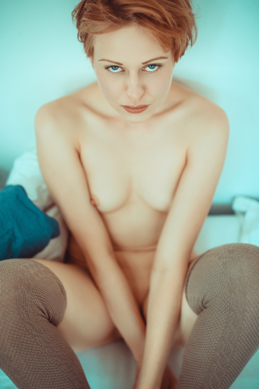
Pixoom PhotographieTitle Unknown (2015)

If you’ve followed this blog for any time, you are most likely painfully aware of my aversion to portrait orientation in lens based image making.

I refer to it–with profound contempt–as #skinnyframebullshit.

It’s a term I use a lot and I’m always linking to the same article I wrote more than two years ago. So–with the notion in mind that someone seeking to determine counterfeit from legitimate currency always studies the real item instead of the fake–it occurred to me that being as this image is not only stunningly gorgeous but also in no way shape or form #skinnyframebullshit, that it might be time for me to create a positive reference instead of a negative one.

It’s maybe not the best place to start but one of the things that doesn’t directly relate to my hatred for portrait orientation but does inform it is the increasing ubiquity of digital imaging technology. (Again, if you’ve followed me for any time you’ll know that I am obsessively anal about differentiating between digital and analog processes. Yes, they are built off the same chassis but their respective functions are vastly different in practice.)

By now, you all are familiar with shitty Youtube videos wherein due to the shape of and interface of our smart phones you get a preponderance of video with vertical frames. It’s ugly, sloppy and I would maintain a poor reflection of the author’s basic intelligence.

I’ve been pretty active in Internet photo communities since 2006. Back then, folks making work were basing it off the history of lens based image making up to that point. Yeah, you had vertical oriented images but whether or not there was a reason for them to be vertical (i.e. an internally consistent compositional logic) they were the distinct minority.

Of that minority, a plurality featured this sort of self-conscious flipping the physical camera body on its side makes me look more like a photographer. When you do it, you feel a little rebellious.

Now, if you’re a person shooting on film, then you drop what you shot at your lab (or better yet, process yourself); and then you pop your slides or negs down on a light table and have a look-see. The thing you note immediately is that your vertically oriented frames break the flow of your reading your slides. You end up having to flip the filmstrip, contact sheets or whatever. Invariably, this causes you to favor either the landscape or portrait images due to the fact that it’s easier to read images that are in line with however you have the page currently oriented.

I learned quickly that there really needs to be a compelling reason for a shot to be vertically oriented. And with my reluctance to deal with vertical oriented shots, I realized that almost categorically, image makers opt for vertical orientation as a compositional shortcut. Like: oh, hey…what I want to shoot won’t fit this way, I’ll just flip the camera and that’ll fix it. Makes sense. Except one small thing and I’ll state it as a truism–you will always get a better shot by moving your body in relationship to the object or by using a different focal length lens. It’s just a fact.

And if you apply that to the history of photography, it’s interesting to note that most images with vertical orientation are–wouldn’t you know it–within the architectural genre. Why might that be? Well, in relationship to an edifice there are few options with regard to moving in order to achieve the framing you want.

Thus, I maintain rather rigidly that in general, if you aren’t shooting architecture, you can go ahead and shoot that vertical but then maybe move around and shoot the same thing landscape from different positions. I’m confident that all things being equal, you’re going to find you prefer the landscape frames.

One of the first things a beginning photography student hears about is the sacred rule of thirds. As a rule of thumb, it serves–and ensures photography instructors cut down substantially on the godawful wawker-jawed, indecipherable images. But like any rule, it’s nothing more than a general guideline that you really have to understand before you’re allowed to start ignoring it as you please.

Yes, the rule of thirds is an abstraction of the Golden Ratio. And with the tendency to frame the subject at one vertical third line and then leave a great deal of negative space to the left or the right, it does produce appealing images. (Note: how images that are perfectly balanced within the framework of the rule of thirds tend to have the effect of leaving you confused about what you’re supposed to be looking at.)

My theory is that with vertical compositions, the rule of thirds is less useful as a guideline; the expectation of the eye is something more in-line with the golden ratio.

There is only one horizontal line in the above image–dividing the frame top-to-bottom roughly 60/40. Katjuschenka is ever so slightly off-center (consider the mid-line of her face)–balanced expertly by her right knee opening what would’ve otherwise been a repetition of the angle of her arms.

There’s essentially only two colors in the frame–red (hair, skin tone) and blue. Everything falls in line with those tonal hues. Focus is sharpest on her eyes. (And as a dizzying bonus, check out the texture in her stockings. Dayum.)

A creepier photographer would’ve focused on the nipple or at least increased the depth of field so that it would remain in focus. But the decision to do that makes this image about the color and framing. The eye contact is neither coy nor pouting. It’s not flirtatious but it does convey a sense of knowing a great deal that the viewer does not.

This image is breathtakingly exquisite. If you’ve got to go vertical, this is the baseline. Either make it clear that the composition was the only thing that would’ve communicated the magic of that moment or go home with your weak ass #skinnyframebullshit.

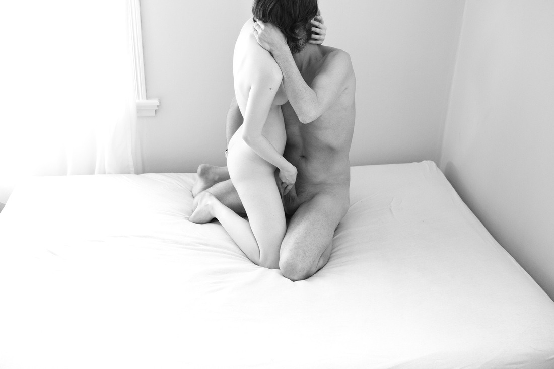
René GroebliUntitled from The Eye of Love series (1953)

Lately, I’ve been pondering darkness.

I know, I know… sounds like rejected Celtic Frost
lyrics; but seriously, another of the many unsavory side effects of the
shift from photography/cinematography to digital imaging is the
redefinition of how low-light scenes are represented.

Overlooking
the immense differences between analog and digital, Hollywood has
established an expectation for how things look at night that whether one
realizes it or not, is irreducibly stylized.

I
get asked all the time by folks to recommend cameras to fit a litany of
expectations which almost always center on a low price point and a
prodigious ability to handle low-light situations. People who aren’t
steeped in the technology seem to expect that there’s a camera out there
that’ll render your concert shots and exterior street at night scenes
as if they were Blade Runner
deleted scenes (overlooking that Blade Runner had arguably the best
production design in the history of cinema combined with the fact that
it was shot by Jordan Cronenweth, i.e. one of the all-time great cinematographers.

Working in low light is a challenge. Unless you’re Stanley Kubrick–who famously adapted f0.7 lenses made by Zeiss for NASA to shoot scenes in Barry Lyndon
with only candles for illumination–the recourse was to just let things
go too dark (I’m thinking here of the all but illegible evening walks
in Akerman’s otherwise masterful Jeanne Dielman, 23 Quai du Commerce, 1080 Bruxelles and the most naturalistic representation of low-light cinematography Kiarostami’s–arguably the greatest living filmmaker–Where is the Friend’s Home?)

At
a certain point, certain (largely European) filmmakers started flooding
night scenes with ambient blue light (likely a way of rendering the day-for-night tradition more visually palatable)–I first remember noticing this in del Toro’s Mimic but Besson’s La Femme Nikita
preceded that and as anyone who has followed the latter’s career, you
know he’s incapable of formulating an original idea (although, at least
he tends to steal from the best).

Then along comes digital with
it’s fundamentally less shallow depth of field which in combination with
the theoretical impossibility of it ever rendering even half the
dynamic range of black that the human eye can read. The tendency has
been to invert things and to, when working digitally, treat white as you
would black when shooting analog. (Orange is the New Black does this super obviously.)

Then
there’s also color grading to consider. Toward the end of the analog
era, what came out of the camera was not even close to what made it onto
the screen. Lighting was modified with magic windows, color graded,
etc.

That’s still done today. But that thing that’s different is
that digital cinematographers aim for an in camera image that is
essentially flat. When you export it, it looks bleached–like one of
those Tumblr’s that adds a soft grunge tag to everything. Subsequently,
the footage is graded. Contrast is add, color is resaturated.

Anyway,
I was thinking what I was going to say about this image last night and
even though I swore I wasn’t going to keep watching it after last
seasons bullshit finale, I was watching the 3rd season premiere of NBC’s
Hannibal–a show that I consider frequently reprehensible but features the best production design
in the history of television. (The digital cinematography is also
astute even if I strenuously disagree on a philosophical level with the
excess with which it resorts to glossy close-up inserts; I’m more in
line with Aaron Morton’s work on Orphan Black
and his precocious consistency with regard to scale and the resulting
compellingly believable three dimensionality of space in his scenes.)

While
I think the artifice from which the darkness in Hannibal’s visuals
emerge befits the ostentatious amorality the show goes to such great
length to foster, I can’t help but wonder what it’d be like if it were
as willing to go real and truly dark like the above image instead of
amending its tenebrism as a post-production filter.

Ida OppenPale Afternoon from The Wicked Innocent series (201X)

Ida Oppen is an early twenty-something freelance image maker hailing from the suburbs of Oslo.

Her work transcends the perfunctory reproaches I customarily present. Honestly, I am profoundly impressed with her sophisticated compositions, precocious attention to scale and use of color.

Thus, the bifurcation into two mutually exclusive bodies of work–the editorial/‘fine art’ and the sexually explicit–really fucking baffles me.

From the standpoint of commerical viability, this is understandable: ‘professional’ clients are unlikely to appreciate graphic presentations of genitalia, intercourse and sexual effluvia.

What fails to track is the degree to which Oppen’s approach varies between disparate oeuvres.

The painstaking craft of the editorial work loosens in favor of a grittier immediacy. Not that craft is by any means lacking–pay attention to the precision of the framing (especially in the multiple image assemblages reminiscent of analog contact sheets), the manufactured multiple exposures and the–admittedly less astute–digital chromatic interventions.

Oppen admits this is what she’s after in her artist’s statement for The Wicked Innocent series. And there really isn’t much room for argument. She knows what she’s doing as well as how it is going to be read by an audience.

But as a member of that ostensible audience I would like to be pushed outside of my comfort zone and confronted a little more directly. Honestly, I mean that less as a criticism and more as a misguided compliment because although I know Oppen does not conceptualize this work as pornography, it offers me everything I look for–but rarely find–there. It’s partly that there seems to be a great deal of overlap between the kinds of sex with which Oppen is preoccupied and my own interests. But that is only intensified by the fact that vulnerability and trust factor so prominently into the process of making the images.

Viewing the work there is an unshakeable sense that the openness is equally if not more arousing than that which is explicitly depicted; the feeling that I am seeing what I am seeing not because there’s any expectation that it will turn me on but that it is a record of what gets someone else overwhelmingly aroused.