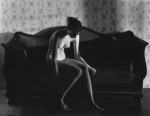
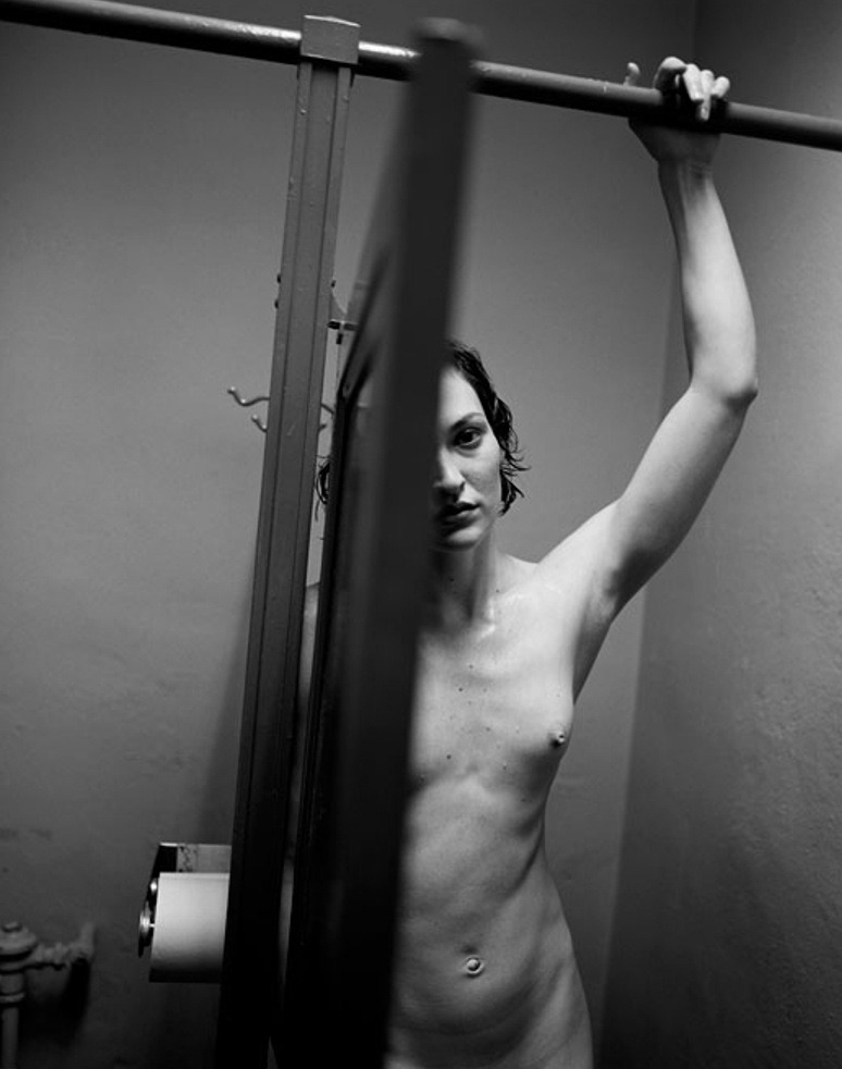
Ken SchlesUntitled from Night Walk series (198X)

This is a fan-fucking-tastic photo for dozen of reasons.The eye scans the frame left to right, following the crossbar over the stall doors. The stall divider plunges sharply, emphasizing the door as obstruction–this is actually crucial to the legibility of the scene (for example: if the door was open a bit wider it would seem that the woman was looking either at the back of the door or along the back of the door toward the camera, drawing attention away from her and towards the scene space between her and the camera; any less of the stall door and it wouldn’t read as easily as a stall door, just as some sort of shadowy occlusions).

The Dutch tilt imposes a dimensionality that a perfectly level and balanced frame wouldn’t have permitted. Also, it forces the viewer to do some of the work w/r/t organizing shapes. Note: how the stall divider, out of focus stall door edge in the foreground and the back corner divide up the picture plane; how this is also echoed with the horizontals, the upper stall cross bar and the top corner of the door.

All that is further augmented by the use of light. There’s a truncation of mid-tones… perhaps two zones mostly centered on the walls, her arm hooked over the cross bar and her left breast. The nuance in tone in the highlights and shadows is crazy. A less talented photographer would’ve taken a stylistic approach, much how a painter layers on paint to create the illusion of three-dimensional space in a two-dimensional representation.

Schles goes a different route. light falling like a drape over the scene. It’s not just more realistic, it adds a numinous immediacy to the scene.

The balance between light and dark is extremely astute, also. I can’t think of another image maker–okay, maybe Uta Barth… but I digress who could so aggressively chop of their frame up into three distinct sectors, while keeping everything organically interrelated and holistic. In the parlance of the Corleone’s: the composition is the offer and the lighting is what renders the offer impossible to refuse.

Not white of the toilet paper, adjacent to the darkest portion of the frame, the porcelain white of the left side of the woman’s face and how despite how the rivulet of deep black that is the door edge in the foreground, the blur caused by it being too close to the lens to allow for sharp focus, creates a similar burnt in sort of hazing similar to the transition from the toilet paper to the aforementioned lower shadowed blot. The way the shadow from her hand over the upper crossbar bleeds outward, not merely in how it would be case but also tying the triangle in the upper right corner seamlessly back into the whole.

Then there’s her inscrutable expression, and why the fuck is she naked and drenched–is her hair wet and dripping, is she sweating? The answer remains eternally unclear.

Danny LaneJohn Yuyi for Purple Magazine  (2017)

Perhaps the primary reason I’m less than fond of studio/studio adjacent work is that the point is–to greater or lesser extent–emphasizing decontextualization.

It’s sexy knickers on a model in a catalog vs you finally trying them on in front of a full length mirror.

If you’re going to make studio work, it’s a good idea to embrace the decontextualization and to show the viewer something about why the absence of more context was a necessary precondition of the work.

The above photograph succeeds marvelously at this task. It’s simple. A beautiful model, in front of a plain white wall. Light left to right, after the Baroque fashion. The pose is unusual, dynamic–fashionable in its artifice, but open, confident.

It’s an astute use of space–the balance between the positive space of the Yuyi’s body/posture vs the wall and shadows cast on the wall.

Diana Bodea#1 The Shadow from Touched by light series (2008)

Looking at this my first response isn’t to pedantically point out that it features backlighting.

As I am sitting here struggling to wrap my head around how to write about it, I am uncertain where else I might start.

See the problem isn’t noticing it’s backlit; the problem is focusing on the backlighting emphasizes technique over a more organic handling of the unity between concept and execution.

And what I want to talk about has more to do with the dynamics between the technical and the conceptual in this photograph.

Two days ago, Amandine spent a lovely day sharing time and space as well as practice our respective crafts–me trying to capture the interplay between color and fog along the coast, her drawing and painting dunes, people walking in the distance and the subtly variegated beach grasses.

Driving back we were talking about music. She asked me what I thought of Joanna Newsom. I said I had liked The Milk Eyed Mender. Then back-tracked that I was only really familiar enough with the track Sadie–which I adore.

My ex hated both Björk and Newsom because of their eccentric vocalizations. I felt the same way about the former–at least initially (she’s subsequently become one of my all-time favorite artists) but I wasn’t familiar enough with Newsom, so I sort of missed her work.

Amandine was telling me about how amazing she was and how I really should check her out. But she offered a caveat that one of her favorite of Newsom’s songs contains a mistake.

See the song Emily contains the following lyrics:

That the meteorite is a source of the light
And the meteor’s just what we see
And the meteoroid is a stone that’s devoid of the fire that propelled it to thee

And the meteorite’s just what causes the light
And the meteor’s how it’s perceived
And the meteoroid’s a bone thrown from the void
That lies quiet and offering to thee

She has it backwards, Amandine insisted. I mean it’s poetic and beautiful and brilliant but it’s the other way around, really.

I don’t know enough about it to comment but I do know–subsequently having listened to the album it’s on several times–it doesn’t matter, I don’t think.

Like maybe she created the lyrics based on being told it the wrong way around–which contributes to the meaning of the song, actually. Or it’s a John Donne-esque metaphysical metaphor of the soul–which again, contributes to the song. Or, it’s a rejection of science–again, something that fits with the song.

Whether it’s right or wrong, it works. And that’s kind of a rare and wonderful thing.

But it occurs to me that backlighting is the wrong thing to focus on in the photo about for the same reason it’s a mistake to get caught up in whether the rhyme about the difference between meteors and meteorites is right or wrong.

When I used to teach lighting workshops I would show kids how to set up a quick and dirty three point lighting setup. I’d explain that this is the key light, this is the fill light and this is the back/rim light. I’d then show them what each looked like independent of the others.

I’d then turn all the lights back on and explain the rationale behind this setup–it’s a stylization of how we experience light in the world around us. Like: if I’m standing in a field facing a camera and the lighting is behind the sun is behind the camera relative to my position–unless it’s straight on (a poor strategy if you’re trying for an aesthetically pleasing image because the light is too bright and people naturally squint when the light is in their eyes), then there’s one side that is incrementally brighter than the other. So natural light presents with a key and a fill light.

But light also falls on the ground behind where I am standing in said field. Yet, that light is like the fill light except it reflects enough light back towards the camera that because the body separates the light reflecting off the ground from the camera, it contributes a dimensionality to my body.

The point is–what we see we see only in relation to the way light interacts with it. The only source of light in this is presumably the window behind the shower curtain and the subject.

It’s interesting that backlighting combined with other lighting contributes dimensionality–yet we normally think of backlighting in terms of silhouetting. There’s a surprising amount of dimensionality in this. That’s partly due to the one point perspective imposed by the tile.

But the visibility of the mirror and the reflection of the hand, as well as the white sink gives a stark solidity to the image.

It’s a mistake to say: this is backlit and then just leave it at that because it’s how it’s backlit (how this is used formally and contextually to foster a sense of dynamic unity to between generally opposing elements).

An exquisitely refined work. Impressive and thoroughly unforgettable.

Steven Meisel + Bruce WeberSafe Sex Is Hot Sex campaign (1990)

Generally speaking, I am loathe to take taxis. My legs aren’t broken and with enough time I can walk just about anywhere I’m inclined to go. (Or, I can walk to a subway that will then take me to where I want to go.)

Recently, thought my flight got in super late and I had to be at work at 7am the next morning–so I cabbed it. Since I don’t take taxis, I don’t know if it’s just a NYC thing but the cab played this like 7 minute loop of commercials again and again.

One of them was an anti-drug campaign encouraging parents to talk to their kids about drugs. The premise was these teens in idyllic teen settings being–ostensibly–teens before asking the camera overly earnest questions about drugs.

The only reason I even noticed the commercials was because I was seeing it for like the fifth time. And like the third time I saw it, I’d remembered how it occurred to me late last year exactly how appallingly racist a lot of the anti-drug propaganda was in the mid-to-late 80s.

So it was through that filter that I saw the commercial and I realized something about almost all anti-drug adverts: their bread and butter is conflating drug use and drug abuse (two linguistically distinct terms–and that’s for a reason).

When you see things that way there’s only one option: eradication and selling that entails an abstinence only message. (Anyone who’s bothered to do any research into methods of decreasing drug use and abuse, knows the only statistically proven means of accomplishing this is through emphasizing harm reduction/education.)

But there’s more to it than all of that. The thing that struck me about the commercial I saw in the cab was that the kids in it were impossibly uncool. Like I remember seeing ads of this ilk when I was a teen and I just thought they were normal kids like me.

Yet watching the commercial I was like–these kids are lame as fuck. There’s this charmed naivete that each almost certainly had to be coached by the director to achieve. The notion that nothing bad ever happens in this world, nothing ever hurts and that if you trust in society’s virtue, you will be rewarded. And that’s just–such bullshit.

It’s not that abstinence (whether referring to drugs or sexuality) is a bad thing, it’s just how folks are or aren’t wired. The notion that if you teach someone about something they are more likely to do it is such rubbish. Education allows you to make more informed choices–it’s that simple.

And that’s what I love about these ads. Instead of being like sex is scary and should be avoided their like: sex is awesome, have as much as you can but be safe. It’s refreshing to see someone get it right for once.

rosewatergoats – cramps (2017)

There are so many things that are extraordinary about this, I really don’t even know where to start.

I guess you really have to start with the lighting. I’m not fond of the glut of photographers & image makers who pose models right next to the freaking windows.

Yes, it contributes about an extra ¾ of a stop to your exposure. And if you’re shooting handheld, that can mean the difference between a usable shot and something ruined by motion blur.

Frequently, that light is rather hard and unflattering–plus: there’s rarely any sense of the context. Like why this room? Why is this person in the room? What’s the motivation? It’s all just so lazy. It’s like if you want to shoot studio-esque shit, set up a daylight studio or rent studio space. Doing it like you’re doing it is just inexcusably unimaginative and lazy.

This differs greatly from that tendency. First of all the light is at least somewhat diffuse. We see the curtain not the window. The frame is a bit over-exposed but on a partly sunny day with high, rapidly drifting clouds, the exposure can shift drastically in several seconds. This is clearly within an impressively controlled range.

And the richness of detail: the radiator with the shelf topper (I did not know such things existed! this new awareness will almost certain inform further nesting endeavors), the dried flowers, the armchair demonstrating heavy wear, the faux antique lamp, the table and the ottoman. (Note also: the textured wall; yes, I’m a sucker for texture but you can’t look at this and argue that it adds a captivating extra layer of visual intrigue.)

The light comes left to right, after the Dutch tradition. (I’d wager the author is familiar with Vermeer–in this case, this photo suggests a hybridization of The Procuress and A Girl Asleep.)

Initially, I didn’t like the fact that the subjects left leg is amputated by the frame edge. I’m still not 100% convinced it was the best decision but I can’t posit a better alternative.

And the way that it is presented–i.e. a 35mm negative has eight perforations per frame. The image we’re presented includes 8 frames, but with 2 from the leading frame and then two perf are amputated from the primary frame the viewer is show. It’s self-consciously preoccupied with truncation. But what I think is interesting is the mise-en-scene suggests an implicit continuation between the boundary of the frame edge; what we’re shown speaks not only explicitly but implicitly–there’s a feeling of being more that the viewer can probably guess reasonably accurately at given the available contextual clues.

I’m generally against cropping. Primarily because precious few people add anything interesting to the work by doing it. But this? This is freaking ingenious. Definitely, check out this woman’s blog. A lot of it is grimy and lo-fi but her conceptual chops are mad on point.

EDIT: Apparently, she’s been accepted to the ultra prestigious photography program at FAMU in Prague and is trying to crowd fund her tuition. If you can consider donating to her GoFundMe campaign.