Source unknown – Title unknown (201X)
I am so thirsty for
the marvelous that only the marvelous has power over me. Anything I can
not transform into something marvelous, I let go.—
Anaïs Nin (via immodicvs)
Source unknown – Title unknown (201X)
I am so thirsty for
the marvelous that only the marvelous has power over me. Anything I can
not transform into something marvelous, I let go.—
Anaïs Nin (via immodicvs)

Source unknown – Title unknown (19XX)
This reminds me of Nan Goldin’s work although I am reasonably certain it isn’t hers.
To the best of my knowledge, Goldin used color slide film exclusively. (I vaguely remember that she now uses digital–which makes sense given the gritty immediacy she trades in.)
That it’s B&W would be a huge departure for her.
Also, the orientation of the couple to the space they’re inhabiting is a bit over-stylized–the way her body enters the frame at a slant gives a sense of dynamic left-to-right leaning in, which in turn contributes to a physical sense of forward motion into the cocksucking motion–despite the fact that she’s pretty clearly moving her mouth up the length of the boy’s erection not down it. (That tension between bending in and pulling away, makes it feel a bit like a gif despite the fact that it’s a single frame.)
Again, though: there’s a way in which this image doesn’t seem to be for or about the viewer–it’s merely something the viewer has been deemed lucky enough to witness second hand. (And in that way, it’s also very much like Goldin’s work.)
Lúa Ocaña – Untitled from Don’t Break series (2011)
I first featured Ocaña’s work roughly a year ago. I liked it quite a bit but it didn’t really reach out and grab me by the throat like say Allison Barnes or Sannah Kvist, and after just a single encounter I compulsively spend days meditating on the work.
This popped up on my dash the other day and I’m glad for that because I have been meaning to spend further time with her photos–it’s just that frequently in the rushed fuss and bustle to keep this blog running, work that I like but doesn’t necessarily immediate worm its way under my skin falls (unfortunately) by the wayside.
For now I have two additional observations to offer regarding Ocaña‘s photos. First, it’s interesting how her visuals play with the ubiquity of a certain minimalism embraced by hordes of internet famous image makers–a naked model against a white wall in medium close up with light falling in such a way that you know a window is just beyond the edge of the frame.
However, there is an intense vitality to Ocaña‘s work; a vitality absent from 99.9% of thematically adjacent imagery. I think the best I know how to point to that vitality is to refer to it as ‘intense introspection as a route to surreal experience’.
This leads to the second point: there is another image maker working in a similar style: Els Vanopstal. Yes, her work is a bit more varied and formal. But I can’t look at this image and not automatically connect it with Ocaña.

Source unknown – Title Unknown (201X)
i am
afraid
that if
i open
myself
i will not stop
pouring. (why do i fear becoming
a river. what mountain
gave me such shame.)
—
Jamie Oliveira (via lazypacific)

Source unknown – Title Unknown (201X)
Folks always give me shit about how I fixate on the framing/composition of a photograph or image. Yet, framing/composition contribute or detract immeasurably from the legibility of a photograph or image.
Take this, for example: it reads vertically and thus represents a rare instance where a skinny frame is logically consistent composition decision.
I’m fairly certain that this is not a panoramic photograph. (I’d wager it’s been cropped from a wider scene and digitally desaturated.)
Under normal circumstances, this is the sort of thing I avoid showcasing–except this is remarkably well-realized on two counts:
First, the affected white border around the image giving it a lurid news paper clipping/traditional dark room work print feel. (Both contribute a tactility to something that emphasizes the extremity of touch.)
Second, note the way different parts intersect in the space delimited by the frame–his hands, her face and handcuffed hands.
It’s partly the juxtaposition between the highlight detail of skin against the impenetrable background shadows, partly the way each feature converges at right angles to each other within the frame.
It’s also the way the camera is a witness as opposed to an intercessor. For example, rotate the image 90° clockwise gives you this:
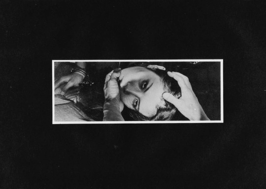
Now maybe it’s just me but there is a certain way that with this orientation and hands entering the frame from the lower half (such as this) suggests that the hands belong to the photographer/image maker. Many folks are rightly criticized for this tact–looking at you Insuh Yoon. (Alternately, I did see this image made by Bang Sang Heyok, that while not a good image is–as far as I’m concerned–a successful proof of concept that there may be situations where the image maker/photographer insert themselves into the scene may actually serve a non-creepy purpose; in this case I appreciate that the image maker is attempting to preserve the anonymity of the subject in such a way that doesn’t not require decapitating them with the frame edges.)
Let’s take it another step, actually. Here are the same images rotated 180° & 270° degrees respectively.
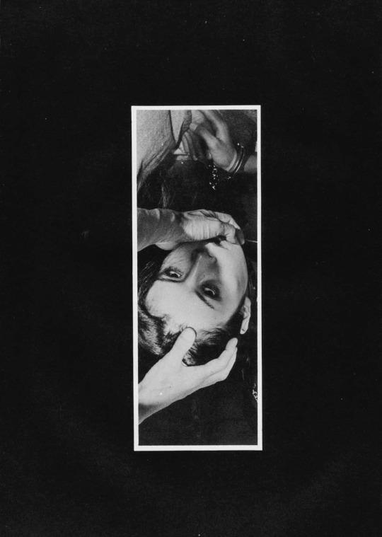
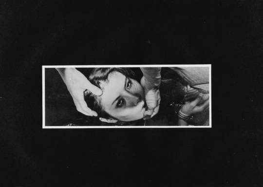
To my eye, the 180° rotation doesn’t read as well. I see the handcuffs before the hands. With the mass of negative space at the bottom of the frame, your eye immediately retreats and locks on the handcuffs.
The 270° one is more surreal–how are the hands at that angle unless there has been some sort of gravitational trickery with the staging/positioning of the camera. In other words, this orientation undoes the physicality established by the original orientation. And, given that this is ostensibly a BDSM image, that exact physicality is the raison d’etre of the image.
Lastly–and this goes out to the naysayers who take issue with my #skinnyframebullshit ethos: the argument that you employ to dismiss my objections is that there is fundamentally no difference between the way you read the original and the 270° rotation. And you aren’t wrong. You encounter the same information in the same order with both orientations but the logical consistency of the composition and conceptual interpenetration given the various orientations not to mention the shift in psychological impact is the reason I harp so much on the fact that image orientation matters a whole lot more than I think you’ve really bothered to stop and consider.

@selinamayer – Chimera feat. Jordan Lehn + Kyotocat (2016)
I’m choosing this one as a meditation on vulnerability, intimacy,
and trust. I think a certain amount of neediness isn’t so bad if you can
own it and ask for what it is you need.
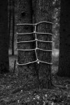


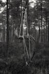


Anna Reivilä – [↖] Bond #1 (2014); [↑] Bond #2 (2014); [↗] Bond #3 (2014); [+] Bond #5 (2015); [↙] Bond #8 (2014) ; [↘] Bond #13 (2106); [↓] Bond #21 (2016)
Artist Statement:
According to Japanese religious ceremonies, ropes and ties symbolize
the connections among people and the divine, as a mean to identify
sacred space and time.
Inspired by Nobuyoshi Araki’s images and their mixture of raw
violence and beauty, I study the relationship between man and nature by
referring to the Japanese bondage tradition. The Japanese word for
bondage, kinbaku, literally means “the beauty of tight binding”. It is a
delicate balance between being held together and being on the verge of
breaking.
I search spaces where nature’s elements combine to create interesting
natural tensions and continue this dialogue trough [sic] my interpretations
by extending, wrapping and pulling upon these indigenous forms. I create
a new sense of volume from the existing components.
Using ropes as lines is my form of drawing. The lines create
interactions, making connections between the elements—a reinterpretation
of the landscape. These three-dimensional drawings are physically
unstable—they exist only for the moment. By recording the process the
photograph becomes part of the piece.
Robert Smithson installed 12-inch-square mirrors to the site in his
project “Yucatan Mirror Displacements” 1969. The mirrors reflected and
refracted the surrounding environment and gave a new angle to see the
landscape. In a similar tradition of Smithson’s use of mirrors, my lines
show how shapes of the elements and the connections between them come
visible when something alien is added. I’m not only changing their
essence, but also my own point of view. Every space is different and I’m
interested how the volume of any given site can be stretched by the use
of several simple lines.

Daniel Southard – Title unknown (2010)
There are souls that you feel to lean forward to, like a sun-filled window.
–Federico García Lorca


Petr Žižák – [↖] tereza (2015); [↑] tereza (2015); [↗] bety (2014); [+] jen tak (2010); [↙] kamasutra (2010); [↘] bety (2014)
Žižák’s works in 6×6 exclusively–which I don’t believe to be the format most well suited to the type of work he’s pursuing. (In my mind–square formats are best suited to portraiture.)
Well, aren’t these portraits? Yes and no. Strictly speaking–from the photos above–you could make an argument that jen tak and the second one of bety (on the lower right) are portraits. (Both feature eye contact with the camera and so ostensibly with both the photographer and the audience.)
But something like kamasutra? No. That’s more whatever the fuck you’d call what Jan Saudek does…
Additionally, figuring out what Žižák‘s about is complicated by his lackluster and toothless editing. He presents his work separated out chronologically, it’s easy to see how he frequently includes two very similar images side-by-side (with one exception, the second image is always the better–and honestly I think the one exception has been purposely had the shot order switched in order to thwart would otherwise appear a rather staid and knee-jerk tendency to indulge base voyeurism over contemplative seeing.
Now I could be seeing things due to these poorly edited near duplicates but I don’t believe I am. After all, the first thing that commanded my attention was the way he uses his frames. It’s inspired, actually.
See one of the reasons square formats are better suited to portraiture is that you can situated your subject dead center and the frame will still scan in most cases. This being the case, most square work tends to be centered. Žižák? Not so much.
There are two things he does in particular that I think are very much worth studying: one deals with the distinction between finding a frame and constructing one; the other has to do with what I don’t know how to convey except to say that his frame edges are almost always permeable.
I think the vast majority of us find a frame as opposed to making one. It’s a bit like a dance. You find an alluring subject and then you try to position yourself and by dint a camera so that you can coordinate various respective positions in such a way that the world arranges itself neatly around the subject. Often its finding the square or rectangle surrounding the subject that is suggestive of some notion of ‘a photograph’.
Making a frame is different. It involves selecting a scene and then given that scene positioning various elements within that scene so that it reads in such a fashion as if one just happened upon it wait for you there in situ, as if by magic.
It’s partly the difference between street photography and landscape photography, partly dance vs choreography.
Almost without exception, Žižák favors to stand in relations to a backdrop in one of three ways–parallel to a backdrop or so that the backdrop recedes at an acute angle from either left to right or right to left (such as in the first photo of bety above).
Let’s stick with this photo of bety for a bit… see how there’s that small rectangle of an adjacent building in the upper left corner of the background. Žižák does something like this in just about every photograph he makes. (Although very much in the foreground of the adjoining photo of tereza, note how the rectangle along the edge of the frame is used not only to balance the composition–in this case offsetting the relative shadowness of the frame–but also seems to speak to their being continuous space beyond the frame edges’ boundaries.) Also, here the reflection also serves to opens the frame.
There are themes that become a bit cloying in the work. Žižák show a penchant for semi-clothed to nude; he’s models frequently forgo clothing below the waist and he definitely has a thing for women with books and cameras.
Some of the technical aspects of the work is uneven. It’s tough to tell if it’s the scans or that the stock was underexposed in camera but it’s rare for him to get things as perfect as he does in the photo of jen tak above–which is a thing of heartbreaking beauty.

Mœbius – Angel Claws cover (1993)
I was super into comic books in my late teens–roughly circa 1991 through 1997.
I followed the spate of hot shot upstart pencilers–who would go on to become Image Comics’ freshman class–Dale Keown, Jim Lee, Rob Liefeld, Todd McFarland and Marc Silvestri.
I was aware of the edgier stuff out there: Neil Gaiman’s run on The Sandman; the Frank Miller/Geoff Darrow collaboration Hard Boiled–alternately, I never got what the fixation was with Alan Moore…
I fell out with the medium for two reasons: it became too expensive of a hobby for me to keep up with–there were also more things that I wanted to read each month than I could afford to acquire myself. And, my more professional interest in it waned.
At a certain point, I entertained the notion of writing and perhaps drawing sequential narrative work. I was especially partial to Jim Lee’s dynamic frames and diversity of depiction. His figures seemed solid in a way that others didn’t, his poses more considered. (Although in hindsight her frequently favored what in filmmaking you’d call insert shorts a wee bit too much and his economy of frames and layout were sometimes questionable.)
I was really taken with his Deathblow style reinvention. It was much darker, more abstract–with heavier lines, looking often more like a photographic negative than a comic book panel. I obsessed about this style; so much so: that when we were ordered to write a report on an artist my junior year of HS, I picked Lee.
This was pre-Internet. And it was daunting to find enough sources to build out a workable biography, let alone find information on development and growth of style and technique.
I managed to find enough information that I could stretch it to make the project work. But what I enjoyed most was selecting samples of his work and drawing an exact copy of one of his pictures and then drawing something using his style but applied to an original work.
My copy was a redux of the gatefold cover to X-Men #1. (Yeah, I’ve always been super ambitious/or a glutton for punishment, depending on your perspective.) My original in-the-style of was a riff on Cyberforce’s Velocity character in Lee’s Deathblow style.
I was ridiculously proud of it. I mean it wasn’t a masterpiece by any stretch but I’d applied myself in a way I rarely did on projects and if nothing else it showed a stubborn potential.
Things didn’t go so well. You’ll remember I went to an Xtian HS. And my art teacher was unspeakable offended by the degree of inappropriateness that my project demonstrated. I was ordered to give my presentation to my classmates as per normal but I was required to give a disclaimer that I had picked an insanely inappropriate artist and that I was very apologetic for bringing such filth into a place founded for the worship of and bringing glory to the name of God.
I was given after school suspension for a week–where I would sit with my art teacher, she would drape her arm around my shoulder and we would take turns praying that good would forgive me for the sins of the flesh I had committed by allowing this stuff into my head.
Since then, I’ve never been able to draw. It makes me violently nauseous.
Anyway, it’s nice to actually re-encounter Mœbius though. Logically, the preponderance of his work popping up on Tumblr likely has to do with the current ramping interest for Besson’s upcoming Valérian and Laureline adaptation (another Franco-Belgain comic book classic).
I have little interest. Besson hasn’t appealed to me since 1995. (However, in fairness, Léon: The Professional is what ended up making me a film student not ten years later.)
Also, does anyone else notice the degree to which Apollonia Saintclair has been influenced by Mœbius? It’s kind of cray-cray…
