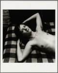
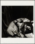
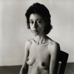
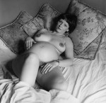
Peter Hujar – [↑] Reclining Nude on Couch (1978); [↖] Robin Brentano {1} (1975); [^] Sarah Jenkins with Head Brace {3} (1984); [↗] Bill Elliot (1974); [+] Fran Lebowitz at Home in Morristown, NJ (1974); [↙] Candy Darling on Her Death Bed (1973); [↓] Lucia Rudenberg (1979); [↘] Pregnant Nude {Lynn Hodenfield} (1978)

When one of my classes stipulated that I would be required to see one from a list of five current big ticket exhibitions in the San Francisco area, it wasn’t a choice–at least for me: Peter Hujar: Speed of Life all the way.

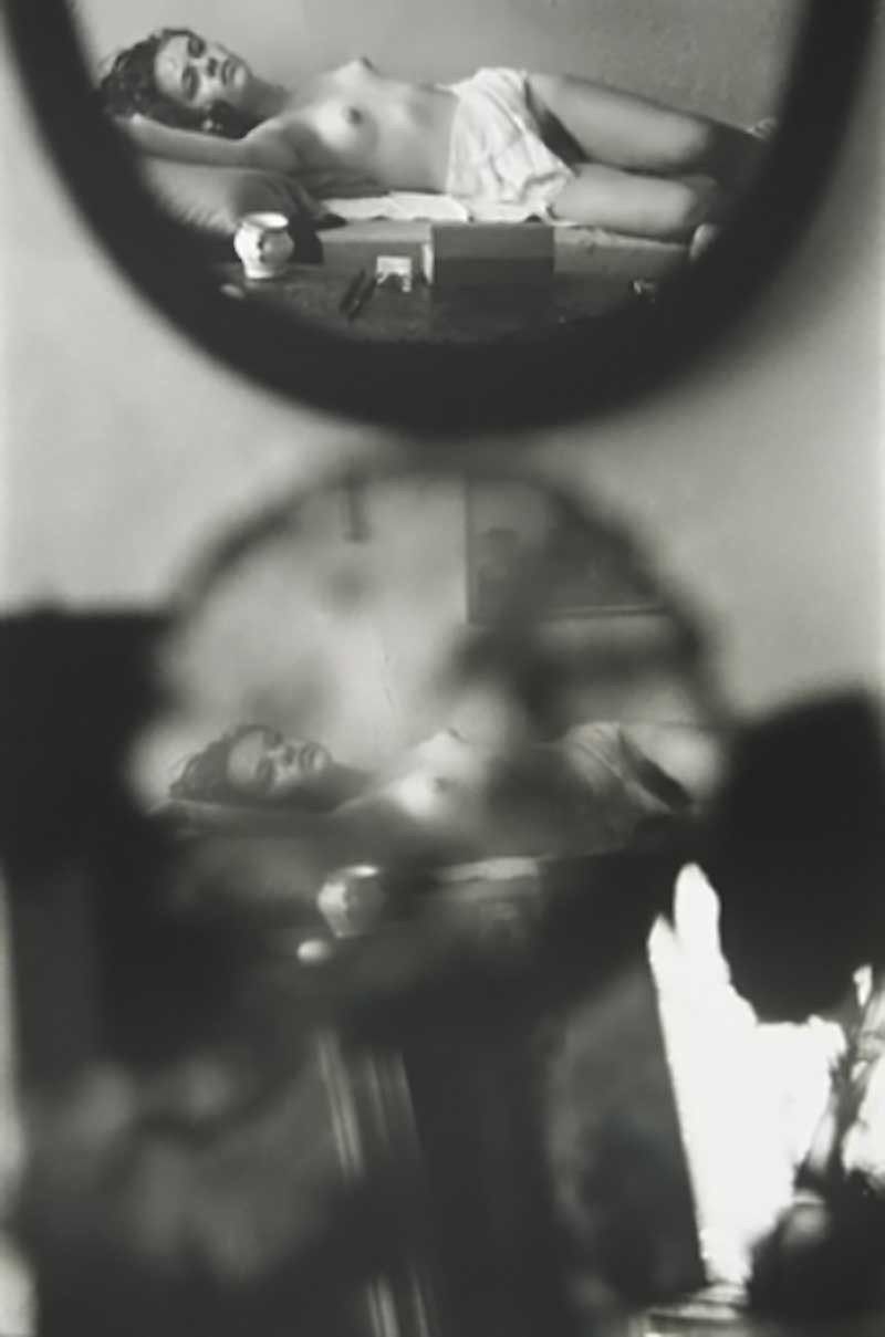
He was not only phenomenally gifted, I count him as one of my personal art heroes. (He also made one of my favorite photos of all time–the center image in this photoset I posted back in 2015).

The show is at BAMPFA through November 18th and I had mixed feelings about it. On the one hand it’s always great to get a chance to look at work actually emanating physically from the body of any artist you adore.

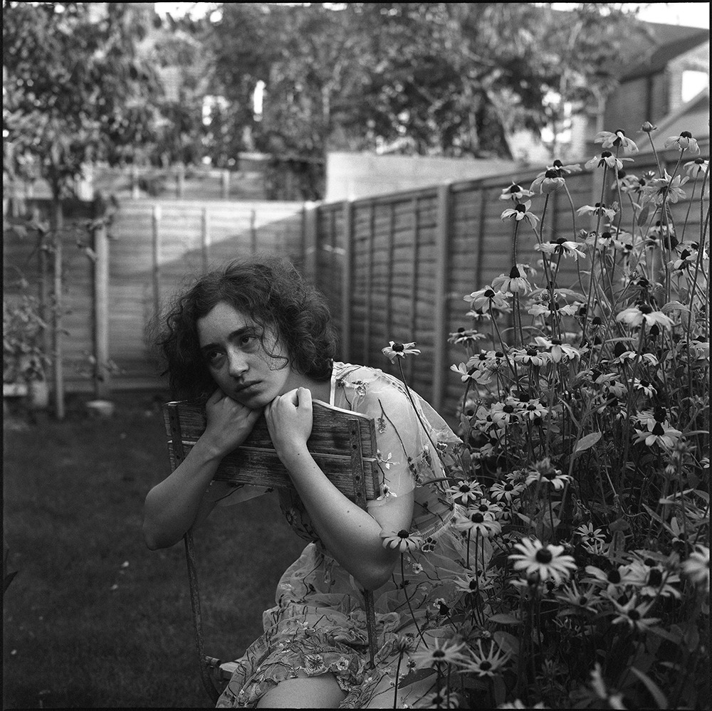
My sense of the show was that the curators wanted to downplay the degree to which Hujar’s being gay during the AIDS crisis up to an including death as a result of AIDS related complications of pneumonia informed his work. The things I walked away from the show thinking about had to do with the way he chose to install shows (arranging the framed photos two high and then stretching the length of the wall in such a way that no portrait would sit next to another portrait, and no landscape would share an edge with any other landscape, etc.) as well as the fact that he apparently loved taking pictures of animals just as much as people. (There are a lot of cow pictures, for those of you who love mammals of the bovine persuasion.)

There was at least one great anecdote: apparently my aforementioned favorite photo caught Richard Avedon’s eye during it’s exhbition. So much show that he got in his car, zipped over to the gallery, double parked and ran upstairs with a handful of cash to buy it.

I was talking with my teacher about it and he at first didn’t agree with my characterization of the show but subsequently relented that he did find it odd that the show didn’t mention that apparently Hujar held Robert Mapplethorpe in abject contempt. One problem, it seems Mapplethorpe was desperate for Hujar to be his friend. (So much so that he used to give his work to Fran Lebowitz in an effort to get her to mediate some sort of relationship between them. I take fiendish pleasure in this story as I def. prefer Hujar to Mapplethorpe.)

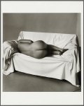
The other thing I thought is that I’d be quite frankly shocked if Hujar didn’t wield an outsize influence on Joel-Peter Witkin, actually. The photo of Sarah Jenkins with Head Brace (above) predates most of Witkin’s work and shares a very similar tone and aesthetic.

Julie Van Der VaartUntitled 3 from Beyond Time series (2017)

I am v. into the way there’s a sense with what’s visible of these four frames that the motion the viewer is offered glimpses of is not unlike a flipbook animation. (My impression is that the subject is moving from laying on their side to kneeling with their back arched–not an especially comfortable movement to enact…)

The more I look at it though, it’s as if the subject is not only moving, the camera is moving in relationship to the subject while still preserving a sense of continuous motion. It’s really effing cool effect.

Arne van der Meerthree times nothing | camera failure. (2017)

I love so much about these: the way those striations along the right most edge of each are not consistent across all three frames; the areas in the corners where there’s that light leak like effect that’s half-tin type edging, half inversion of those black spots you get on old mirrors and the way there’s something visible in the frames (almost like a cloudy x-ray or an underexposed document of trees in a forest–if you squint a little and treat it as if you’re laying on your back watching clouds drift in the sky overhead, or some sort of monster in the shadows) on either side but just darkness in the central panel.

….

In the process of packing up my life and moving away from the city where I’ve lived for ~ 15 years, there’s been a lot of soul searching.

A couple months ago, I had a dream which I haven’t been able to completely shake: I was walking through an old neighborhood, an autumnal chill in the night air. I smelled the skunk weed before I saw another person approaching me.

He was tall with long hair and a thick bristle of a goatee. He seemed oblivious to me–except for the fact that he was holding his left hand at his side and slightly behind him as we neared each other in an effort to shield it from view with his body.

With a start, I recognized where I was and who I was seeing. It was November 22nd, 2001: Thanksgiving–and the person I was seeing was me at the age of 24. Faced with the prospect of eating Thanksgiving dinner with both my mother and younger brother, I’d rolled a joint and informed everyone I was going for a walk and then proceeded to bogart it in an effort to get stoned to a level that involved at least some degree of dissociation.

I remembered the walk, remembered hiding the joint as I was watching myself doing but I didn’t remember the person I’d encountered.

As I drew closer, I realized that this was just such an opportunity as the ones I always create for myself as thought exercises: if you could give advice to your younger self, what would you tell them? (Of course, bearing in mind that them listening to you is one thing but them believing you enough to actually put stock in what you were telling them? Rather another entirely…)

I said: In 2018, you’ll be living in Brooklyn in a beautiful apartment with fantastic light, blond wood floors and lots of plants. Also: you’re a woman–the sooner you get a handle on that the easier your life will be.

He looked at me and sort of recoiled.

I woke up with the feeling that it was less dream and more of a evanescent memory.

Ludwig Wittgenstein held that understanding was impossible without the equal and opposite possibility of being misunderstood.

The advice I gave myself in my dream wasn’t actually the advice I’ve always thought to give my younger self. It’s always been some admonishment along the lines of Wittgenstein: don’t be afraid to fail because failure is the necessary first step in the quest to master anything worthy of mastering. (And for fuck’s sake: the cost of those three Polaroids with nothing on them was at least $2.50 a frame.)

It’s common sense such that pointing it out seems cliche–and cliches are easily dismissed.

For some reason all of this lead me to make an effort to empathize with myself at previous points in my life. The sort of see if I could with what I knew at any one point, have had any sort of clue where I would end up.

What I realized is not that my faculty for logic is too bereft to predict where I was heading but that frequently my expectations have a tendency to suffer from a disconcerting impoverishment of imagination–and by that I mean that where I have ended up has always been nothing like I expected but better for that fact.

Which leads me to think that the only way to really fail is through a refusal of doing.

Nagib El DesoukyArtemis (2018)

Every time I’m cruising through my liked posts, I always pause over this photo.

It’s not just this picture, everything El Desouky posts is quality and every third post or so is freaking brilliant. However, there’s something about this photo in particular that I find captivating.

I think it’s mostly the spot on-ness of Artemis’ daydream-y expression. Still, there’s something weird about the composition.

One of the things you learn when you’re studying photography in academia is that one of the ways you can balance a composition is to use the subject’s gaze to draw attention to negative space.

Think of it this way: imagine a photo of someone standing near the rim of the Grand Canyon–given that the camera is set up so that the edge of the canyon runs more or less diagonally from the lower right frame edge to the middle left frame edge.

You take two pictures. In the first, the model–let’s call him Edwin–is standing just back from the edge of the canyon at the left edge of the frame. He’s looking out beyond the left frame edge.

For the second, keep Edwin’s pose the same only move him so that he’s positioned in the right third of the frame.

In Photo #1 you’re seeing Edwin but you can’t see what Edwin sees. You might wonder if he knows he’s missing the view. Or, conversely, maybe he’s got a better view than you, the viewer. (Also, the human eye is generally more immediately interested in people over landscapes–thus: there’s a tendency to focus on Edwin without fully grasping that Edwin is standing in the landscape, due to photographs predominantly scanning from left to right.)

In Photo #2, his positioning dictates that you aren’t seeing the same view but there is at least overlap. It’s possible to follow the angle of his gaze and infer something of what he sees.

In the photo of Artemis, you can somewhat follow her gaze–there’s a bright circle of light (presumably from a gap in the trees foliage about 1/5 of the way down the left most frame edge that is more or less where she’s looking, although her gaze is at an angle that is slightly turned towards the focal plane).

Normally, this would be a trap for the gaze while scanning the photo. It’s not here. I’ve been trying to figure out why and here’s my best guesses:

First, there’s some interesting stuff with triangulation. That little black sprig sticking into the lower left of the frame? It forms a natural triangle with Artemis’ eyes and the aforementioned bright dot in the background tree. This pushes your eye left.

Then there’s the upward oriented triangle suggested by Artemis’ arms–this draws attention to her face but it also echoes a larger triangle between the three darkest points in the frame: the sprig at frame left, her hair to the right of her face and the area in the thicket of flowers near the lower right edge of the frame.

That thicket of flowers is rowdy and cluttered, but the slightly soft focus renders them a decorative anchor to the foreground without distracting our attention from the subject.

All of this is executed in a style reminiscent of the way Renoir tends to give solidity to objects in the foreground while rendering the background in a sort of teary eyed blur.

Saul LeiterThe Young Violinist {Young nude on bed, reflected in mirrors} (195X)

If Leiter came up in conversation, I would probably think: Leiter? Leiter… mid-century American photographer, maybe?

In other words: I know little about him or his work. So little, in fact, that I don’t know whether the photo above is more authentic than the one I first encountered:

The landscape orientation is more even handed. (There’s a better exposure balance across the frame–pay close attention to the reflection of the bedside table and the detail in the subject’s coiffure; also: the sepia-like toning contributes a nostalgic softness that resonates with the content in a flattering fashion.)

The horizontal frame is noticeably less contrast-y, however; this additional contrast contributes to the skinny frame both a sense of solidity and dramatic immediacy.

Which variation is more effective?–Well, I’m going to surprise myself by bucking my own generaized antipathy towards #skinnyframebullshit and side with the the vertical orientation.

Why?

I think it’s better to start off with the fact that we are accustomed to conceptualizing the orientation of a frame in terms of portrait (vertical) vs landscape (horizontal). Usually, one of my objections to this is that it suggests too much of a paint by numbers approach to composition. What is the photographer/image maker trying to depict? Grace Hartzel? Portrait orientation. A scene in nature? Landscape.

It’s not that it’s bad advice, necessarily. It’s that it begins from an unconsidered assumption–and thus the basis of the composition is taken as given. (Also: considering that as far as I can tell the portrait vs. landscape dichotomy is largely a function of standardizing output that is then retroactively applied to the creation of the photo or image.

I think it’s better to make a decision with regard to orientation based organically on the scene at hand and what of it you want the viewer to see (and subsequently how you want an audience to see what you are showing them).

A vertical or portrait orientation is naturally predisposed to drawing the eye of the viewer up and down over the frame; whereas, a landscape or horizontal framing creates a side to side visual flow. (I haven’t actually tested this theory but I suspect that if you were to divide art history into works that are explicitly spiritual vs work that is secular. The former would favor vertical orientation and the latter would favor horizontal orientation by–I would guess–at least a 3:1 ratio (e.g. if x is the number of spiritual works that are vertical and y is the number of spiritual works that are horizontal, then X:Y).

In this case the sepia horizontal frame does a better job of moving the eye over the work. Unfortunately–and this is another of the issues I normally associate with #skinnyframebullshit: there’s a self-consciousness with regard to the composition. Like, yes–the eye does move over it better but in scanning it you are faced with questions of what sort of gravity is acting on this scene? Oh, wait: the photographer is fucking with perspective. OK, but to what end? And that’s where a common sense question begins to lead you down a path away from anything suggested by the work itself.

Additionally, the less-contrast-y sepia version doesn’t clarify anything pertaining to what is too close in the foreground to be in sharp focus. My eye tracks right and gets trapped in the mirror frame in the horizontal version.

The vertical version opens that up a bit and because my eye enters the frame from left to right and then drops, I find myself scanning the image up and down across the entirety of the composition instead of getting stuck on one facet.

Lastly, I feel it’s relevant to add–I am more than passingly irked by the use of ‘young’ in the title. I get that it’s a clever way of echoing the two reflections in the frame–reflections which are in themselves already doublings. It reminds me of the way that men tend to refer to women they find attractive as ‘girls’. I’m of a mind that when men do this it is always a red flag. But I’m especially attuned to this because I watched Hannah Gadby’s Nanette last week and it shook me. I suspect if you were to watch it and come back to this photo, you’d have a pretty good idea what I’m trying to get at. Unfortunately, I’m not sure how to articulate it yet so you’ll have to accept my inarticulate pointing for now.