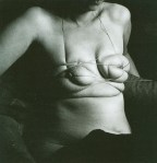

[←] Hans Bellmer – Unica Zürn from Unica Tied Up (1958); [→] Source unknown – Title unknown (2015)
Juxtaposition as commentary
[←] Hans Bellmer – Unica Zürn from Unica Tied Up (1958); [→] Source unknown – Title unknown (2015)
Juxtaposition as commentary
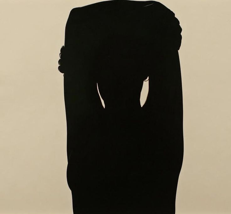
Harry Callahan – Eleanor (1948)
There are only a handful of photographers in the history of the medium with as roundly as exquisite a body of work over their lifetime. Callahan is absolutely one such photographer.
(In fact: if I was asked to name one photographer who one might through an especially thorough study of their work, glean the most extensive picture of photography as an art form, I’d probably insist that Callahan was the only consideration.)
My favorites are the photos he made with Eleanor and subsequently Eleanor and his daughter. But even with his minimalist landscapes and plants in the landscape–he is always magnificently attuned to nuance of light, tone and dimensionality.
I love everything about this photo. (I’ve somehow never seen it before encountering it here.) But what’s particularly revelatory about it is that silhouettes usual appear completely flat–as if someone cut out a shape in heavy cardboard and placed them between the camera and the light. (If you’re thinking of the scene in Home Alone with the cardboard Micheal Jordan cut-out… good call.)
The reason for that you’re dealing with something that is brightly backlit–thus, the object is blocking the light. The point at which the object blocking the light is the widest only has one dimension and there’s light that is blocked and light that is not blocked on either side of that object.
When I teach three point lighting to undergrads, we talk about the key light, the fill light and the back (or rim) light. The reason it has become customary to use this setup is because it a standardized approach to the stylized representation of natural lighting.
If you’re standing in the middle of a field on a sunny day–unless you’re facing into the sun (which doesn’t make for the most aesthetically appealing imagery–the sun is going to be bright on one side of you than the other. This is because the sun hits one side of you and by hitting that one side of you, it’s blocked from hitting the other side of you. (Unless you’re a ghost and then my apologies.)
The ground around you actually reflects light to a certain degree. So while one side of your face is brighter than the other, the ground helps fill it in so it’s still slightly darker but naturally and flatteringly so. (The key light is usually to left and the fill light to the right of the scene–you can do it however but as the convention is borrowed from Dutch Baroque painting, where the light almost categorically falls left to right.)
It’s the light behind you that actually gives you dimensionality. (A key light and a fill light will make the objects illuminated appear flat in exactly the same way a silhouette makes the subject presented in silhouette appear two dimensional.)
Notice how just the faintest of fills on the fingers of Eleanor’s right hand on her left arm–I’m reasonably certain that she’s is standing with her back to the camera–have dimensionality; and therefore create this strange since that she is and is not actually flat.
[←] Ana Mendieta – Untitled from Stonewoman series (1983); [→] @anata39 – pois gourmands (2014)
Juxtaposition as commentary
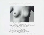
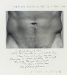
Duane Michals – [↑] The Most Beautiful Part of a Woman’s Body (1986); [↓] The Most Beautiful Part of a Man’s Body (1986)
[↑] In the oldest dreams of old men / Womens’ breasts still remain. / Long
after their desires have turned to dust. / They are their first
memories. / Warm, nurturing, home. / The point of satisfaction. /
Perfect in their gracious arcs. / Women wear their breasts as medals, /
Emblems of their love.
[↓] I think it must there / Where the torso sits on and into the hips /
Those twin delineating curves / Feminine in grace, girdling the trunk /
Guiding the eye downwards / To their intersection, / the point of
pleasure.
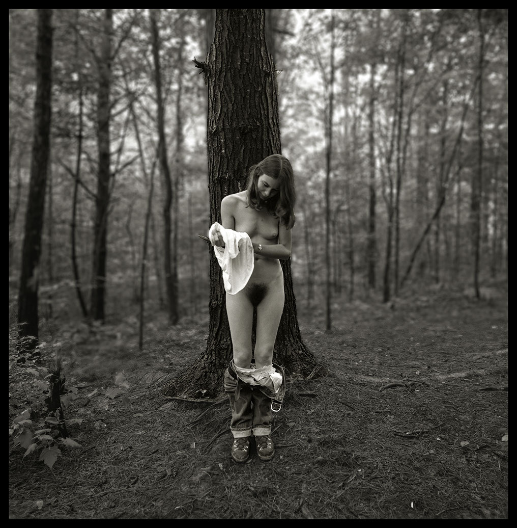
R. Michael Walker – Melissa Undressing, Red River Gorge, KY (1979)
Malcolm Gladwell’s assertion that it takes 10,000 hours of deliberate practice to become world class in any discipline has–by now–been thoroughly debunked. Simply from that standpoint of stifling elitism, I consider the kibosh that’s been put on this a tender mercy. Except…
I don’t think the notion that it takes time to hone your craft is actually–in any way–bad advice. If a young photographer/image maker came to me and asked what advice I have for them as far as achieving their dream, my response would probably be inline with what I was told when I first started making photos: lock yourself in your room and read until your eyes burn and don’t touch a camera for five years.
Or, that’s how I would’ve put it until recently. I think there’s a balance between doing and fueling the doing. And the 10,000 hours probably have less to do with conditioning and more to do with forcing you into a give and take relationship with your craft where you realize that sometimes you do it when you don’t feel like it and sometimes doing it when you don’t feel like it is detrimental to the doing. It’s only through trial and error that you figure it out.
Also, fueling your doing is less fulfilling but it’s easier to learn things that may take you much longer to address in your own work.
For example: the above image has crystallized for me a number of things I’ve been grappling with in my own work.
Long story, Cliff’s Notes ™ version–it’s only in the last 18 months that I’ve begun to see photos as dimensional. And by that I mean more than just the separation between foreground, mid-ground and background. It’s more than a little like Lotte Reinger’s multiplane camera–except expanding so the entire space in the frame is represented by distinct planes.
The experience of seeing space as constructed of layers has actually slowly shifted the way I think about composition. It’s still at a point where I’m not so great at articulate it but there’s a very clear feeling of it.
My notion of seeing space as layers of planes relates to depth of field. And generally depth of field has very proscribed uses. The majority of photographers/images makers think of bokeh as a means of emphasizing the subject while still conveying a sense of the subject in space without all the decontextualization that comes from staging things in a studio space. (In fact, it’s arguable that the quality of bokeh is usual measured across cameras and lenses by giving consideration to the bokeh offered by the fastest lenses available in an 85mm–or equivalent–focal length.)
(As a brief digression: if you’ve read anything written by folks who have worked as cinematographers for several decades, you’ll hear them talk about how different lenses are best suited for shots of a particular scale. I’m increasingly realizing that there is actually a good bit of truth to those claims.)
But the point is there’s a tendency to either go for the shallowest depth of field possible–the reason why fast 85mm lenses are considered the bokeh gold standard because they tend to support the shallowest DoF; or, for deep focus a la Group F/64 or Gregg Toland’s work on Citizen Kane.
In my own work, I favor a shallower depth of field but as I’m frequently working in medium or specialty formats, I’m limited by lenses that by and large are only considered fast in large format.
Really, your DoF should be used as a tool to help the viewer know how to read the frame you’re presenting them. The photo above for example: was most likely faster film shot in low-ish light with a mid-range aperture. Note how all the foreground is in focus and the focus starts to go soft at the rear of the tree directly behind Melissa. Note how this forms a compositional wedge from the lower corners through Melissa to the tree. The subject is pulled forward whereas the forest is pushed backwards. (Yes, digital devotees, you can capture your images in raw with everything in focus and then selectively unsharpen in post but it’s never going to look as organic as the above.)
Point is: I don’t think I’ve ever seen DoF used to quite this effect and I like it rather a lot.

Janice Guy – Untitled (1979)
Murray Guy is one of the most preeminent galleries for photography, film and video.
Janice Guy is the co-founder and co-owner through March 2017.
She founded the gallery in the 1990s after moving to NYC from Düsseldorf, Germany.
In Düsseldorf, she studied photography at Kunstakademie Düsseldorf, working closely with Bernd and Hilla Becher.
Being a woman and a photographer preoccupied with self-portraiture, she’s frequently lumped together with folks like Ana Mendieta, Cindy Sherman and Francesca Woodman–the operative framing being fixated on artists as both simultaneously author and subject.
To think of it that way strikes me as a bit lazy. It fits–with certain limits–for Sherman and Woodman–less so for Mendieta; however, most of Guy’s photos feel less like self-portraiture and more like proto-selfies.
If one were to describe Guy’s work she documents herself as a photographer considering herself in a mirror–i.e. she’s not setting up the camera like Sherman or Woodman and then positioning herself in front of it; she’s interested in including considerations of process in her product (if you subtract capitalist connotations and instead consider the term in a more mathematical sense).
She’s nude in most of her work–except for a utilitarian wristwatch.
Her work wasn’t really exhibited until the late aughts–but there continues to be interest in it to this day and I suspect that interest may even grow down the line.
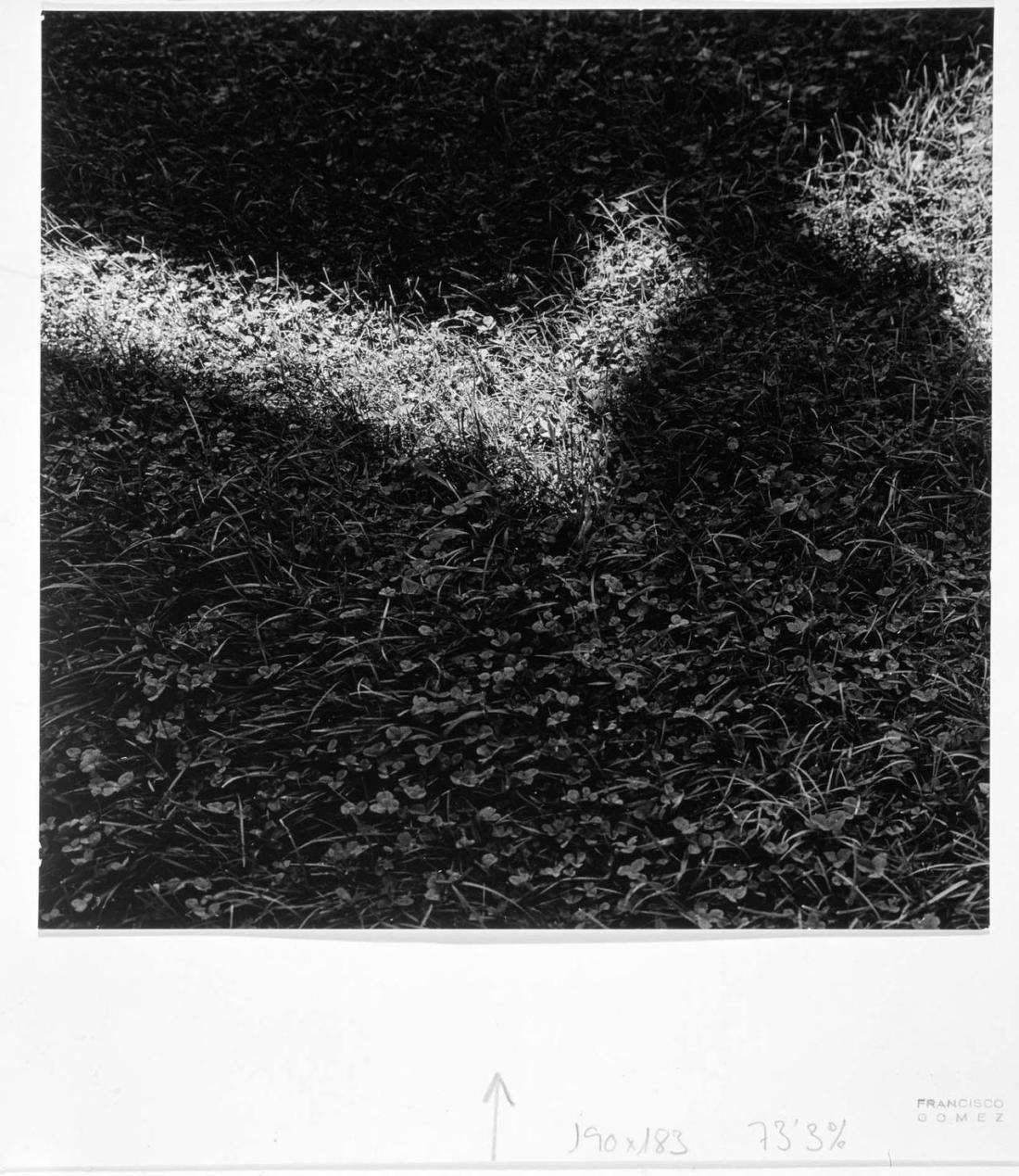
Francisco Gomez Martinez – Sombra y Luz (1956)
Fragment 83
Sappho (translated by Anne Carson)
love, lay me down under grass &
sunlight, and touch me [right here]
and here and here, where the ache
& hurt have gone to nest.
[(now again)] my fingers will find
yours, tangle & sweeten the air,
and the birds will cry [for]
us alone.

Andre de Dienes – Nude (1955)
Dienes is known primarily for early portraits he made with Norma Jean Mortenson before she became Marilyn Monroe.
His worked primarily with nudes in natural settings. His poses tend to be ripped straight from Greek antiquity and there’s not a lot of differentiation between photos.
This is uncanny in a way the rest of his work just isn’t. From the standpoint of form–the models pose is a bit awkward. I’m not sure the positioning of the head works for the image but the way the models body echoes the form of the rocks upthrust is a bold choice.
The problem is… well, there are problems plural. First, while there are reasons to center the horizon line in a photographic frame at the center of the picture plane–it’s generally not a great strategy. It’s better to ask which contributes more to the meaning of the purpose of the frame and then going preferring whatever will carry the most weight. Or, depending on what the frame is depicting, perhaps giving the most important aspect too much weight obliterates any sort of ambiguity.
If Dienes had wanted to emphasize the upthrust of the rock more, he should’ve included more of the ground than the sky. To emphasize the surreal aspect of it, he could’ve treated the sky preferentially.
Further, the contrast isn’t quite right–it’s as if the contrast has been dialed down on everything in the frame except for the model’s skin tone.
Honestly though those are all minor problems that could’ve been erased merely by adding a red filter–resulting in a darker sky, light crowds and an increase in textural differentiation in both the boulder and surrounding sand.
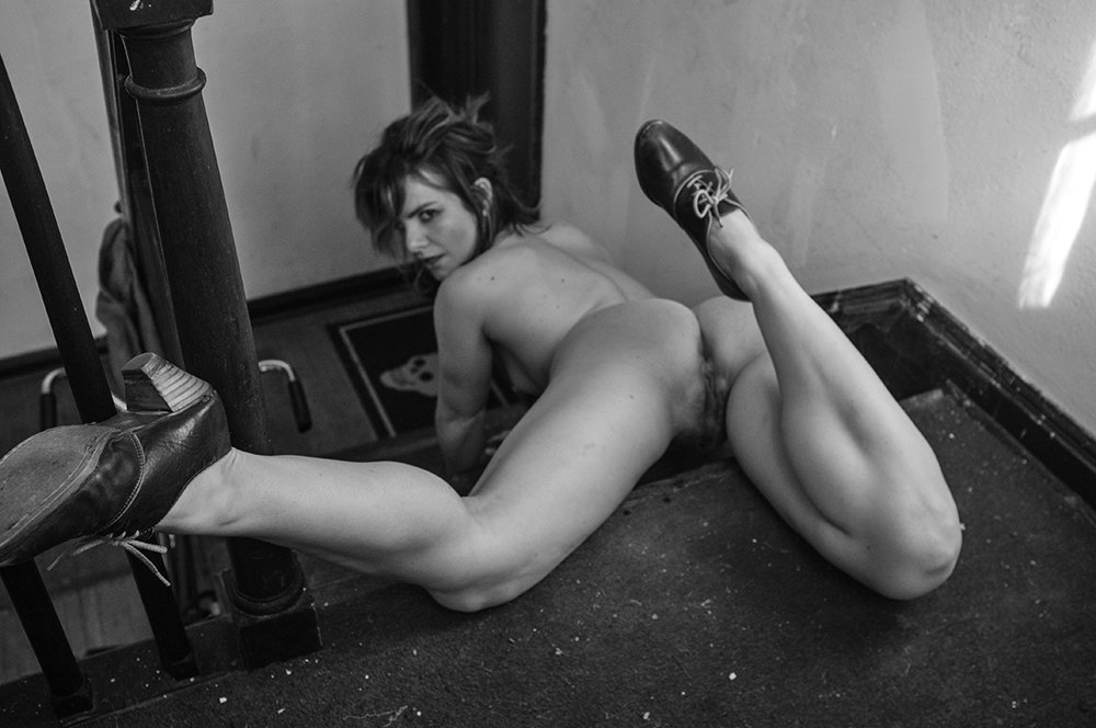
Chip Willis – Nathalia (2015)
When it comes to Willis’ I harbor mixed feelings.
His work is singular (+1); his compositions are arranged compellingly (+1) and always imbued with a strange sense of existing as a prelude to sudden, dynamic motion (+1).
There is, however, no getting around the degree to which the work is tied up with male gaze governed expectations. (-5)
…except while trying to figure out what I wanted to convey with this post, I think my perspective has shifted slightly–the trouble is I don’t know quite how to translate from mental impression to language.
The first part of it has to do with the fact that he seems to be producing less work these days. Now, this is only my impression. I don’t follow him super closely and Tumblr is (unfortunately) a platform increasingly hostile to folks who make work in line with his–thus it’s entirely possible that he’s migrated to another platform.
Interestingly, when you look over his work–his learning curve remains impressively near-vertical. It doesn’t all work and I think there is a strong argument to be made for him developing a more contemplative approach to editing–the work is all distinct and eye-catching but there are times when it feels as if more ends up being less. (Take the scene above–I can’t find the original post of this photo but there are a half dozen frames from the same shoot; not one of the others is as captivating as this is.)
The second piece of my reaction to this is tied up in notions of evolution. This one is larger due to bringing my own baggage to bear subconsciously when I engage with (i.e. decode) visual documentation.
At present most of my friends are in their early-to-mid 30s. (I’m in my 40s, fwiw.) And I am starting to notice a trend wherein there seem to be two potential outcomes to any longstanding commitment to the project of self-determination: there’s a degree of comfortability which begins to entice. A still small voice saying: you’ve done the hard work for so long–time to ease up and enjoy the rewards for which you have worked so very hard.
The focus becomes how do I maintain what I have and when you get right down to it doubt and the nitty-gritty of personal reflection and growth are actually inimical when it comes to preserving the status quo.
It’s a perspective I–quite frankly–do not comprehend. Willis’ work signals (at least to me): that the status quo is BS and that the only thing worth pursuing is the dissolution of sedentary compulsions in the embrace of chaos, uncertainty and discovery–whatever its costs.
That last bit actually ties into another consideration–when I talk about the ‘intersections of art and pornography’–although I am definitely questioning the mutually exclusive nature the framing is recapitulating the framing it supposedly denounces.
I’m not sure I’ve found a better way to convey what I mean just yet. But I do think Willis’ work functions as an imposition of the artist of the question if the debate about art vs pornography might better be considered in terms of both and neither instead of either/or.
Practically, I’m not sure the long term implications are all that much different. However, once you see that sort of pioneering spirit as motivating the work–it renders the work all that much more enticing. (At least that’s my response.)

