wonderlust photoworks in collaboration with @suspendedinlightAssisted Self-Portraits (2017)

Over the last three years or so, I’ve dabbled a bit with street photography. Alas, the only camera I have that I’m fast enough with is a panoramic camera–which is not exactly well-suited to that task.

Really, though–what’s stopped me is that there are just issues of consent with street photography that I find increasingly disturbing.

The idea for these emerged partly from an urge for the challenge of street photography style work–quick thinking on your feet, rapid response, etc; the other part was I’m always looking for ways to reduce the amount of time I allow myself to over-thinking things; and, from the vantage of procedure, I’m interested in minimizing my imposition on the work.

The notion here was that I hand a cable release to the subject–in this case Lyndsie–and she chooses the moment the photo is taken. I merely have to keep her in frame and in focus.

It was such a revelation to work this way that I’ve actually instituted it as a sort of icebreaker every time I collaborate with someone.

wonderlust photoworks in collaboration with @suspendedinlight – [↑] Loom; [←] Darkness Suspending in Light; [→] Baba Yaga (2017)

I have about a half dozen or so frames from this shoot I’m still in the process of editing–but I wanted to get these out there ahead of anything else.

This shoot was one of the most fun I’ve ever had–I love working with other artists but more than anything I prefer working with friends–and Lyndsie has become one of my nearest and dearest over the last year. (She’s so amazing talented and has this freaking magnificent mind and she totally gets *it*.)

The top photo was a riff on this. It’s a bit more inscrutable than I envisioned, but the more I’ve worked with it the more that is perhaps the point of the disorienting perspective. The title cemented it; I’m all about multivalent wordplay–it can be Lyndsie’s relationship to the viewer; or, the device used to weave materials into cloth (using such a device is not an inconcievable reason for her hand’s to be positioned in that way); or the part of an oar between the handle and the paddle (betweenness or, if you will: fulcrum as tool).

To me there’s something magical about it, something witch-like. (Truthfully the entire thing emerged out of me not being able to shake the fact that she’s playing a harp and the similarities between the harp and the loom and how Lyndsie as an visual artist and musician is on both sides of that.

The bottom left was totally making shit up as I went along. Lyndsie sat down and there was something powerful and playful about her demeanor that I wanted to document. I set up the camera and was so obsessed with getting her eyelight just so (check it out–so proud of myself for that!). I didn’t see the reflection until I first gazed at the slides through a loupe.

The photo on the bottom right was based on a dream I had. We played around until we got something that felt right and we took one frame. If you look close it’s not quite in focus–my 6×9 camera took a tumble in Iceland and the focus is just a touch softer now. But it gives it this very David Lynch like haze that makes it more obviously homage to Lynch then any of the half dozen other things in the frame I meant to specifically reference Lynch. So… sometimes I’m my own worst enemy, sometimes I’m looking out for myself against my own ‘genius’ ideas.

There you have it: a peak into my own creative process.

Source unknown – Title unknown (19XX)

Homoerotic imagery in
the visual arts has historically been hidden, destroyed, and censored –
so too the documentation of artists’ sexuality when that includes the
possibility of same-sex relationships…
Documentary evidence of a person’s sexual activities is, in many cases,
rare, regardless of the personal’s sexual orientation. In the face of
little or no information, everyone is assumed to be heterosexual unless
proved otherwise. When asked Can you prove she was lesbian? why do we
not respond, Can you prove she wasn’t?
                   — Jim Van Buskirk, “Between the Lines: The Often Fruitless Quest for Gay and Lesbian Materials,” Art Documentation 11, no. 4 (Winter 1992): 167-170, 167. (via lesbianartandartists)               

Judy DaterSelf Portrait Salt Flats (1981)

One of my all time favorite photos by Dater is her Self Portrait with Snake Petroglyph:

I don’t know how I’ve never made this connection before but it’s entirely possible–quite likely, actually–that this is was intended as a sort of paean to Francesca Woodman.

After all, Woodman took her own life in January of 1981–the same year that Self-Portrait with Snake Petroglyph was created.

There are other similar features–the camera anchored firmly on a tripod while the photograph positioned herself in the scene. There’s the similar sort of motion blur Woodman deployed so often. (Although, it is important to note that: here it used much differently.)

A common critical and art historical question centers less on whether Woodman was an important artist–the interest in her work certainly continues unabated–but there is a lingering question of whether or not any of her mature work would’ve incited the intense reverie and devotion. With notable exceptions, her oeuvre (as it is), has been culled almost entirely from work produced before she was even 20. And there’s an argument to be made that after her year studying abroad in Rome, she never managed to rediscover the same sharpness in conception and execution again. Her foray into fashion photography was incalculably heinous. (Although in fairness, my favorite photo of hers was made during her last year of life.)

I adore Woodman. There’s only a handful of artists whose work I’ve spent as much time with as hers. (When I’m feeling especially full of myself I tell people that we’re involved.)

But I think that Dater’s work from from the year Woodman died–whether she meant it to or not–suggests that perhaps Woodman had, in fact, peaked and was past her prime.

Even in Self-Portrait with Snake Petroglyph, the framing is pretty much just about as wide as Woodman ever got. In her later work, in fact, she retreated–favoring the more intimate close-up style that prefigured the age of the instagram selfie by nearly three decades.

Dater very much went the other direction. Pushing the camera further and further back. (Anyone who is an actual photographer will appreciate the way this increases the difficulty and risk of the composition–the eye is more willing to forgive a composition that almost works if it’s shown something interesting in the bargain.

With the image above there’s also references to Wythe’s Cristina’s World as well as both a reference and a feminist critique of Edward Weston‘s strident male gaze-i-ness.

Also, it occurs to me that although we can with hindsight see the link between Woodman and Duane Michals now, plain as day: I feel like it was perhaps problematic for a straight, cis, white girl to be appropriating so whole cloth the work of a gay man?

Akuma Aizawaexplanation (2014)

Truthfully, I know fuck all about collage as a form–thus I won’t be able to address this as directly as a photography.

What does interest me about this (besides getting the giddy feeling in my tummy that always accompanies finding work that resonates with me), is the conceptual praxis.

The text reads:

This is to my absurd trying/of intending anything/AT ALL Example:/I’ll try to remember the/sensation of imagining you/missing/me

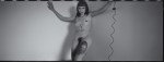
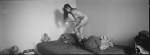
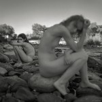
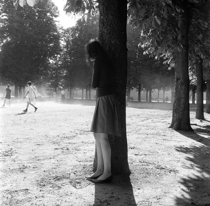
I’m not sure quite how the text interacts with the image yet–although I do think the example is the image and not that statement beneath the image.

I am more comfortable with the text, so let’s stick with that for a minute. The first block of text mentions the absurdity of trying to intend anything at all.

It reminds me of that famous line Yoda utters in The Empire Strikes Back. Luke Skywalker is trying to use the force to life his X-Wing out of a swamp on Dagoba. It seems like he’s making progress and then the vehicle sinks back. Yoda chides him and Luke whines that he’s trying as hard as he can. Yoda snaps back: do or do not; there is no try.

It’s a very Zen sentiment. Essentially, what Yoda means is doing the thing, you either do or do not do it. But by trying to do something the effort of your action is focused not singularly on the doing of it but on the trying to do it–the question of whether or not it can even be done.

The distinct Yoda is pointing toward is the same thing Wittgenstein is getting at in his Philosophical Investigations–only Wittgenstein is concerned with how language means instead of lifting a vehicle out of mire with nothing more than the power of the mind.

Essentially, Wittgenstein says hey, as long as your talking–language isn’t at all difficult for you. You just talk. It’s when you start thinking about how you language works, that you begin to run into problems. Because instead of doing, one begins to think about how one does what one does and that’s where trouble creeps in at the seams.

The philosophy of language questions how words mean. And that question is already off on quite the wrong foot. Wittgenstein proceeds systematically to poke holes in the notion that words mean via some sort of mental process as opposed to meaning as use in context.

The last stand of the person intent on language being a mental process clings to the notion of the possibility of a private language.

In order to demonstrate what this would be like, Wittgenstein conceives the staggeringly brilliant metaphor of The Beetle in the Box.

Say there’s a group of people somewhere and everyone of these people has a box and in that box is what is called a ‘beetle’. There’s a catch: no one can look in anyone else’s box. So there’s no way for anyone to check what anyone else’s beetle looks like. This begs the question does Jethro have an ant in his box while Marieanne has a mosquito, or perhaps her box is empty. Thus ‘beetle’ can only mean nothing or what the group agrees it means independent of whatever is or isn’t in their respective boxes.

(As an aside bad artist, racists and mansplainers are always whining about how they didn’t mean it that way, their intent was different. But that’s the thing, it doesn’t matter how you meant it, there’s a generally agreed upon external context and whether or not you meant it that way, that’s how it functions in the external context. Do or do not; there is no try.)

So what I dig about this is the way the top text cancels itself in a similar fashion to the way the bottom text does the same thing. In the top portion the speaker is trying to intend which is decidedly not doing or meaning–thus, I would assume the absurdity of the undertaking. In the lower portion, there’s again a trying–in this case a trying to imagine the sensation of you missing me. Trying imagine the feeling of something that will never happen.

There’s something profoundly lonely about this but in an unusual and I would argue defiantly feminist way. I feel like this is supposed to look like it’s about a relationship. But I think this is also on a meta-level about the relationship between an artist and their art as well as the relationship between women and the art historical male gaze.

Evgeny Mokhorev – [↖] Marina near the forest bath, Lagoda (2013); [↑] Anna (2016); [↗] ***, Baltic Sea (2017); [←] Anna and Yuri, Tichino, Italy (2015); [+] Katya, Kronstadt (2016); [→] Yuri and Anna, Tichino, Italy (2015); [↙] Alexandra (2010); [↓] Anna, Crimea (2015); [↘] Anastasia from The 26th Element series (2001)

I’ve featured Mokhorev’s work at least once before. (I’m almost positive it’s twice but since Tumblr now hides NSFW content blogs, I have to rely on my own tags to find anything. Alas, I haven’t always been vigilant with regards to tagging, so…)

In the 1990s, Mokhorev was focused on youth culture in St. Petersburg. It was a rather different species than the bohemian, hipster rock n roll rebellion of his compatriot Igor Mukhin; There’s none of the trappings of counter culture and things seem to prosaically orbit the fact that it’s one of the most heavily populated cities nearing the Arctic Circle. Winters are bitterly cold and summer is a time people revel in. As I understand it, getting blitzed on vodka, stripping down and swimming in the Neva is a fairly commonplace occurrence.

There’s a sort of feeling of everlasting summer, of primordial pagan sunworship to his work. It also frequently features folks unabashedly cavorting around in the buff.

Some of his earlier work was a bit disconcerting–frequently featuring nude pre-teens and teens. I’ve spent the morning revisiting his work and what impresses me is that although it is ostensibly interested in nudism, it avoids the trappings of the other two prominent artists interested in nudism, Mona Kuhn and Jock Sturges (in the case of the former, the works remain antisepctic and are less concerned with the conveyance of an sort of concept beyond a sort of idyllic reverie and instead pivot upon questions of form, representation of space and color; whereas Sturges is a perverted hack who dresses up his pedaphiliac ideation in the trappings of fine art legitimacy–I was at one time a fan of his work but increasingly it creeps me out and the work itself relies more on the perception of technical mastery, while demonstrating no such acumen in point of practice.)

I’ve been wary of his work before. Unlike Sturges, however, I have always been fond of it–and suspicious of that fondness. These images make me feel more justified in my admiration.

Here’s some things I noticed about his more recent work. [↑] bears more than a passing resemblance to Mark Steinmetz’s Jessica, Athens (1997); Steinmetz is objectively the better photo, but it feels as if Mokhorev only fell short because he was more ambitious in attempting to convey a similar feeling but also opening up the frame more. (I’d bet $20 that he’s very familiar with Steinmetz.) [↗] I like this because it’s a fundamentally intriguing image but also I’m curious what it is he’s holding and he looks a bit like a hedgehog; [+] between the watch on the necklace and the smoke stack behind her (which reminds me of the scene in Mark Romanek’s music video for // | /’s The Perfect Drug, where there’s a funerary urn that has crushed someone leaving only a pair of legs in riding breaches reminiscent of the Wizard of Oz; [↘] this might as well be channeling Rodchenko from beyond the beyond.

The last thing is a technical note. I am certain Mokhorev favors Ilford film stocks. And I am reasonably convinced he uses HP5 pretty much exclusively. While it is absolutely better than the comparable Delta 400 Pro–which is garbage, fwiw–it’s a finicky stock. It’s impressive that he’s getting these kind of results from it. Damn impressive actually. I’d have said that it wasn’t possible prior to seeing these. Also, another little known analog tidbit, there are subtle differences in the emulsion between different formats. The grain is usually more or less the same but there are differences in contrast, dynamic range and tonality. But the backing is always different–especially with Ilford. All the above are medium format except [↓], which is 4×5 sheet film–it’s possible this is not HP5 but in my experience 4×5 has a completely different feel to it than the 35 and 120 formulations of the same stock.

Olivier KervernParis (2010)

I know the saying: those who can’t do, teach; those who can’t teach, teach Phys. Ed. But I’ve always loved teaching–that moment where the light bulb suddenly illuminates. I don’t know…it always feels like you’re doing something that actually makes a difference in some small, concrete way.

I daydream a lot and a frequently recurring motif is being a photography teacher. I coach imaginary students and construct pithy activities.

One such activity would be for each student to bring two contact prints of one roll of 35mm film to class. (Of course contact sheets, it’s foolish to attempt to teach students photography by allowing them to substitute a completely different standard–i.e. digital imaging.) On the first sheet, the student will have indicated their choice for the best 3 frames on the roll in white grease pencil; the second sheet will remain pristine.

The pristine copies will be reviewed by their classmates. Everyone–except the photographer–will vote to choose the top three images. Subsequently the student will reveal their picks and share why the picked them. The class would have a chance to respond and then I would inquire if the student agreed or disagreed–and to provide an accounting of their considerations in making their final decision.

In my head, there’s usually some overlap between what the photographer selects initially and what the class chooses. It’s all intended to be a valuable lesson in considering the reaction of your audience and standards and expectaitons with regard to interpreting visual grammar.

But as a teacher, as a photographer and as an individual, I’m always going to be interested in the discrepancies.

If you placed Olivier Kervern in this scenario, I’m pretty sure there would be zero overlap between his selections and the class’.

Given Kervern’s body of work I’d be inclined to not let him join the class. It’s really not very good. Except… this is extraordinary. And it’s never something I’d pick off of the contact sheet assignment.

Look at the photo. Seems pretty balanced between light and dark, doesn’t it. It’s not. Highlight tones make up roughly 2/3 of the frame, but the shadows seem to dominate–mostly because they control the foreground.

Then there’s the young woman–who appears to be simultaneously a part of the tree and a figure hiding behind it watching the boys playing on the field–a feeling of quite literally being rooted in the shadows, while also stepping out into the light. (This is part of why I’d never pick this based off a contact print, the fusing of the woman and the tree is almost certainly something done via post-exposure means.)

I also freaking adore the way that her voyeurism is not open to any sort of interpretation. There’s not enough context but even if you assume–which I don’t think is incorrect–that she fancies a boy on the field (who likely doesn’t even know she exists), the focus is too sharply directed towards the implication of the viewer’s voyeurism. In the watching her watching, we have more access to our own motivations than we do to hers.

Finally, there’s my empathic response. It’s very rare that I see a work of art and am willing to assert that the author understands what it is to be as lonely as I am. Pretty sure Kervern is an exception that proves the rule.

Jordi Gual – Untitled (200X)

I have posted one of Gual’s photos before. I’d link to it except after Tumblr’s NSFW schism, Google searches are no help in tracking down previous comment anymore. (And they were never exactly steller, if we’re honest.)

It doesn’t much matter. The post–as I recall–was not able to provide attribution for this photo. At the time, I posted it because I admired the subject’s fashion sense (being similar to my own with an emphasis on comfort and sumptuously soft textures).

I still love the photo. In fact, it’s grown on me since I last saw it.

Now, as I’m re-encountering it in the context of proper attribution I’m a little unnerved at how prescient my reaction was to the work.

See: Jordi Gual is an analog photographer born, raised and residing in Spain. His work focuses on his family–his wife and his two daughters, predominantly.

His oldest daughter, Natalia, was born blind. She is the subject of the photo I posted previously and it appears to be she who is the focus of the upper five photos here.

Beyond traces of his work work that are still floating around the digital aether, he doesn’t seem to have an online presence. That’s unfortunate. He’s not as technically accomplished as someone like say Patricio Suraez; and he’s no more effective at creating moody portraits than some pretentious jack ass hipster shooting in B&W because it’s ‘artsier’; however, what he does have in goddamn spades is a preternatural knack for facilitating unsettled tension.

What little is left of his work on-line sports all sorts of folks imposing their reactions to the work as it’s impetus–oh, it’s ‘sinister’, ‘disturbing’ or ‘sad’. I–for one–reject such facile efforts to pin the work under the viewers finger.

Even I referred to the work as ‘unsettled’ but that was an effort not to project my own view onto the work merely point to the thing about it which I think is crucial and absolutely vital in a way that few things being made these days have even the vaguest ability to imagine in their wildest dreamings: Gual feels like a madman architect who builds ornate structures on shifting sands. He’s studied the sands enough to know that what he builds will stand the test of time but acknowledges that the shape can be–ultimately–maleable beyond his control. In effect, he is walling off an sort of dialogue the viewer can have with any sort of notion of the image being a decisive moment; instead, the viewer is given a moment that is unknowable with regards to any definitive resolution.

I don’t know really know how to say it any better than that but if you understand what I’m pointing toward and squint a bit, you’ll likely start to discern the outline. Even if you don’t, this is some extremely next level shit right here. I hope this guy is still shooting because the B&W stuff of his that you can still find is exquisite and his color work (1 & 2) is also fucking stunning.