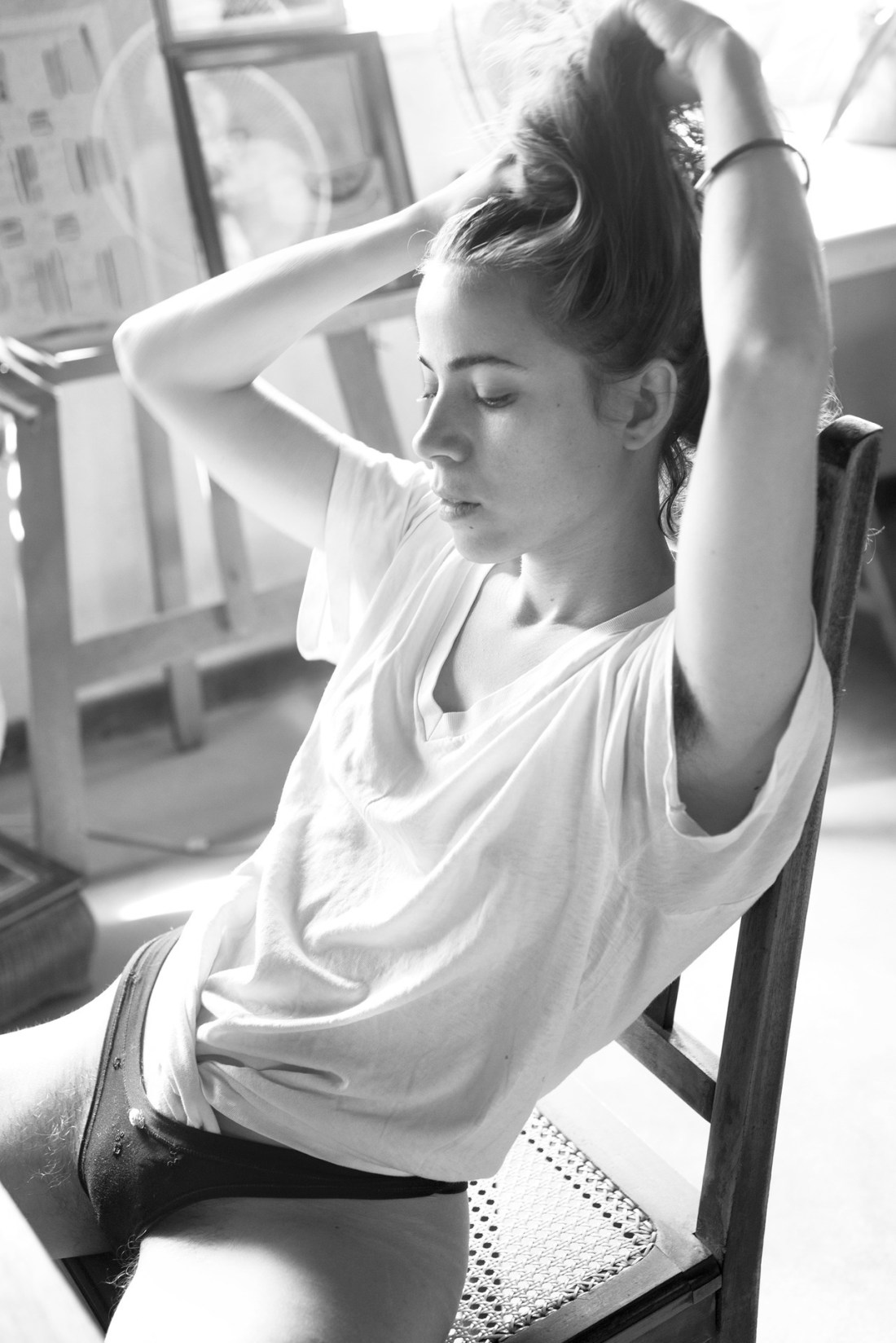
Paula AparicioInés en casa, buenos aires, Diciembre (2017)

Aparicio is a fantastic photographer and image maker. (The above is digital; but she also works in analog.)

I’ve been working out how to tell you something about this for several days now. It’s not easy–not for lack of things to say but in the saying of something there is all too often an effort to demystify. Aparicio’s work resists that approach.

It occurred to me that although this is monochrome–it’s actually not dissimilar from the selection of Polaroids made by Andrei Tarkovsky’s released through Thames and Hudson entitled Instant Light.

My copy of that book is currently in storage–so I searched for some samples to include side by side with other work by Aparicio to illustrate similarities. Except the site I landed on was this and well, I’m inspired to run in rather a different direction.

As Michelle Aldredge points out–Tarkovsky was extremely anti-Hollywood. He felt that there were two predominant means of expressing ones vision: the descriptive and the poetic. He opted for something that was both third option and middle ground: metaphor.

Yet, he was adamant that what he was doing had little to do with symbolic coding. What he meant by metaphor was something along the lines of this:

I think people somehow got the idea that everything on screen should be
immediately understandable. In my opinion events of our everyday lives
are much more mysterious than those we can witness on screen. If we
attempted to recall all events, step by step, that took place during
just one day of our life and then showed them on screen, the result
would be hundred times more mysterious than my film 

In other words, he sought to present the world of his films not as a story or exercise in formal decryption. It wasn’t even really supposed to mimic the function of dreaming, it was more an effort to use the immersive nature of cinema to convey an approximation of an experience that while not the whole experience might be somehow more than experience.

That’s what I admire so much about Aparicio’s work. The way it hones in on the magnificence and mystery in the mundane of lounging around on a sunny morning in a way that feels both foreign and familiar all at once.

Also: the lighting here is excellent. It appears almost backlit but the light is actually slanting left to right across the frame. The flattens Inés right arm against the overexposed backdrop, while emphasizing her face in profile and lending her body more solid dimensionality. (It also has the effect of making it seem as if she’s tilting towards the camera a bit.)

This would’ve been a good image without any other additions but there’s also the way the light catches her eyelashes and what look like burns from cigarette ashes on her underwear that makes this thoroughly mesmerizing.

(It’s also a bit like a Vermeer where you think that if you watch it long enough the picture will come to life and you’ll get a glimpse of what happens next–even though the medium makes that impossible.)

Valerie ChiangAll info is in the image (2017)

This is really effing fabulous, y’all.

It’s a solid image. There’s a sense of person and place, the pose is dynamic and it’s an image that would lose whatever It-thing renders it so damn visually compelling were it B&W instead of vibrantly full color.

Compositionally, the original image had some issues. Kacy is presented slightly left of center. From the standpoint of the way the eye scans this isn’t ideal. Were this digital, you could flip the image so that the top of the juke box/deli-display counter lines the eye up to scan to Kacy’s face and then her gaze back at the camera and through the camera the photographer/audience.

But this is an actual snapshot. So it is what it is.

Cutting a strip from the right and then appending it to the left is a solution that is elegant in its simplicity and stunningly effective. It moves Kacy to the center of the image, yet breaks up the composition in a way that makes the centering non-obtuse and perhaps even a bit enigmatic.

Then there’s the physical tactility of the way it’s presented. The composition book page and tape with a caption added; a caption that serves the same function as most titles for fine art photographs–it tells you what you’re already looking at.

(Let me digress momentarily here to say that after trolls, the most common asks I get are people pissed off when a title controverts their interpretation of an image. On one level I understand the frustration; on another–I think although it’s more challenging a title can actually contribute additional poetic resonance to an image. I always refer people pissed off about titles to Joel Sternfeld’s On This Site… which presents gorgeous large format landscapes and then with the title reveals a horrific crime that took place in that exact location years ago.)

What Chiang appears to be doing here is pointing to this tendency in a super meta fashion that sort of undercuts the logical underpinnings of this tendency.

I mean she’s basically presenting a photo and giving the photo a context–i.e. as something visceral but also as something diaristic (the notebook page, which should also be noted that by using the back side of the page instead of the front gels nicely with the compositional flaws in the photo as well as the fix.)

It’s all very elegant. But it’s interesting because the caption in the image: Kacy Hill, Cafe 50s, Los Angeles, CA merely describes what is been depicted. (That does provide some clarity at least for me because to my eye this could be a Brooklyn bodega deli for what I see of the background but the light is decidedly not east coast. The caption clarifies that.)

The title All the info is in the image is effectively illustrating what any fine art photographer does when the push work out of the nest into the world–where it will live or die on its own. The notion being that you convey enough of a context where the work can make a life independent of its creator. So it’s educational but I also feel like there’s a bit of an urge to proclaim that titling images is important and maybe we can do it in new and different ways just so long as we remember to enliven the context enough to justify such largess when it comes to authorial license.

Either way, I think Chiang’s work is several cuts above most of the stuff floating around the Interwebz these days. Definitely check her work out. It will reward your time and energy richly.

Alexander Talyuka*** (2016)

You know how there’s a statistically relevant correlation between being a fan of Smash Mouth and being a Douche Bro?

I’m here to suggest a similar relationship between white cis men who identify as ‘fashion & nude photographers’ and shitty, quasi-exploitative imagery.

Talyuka is a sterling example.

However, much like the infinite monkey theorem suggests, even a douche-y bro can sometimes stumble upon a good picture–consider the above.

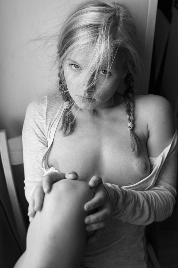
And it’s not even necessarily good. First and foremost, there is no compelling reason for this to be a vertical composition. Second, I’m going to take a wild stab and suggest that it was shot on some sort of full manual, setting. This would’ve been an image that would’ve benefited from an extremely shallow depth of field as her knees and hands contribute decidedly towards creating a foreground and the wall behind her is an obvious background. Rendering both bokehlicious, could have accentuated her expression–somewhere between coy and perhaps deflective of unwanted insinuation.

But really, I’m all about the mussed hair. It’s like she just pulled a wool jumper over her head and her hair is all wild with static electricity. It flies in the face of the prerogative for perfection in fashion moded work and her it at a cute, down-to-earthness to the image that renders it palatable.