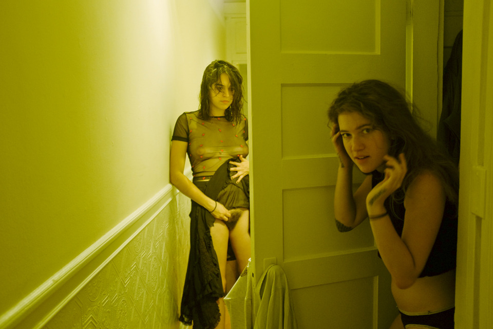
Vivian FuCheyenne and Eleanor (2014)

Independent of my projections on it, this is absolutely wonderful. There’s room for commentary on the way the use of color diverges from Fu’s usual and edges towards the surreal suffusion that have become Sophia’s hallmark. Also, the juxtaposition between the intentionality of the framing–how the top edge of the wainscoting aligns so perfectly with the lower left corner of the frame; and the immediacy represented in the off kilter vertical alignment between door jamb and right frame edge. (This of course echoes the staged/unstaged tension of the image.)

All blasted phenomenal, really. Still what gets to me is they way this image immediately linked arms in my mind with a self-portrait of Catalan feminist pornographer Maria Llopis.

I’m not entirely convinced I can explain the why beyond a general opposition: concerns over portrayal (Fu) vs. art as a process of secondary documentation with regards to radical self-actualization (Llopis). Both have their merits, purpose and place. Both are without question doing the Lord’s work… but I can’t help questioning–not to in so doing place an undue burden on young shoulders–but what I’ve seen thus far of Sophia’s work manages to walk a razor’s edge between performance and academnified activism by firmly anchoring the work in lived experience. If there’s a way to split the difference, I think she might be just the artist to manage it.

Cheyenne Sophiaflint (2013)

Jaw, meet Floor.Floor, Jaw.

You two get to know each other because if Cheyenne Sophia keeps making work this fucking stellar, you both are going to be seeing a lot more of each other.

At first glance this may seem as if it doesn’t belong on this blog. It definitely does but I need to slay some irksome dragons before I get into all that.

First up, FUCKING STOP drawing lazy ass parallels between the work and Wong Kar-Wai or my arch-nemesis Gasper Noé. Cheyenne admits she isn’t familiar with either beyond their use of super saturated color.

Super-saturated color is a TOOL. Insisting there’s overlap between work due to a single prominent feature considered in isolation is like suggesting there’s a parallel between Henry Gaudier-Greene’s and my own work since both of us favor Pentax 67iis.

Secondly, the look associated with Wong Kar-wai is less his and more Christopher Doyle’s invention. Yes, Doyle lets red bleed out everywhere; so in at least one way there is overlap with Cheyenne. However, the overall effect is ENTIRELY different.

Third, Gasper Noé employs a cacophony of colors that sometimes blur but rarely bleed.

Finally, why compare someone whose work is a great deal more interesting than either of these two artists just by virtue of the fact that they predate her and are part of the art establishment?

Now as to why this belongs here. In an interview with wAsTe magazine Cheyenne speak about the importance of queerness to her work. Her answer is revelatory–not to mention displaying mad strong conceptual game:

Learning about queer culture and feminism has been hugely important in making the work I make and feeling like I have something to stand on. They are both a massive part of my identity and my work is essentially one big self-portrait. Queer work is important because queer people are important.

Whether or not the work she makes fixates on depicting sex there is always an edge to it, an underlying insistence upon “being a feminist artist who is open about sex.”

I CANNOT wait to see more work from this artist. And I am over-the-moon at the prospect of a possible collaboration between Cheyenne & Laurence Philomene.