Yan BertoniEmma #3 (2017)

This is a visually arresting image–without a doubt.

Were one so inclined one might talk about color (The palette of red hair to ochre lichen to the brackish algae tinged lake) or about texture (the lack of texture in Emma’s skin and the surface of the water vs. the abundance of texture in the wooden dock).

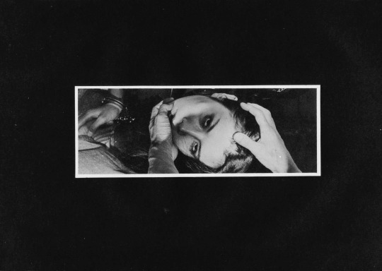
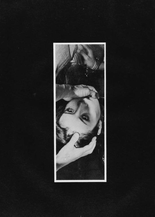
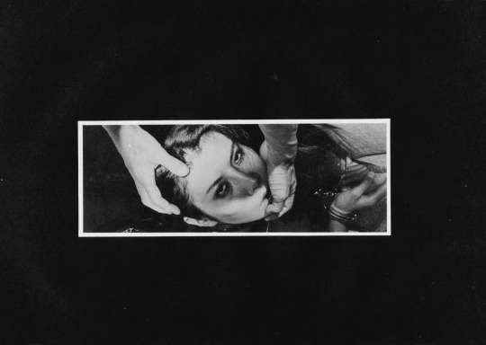
I–for my part–can’t look at it and not compare it less than favorably with Chadwick Tyler’s effing exquisite image of Cora Keegan from back in 2014.

The fact that I prefer one to the other probably won’t surprise anyone who has been following this project for any period of time. The reason why I prefer one over the other almost certainly will: I think the above image is over-composed to the point of sterility.

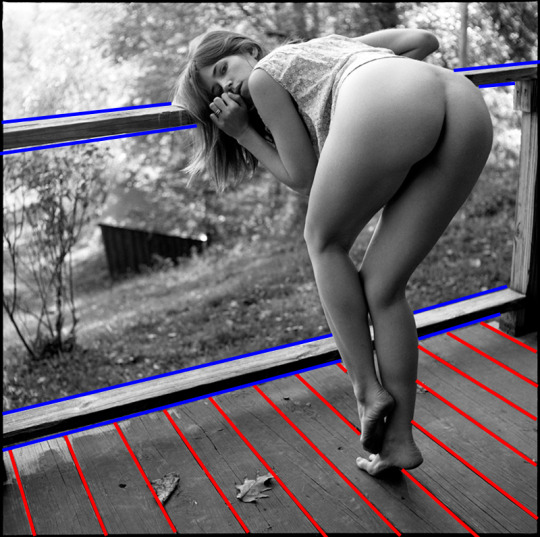
What do I mean? I mean this isn’t strictly governed by the rule of thirds. I charted it for you to peep:

What is interesting is that if you zoom in a bit and ignore the water the dock conforms to the rule of thirds:

This sort of nesting of for frames within frames reminded me of the Golden Ratio. So I diddled around with that for a bit. The image in no way conforms to it but imposing the spiral in on particular way does illustration something about how the image is arranged to cause your eye to track back after it has moved all the way from left to right:

Well, I mean… that all sounds pretty sophisticated when I lay it all out there. So why do I prefer Tyler’s image?

Well, I don’t think the golden ratio overlay is a function of calculations in the making of the image. More: I think that the golden ratio is everywhere. Yes, it’s rare to find an image that conforms to it to a T but I think the rule of thirds works because it takes the ordering principles of the mean and parses them in such a way that you can achieve a similar effect without measuring with painstaking exactness. I’d wager there’s very few thoughtfully composed images that can’t be argued demonstrate some implicit reliance on the golden ratio.

What makes Tyler’s image better is that well–there’s little if anything to stop someone with a decent camera, time and a little bit of money from recreating Bertoni’s image. While I will grant that the model will be slightly older and the reflection of the sky and the weathering on the dock might have changed slightly–it’s not a question of whether or not it can be done, more a question of whether or not the person doing it has the patience to do it.

How would you even begin to go about recreating Tyler’s image. Go ahead, I’ll wait.

When I say sterile that’s partly what I mean. Bertoni’s image has been so rigorously balanced it has no life left to it and as such there’s nothing distinguishing it as singular or unique. (Also, I’ve seen other pictures from this series and the dock here is like six feet off the water–which you can’t tell given the image.

Also, what is Bertoni’s image about? A model posing for a photographer. There’s little else as far as suggestion of a narrative.

Whereas with Tyler’s image: why the hell is she smoking with her head hanging off the dock? Does she not want her face int he shot. Is her hair in the water? Is this a model posing for a photographer or is it two friends hanging out one with a camera and another just fucking around and then there just happened to be this wonderful accident of a masterpiece of a shot.

Source unknown – Title Unknown (201X)

Folks always give me shit about how I fixate on the framing/composition of a photograph or image. Yet, framing/composition contribute or detract immeasurably from the legibility of a photograph or image.

Take this, for example: it reads vertically and thus represents a rare instance where a skinny frame is logically consistent composition decision.

I’m fairly certain that this is not a panoramic photograph. (I’d wager it’s been cropped from a wider scene and digitally desaturated.)

Under normal circumstances, this is the sort of thing I avoid showcasing–except this is remarkably well-realized on two counts:

First, the affected white border around the image giving it a lurid news paper clipping/traditional dark room work print feel. (Both contribute a tactility to something that emphasizes the extremity of touch.)

Second, note the way different parts intersect in the space delimited by the frame–his hands, her face and handcuffed hands.

It’s partly the juxtaposition between the highlight detail of skin against the impenetrable background shadows, partly the way each feature converges at right angles to each other within the frame.

It’s also the way the camera is a witness as opposed to an intercessor. For example, rotate the image 90° clockwise gives you this:

image

Now maybe it’s just me but there is a certain way that with this orientation and hands entering the frame from the lower half (such as this) suggests that the hands belong to the photographer/image maker. Many folks are rightly criticized for this tact–looking at you Insuh Yoon. (Alternately, I did see this image made by Bang Sang Heyok, that while not a good image is–as far as I’m concerned–a successful proof of concept that there may be situations where the image maker/photographer insert themselves into the scene may actually serve a non-creepy purpose; in this case I appreciate that the image maker is attempting to preserve the anonymity of the subject in such a way that doesn’t not require decapitating them with the frame edges.)

Let’s take it another step, actually. Here are the same images rotated 180° & 270° degrees respectively.

image
image

To my eye, the 180° rotation doesn’t read as well. I see the handcuffs before the hands. With the mass of negative space at the bottom of the frame, your eye immediately retreats and locks on the handcuffs.

The 270° one is more surreal–how are the hands at that angle unless there has been some sort of gravitational trickery with the staging/positioning of the camera. In other words, this orientation undoes the physicality established by the original orientation. And, given that this is ostensibly a BDSM image, that exact physicality is the raison d’etre of the image.

Lastly–and this goes out to the naysayers who take issue with my #skinnyframebullshit ethos: the argument that you employ to dismiss my objections is that there is fundamentally no difference between the way you read the original and the 270° rotation. And you aren’t wrong. You encounter the same information in the same order with both orientations but the logical consistency of the composition and conceptual interpenetration given the various orientations not to mention the shift in psychological impact is the reason I harp so much on the fact that image orientation matters a whole lot more than I think you’ve really bothered to stop and consider.

Petr Žižák – [↖] tereza (2015); [↑] tereza (2015); [↗] bety (2014); [+] jen tak (2010); [↙] kamasutra (2010); [↘] bety (2014)

Žižák’s works in 6×6 exclusively–which I don’t believe to be the format most well suited to the type of work he’s pursuing. (In my mind–square formats are best suited to portraiture.)

Well, aren’t these portraits? Yes and no. Strictly speaking–from the photos above–you could make an argument that jen tak and the second one of bety (on the lower right) are portraits. (Both feature eye contact with the camera and so ostensibly with both the photographer and the audience.)

But something like kamasutra? No. That’s more whatever the fuck you’d call what Jan Saudek does…

Additionally, figuring out what Žižák‘s about is complicated by his lackluster and toothless editing. He presents his work separated out chronologically, it’s easy to see how he frequently includes two very similar images side-by-side (with one exception, the second image is always the better–and honestly I think the one exception has been purposely had the shot order switched in order to thwart would otherwise appear a rather staid and knee-jerk tendency to indulge base voyeurism over contemplative seeing.

Now I could be seeing things due to these poorly edited near duplicates but I don’t believe I am. After all, the first thing that commanded my attention was the way he uses his frames. It’s inspired, actually.

See one of the reasons square formats are better suited to portraiture is that you can situated your subject dead center and the frame will still scan in most cases. This being the case, most square work tends to be centered. Žižák? Not so much.

There are two things he does in particular that I think are very much worth studying: one deals with the distinction between finding a frame and constructing one; the other has to do with what I don’t know how to convey except to say that his frame edges are almost always permeable.

I think the vast majority of us find a frame as opposed to making one. It’s a bit like a dance. You find an alluring subject and then you try to position yourself and by dint a camera so that you can coordinate various respective positions in such a way that the world arranges itself neatly around the subject. Often its finding the square or rectangle surrounding the subject that is suggestive of some notion of ‘a photograph’.

Making a frame is different. It involves selecting a scene and then given that scene positioning various elements within that scene so that it reads in such a fashion as if one just happened upon it wait for you there in situ, as if by magic.

It’s partly the difference between street photography and landscape photography, partly dance vs choreography.

Almost without exception, Žižák favors to stand in relations to a backdrop in one of three ways–parallel to a backdrop or so that the backdrop recedes at an acute angle from either left to right or right to left (such as in the first photo of bety above).

Let’s stick with this photo of bety for a bit… see how there’s that small rectangle of an adjacent building in the upper left corner of the background. Žižák does something like this in just about every photograph he makes. (Although very much in the foreground of the adjoining photo of tereza, note how the rectangle along the edge of the frame is used not only to balance the composition–in this case offsetting the relative shadowness of the frame–but also seems to speak to their being continuous space beyond the frame edges’ boundaries.) Also, here the reflection also serves to opens the frame.

There are themes that become a bit cloying in the work. Žižák show a penchant for semi-clothed to nude; he’s models frequently forgo clothing below the waist and he definitely has a thing for women with books and cameras.

Some of the technical aspects of the work is uneven. It’s tough to tell if it’s the scans or that the stock was underexposed in camera but it’s rare for him to get things as perfect as he does in the photo of jen tak above–which is a thing of heartbreaking beauty.

Sanders McNewMelanie King (2014)

Often, I drone on and on about the notion of ‘composition’–as if y’all magically know what I mean.

I mean I do try to at least apply the term consistently, usually meaning something like the way visual information is arranged and presented within a given frame.

Unfortunately, such a definition is a bit too open and inclusive as to be functionally useless.

Interrogating matters of composition might be better separated into several congruent examinations. There’s the notion of the frame. This gets tied up in ideas of inclusion and exclusion. However, there are also tangential concerns about the way things like the angle of view and tilt/pan/cant of the frame subtly informs psychological resonance.

There’s also questions of space. This can pertain to depth of field. The way a scene or setting is depicted. (Generally, it’s this to which I’m referring when I mention composition–the way a photography parses visual information in space through a lens in an effort to not only show the viewer something but offer them a particular way of seeing it.)

I’m not sure the above is a great photograph. I like it enough. But what I think is truly exceptional about it is how clear an example it is of parsing visual space for the viewer.

image

The default order of operation for reading images is left to right. Yet, that doesn’t always work. (As anyone fixated on making images exemplifying bilateral symmetry will tell you: it’s rare that things that appear symmetrical are truly and rigorously so.)

So one thing photographers do is to us contextual elements within the frame to guide the viewers’ eye over the frame.

The lines highlighted in red pull the eye upward and left and then the lines highlighted in blue shift the eye left-to-right. Melanie’s gaze directly into the lens closest the loop and the eye circulates following the lines highlighted in red inward, then the blue lines drift right and then we’re back at the beginning again.

What’s also skillfully applied here is Melanie’s position vis-a-vis the lines. She’s in front of them and therefore blocks them. That makes her the undisputed subject of the frame. (The DoF presents both her and deck in sharp focus but the scenery behind her goes soft and bokeh, further pushing her and the porch to the foreground.)

Source unknown – Title Unknown (197X)

Although this seems–initially–highly staged/contrived in an effort to balance the composition, there’s also something profoundly compelling about it.

I knew from square one that I fucking adored it. Putting my finger on the why of it took some time. But, last week I stumbled upon an article about a photo snapped during one of the many brawls in the Ukrainian Parliament and how it has garnered a great deal of attention because its composition resembles the Golden Ratio governing composition of Renaissance masterpieces.

It’s really the first time the how of the Rule of Thirds derivation from the Golden Ratio has made sense to me. But it triggered another correlation that’s generally overlooked in most work governed by the rule of thirds–the reliance on an increasingly dense deployment of negative space as thing spirals outward.

This realization reminds me of the wonderful–as per usual–analysis Every Frame a Painting presented of Nicolas Winding Refn’s grossly under-appreciated Drive and it’s use of a so-called Quadrant System of composition.

Granted Refn’s use of quadrants isn’t exactly in line with the Golden Ratio; however, I suspect if one had the time and energy one could demonstrate that the reason some of the unexpected cuts he uses work so well is actually due to an overall respect for the Golden Ratio across connecting scenes… the point is if you overlay quadrants over the rule of thirds and recall that one quadrant needs to be predominantly negative space, then the logic of the rule of thirds suddenly clarifies itself. (At least for me it does.)

I strongly suspect that the above image was originally composed according to the Golden Ratio and subsequently cropped prior to publication. It’s interesting to note that if something is rigorously composed according the Golden Ratio, then any thoughtful crop retains a logical consistency in composition.

Yet, what especially fascinates me  is that although my first thought is stylized contrivance–looking at this now, I view it more as a lie about a lie that manages to tell something not unlike the truth.

I love her introspective expression, the way it conflicts with the obvious catering to the voyeur suggested by her pose and it now strikes me as disarmingly intimate and beautiful.

kalkibodhi:

Feet

KalkiBodhi Archives

Normal
0

false
false
false

EN-US
X-NONE
X-NONE

/* Style Definitions */
table.MsoNormalTable
{mso-style-name:”Table Normal”;
mso-tstyle-rowband-size:0;
mso-tstyle-colband-size:0;
mso-style-noshow:yes;
mso-style-priority:99;
mso-style-parent:””;
mso-padding-alt:0in 5.4pt 0in 5.4pt;
mso-para-margin-top:0in;
mso-para-margin-right:0in;
mso-para-margin-bottom:10.0pt;
mso-para-margin-left:0in;
line-height:115%;
mso-pagination:widow-orphan;
font-size:12.0pt;
mso-bidi-font-size:11.0pt;
font-family:”Garamond”,”serif”;}

Sans attribution, there are two directions guesses at credit for any photograph featuring young nudist women can go: David Hamilton or Jock Sturges.

And despite being in color this bears none of Hamilton’s idyllic, dreamy soft focus.

The large-format aspect ratio points to Sturges despite the fact that he works almost exclusively in B&W.

Also, I am pretty familiar with his work and I cannot recall an instance where the subject whose eyes were wide open was this close to the camera without staring directly into the lens.

Further, although Sturges favors vertical compositions to echo the people standing within his frames, this vertical orientation is skillfully contrapuntal, delicately diminishing the horizontal force of the pose by balancing the negative space in the doorway against the blue wooden slats.

All in all, this contains altogether more calculation than I expect from Sturges’ knee-jerk fine art-photographer-as-gilded-voyeur routine.

But it’s the un-self-conscious mien of the model—who, although nude, appears not as a sexualized object so much as a spectrum of being that includes the possibility of sexuality. Such presence in both one’s own skin and a moment has a definite parallel with Sally Mann’s wonderful Immediate Family.