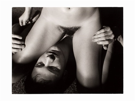
Malerie MarderUntitled from Carnal Knowledge series (1998)

I’ve wanted to post this for at least a year–but have not be able to track down anything larger than a teeny-tiny thumbnail. (I have complicated feelings about Marder’s work; over all I lean toward the fan person end of the spectrum.

Now that I can post it… I just don’t have any thoughts on it. I mean I love the direct sunlight, the way it makes the skin shine. I love the way you could likely distinguish shadow detail to a degree that would allow you to distinguish individual strands of pubic hair around the edges of the bush–but things go dark and become solid away from the edges (almost like a vague nod to something not unlike modesty, in spite of the explicit nature of the image).

I love how the low angled light stains the boys cheeks with the shadow of his lashes. The way he’s meeting his partners eyes even if the viewer can’t see them. The gentleness with the way he’s touching her things with his fingertips.

Still: looking at this I have trouble feeling the usual resonate rush of vicarious anticipation that I usually do when I spend time with it. I know why I feel this way: my fortunes have shifted rather drastically over the last year. I’m definitely in a better place than I have been but I’m a long way from OK.

And honestly, as much as the feeling of this image has always been something that motivates hope for future physical intimacy with folks I care about–that is something that it’s becoming increasingly clear is not in the cards for me. So while I love this and want to share it with you and hope you can feel something towards it that I don’t seem to be able to muster any more.

Source unknown – Title unknown (19XX)

I’m not 100% sure the framing works here–both his legs and here right shin are amputated in awkward places. While there is very much a sense of context–i.e. a boudoir, there’s a flatness to the print that does no one any favors.

On the plus side: I’ve never seen the above position enacted in porn prior to viewing this–it’s rather charming; emphasizing giving over receiving and I simply adore they way their lazily holding hands and caressing each other.

Also, that Cheshire smile she’s wearing would’ve been enough on its own to convince me to post this.

Source unknown – Title unknown (201X)

I have so many complicated and conflicting feelings about posting shit like this. Or honestly even looking at them–it feels a bit like being stranded in the middle of a desert desperate with hunger and thirst and having an airplane fly overhead and drop menus from a fancy restaurant. I’m looking at something that will never be a part of my life.

I don’t know maybe that’s what gives this project a vitality that some of you seem to respond to: the wanting makes it seem more relevant.

In the end I’m posting this gif loop not because of what it depicts but because of the notion that maybe someday someone will see me as containing multitudes and within those multitudes are contained all three of these lovers.

Source unknown – Title unknown (200X)

This appears to be an earlier image from the same sequence as something I posted way back when Acetylene Eyes was just a baby blog. (The similarities run beyond both being taken in a truck cab: that’s the same boy and the pattern stitched into the upholstery is an exact match.)

But there’s other similarities, stylistic overlap. I noted in the early post before #skinnyframebullshit was a fully qualified thing, that the vertical orientation was counter-intuitive given the tableau.

The astute reader will pause here to inquire but aren’t you being disingenuous? You’ve said on a number of occasions that whether the eye scans left to right over the image or top to bottom can be a part of the logic governing the decision between landscape vs portrait orientations?

I have two responses.

  1. You have to distinguish between actual 3D space and how three dimensions are rendered in 2D representation.
  2. I noted that about the previous posted image as well: the top 20% of the above frame and the bottom 10% contributes nothing to the compositional logic. (It’s negative space that doubles down on information that would otherwise be conveyed to the viewer even if it was cropped out.)

Let me expand that first point a bit further: from the standpoint of visual grammar, the image is telling the viewer that it has something to say about elevation. But that isn’t supported by the image. One only sees, what a meter of elevation from the low point of the stitched seam in the lower right almost corner to the halfway up the open passenger side door? (Depth of field, i.e. front to back representation of 3D space in 2D vs top to bottom orientation for the purpose of emphasizing a sense of concern with the relationship of various elevations are not interchangeable.)

Also, whereas I commented that the previous image would benefit from slight shifts in the poses, I think that a horizontal oriented frame would add a narrative denotation to the reading of the image. (Something which is conceptually appropriate given that the question what constitutes narrative is so similar that it runs virtually parallel to questions of the mechanics of eroticism.)

If her right leg were braced against the door frame instead of bent as such, it would open the frame up more. From which point it would be logical to cheat her a little bit further towards the edge of the passenger side bench, reposition the camera with a bit more of a down-tilt so that you can see a bit of the grassy shoulder outside the car door and perhaps something of what he’s doing with his hands–his current position above is hell of awkward.

My point is it’s a reasonably good notion for a image that unfortunately muddies matters when it comes to thoughtful execution.

There are some technical considerations to belabor, too. Gun to my head, I’d say this was shot digitally and desaturated in post. Shutter speed is below 1/30 of a second. My gut says its 1/8th of second given the slight motion blur of her left leg.

I can’t really quibble with the overall exposure across the image. Yet if this is, in fact, digital, then you’d want that highlight contained just inside the upper limits of the histogram.

Then you’d have room to selectively dial things some detail back into the some of the heavily shadowed areas in the frame.

Bettina Rheims – MC6 II from Morceaux choisis series (2001)

I’m not especially familiar with Rheims work but from what I’ve seen of it, she seems to meet her subjects halfway.

What I mean by that is not something I know how to easily indicate. It’s kind of like this: most photographers/image makers operate with a reliable fixation on appearance as factual representation. In other words: they trade in the ontology of I can see this and I can show you this, so this must be ‘real’.

There’s a lot made of Rheims and her use of color in concert with insanely high quality printing to “[make] the flesh appears living and [contribute] a disconcerting realism.”

I don’t disagree with that summation. It’s more that I think the way Rheims uses her erotics as a mode of unsettling the viewer serves to create work that trades less in establishing sacred cow archetypes and more to show people as they are instead of how they would like to be seen or represented.

And isn’t that just the central tenet of artfulness–the dialectic between hyper-stylization as a destination in and of itself vs that rare effortlessness that takes oodles of effort to accomplish but the accomplishing carefully erases any sign of over-the-top intentionality on the part of the creator.

For something as heavily contrived as the above image is: shot in a studio, with precise lighting orchestration, there is something compelling about the way it absolutely doesn’t read as pornography in spite of what it depicts.

(Full disclosure: the above is not the image I wanted to post most of all. I am especially fond of this one from the same series but I couldn’t find a HQ scan of it, unfortunately.)

Source unknown – Title unknown (201X)

The eye moves left to right over this frame; the action flows in the opposite direction (right to left)–like walking into the ocean when the tide is pushing in against the land; or, as if the arrow were pushing itself against the bowstring of its own accord–seeking that perfect tension wherein it can only be loosed free and true on target.

Source unknown – Title unknown (19XX)

Free love? As if love is anything but free! Man has bought brains, but
all the millions in the world have failed to buy love. Man has subdued
bodies, but all the power on earth has been unable to subdue love. Man
has conquered whole nations, but all his armies could not conquer love.
Man has chained and fettered the spirit, but he has been utterly
helpless before love. High on a throne, with all the splendor and pomp
his gold can command, man is yet poor and desolate, if love passes him
by. And if it stays, the poorest hovel is radiant with warmth, with life
and color. Thus love has the magic power to make of a beggar a king.
Yes, love is free; it can dwell in no other atmosphere. In freedom it
gives itself unreservedly, abundantly, completely. All the laws on the
statutes, all the courts in the universe, cannot tear it from the soil,
once love has taken root.

Emma Goldman, Marriage and Love

Otto Schmidt – Untitled (189X)

The above sampling of Schmidt’s work was posted by @vensuberg with the following note appended:

I’m posting these three pictures by Otto Schmidt to advertise another of Sparismus’ blogs, here.
The pictures there are generally of this type, about half by Schmidt
and considerable graphic material as well. Also the scans are much
better than he is able to manage on his regular Schmidt series and tend
to be about 6000×6000 (three times the resolution tumblr will post
these).

If you like your smut turn-of-the-century vintage with a dash of too-cool-for-art-school, then you’d do well to follow them.

I was unfamiliar with Schmidt prior to seeing this but his work is intriguing. There’s an attention to depth of field (particularly in the top photo of what might be referred to as a cunnilingus pyramid) and control of overall tonal range which both suggest a familiarity with the photo avant-garde. Also, the blocking and positing suggests the photographer was extensively familiar with art history–particularly oil painting.

One might quibble that the commitment to fitting pornographic content to classical forms, detracts somewhat from the erotic effect of the work. I can see that and absolutely think that one of the struggles in trying to produce work that is Capital A Art with the pornographic depiction of sexuality as its subject is to carefully balance concept, form and technique with a carefully considered execution that leaves room for ruptures, disjunctions and spontaneity. (For example: although sterile and awkwardly over-posed the cunnilingus pyramid does end up reading as playful.)