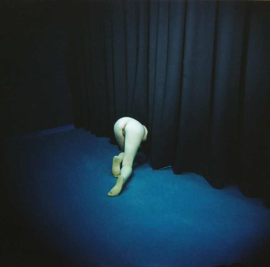
Hila Vugman – Tel Hai from Cities by the Sea series (2012)
“Certain thoughts are prayers. There are moments when, whatever be the attitude of the body, the soul is on its knees.”
–Victor Hugo
Hila Vugman – Tel Hai from Cities by the Sea series (2012)
“Certain thoughts are prayers. There are moments when, whatever be the attitude of the body, the soul is on its knees.”
–Victor Hugo
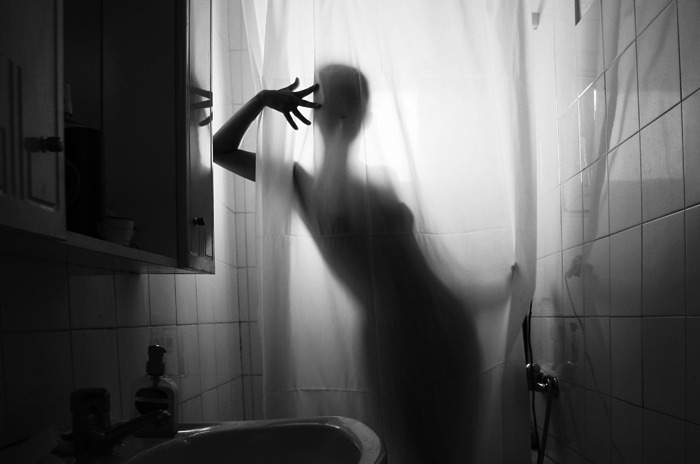
Diana Bodea – #1 The Shadow from Touched by light series (2008)
Looking at this my first response isn’t to pedantically point out that it features backlighting.
As I am sitting here struggling to wrap my head around how to write about it, I am uncertain where else I might start.
See the problem isn’t noticing it’s backlit; the problem is focusing on the backlighting emphasizes technique over a more organic handling of the unity between concept and execution.
And what I want to talk about has more to do with the dynamics between the technical and the conceptual in this photograph.
Two days ago, Amandine spent a lovely day sharing time and space as well as practice our respective crafts–me trying to capture the interplay between color and fog along the coast, her drawing and painting dunes, people walking in the distance and the subtly variegated beach grasses.
Driving back we were talking about music. She asked me what I thought of Joanna Newsom. I said I had liked The Milk Eyed Mender. Then back-tracked that I was only really familiar enough with the track Sadie–which I adore.
My ex hated both Björk and Newsom because of their eccentric vocalizations. I felt the same way about the former–at least initially (she’s subsequently become one of my all-time favorite artists) but I wasn’t familiar enough with Newsom, so I sort of missed her work.
Amandine was telling me about how amazing she was and how I really should check her out. But she offered a caveat that one of her favorite of Newsom’s songs contains a mistake.
See the song Emily contains the following lyrics:
That the meteorite is a source of the light
And the meteor’s just what we see
And the meteoroid is a stone that’s devoid of the fire that propelled it to theeAnd the meteorite’s just what causes the light
And the meteor’s how it’s perceived
And the meteoroid’s a bone thrown from the void
That lies quiet and offering to thee
She has it backwards, Amandine insisted. I mean it’s poetic and beautiful and brilliant but it’s the other way around, really.
I don’t know enough about it to comment but I do know–subsequently having listened to the album it’s on several times–it doesn’t matter, I don’t think.
Like maybe she created the lyrics based on being told it the wrong way around–which contributes to the meaning of the song, actually. Or it’s a John Donne-esque metaphysical metaphor of the soul–which again, contributes to the song. Or, it’s a rejection of science–again, something that fits with the song.
Whether it’s right or wrong, it works. And that’s kind of a rare and wonderful thing.
But it occurs to me that backlighting is the wrong thing to focus on in the photo about for the same reason it’s a mistake to get caught up in whether the rhyme about the difference between meteors and meteorites is right or wrong.
When I used to teach lighting workshops I would show kids how to set up a quick and dirty three point lighting setup. I’d explain that this is the key light, this is the fill light and this is the back/rim light. I’d then show them what each looked like independent of the others.
I’d then turn all the lights back on and explain the rationale behind this setup–it’s a stylization of how we experience light in the world around us. Like: if I’m standing in a field facing a camera and the lighting is behind the sun is behind the camera relative to my position–unless it’s straight on (a poor strategy if you’re trying for an aesthetically pleasing image because the light is too bright and people naturally squint when the light is in their eyes), then there’s one side that is incrementally brighter than the other. So natural light presents with a key and a fill light.
But light also falls on the ground behind where I am standing in said field. Yet, that light is like the fill light except it reflects enough light back towards the camera that because the body separates the light reflecting off the ground from the camera, it contributes a dimensionality to my body.
The point is–what we see we see only in relation to the way light interacts with it. The only source of light in this is presumably the window behind the shower curtain and the subject.
It’s interesting that backlighting combined with other lighting contributes dimensionality–yet we normally think of backlighting in terms of silhouetting. There’s a surprising amount of dimensionality in this. That’s partly due to the one point perspective imposed by the tile.
But the visibility of the mirror and the reflection of the hand, as well as the white sink gives a stark solidity to the image.
It’s a mistake to say: this is backlit and then just leave it at that because it’s how it’s backlit (how this is used formally and contextually to foster a sense of dynamic unity to between generally opposing elements).
An exquisitely refined work. Impressive and thoroughly unforgettable.
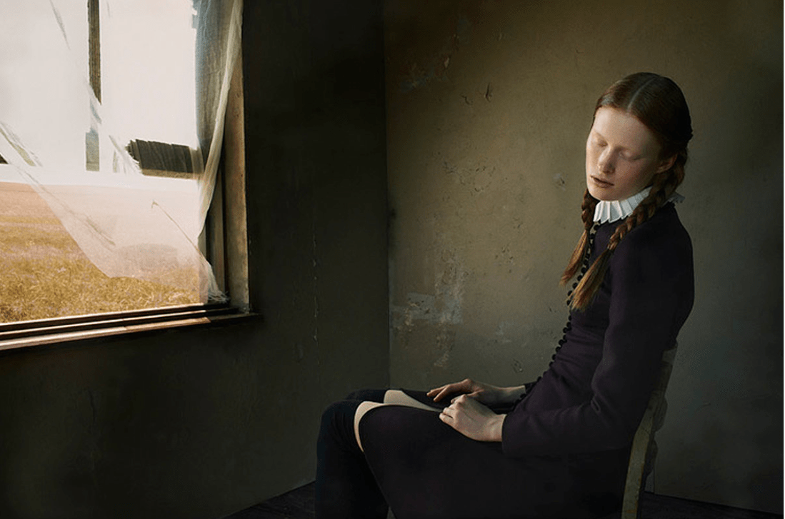
Bruno Dayan – Winter’s Tale for Ilva Hetmann and Erin Axtell Flair Italy (2011)
I really like this image.
A big part of my attraction is tied up with perhaps the closest thing I have to a legitimate paraphilia, namely: I get unspeakably aroused by things which press up against the boundaries separating traditional conceptions of the sacred vs the profane.
In this image it’s the Amish inspired wardrobe rubbing up against a quasi-masturbatory sensuality. (I can’t tell if the white on her thighs is her pulling her dress up to reveal knee-high stockings and a swatch of skin–essentially exposing herself to the open window and summer breeze–or if it’s pattern that’s a part of her pants; either way, it’s extremely evocative.)
The other part of it is the art historical resonance. This image immediately aligns with at least three other undisputed masterpieces: the young woman’s expression is a riff on Bernini’s sculpture The Ecstasy of St. Teresa and the view out the window of the scorched grass is obviously intended to invite associations with Wyeth’s painting Christina’s World, as well as Malick’s film Day’s of Heaven.
Also, perusing Dayan’s other work, this project is interesting as it steps well outside his usual pre-Raphaelite sensibilities.
Source unknown – Title unknown (2012?)
Google image search and Tin Eye are both dead ends trying to determine authorship with the above.
A shame because it’s exquisite. (In my experience you can have the best gear in the world, meter seventeen different points and do the math to determine the perfect exposure. But in the end what allows an image to turn out like this has more to do with trusting the unconscious instinct the demands you stop down and you don’t question you just rotate the aperture dial to the appropriate setting and trigger the shutter.)
Also, I’m certain this is riffing off Michelangelo’s The Creation of Adam.

Robert Weissner – Bree Addams (2013)
As it is, the framing functions. The desk more or less echoes Ms. Addams knees; the window edge starts a wee bit shy of the first vertical third but the vertical blinds and radiant light not only accentuate her form it contributes an implicit leftward momentum to the image.
Her weight is supported by her right arm and foot–her left leg shifts behind the other at the knee, her left hand is extended only for the sake of balance. It’s interesting because this posture suggests between her arms and torso a form close enough to round up to an equilateral triangle–drawing attention to her breasts (exquisitely semi-silhouetted behind sheer fabric), reiterating the shape of her pubic hair. .
With only this image to go on, I’d be pretty excited about digging in to the image maker’s other work. Alas, I think the praise here needs to go to Ms. Addams.
Don’t get me wrong, Weissner isn’t half-bad. He’s got enough technical chops to give his work a faux art sheen. The trouble is: he seems to see himself as a Dan Smith when his work is inline with the ‘art’ as a pretext for sating voyeurism of someone like Fox Photo-Art.
Credit where it’s due: technical acumen is nothing to sneeze at and this is one image is lovely and I certainly prefer Weissner to Fox Photo-Art’s rubbish. Unfortunately, there is so little distinguishing their work from each other or the scads of other female-nudes-all-day-every-day-because-I-own-a-dSLR-and-can-afford-to-hire-beautiful-models that I just have to shake my head and close another tab.

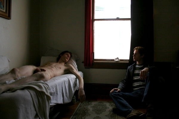
Yann Faucher – Untitled (2012)
Frustrating and illogical composition aside, there is so much to love here: suffused summer light bleeding from the window like a wound, suffusing the fringe of a beautiful body and clotting—white and diaphanous—on curtain gauze; eyes closed lightly, mouth open just a little; long arms dangle, finger tips tracing the textured braille of the bed sheets; above his right knee, and the forgotten change left on the sill that will stick for a moment when he stands again.
The content of the work is stunning, trading in sincere portraits of primarily nude male-bodied models. When [gender neutral pronoun] does make images of female-bodied individuals, the result is a sort of Fassbinder-ian waiting for those quiet moments wherein women are no longer divided into a me & the-me-the-world-sees and are finally alone with their thoughts.
It kills me to say it but all this potential is greatly diminished by Faucher’s thoughtless reliance on #skinnyframebullshit. I don’t know what it is more insufferable or sloppy.
There needs to be a reason, a compositional logic behind a vertical frame. I don’t know if in making portraits Faucher considers portrait orientation more fitting—though [insert gender neutral possessive] grasp of the technical seems more nuanced than that. It might also be an effort to comment on the way audiences view images (what with smartphones leading the #skinnyframebullshit charge). If that was the case, I could accept it. (I am not against vertical frames; I am against using them without any good reason.)
I admit that I haven’t looked closely at the rest of Faucher’s images; but the sense driving the framing seems to be the grievously mistaken notion that the frame should echo the length of the window. Only, due to the camera’s pan and the lenses wide angle of view, the visible portion of the window is closer to a square than a rectangle.
The window bay’s leftmost vertical angle does not align with the left frame edge. A small point, yes; nonetheless one that would have been de-emphasized with landscape orientation.
In this case the oddity of the angle indicates other glaring inconsistencies: the boy’s body is not balanced within the frame– the top of his left knee is lopped off by the right frame edge, his left foot hacked through the ankle and heel by the bottom frame edge. Then there’s the dead space directly above his head…
Don’t get me wrong the work is good; but it also has the potential to be so fucking much better. Unrealized potential pisses me off. (However, I suspect this says more about me than Faucher.)

“A dream, you see, is not necessarily visual. It may be an emotional experience in which there is depth and where one feels the weight of an object and the warmth of a body…” Tadeusz Borowski
