Francesca WoodmanDepth of field, Providence, Rhode Island (1975-8)

Woodman first appeared on my radar in either late 2005 or early 2006.

Her Wikipedia entry was much sparser then–not that it’s anything to write home about now; however, it did have one fantastic feature: there was a ridiculously chronological index of approximately 120 of her photos. (At that point it was the most comprehensive collection of her work–essentially, every photo uploaded to the Internet was centrally linked.)

Dribs and drabs of additional work would emerge as new exhibitions went up. And the spate of new and/or updated monographs in the late aughts introduced even more work.

That shifted noticeable with her 2012 Guggenheim retrospective in NYC–which if memory serves consisted of 20% new/rare photographs.

The Guggenhein show was staged more or less chronologically. Beginning with the early work–culminating in her Swan Song series; before interjecting the work she made while studying in Italy for a year (which was housed in a passage and adjacent niche), followed by the ‘failed’ fashion photographic efforts and then looping back into the first room where there was work from her time at the MacDowell artist colony.

This layout was simplistic but with the simplification driven by cleverness not torpor–allowing her work to demonstrate itself as always of exceptional quality but arranged in such a way that her incandescent genius becomes all that much more apparently as she slowly begins to fire on all cylinders. (If nothing else a strict chronological view of the work shares with the viewer a sense of hard work finally paying off when you consider a photo like the one of her as her alter ego Sloan side-by-side with other work from the same period. She was getting better, saw she was getting better and derived confidence from the awareness.)

The narrative of her trajectory has always been that she peaked during her year abroad and never quite managed to reach such Olympian heights ever again. The notion that her fashion experiments were a failure dovetails nicely with this theory.

Still, it’s always bothered me that one of my favorite photos she ever made emerges from the same period as the fashion ‘failures’–namely, this self-portrait with a wasp on her neck.

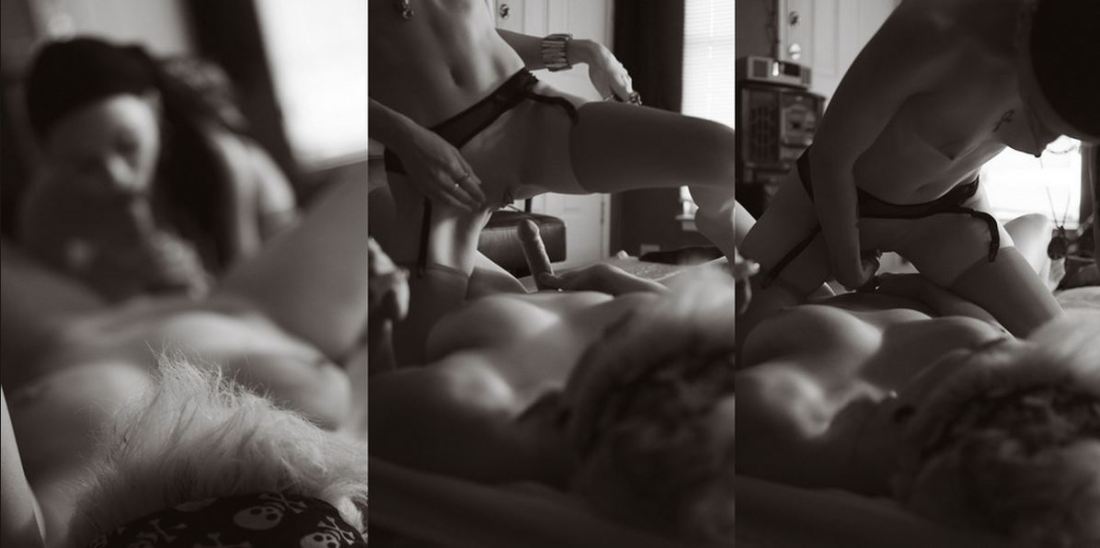
Over the last 18 months, I’ve noticed a deluge of work I’ve previously never seen emerging. (The above is an example of such.) There’s no enough of it that I am beginning to question the endurance of the narrative that she was very good but also immature, undisciplined and very lucky.

There’s a couple of things you have to keep in mind here: first, the photos that until recently have been understood as her overarching body of work were ones she exhibited during her life. The subsequent work that’s emerged has been released into the world by her parents. (This has led to issues where there exist an original print or two she made herself vs work that he father has reprinted–the latter tend to present a more dynamic range of tones, whereas hers skew much darker, as a rule.)

The notion that the fashion work was a complete failure is something I think the newly released work calls sharply into question. I won’t argue that a lot of it is bad. There’s enough of it that is at least stubbornly iconoclastic that suggests something further at work here.

Increasingly, I think that what gets interpreted as failure was merely an effort to play the can I be an artist in mid-to-late capitalism and not starve. My impression is that Woodman was attempting to fit her style and preoccupations to what she understood as the framework high fashion sought. When, really, the other way round was the way she should’ve approached it. (A more concrete way of putting it might be to suggest that whereas her early work were about self-expression, the later work is an effort to invert the ploy of inventing an alter ego like Sloan (to allow herself to explore–representation at some degree of remove) and instead wanted to filter her work in such a way that she would be perceived as belonging on the fashion scene. It didn’t work because too much of who she was involved independence and a commitment to non-conformity.

As bad as some of the fashion stuff, it is not all bad and she continued to make exceptional work–or that’s what the emerging work suggests to me. It’s almost as if the darker her vision became the more increasingly universal the reaction to and response to her work.

urbanfaerietalesTitle Unknown (201X)

The above images are interesting–if a bit muddled. Yet, the way in which they’re muddled suggests several things to me about visual grammar. So like good Wittgensteinians, let us conduct a grammatical investigation!

A lone photo or image must stand on its own. However, as soon as you position photos or images adjacent to one another–each subtly shapes and informs how we read not just the one image or photo but how we read both of them together.

In the loosest sense there are two ways that photographs can relate to each other: as polyptychs or as sequences.

The above is not a triptych.

Strictly speaking, a diptych means ‘two-fold’. A triptych would indicate three folds. As such you can see panel A alone, panel B alone, panel C alone or panel A & B together or B & C together or A & C together or A, B & C all at once.

While polyptychs can be seen as relating to each other in a way that conveys are broader, overarching narrative–their construction is not intrinsically narrative. The each panel stands alone but that together each comment, enliven and enrich each other so that the piece as a whole comes to constitute more than the sum of its parts.

A sequence, on the other hand is fundamentally tied up with the movement of time. (To be 100% clear, a polyptych can be sequential but a sequence is not automatically a polyptych.)

There’s several things the above sequence does well. First off, the use of depth of field to direct the viewers eye is totally on point–in the first panel, only the top of the head in the foreground is in focus while everything else goes soft; in the second panel, the focus point is ever-so-slightly behind the kneeling figure; the final panel shifts the focus towards the middle ground between the two lovers.

Compositionally, the first and last panel are #skinnyframebullshit–there is absolutely no effing reason given the frame that vertical orientation contributes fuck all to the logical consistency of the whole.

In the first panel, the way the supine figure’s legs open up to the room begs for landscape orientation, further given the narrative auspices of the piece as a whole–it’s extraordinarily poor form to employ portrait orientation.)

The contrast and overall tonal range are best in the third panel; however, the frame feels constricted; it makes me nervous that it’s so clearly supposed to be set in this room but the view of the room is so claustrophobically limited.

The second panel is actually a fabulous example of when a vertical orientation actually serves a goddamn purpose–the frame reads up and down and by fitting it to a form that is predisposed to that sort of scanning, the image maker employs the appropriate visual grammar to convey to the viewer how to best engage with the image.

In summary, there is a great deal of raw potential here. I’m of a mind that this would’ve been more effective if all the images had been landscape oriented or if the second panel had been extracted and presented independent of the others (I do think you’d lose something but the image is strong enough to stand on its own).

Alternately–and probably even stronger–would have been if the first and third image were landscape oriented and the second image remains in its current, portrait orientation. This would’ve pushed things more in the direction of a polyptych and would’ve also suggested an altar piece–which is more in keeping given the almost liturgical tone of the images.

And that’s why I make such a big deal about using portrait orientation correctly. Maintaining that it doesn’t matter is the same as saying that the comma in Let’s eat Grandma vs Let’s eat, Grandma doesn’t make any difference in the end result.

Mona KuhnClaire Obscure (2001)

I do not have an entirely positive opinion of Kuhn.

Viewing this image re-contextualizes my thoughts about her work a great deal, however.

The first major difference is clearly the question of monochrome verses polychrome.

This image predates the earliest image in my previous post on Kuhn by a year. There’s the same intense intimacy and the creative deployment of depth of field  marking the later work.

Conversely, it lacks the profound sense exemplified in the later work of being anchored to a particular place and time–this is after all just a nude woman, darkness and light.

I think I’m supposed to appreciate the increased complexity and variation of the later work. Though honestly, I skew in an entirely different direction.

To me: Kuhn’s later work demonstrates an innate and unnerving sense of the interplay between colors. But there’s an almost galling lack of consistency.  For example, consider the more painterly affect of this versus the were she a painter she’d be using cadmium pigments and then leaving the finished canvas in the sun for a couple months to give it that sort of summer, sun-kissed beach bleached effect that accentuates her insanely shallow depth of field and underscores the conceptual interpenetration of her process with her material (French naturalist communities).

I reminds me of the topic du jour when I was pursuing my MFA: the role of color in fine art photography. The purists will argue that the purpose of color in fine art photography is to demonstrate something about the nature of color and lens based visual representation. In fairness: that’s already been done to perfection–see William Eggleston.

Others maintain color is just another form. Yet, the objection I always had to this is suggesting that the same–and I’m hesitant to invoke such a word here but since I can’t think of a more operable one, I’m going ahead: rules govern monochromatic work as polychromatic work.

I’m not confident enough with the clarity of my thoughts on the subject to push forward with that line of analysis at present. But, what does occur to me is that given Kuhn’s conceptual underpinnings her interest in the optics of intimacy and using naturalist communities as a sort of ersatz synecdoche, I feel the color–although contemplatively orchestrated–actually works against the stated aims of the work. With the exception of the aforementioned more painterly image, I feel like most of Kuhn’s work would actually function better with the ‘abstraction’ offered by black and white.

JoymiiWhat a Ride featuring Josephine and Den (2015)

There are a raft of reasons I ought not be posting this:

  • I am suspicious–at best–of close-ups (let alone extreme close-ups such as this)
  • It’s heteronormative in a way which really goddamned irks me
  • The above image has been cropped from the original (which I would’ve posted if it didn’t feature an intensely intrusive, dumb watermark).

All that BS aside, there is something not if not exactly substantive then I guess ‘considered’ about this. I don’t mean the polished gloss of it–although it certain supersedes that of quotidian porn.

What catches my eye is the extremely shallow depth of field–which allows both out of focus bits in the foreground and background.

Image makers are frequently obsessed with the flattering effects of so-called bokeh to isolate and emphasize the subject of the composition. But bokeh centers on rendering the background out of focus. Out of focus elements in the both the fore- and back- ground is more commonly associated with cinema–where due to the scene playing out of thousands of frames shifting focus can be used to guide who or what within the frame the audience is supposed to attend to. (I’ve written about this before.)

In the above image the point of sharpest focus draws attention to the act of genital penetration. In this crop, the action still manages to be ever-so-slightly off-center. No matter how pretty the soft focus, the image would’ve crumbled given knee-jerk dead center placement.

What’s interesting is in the uncropped version, everything shifts left and down. It’s a better frame by miles but I don’t think I’d have necessarily realized what I have about the image and why it appeals to me without comparing the crop and the original–although not strictly compliant, there are absolutely points of correlation with the composition and the Golden Ratio. (I recommend opening the diagram and the original side by side.)

Mona Kuhn – [↖] Untitled from Evidence series (200X); [↗] George by the Door from Evidence series (2002); [←] Libellule from Evidence series (2006); [+] Untitled from Native series (200X); [→] Untitled from Venezia series (20XX); [↓] Jacintha from Evidence series (2006)

I cannot in good conscience endorse Kuhn’s work wholesale. I fucking love the photos above–this one is great, too; but, hearing her defend her work is rather off putting.

She’s big into nudes due to their ‘timelessness’ and the human body as a ‘residence’. She’s quick to point out that she’s also interested in totality and, as such, sexuality being an element of physical embodiment–which is problematic for it’s failure to include the experiences of folks with an asexual reality–it is clearly a facet of her work.

She’s walking the same high wire as another photographer with whom her work shares overlap (a focus on nudes, specifically within French naturalist communities), namely: Jock Sturges.

I find her work much less disingenuous and of a higher quality but it still vexes me that she dodges accusations of sexual overtones in her imagery because while I totally think Sturges is a perv who goes to great lengths to insist he’s not a perv–and to be clear here, I’m reclaiming ‘perv’ in a non-value judgement-y, re-appropriative, sex-positive way–Kuhn images function due to a sexual tension. (I’m referring specifically to Jacintha [above] but I think there’s a voyeuristic heavy-handedness motivating the concealing/revealing of nudity, i.e. her depth of field–which clever–is also a wee bit salacious in the way it invites squinting leers.)

What always ends up nudging me away from these concerns is how powerfully the photos communicate a palpable sense of intimacy. I’ve always maintained that narrativity and how we determine what is and is not narrative holds up a mirror to questions of the function of eroticism. Increasingly, I am beginning to think that it’s a trinity: narrative, intimacy, eroticism.

Is not the most erotic portion of a body where the garment gapes? In perversion (which is the realm of textual pleasure) there are no “erogenous zones” (a foolish expression, besides); it is intermittence, as the psychoanalysis has so rightly stated, which is erotic: the intermittence of skin flashing between two articles of clothing (trousers and sweater), between two edges (the open-necked shirt, the glove and the sleeve); it is this flash itself which seduces, or rather: the staging of an appearance-as-disappearance (Barthes, pg. 9-10).

Perhaps it’s the introversion suggested by the huddled pose or the comely skin. My eye—wishing it was a tongue—darts and circles the erect left nipple.

But the wetness of wanting is thwarted by the shallow depth of field which pushes my gaze away over oceans of cream floating morning glories, wilds rose and springs of red baby’s breath before being pulled back again over small breasts and pale skin to sunlit shoulders and long strands of red silk hair.

And in this seeing I have an honest-to-goodness itty-bitty petit mort every time I glance at this picture.

No, it’s closer to a lover shifting slightly and the movement sending cascades of shivers outward through the ebbing pulsing of orgasmic spasms.

A feeling not unlike the memory of pixie with snow white skin, wire straight, carbon black hair and mischievous eyes wider than miles of un-translated manga: I gazed as she reached across the table, her motion pulling the lower edge of her too-small t-shirt away from the waist of her too-large belted jeans. Thinner than a rail, the ridges of her spine led my eyes down to the orange on purple Victoria’s Secret underwear.

Edges are important. Particularly given their extensive history of being manipulated in order to objectify and sexualize the female body—expertly lampooned by Duchamp’s Etant Donnes.

But the headless woman does have anonymity. And where this previous implied women as little more than fodder for men’s sexual appetites, it now is put into service in order to facilitate the open expression of a sexual identity from behind the safety of a mask.

To be clear, I think that’s awesome; but like all awesome things, it is not without its problems. In this case, the line between anonymous expression and exhibitionism is razor thin at best. What is presented as artful and considered frequently suffers as a result of compositional inconsistencies necessitated by the requirement for anonymity.

This beautiful photograph is one of the few that manages to be rigorously consistent in its composition while also employing the frame edge as a means of masking idenity. A slight shift in perspective, however, would have almost certainly transformed it into something either nakedly exhibitionist or visually impoverished.

It for that reason I think most photo dabblers would do well to borrow from the book of Bellocq’s brother by making a thoughtful image first and then blacking out faces and identifying features later.