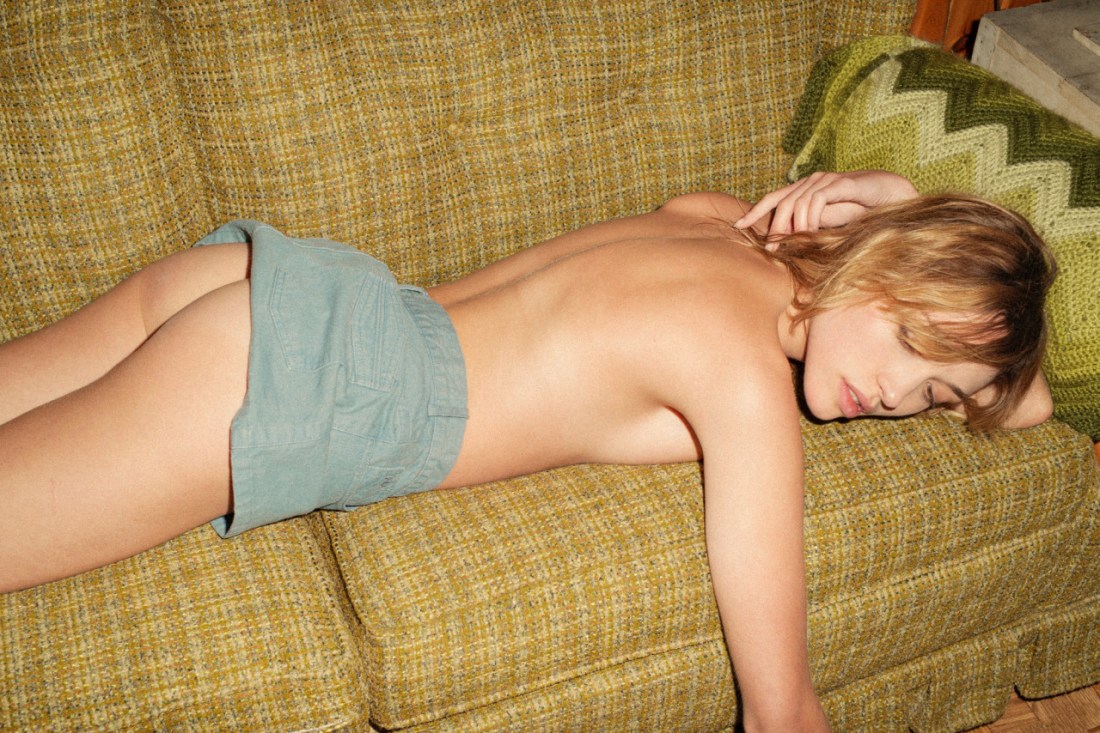
Source unknown – Title unknown (201X)

Efff me but this is magnificent.

The palate is reminiscent of Edward Isais–the perspective, lighting, composition and more unadordned mise en scene are decidedly not, however. (The pose might as well be a doppelgänger for Yung Cheng Lin–but although the perspective and composition of this are more in-line with his work, I don’t think he’s ever done anything this tenebristic.)

I originally found it here (which looks less like the source or even the site of the model and more just a really precocious self-definition-through-curatory-reblogging).

Does anyone know the source for this? I would be very interested in learning more about whomever made it…

EDIT: It seems likely that it’s Chinese image maker pingguodang (tumblr) (behance)–thanks for the tip-off anon!

@coffeemugccUntitled (2017)

An argument that I’ve made multiple times through this project is that I don’t think there’s every any reason to decapitate someone. This goes triple for folks making work where they want to remain anonymous–it’s really just lazy and sloppy for you to position yourself with your head just beyond the edge of the frame. It limits what you can do compositionally and just signals a lack of willingness to do some planning and or problem solving.

I’ve forward the idea of excising faces of folks who want to remain anonymous–a la Bellocq’s Jesuit brother.

This was before I spent any time on Instagram–or, as I insist the kids are calling it The ‘Gram. The Gaussian blur over nipples and genitals is incredibly distracting and detracts enormously from the images. Thus: I will concede that I didn’t think this all the way through. Short of the effect that liquefy effect that @lisakimberly uses so fantastically, masking faces in post is probably not the best approach.

Point being: it’s good to have some kind of idea what you are going to do with an image after you make it. Case in point: the image above.

Ostensibly it’s the picture of a young woman, hands covered in papaya juices with her finger disappearing into the soft core of the ripe fruit. It brings to mind both masturbation and lesbian fucking.

It’s also 100% compliant with The ‘Gram’s standards. It’s arguably that the depth of field would’ve rendered the fact that the model is naked from the mid-riff down but the right little finger protrudes in such a way as to obfuscate any sort of consideration that the creator is trying to sneak something by the censors.

And really that’s what I should be emphasizing instead of completely poopoing any one strategy for addressing concerns over what to show, what to hide and what to excise–there’s almost always a better way to do something than what first occurs to you. It’s always wise to know your own limits as well as the limits of those you work with as well as the forums where you disseminate work.

This does just that and does it masterfully.

Marat SafinUntitled (2015)

سأصير يوماً طائراً ،
One day, I will be a bird,
وأَسُلُّ من عَدَمي وجودي .
and will snatch my being out of my nothingness.
كُلَّما احتَرقَ الجناحانِ اقتربتُ من الحقيقةِ ، وانبعثتُ من الرمادِ .
The more my wings burn, the more I near my truth and arise from the ashes.
                   —Darwish – دَرويش (via m7madsmiry)               

Joanne TaosuwanThe Cold, The Dark & The Silence (2008)

I could probably yammer on for a couple of paragraphs about opacity–you know: transmission vs reflectivity w/r/t light.

But even thought it’s just a shower curtain, I can’t help but see it as the surface of a puddle seething with tadpoles and she’s a god like figure who unfolds time and space and unfolds her creation by unfurling it, throwing it away from her, letting the wind catch it and then letting it drift slowing to lay upon the ground–not unlike you’d cover a bed with the topsheet in the process of making it.

If you see it like that it’s not hard to imagine this as an image of a piece with William Blake’s metaphysical illustrations. Perhaps that’s why this has imprinted itself so indelibly on my mind.

Marat SafinCamapa (2017)

This image has been shuffled around in queue for more than a month.

Initially, I wanted to focus on Safin’s knack for consistently presenting the women with whom he works–regardless of whether or not they acknowledge the camera/viewer–as reveling (for lack of a better word) in their own femininity; since, you know: that is the one consistent piece in his work.

This rapidly degenerated into a morass of attempting to balance an unbalance-able equation of problematics to virtue, however.

Next, I figured it was damn time I called out Brooke Shaden again–seriously her work is fucking inexcusably god awful. (The connective tissue being how both use over-the-top post-process intervention to justify their images’ existence. On the one hand, Shaden guilelessly embraces the Lynchian conflation of the grammar of surreality with the grammar of the oneiric–not that Lynch is inherently bad, it would just be better if more folks considered his work as a cautionary tale warning against any sort of casual and/or unconsidered aping of his style. Safin’s manipulation are similarly egregious but they integrate holistically with the images and never insist on themselves.)

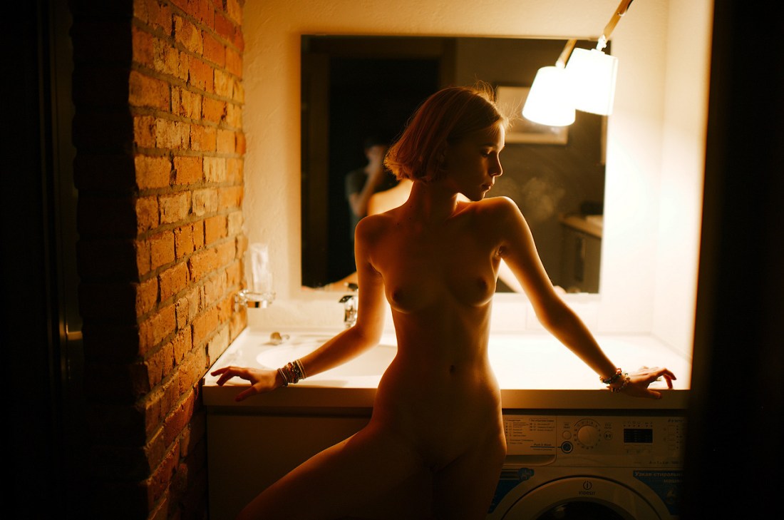
For a while, I had it following this image in an effort to point out backlighting and then present something backlit and subsequently drawing attention to an aspect other than the backlighting. (A good teacher–and what else is a curator?–makes efforts to build occasions into the lessons where the student gets to feel smart but by paying attention/staying engaged.)

Yet… all the time the only thing I want to talk about is the fundamental Russian-ness of his work.

I mention this all the time but I’ve yet to define it in any sort of non-abstracted fashion. I think I may have found a way to do it–not now, but maybe at some point down the road.

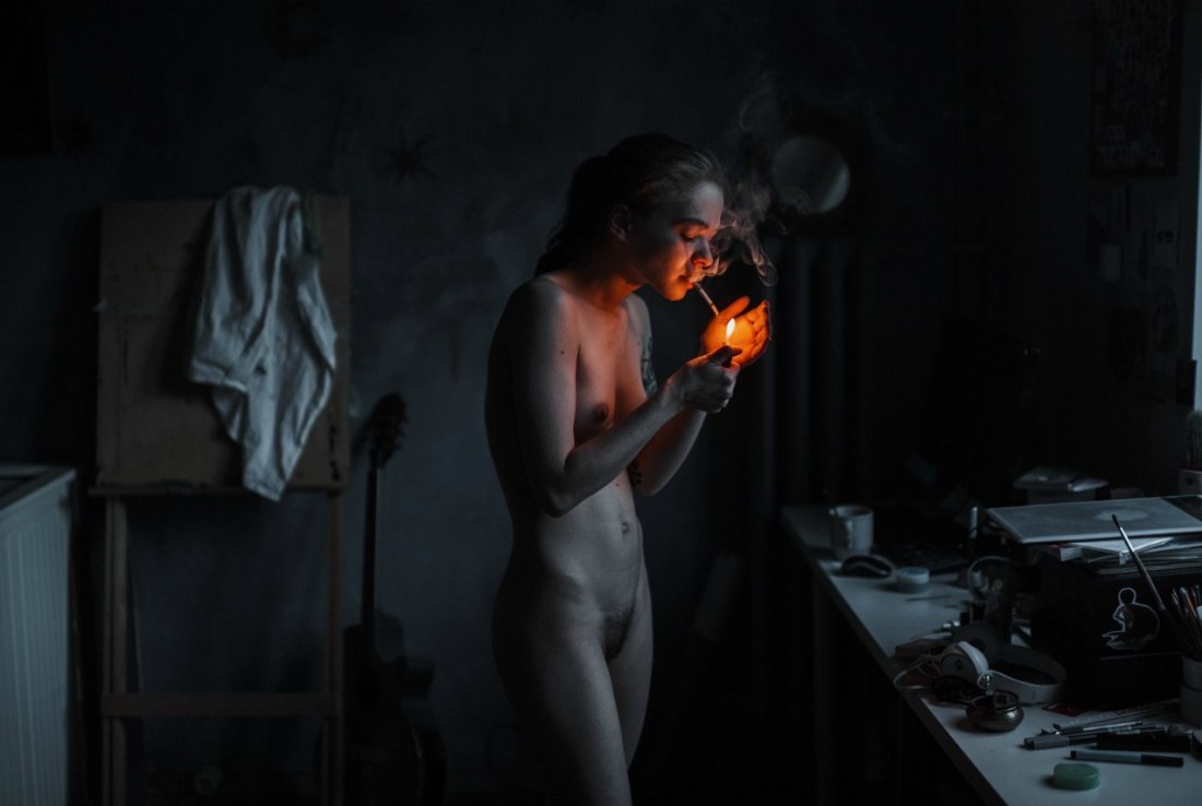
See: looking at this image, I’m reminded of Igor Mukhin’s color work with the Leica AG M9 (an absolutely fabulous camera if you can stomach the astonishing cost)–specifically the vivid blacks it renders.

Safin is using a Nikon d700 with a 35mm f1.4g lens–as far as I can tell it’s the lens he’s used for most of the stuff he’s posted in the last year or so.

A good 35mm lens is an interesting beast. It’s wide angle without adding too much unattractive distortion–the wider the lens for example the more unflattering it is to say the dimensionality of the human face, for example.

Yes: Safin is not using it on anywhere near the level of precision and care as Mukhin; but credit is due for managing what he does with a camera that’s a fraction of the cost as Mukhin’s top of the top of the line kit.

An idea occurred to me in the process of unpacking all the above: I began to wonder about respective influences of these two artists.

All I’ve managed to find regarding Mukhin is that he studied with Alexander Lapin and that he cites Alexander Rodchenko and Lou Reed as influences.

Rodchenko is actually super useful in getting at what I mean when I point to essential Russian-ness of a photo or image. (It occurs to me that it might be interesting to create an infographic wherein the historical influence of Rodchenko is mapped.)

Lou Reed is more interesting. I dig The Velvet Underground just as much as the next arty fucker. And I’ve heard literally all the correctives about what a heinous human being he was. (Anyone who worked at Film Forum in the mid-to-late aughts can tell you stories that will strip paint off walls.)

But, as far as I know, Reed believed rock and roll could save the mortal soul. (I think this is one reason his work appeals to me so very much; I would not be here now if it weren’t for music, in general–but specifical Rock and Roll.)

I found the mention of the influence of Rodchenko and Reed in a blurb about Mukhin penned by A. D. Coleman. I don’t agree with all the author’s conclusions; namely: I’d bet a tidy sum on the fact that Mukhin was intimately familiar with Robert Frank before he began documenting youth culture in the Soviet Union in the 1980s, the notion that Mukhin is somehow inherently more conservative for not being familiar with/embracing the work of someone like William Klein is disingenuous, a bad faith engagement with Mukhin’s work and prejudices America’s role in the advancement of the photographic medium in a fashion that’s a little too imperialistic to be allowed to stand.

Interestingly–and I promise I’m working my way back ‘round to Safin, Coleman does at least imply the dual role of culture and individual taste in the creation of work. To the extent that Mukhin has lived in Russia all his life, his life has been impacted by state censorship then and now. I’m not entirely sure that his gravitation towards youth culture and it’s stock and trade in activities, practices and documents banned by the state was entirely innocent. (We move towards what moves us–so my thought is that Mukhin either already had access to western work most others wouldn’t have seen or he gained access to them through this path.)

But the question of how freely information flows and how it impacts questions of artistic influence is something to consider–all the more in the light of Mukhin vs. Safin; or: pre-Peristroka state censorship vs post-Soviet surgical censorship.

There’s a very fine line between doing the work and feeding the work. A better way to say it is that Andrei Tarkovsky always claimed that he was a better artist for having to navigate around concerns of state censorship–in other words: being able to convey his premise in both the shape, form and manner he intended while not running afoul of anyone.

I feel like as long as you are doing your own work and feeding the doing by critically, appreciatively and contemplatively looking at other people’s work–that’s a good place to be. The problem is that with so much information out there, part of the work becomes feeding the work and it’s dangerous to fall into that trap because that’s where it’s very easy to began aping the work of others.

And at the bottom of it I think that’s what I mean by essential Russian-ness the attempt to balance scarcity with abundance. Because speaking of mapping influence–an interesting project (and if anyone does this and does a good job I will actually post your work here): would be to map Marat Safin’s influences because I can’t think of another image maker whose work is such a who’s who of paen to virtually all the top notch internet famous photographers and image makers active today.

urbanfaerietalesTitle Unknown (201X)

The above images are interesting–if a bit muddled. Yet, the way in which they’re muddled suggests several things to me about visual grammar. So like good Wittgensteinians, let us conduct a grammatical investigation!

A lone photo or image must stand on its own. However, as soon as you position photos or images adjacent to one another–each subtly shapes and informs how we read not just the one image or photo but how we read both of them together.

In the loosest sense there are two ways that photographs can relate to each other: as polyptychs or as sequences.

The above is not a triptych.

Strictly speaking, a diptych means ‘two-fold’. A triptych would indicate three folds. As such you can see panel A alone, panel B alone, panel C alone or panel A & B together or B & C together or A & C together or A, B & C all at once.

While polyptychs can be seen as relating to each other in a way that conveys are broader, overarching narrative–their construction is not intrinsically narrative. The each panel stands alone but that together each comment, enliven and enrich each other so that the piece as a whole comes to constitute more than the sum of its parts.

A sequence, on the other hand is fundamentally tied up with the movement of time. (To be 100% clear, a polyptych can be sequential but a sequence is not automatically a polyptych.)

There’s several things the above sequence does well. First off, the use of depth of field to direct the viewers eye is totally on point–in the first panel, only the top of the head in the foreground is in focus while everything else goes soft; in the second panel, the focus point is ever-so-slightly behind the kneeling figure; the final panel shifts the focus towards the middle ground between the two lovers.

Compositionally, the first and last panel are #skinnyframebullshit–there is absolutely no effing reason given the frame that vertical orientation contributes fuck all to the logical consistency of the whole.

In the first panel, the way the supine figure’s legs open up to the room begs for landscape orientation, further given the narrative auspices of the piece as a whole–it’s extraordinarily poor form to employ portrait orientation.)

The contrast and overall tonal range are best in the third panel; however, the frame feels constricted; it makes me nervous that it’s so clearly supposed to be set in this room but the view of the room is so claustrophobically limited.

The second panel is actually a fabulous example of when a vertical orientation actually serves a goddamn purpose–the frame reads up and down and by fitting it to a form that is predisposed to that sort of scanning, the image maker employs the appropriate visual grammar to convey to the viewer how to best engage with the image.

In summary, there is a great deal of raw potential here. I’m of a mind that this would’ve been more effective if all the images had been landscape oriented or if the second panel had been extracted and presented independent of the others (I do think you’d lose something but the image is strong enough to stand on its own).

Alternately–and probably even stronger–would have been if the first and third image were landscape oriented and the second image remains in its current, portrait orientation. This would’ve pushed things more in the direction of a polyptych and would’ve also suggested an altar piece–which is more in keeping given the almost liturgical tone of the images.

And that’s why I make such a big deal about using portrait orientation correctly. Maintaining that it doesn’t matter is the same as saying that the comma in Let’s eat Grandma vs Let’s eat, Grandma doesn’t make any difference in the end result.

Yulia GorodinskiTitles unknown (201X)

Remember when Flickr was the primary hotbed of up-and-coming photo and image making talent? Well, the first wave of that milieu crested in what–early to mid-2006, if memory serves.

At the time, Gorodinski was studying History and English literature in Tel Aviv. Originally of Belorussian extraction, her family immigrated to Israel when she was 12.

She joined flick in the post-first wave low-tide around 2007 and built a reputation for the sumptuous color invigorating already dynamically composed, narratively insinuative frames.

By 2010, she was a fixture of the Flickr second wave–gaining the attention of Dazed. (Virtually everything written about her after that point–leans heavily on the content of this interview.)

It’s still possible to see a good chunk of her work–a Google search turns up a lot of them. A Tumblr search adds some other exquisite samples of her work. However, as far as I can tell, Gorodinski no longer circulates this work herself. (I won’t pretend to speculate as to the motivations for this…)

It would seem that she does still make images. The above attribution links to a Tumblr that shares a few images indicative that it is the same Yulia Gorodinski. The new work is more mannered, patient and quotidian. It’s not bad–still definitely artful. But I do have to say that I miss the dizzying audacity of these self-portraits.

I think there’s an argument to be made that although she would probably wisely resist such a label, I think you could argue that the problematic term “the female gaze” could be well applied to her work.

Honestly, though beyond the fact that her work insists upon the profusion of color it present (that should not be diminished since so few photographers and image makers treat color as anything more than a binary that contributes to a better meshing between the conceptual and compositional, meditation on the nature of how color affects perception and reaction to such perception being so intrinsic to these images), there’s also something else very special about these: an imagistic totality.

As someone who is ostensibly fixated on both the tradition of staffage and cinematic/narrative photography & image making, the line between a landscape with figures in it (a more painterly affectation) and something that seems more suggestive of composition through post-production layering–i.e. shooting someone in front of a green screen–it’s not always easy to pull off work like Gorodinski’s.

That she does it at all is impressive but that she does it so flipping well, so frequently is even more awe-inducing. This is impressive stuff and while I don’t feel as strongly about her more recent work, I am curious to see what her newfound restraint would contribute if she returned to a similar approach again. I suspect it would probably be the sort of thing that would make me feel like I needed to sell all my gear and leave the photo game to the real pros.