Stef MitchellUntitled from Them That Believe series for Revue Magazine (2018)

I am head over heals for this editorial.

I can’t find enough of a high res versionof the series to decipher the several contextual paragraphs included with the images. However, what it seems like is that this is a depiction of what it’s like to be a young woman growing up in a very conservative religious environment.

When I say very conservative religious environment, I mean a good bit more strident than the current glut of uber-political right wing evangelicals–something more along the lines of country congregations in churches that don’t have air conditioning, only fans. Where the gospel of salvation is de-emphasized to instead draw attention to sin, punishment, and eternal suffering in swamps of fire and brimstone.

Mitchell explicitly conflates the visual coding of Evangelical experience and threads it together with a more aggressive strain of Pentacostal faith–i.e. snake handling.

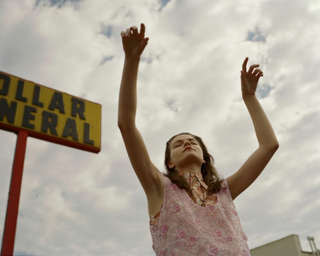
There are so many things this series accomplishes with near effortless aplomb. The snakes are all presented in such a fashion where it’s difficult to tell whether they are venomous or not. The expressions of the young woman are Stepford-esque–all youthful curiosity, confidence and a disturbing detachment.

The groups of young women appear to enjoy a hyper-performative group solidarity. There’s a very Virgin Suicides flavor to the proceedings.

But what I think is most effective about this is that it’s impossible to suss out whether or not Mitchell is glamorizing what she’s ostensibly depicting (a la the way Nan Goldin is so frequently castigated for glamorizing heroin addiction) or if she’s merely bestowing upon it the sheen of commercial photography as a means of bestowing upon it a since of legitimacy as far as invitation to mass consumption… or is it just an edgy editorial campaign. It’s not any one thing at once but it’s also never all three at once, either. (A more concrete way of putting it might be to point out how the image above is clearly stylized; the position of the camera is very unusual–emphasizing her hands over her head in the attitude of someone in an Evangelical service who is feeling the presence of The Holy Spirit. The camera is positioned how it is to cut out the distraction of the fact that the subject is very clearly standing in the parking lot of the sort of strip mall that are ubiquitous in the deep south of the U.S. Is this frame supposed to suggest a correlation between suburban mass consumption and extreme religious fervor, or is it about the color of the blouse, the sign and the sky taken together; or, is it a fetishization of a particular fashion aesthetic? It’s not only one and it’s not all three together.)

I keep coming back to this series. I thought it was fantastic from square one. But each time I come back to it seems to telegraph something astute about the current state of politics in my country.

It was wild to read this week about–something which is admittedly a distraction from more pressing concerns, i.e. gun violence, white supremacy, the flagrant corruption of Dump’s regime, the vicious actions of ICE and the Border Patrol as well as the breakneck dismantling of democratic convention–the hoopla over Roseanne’s inexcusably racist tweet and the predictable whataboutist response. (What about all the terrible things that the media has said about the president? What about Bill Maher? What about Keith Olbermann? What about The View?)

There’s the usual misconceptions about freedom of speech entailing equal access to public platforms. That argument runs something along the lines of Roseanne is being penalized for her speech by ABC cancelling her show. However, ABC is not bound by law to provide Roseanne a platform. The assumption is that she brings her freedom of speech to a platform that ABC provides her, she makes them something which they can in turn monetize. However, when she makes racist ass comments, they are free to decide that her freedom of speech brings consequences that are detrimental to their platform. (Freedom of speech does not and has never entailed freedom/protection from consequences.)

However, the right seems to believe that being called a racist is far more offensive than, you know: actual racism. Thus they are framing the argument as if it’s all just incivility and that the left is frequently espouses extreme bigotry towards them and is not held to account. (This plays fast and loose with the truth of the matter. For example: Maher has gotten a lot of flak–however, that overlooks the fact that there are many of us who have spoken out repeatedly against Maher’s Islamophobia and sexism.)

But in all of this–and what relates to Mitchell’s images–is that apparently Evangelicals think that calling Dump ‘a liar’ is untrue and unkind and therefore requires an apology. They don’t believe he is an actual white supremacist–you know despite his statements that their were good people on both sides in Charlottesville (FAKE NEWS!) and that he characterized Mexicans as ‘rapists’(FAKE NEWS) and referred to MS13 as animals in such a fashion that he eventually–and apparently grudgingly–admitted he had only meant gang members not all migrants/asylum seekers.

They also seem to feel that they are under attack. A particularly disturbing line of thought that I’m seeing writ large is that one of the panelists on The View referred to Mike Pence’s claim that he speaks directly with God as a sign of mental illness. Xtians see this as bigotry towards prayer.

I grew up in an Evangelical milieu that skewed decidedly Pentecostal. Things were a bit too urban to be snake handling territory but I’ve done enough research on the topic to see broad swaths of overlap between my experience and what it’s like in snake handling communities of faith.

And while we almost certainly shouldn’t refer to the claim of faith-based people’s that they talk to God personally as a form of mental illness–for no other reason than that standpoint being unfair to mentally ill folks. However, the this is already veering all to close to the sort of framework where to question whether prayer as a form of communication is legitimate also needs to tie into notions of prayer as a form of self-hypnosis. I think it’s maybe better to focus on the ways in which what Pence claims to believe are actually entirely anathema to the text he claims as the basis of his belief. (There have been an number of mainstream articles about Evangelical backlash w/r/t the broad support Dump has among white Evangelicals. One group in particular is fascinating to me–they refer to themselves as Red Letter Christians (based on the fact that frequently Bible’s include the actual words attributed to Jesus Christ in red ink).

Anyway, I’ve gone a bit off the rails but what I see in Mitchell’s work in the case of this project, is something that speaks to the increasing sense of anxiety and dread I feel as these people are entrenching themselves and strategically grasping for more and broader power.

Emmet GreenMailin for REVS magazine (2018)

There’s a great deal I like about this photograph.

The inorganic lighting is reminiscent of Maxime Imbert; except Imbert tends to goose things for stylistic affect whereas Green underscores style with substance.

The Rules of Color Theory ™ instruct: red advances; blue recedes–although there’s not a lot of blue here, there is a mess of red, a pretty decent amount of yellow and then some green to blue tinged hues in the shadow behind and below Mailin’s right shoulder/arm.

The overall perspective is roughly Platon-esque. But whereas Platon uses scale to impose dimensionality (whatever is closer appears bigger than what is further away), this uses color to accomplish a similar mission. Mailin is leaning forward slightly, in a very shallow depth of field. The red pulls her face forward, the yellow on her right shoulder and upper arm gives a solid sense of a mid-ground (and also balances the her blond hair) and the darker colors give the illusion of more space than their really is here.

Interestingly, the positioning of the different colored sources of illumination are such that Mailin is casting multiple shadows. The blue green shadow is cast closest to her right side, then there’s a red shadow and then the yellow shadow–the line of her shoulder separating yellow from green-blue. (Actually the way the shadow appears in relationship to the wall it’s falling upon reminds me more than a little of Laura Pannack’s recent project on what Brexit means for love.)

The other thing I really like about this is the balance between positive space and negative space and how it relates to scale and dimensionality.

(I’m also weirdly interested in the water/oil slick looking mark in the upper left corner–is that on the negative or a mark on the wall. Either way it’s cool AF.)

Author uncredited – COS PRIMAVERA/ESTATE (2017)

When you start learning photography, you’ll have a lot of maxims thrown your way:

  • 400 speed film stock should always be shot @ 320 ISO
  • Expose for shadows; develop for highlights.

The premise behind both of this isn’t nefarious. I mean the 400/320 thing actually was a huge benefit for certain Kodak B&W stocks–all of which are no extinct (to my knowledge).

But you’ll have someone like me who rates a a half dozen rolls of 400 speed stock at 320 ISO and is subsequently displeased with the result so then goes on to shoot another half dozen rolls at the 400 box speed and is equally dissatisfied and only then realizes that maybe it’s the film stock that’s not working for me.

The expose for shadows; develop for highlights is useful. But I’d rather teach someone how to actually use the Sunny 16 rule to shoot without a light meter and then teach the expose for shadows and develop for highlights after the student has spent a year or so honing their dark room chops saving overexposed prints.

There is one thing I heard Mark Steinmetz suggest in a lecture that is actually indi-fucking-spensable. He talks about how in the afternoon, you’re walking down the street with your camera loaded with B&W film and you find that walking on the side of the street in shade, everything looks flat and muddy but if you cross to the sunny side of the street, shit just pops off your negs.

The reverse is true of color. Too much light is a bad thing but if you cross over to the shady side of the street.. bingo, your colors look better. (And, in truth, your colors are never going to look better than golden hour or for like three hours after its rained in the spring but the clouds are still hanging around and the grey against the green just super saturates everything. Swoon.)

But the point is well taken here. There’s entirely too much light for this image to have worked in color. This is likely digital–but it’s smartly executed–the gray scale grade of the background means that you can actually let the white of the suit blow out completely at points but the lost detail in the highlight tone just conveys a brighter white. (With only a few exceptions the only folks doing anything interesting in digital cinematography are actually exploiting this same trick.)

Hart+LëshkinaCommand to Look for Near East (2015)

Such thoughts/feels about HART+LËSHKINA;  I am at a loss as to how to even begin addressing their work.

I guess as good a starting point as any is their compelling compositions. If you’ve followed this blog for any length of time, you’ll know that I’m hardly a proponent of vertically oriented photographs/digital images. In fact, I’m rather inclined to dismiss the vast majority of such work as #skinnyframebullshit.

HART+LËSHKINA‘s are a sterling exemplar of how to do vertically oriented framing masterfully–emphasizing an up + down over the left + right image reading default. (Also: while their vertical images absolutely stand on their own, they tend–at least with this editorial–to pair two vertical compositions as diptychs. This is a prescient strategy as far as balancing between orientation shifts but it also works to create a flow not only between images but also across the entire body of work.)

They do an insane amount with very few elements. (If you’ve ever worked in an essentially empty houses like this, you’ll know setting up rigorously staged images like these borders on impossibility.)

There’s a studied patience to everything–the way the pattern of the light passing through the windows is broken by the kneeling figure and broken again by the reflection off the open window we can’t see that is echoed by the open window we can see.

But the thing I like most is that instead of falling into the dichotomy of nudity as signifier for sexual subtext vs nudity as a natural extension of self (and when intersecting with visual representation, a means of expression thereof), this duo takes what I always feel to be the far more interesting route of poo-pooing the dichotomy and presenting it as if it’s simultaneously both and neither.

I also can’t help but think about another conversation I had recently about the pros and cons of the mass proliferation of digital. On the one hand, yes, there is absolutely merit to the notion that digital is a democratizing force. These days the obstacles to accessing a decent camera are fewer than they’ve ever been–and that’s not to discount folks the world over who are still struggling to find clean water and enough to eat. (In other words, it isn’t all about who has a camera and who doesn’t, there are ultimately other more pressing considerations.)

Yet, I don’t believe that this democratization has led to the sort of expansion in vital, important work. In fact, I think that the only real expansion is in half-assed, arrogant or just straight up bad work. And one of the fall outs from this is the expansion of a curatorial class.

As a curator (ostensibly), I have pervasive concerns about curation due to the fact that a curator’s purpose is to sift through impossibly large information reserves and then pass along the best and brightest bits. No matter how much careful consideration on the part of the curator, the resulting decisions are informed by personal bias, prejudice, etc.

On it’s own, that’s a huge problem. But then consider the fact that it’s impossible to sift through all the information and therefore every curator has enormous blind spots. For example: how long have HART+LËSHKINA been around and despite the massive overlap in what their doing and my own personal photographic preoccupations and I’m only now learning about them. (I mean: yes, they work primarily in fashion/editorial, which is decidedly not my bag, baby; still, it makes me wonder sometimes if maybe curators create more problems than they resolve.

Harley Weir – [←] Agata for Baron Magazine (2014); [→] Greta Varlese for Self Service (2015)

I was not especially fond of Weir’s work, initially–it came across as frivolous, trite even.

Over the last year, my thinking on the matter has shifted; the mechanism of that shift was not solely motivated by the maturing of the work so much as the way that Weir has slowly but steadily improved by increment.

That’s an unusual progression to witness. Usually, you have someone who is making good work who disappears for a bit and then explodes back onto the scene with some skull cleaving next level shit. (Case in point: Jacs Fishburne, who has going from demonstrating obvious talent two years ago to sharing some fucking profoundly inspired and technically accomplished work.)

The sort of quantum leap tends to be the exception and not the rule. So it’s refreshing to see an artist to present such a public face to the false starts and failures that are informing behind the scenes growth in perspective and conceptual acuity.

It’s interesting to me that the now seemingly defunct Baron Magazine’s stated goal was something along the lines of exploring the space between pornography and art.

Overlooking the fact that there isn’t a proverbial no man’s land separating art from pornography, so much as a venn diagram overlapping, It’s interesting to see the image of Agata in that context. Why? Well, although she is nude, she is turned away from the camera (ostensibly also from the viewer). She’s undressing but in a way that is both sexy and awkward–she seems restrained by her clothing, in a way. There’s also the lurid 70s porn palate, super saturated red, pale rose and washed out blues. The phone on the wall, although distracting is a really nice touch that ends up selling the image.

In the second image, things on the surface appear simpler: a model in a fashionable sweater and tartan print skirt. The ¾ profile of the first image is shifted to 7/8 back to camera. The frame lines are tighter–below the eyes and mid-thigh. It’s obvious that Greta is positioned in front of one of those slightly marbled photo paper backdrops. The clumsily presented clothing as physical restriction theme is revisited… only this time the clothing is presented as something almost interchangeable with high end bondage gear. The positioning of her hands hikes up her skirt revealing a centimeter less of the cleft between her legs than would be pornographic.

With so many young women making work on the fringes of fashion and erotica, there’s a lot of talk about developing a female gaze to counter Berger’s art historical male gaze. I’m highly critical of this trend–mainly because the people who are most emphatic about claiming it really do very little in their work to justify their claims. But I think the key difference between the above images is the former is made–probably unintentionally–to cater to the male gaze. The latter won’t necessarily fail to appeal to the male gaze so much as to see it as erotic (and I would argue it’s actually far more erotic in concept and execution than the former is) requires a certain acculturation in an experience of visual culture that is decidedly feminine.

transitofvenus:

Mathieu Vladimir AlliardNicole Pollard (2013)

Such editorial-fashion portraiture is not my cuppa Joe. This though, I can’t get out of my goddamn head.

It’s the asymmetrical picked at nailpolish on her right thumb, the textured trim on her knickers, the way the light makes her hipbones look uneven, the mole above her navel, the contrast between the cream color of her bra against the sickly white of her skin somehow balancing against the dark background to create a strange vibrancy.

But it’s really the strangely intense blue-eyed stare somewhere between knowing, asking and boredom that is most captivating. I do not know what Ms. Pollard is thinking but I really, really, really would love to know.

Expressions are what elevates Alliard’s work above the paint-by-numbers editorial-fashion crap. His sitters usually appear edgily defiant and half feral.

A similar mien shows up in Ms. Pollard’s work. It’s less overt but she appears matter-of-fact, in control and as if she is prepared to give it to you with both barrels if anyone so much as thinks about giving her shit.

Somehow what Alliard customarily seeks and what Pollard offers, cancel each other out here. In the resulting void, something unexpected happens.

The single substantial criticism I have is #skinnyframebullshit. The only compositional logic governing the use of a vertical frame is to facilitate slimming–which is unnecessary and fucking stupid. Ms. Pollard is quite gorgeous but she’s fucking skinny. The bra straps hanging off her shoulders accomplish the desired purpose well-enough and do not require backup. Not to mention, the image would been moodier for landscape orientation as well as adding weight to the oddness of the expression.