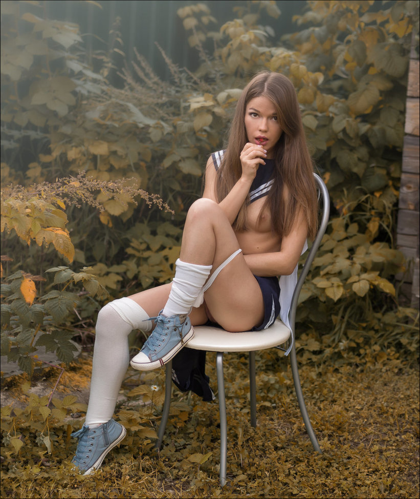
Pavel KiselevKate (2017)

If you’ve spent any time plumbing the depths of :::air quotes::: fine art nude photography/image making on the Interwebz, you’ll be familiar with Kiselev: he made a bunch of images of women lounging around in various stages of undress inside a cabin on a sleeper car aboard a train. He eventually edited these images down and released them as a photo book called Railway novel.

His work has always been interesting in a knee-jerk, voyeuristic fashion–he’s clearly most comfortable when his work pursues a measured but by no means reserved eroticism.

This portrait of Kate (above) is surprising for a number of reasons. The eroticism is understated. Yes: there’s the cherry pinched between her teeth, hair partially obscuring her left nipple and her knickers pulled down and up draw attention to the shadowed cleft between her thighs.

The way she meets the gaze of the camera though suggests–to me at least–that it’s all a carefully constructed ruse to command attention. I mean: leaving the eroticism and voyeuristic impetus for a minute–the use of color is actually effing fantastic; the dark navy of her sailors collar, the matching skirt (darker for less lights reflecting off it) and the darker blue of her denim shoes.

And the blue is perfectly balanced by the green brown to yellow motif of the autumnal leaves. (Hell, the attention to texture is even hitting and sticking: the brushed chrome of the legs on the bistro chair, the vinyl of the white seat cushion–even the texture of her stockings registers.

I am not 100% sure what the haze in the upper left corner is exactly. I’m guessing it’s supposed to look like fog–or, what in painting is termed: sfumato. It’s not evenly applied across the area, however; and my gut says it’s that thing you see often in documenting products for commercial campaigns where you reflected light directly into the lens. (You can do this with a white sheet of paper or the blade of a knife held at an angle just on the periphery of the lens’ angle of view.)

I’m bothering to point this out for a number of reasons but mainly to demonstrate that if you keep making pictures–merely the act of continuously creating will improve your work.

However, those who both consistently create work and consume work will always progress faster and more organically than others. Like I’d put money on the fact that Kiselev knows the work of the Ninja Turtles namesakes. But, looking at this, I suspect he’s also familiar with Otto Dix. (This portrait of Kate reminds me of Dix’s 1926 Portrait of Sylvia von Harden–I suspect that’s not an accident.)
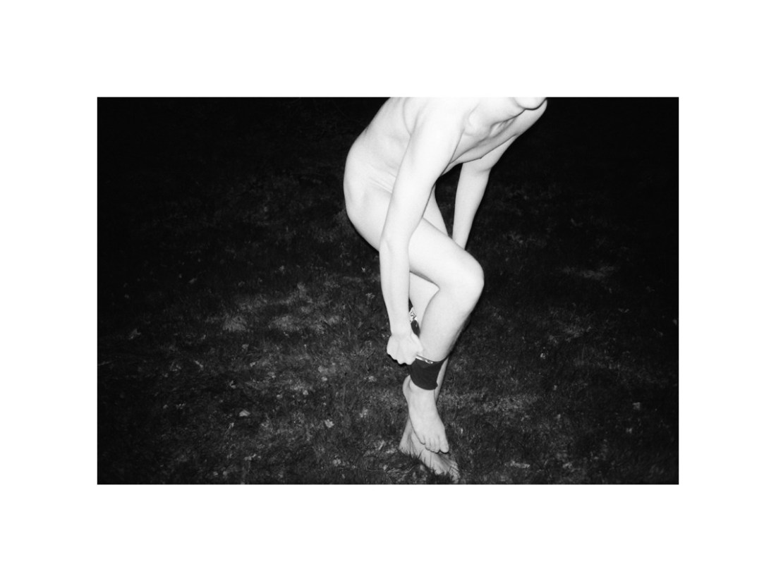
Julie van der VaartUntitled (2015)

A good percentage of folks reading this likelyknow that almost a month ago (at this writing) Ren Hang–one of the most ‘internet famous’ photographers–took his own life.

Now, I’m not now nor have I ever been a Ren Hang apologist. However, as–ostensibly a fellow photographer–who also suffers from fairly debilitating depression, the knowing in this case has not been exactly easy to process.

What I know of the man behind the work suggests he would vigorously disagree with my characterization of his work as ‘audacious’ and ‘brash’. It seemed very much like he was struggling to feel some sort of connection, any sort of connection (however ephemeral) to the world around him.

And on those grounds, he certainly succeeded–insofar as his photos presented a seamless stylistic imperative of casual confrontation and conceptual extremity.

My gut feeling is that history will likely not be especially kind to his work. And I would be fine with that were it not for a handful of things I think he did that were of crucial importance.

I can’t look at his work and not think of Terry Richardson’s bright strobe with the subject frozen against a milk white background. Hang unquestionably ‘wore’ it better and to more stunning/less predatory effect–harnessing the immediacy of a snapshot and anchoring it to a fine art formalism.

It’s unlikely that he intended to comment on questions of pornography vs art but there’s a way in which his work bucks the trend to which Rebecca Solnit points about how the balance between highlight and shadow is–in pornography–skewed away from the more typical human experience of sexual intimacy.

I have no way of knowing definitively but there are a handful of up-and-coming image makers that seem to have internalized the fetishized conceptualization of technique in Hang’s work and applied it exquisitely to their own work.

I’m thinking here primarily of Ao Kim Ngân [aka yatender], who for my money is one of the best upstarts actively making new work. But also van der Vaart. The hyper-bright, edging on over-exposure vibe is reminiscent of Hang–especially given his exterior, night work. However, the technique folds together seamlessly with the concept. The pose is at once confrontational and demurely modest–hiding as a sort of revelation.

Although I have objections to cutting off body parts with the frame edges and think there are far better ways to preserve anonymity without decapitation–this actually is an exception to that rule. There’s a logical consistency to the presentation here.

The point is I think Hang’s work is a long way from done with the world of fine art photography and the milieu of internet famous image making.

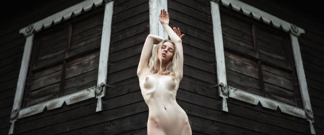
Elias HotNatalia (2016)

Given that the corner of the building is ostensibly a 90° angle, that leaves 270° from the side of the building at frame left to the side of the building on frame right.

Were everything perfectly symmetrical–and spoiler alert: it’s admirably close, but alas no cigar–looking at this from overhead and drawing a circle around the corner of the building, the building would represent a quarter of the circle. You’d divide the remaining circumference in half, in other words: 135°.

With the camera perfectly centered on the corner of the building the camera would align perfect with the 45° bisection of the 90° building edge.

This does not do that. If you measure the 270° of the circumference that isn’t occupied by the building, then Hot has situated his camera at about 138° (It’s more on a plane with the side of the building at frame right than the other.

That shouldn’t really be a big deal. Unfortunately, it is. One thing you learn working with a camera on a tripod for long enough is that rigorous symmetry in composition is extremely goddamn difficult to achieve. Lens distortion and the fact that there’s almost no SLR viewfinder that allows you to see 100% of the frame. Add to that that things that appear symmetrical, rarely are exactly symmetrical. (Also, the up-title and that this has been cropped in post complicates things even further.)

Still, I think it’s an audacious image. I don’t think it entirely works–but there’s something dynamic about it. If it weren’t in color, it could almost be a lost photo of Edith by Emmet Gowin.