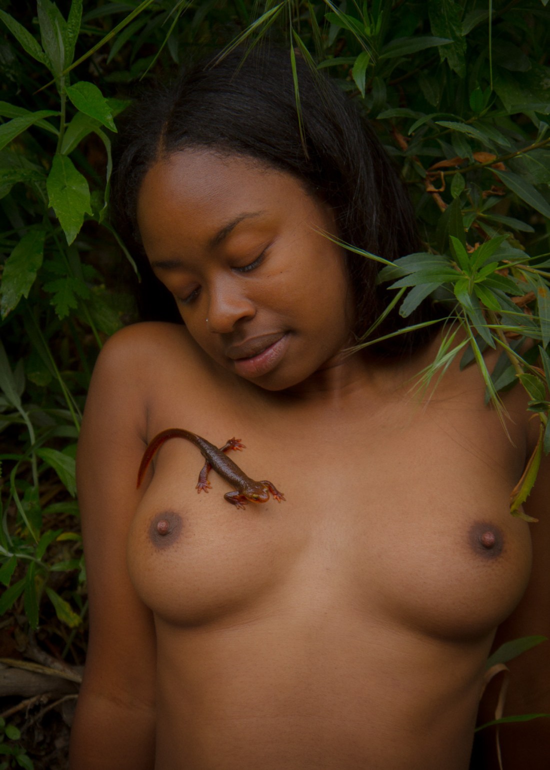
Karen KuehnUntitled from MetropoLOVE (2010)

Confession: I find this ineffably effing sexy.

It’s really all the little things in concert that get me worked up into a lather. The texture–his pants (the bunching of the rolled down waist band against the velveteen texture of the rest of the garment), the thickness of the cotton of the waistband and leg holes of her panties (and the visible stitching!!!) vs. the busy pattern on the thinner, inner cotton. His skin against her skin (the sheen and grain of it so tactile.

I love that the picture in and of itself communicates–without a single word–some of the truth underlying the image. The illumination as well as the background (what you can see of it) is very clearly arid and dry. And it turns out that Kuehn is a burner and travels to Burning Man every year with her camera gear.

But it’s really the intimacy of it. His thumb is clearly inside her underwear but the position makes it clear that it’s in the crack of her ass. Further, his index and ring finger are positioned in such a way that he’s almost certainly touching her anus through the material.

Given a wider frame, you would’ve lost the emphasis on the graphicness of the touch while–presuming nothing in the background–contributing a sense of two lovers alone in an empty world.

But the close up here in combination with the gesture, brings in questions of public vs private. With this frame there’s no way to know if anyone else can see this but given that the photographer can, we presume others can but since we don’t see others in the frame, they are both engaging in amorous foreplay with a potential for the behavior to be occurring simultaneously private and in public. (It’s a clever way of invoking the thrill seeking mind set that drives most people to attempt to have sex in public in the first place: the balancing of the risk of being caught with not actually being caught.
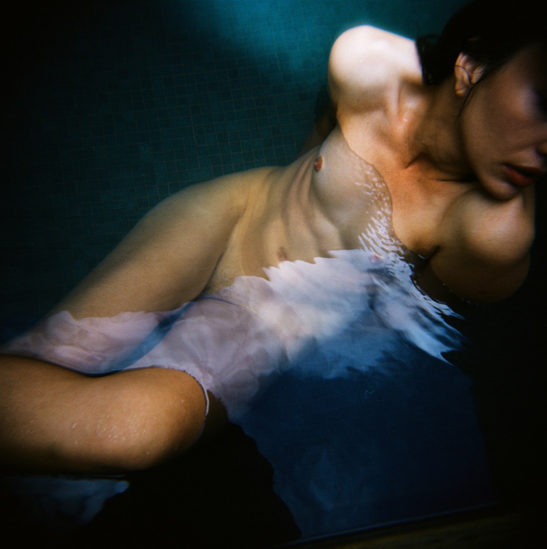
Rodolfo AsinNoelia (2013)

A black and white photograph (and I say photograph specifically because no matter what your opinion on digital, there is no damn reason anyone should be working in B&W in digital–it’s just poor form) can convey a lot of things. It can be sinister, moody, clinical, severe, etc., etc.

In other words, a B&W photograph no matter the concept or execution carries a sense of shining a light onto a scene in a such a way that allows the viewer to discover the foreign in the familiar.

Color just doesn’t work like that. A photo or image can be in color and be good and important and sumptuous without really even being about the color.

So every B&W image is at a certain level monochromatic in the same way and every color photo or image appears in color in a different way.

Loosely speaking, when we are interrogating color images there are two sorts of photos/images: those in color and those about color.

To my mind, William Eggleston is really the only photographer who ever managed to cobble together a body of work managed–largely–to accomplish both.

Eggleston established a beach head that allowed other photographers–like Stephen Shore, Jeff Wall and Joel Sternfeld to emerge. These photographers were interested in trying to bridge the gap between color as facet of the image and color as intrinsic to the images manifold meaning.

Yet, most work post-Eggleston color work seems less interested in solving a problem like color than dealing with issues of color fidelity, depicting mundane normalcy (for some reason B&W always seems more immediate and authentic, even though it’s not how we naturally perceive the world) and the employment of color as a means of orchestrating emotional response.

Whereas, folks like Harry Gruyaert, focused on color itself.

Now what I find interesting is that to a certain degree Shore, Sternfeld and Gruyaert and desaturate their photos, the images lose some of their punch but they still work. (With Gruyaert, you have to bear in mind that he titled his images. Also, I’ll concede that this might be splitting hairs since both Shore and Wall both work in both color and B&W.)

Eggleston desaturated is just fucking pointless–the color is effectively the glue holding everything together.

These days–sadly–most of the raft of internet famous photographers & image makers produce images in color or B&W and more likely a combination of the two. But I’m hard pressed to name anyone who like Eggleston is making work that only works in color. @pru-e is the first person who comes to mind. (But that’s also not entirely fair since she’s arguably one of the best up and coming image makers in the world.)

Asin, like Shore, Wall and Sternfeld, loses a good bit of his punch in a desaturated reimagining of his work. But he is doing some extremely exciting things with color. The work absolutely loses some of its punch in B&W but it also loses a vitality that the color contributes to the scenes.

I’ve featured another of his images several years back and I was just as taken with his use of color then as I am now.

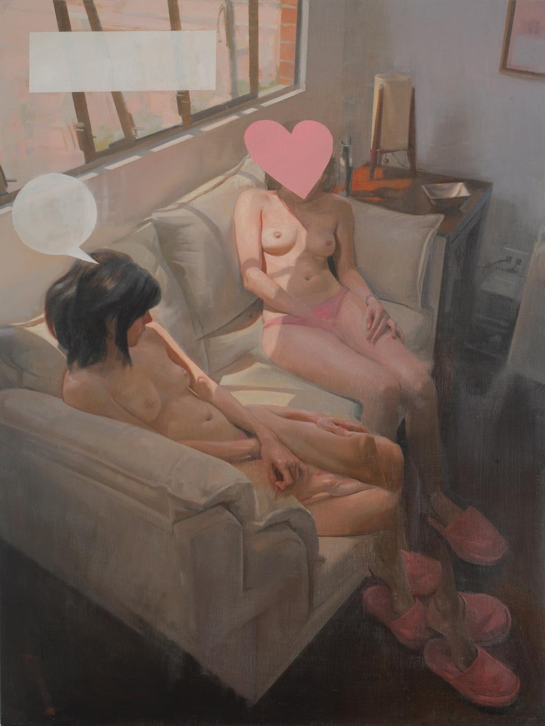
Nicolás UribeSunday Conversation (2008)

I really love this guy’s work.

But this one in particular has a lot of meaning for me.

My life has been a living hell for the last five months. My partner is dependent, at least, in all likelihood addicted to pain killers. She’s fine as long as she can get pills but when she can’t she becomes profoundly emotionally abusive, manipulative and suicidal.

For the longest time, she was the only person who wanted me and more than that wanted to be with me. But at the end of May last year, I went out to the Bay Area for the first time and spent 48 hours with my friend Amadine (not her real name).

It was maybe the best 48 hours of my entire life. I have only ever felt so completely connected with one other person in my life.

Anyway, the first night I was with her we ate edibles together and sat on the couch in her living room talking. As those of you in California already know, the CA medical edibles tend to come in a bit higher in THC concentration than they are advertised. For example: at that point I was consuming around 35mgs on a two days on-one day off rotation. I ate something like 65mgs that night and I’ve only been that stoned maybe three other times in my life.

Amadine was outline three projects she wants to work on, one involving animation.

Unlike this painting, we were fully clothed. In fact, her partner was in the other room. We also were not sitting side-by-side. She was sitting with her back against the arm of the couch, with her legs crossed, her knee touching my thigh.

The only light in the room was a lamp on Amadine’s desk–her desk being in a recessed work space divided off from the main room by one of those antique dividers with the carved wooden arabesques. As my eyes scanned between her eyes and the room–I have trouble with eye contact and while that trouble is almost non-existent with her, I had to keep shifting my gaze because the urge to lean forward and kiss her was so overwhelming.

The light through the carved gaps seemed like it was rotoscoped, it kept undulating and shifting slightly distracting me. Amadine stopped talking and we just sat there looking at each other for what felt like five minutes. She finally giggled and smiling broadly said, wow, yo, that was super intense.

It’s taken a while but we’ve finally gotten around to talking about our experiences of that weekend. And it turns out that we are both insanely attracted to each other but that due to a number of factors in her world right now it’s not something that those feelings aren’t something that can be acted upon just yet.

So yeah, this painting perfectly captures the feeling of sharing space and time with a dear friend that I love and am devastatingly attracted to…

It’s probably not realistic and I know we won’t hook up when I see her again next month, but I stupidly have in mind that we might be able to share space again like before, perhaps more inline with this painting. (We both have a pronounced nudist streak, so it’s not impossible even if it is unlikely.)

Toshio SaekiRenrui (1972)

Apparently, this is a work within a genre known in Japan as ero guro nansensu–a literal translation of the English phrase “erotic grotesque nonsense”.

A lot of it gets lumped in with hentai and the term has become synonymous with gore.

There’s an article over at Vice’s The Creators Project and honestly I’m head over heels for all the references in that article (which includes the above).

It strikes me that ero guro provides a sort of broad overview of how pornography might be a subject for artistic contemplation–since true ero guro seems rooted in a sort of code switching where political and cultural realities are rendered as viscerally extreme metaphors.

I read the above as a sort of meditation on grief. The narrative elements suggest that the woman ostensibly masturbating in the foreground has lost her husband–who is picture and perhaps also peaking out from the hot tub in the background.

There’s a ritualistic element to the way the people in the background are staged. And the meaning seems to me to be illustrating a correlation between the publicness of loss, grief and grieving compared with the private-ness of masturbation. Except where what is done privately to get by is suddenly performed public and judged by others.

It’s compelling and matches very closely to my own experience of grief and grieving. And that’s the thing with all the stuff in the aforementioned vice article: it resonates with me in a way with which I am not entirely comfortable.

Source unknown – Title unknown (19XX)

This reminds me of Nan Goldin’s work although I am reasonably certain it isn’t hers.

To the best of my knowledge, Goldin used color slide film exclusively. (I vaguely remember that she now uses digital–which makes sense given the gritty immediacy she trades in.)

That it’s B&W would be a huge departure for her.

Also, the orientation of the couple to the space they’re inhabiting is a bit over-stylized–the way her body enters the frame at a slant gives a sense of dynamic left-to-right leaning in, which in turn contributes to a physical sense of forward motion into the cocksucking motion–despite the fact that she’s pretty clearly moving her mouth up the length of the boy’s erection not down it. (That tension between bending in and pulling away, makes it feel a bit like a gif despite the fact that it’s a single frame.)

Again, though: there’s a way in which this image doesn’t seem to be for or about the viewer–it’s merely something the viewer has been deemed lucky enough to witness second hand. (And in that way, it’s also very much like Goldin’s work.)

Olaf Martens – Sabine I, Nordhausen (1983)

I effing love this. Part of it is the color–that red is to die for and there’s just enough pale magenta at the edge for the frame to de-emphasize the garish tapestry-esque table cloth.

And while everything in the frame–decor, the dark liquor in an ornate rocks glass, the CRT television set–screams 1950′s housewife fetish, I’m more into the sheerness of the material.

The first nude photo session I ever did was almost two decades ago, now. The model was my significant other and she was interested in posing nude but had some reservations about what might happen if the pictures got out into the world.

She had this silk scarf that was enormous and actually more like a shawl that was see through. I suggested that perhaps she use that to cover up if it made her feel more comfortable.

She loved the idea and the pictures ended up being far more revealing that I ever expected them to be. It was as if that thin piece of fabric was like some sort of armor that allowed her to feel empowered and invulnerable.

The pictures weren’t especially good and I’m uncertain whether I still even have them. So much in erotic image making depends on what is shown and what remains hidden. I humbly submit that perhaps what you can see but not completely or clearly is arguably more sexy than either of the aforementioned extremes.

Aaron Tsuru –  just you and me feat. Lorelei (2015)

There’s this marvelous @reverendbobbyanger quote from one of his Sunday Posts a year or so ago:

There is more than finding the right light to shoot in. You must find
the people with the right light in them.

He’s absolutely correct. That’s always the first step. But a think a indispensable second step follows implicitly given that first step.

I remember being told once that the Sanskrit word ‘namaste’ translates to something like the light in me sees and acknowledges the light in you.

It’s not enough to find the right light in someone else–you must also find that right light in yourself.

Whether it was Hemingway or Leonard Cohen who said it first or best, it’s still true: the broken parts are where the light gets inside.

Or to borrow a monologue from the film with the best color cinematography of all time that was subsequently appropriated by Texas post-rockers Explosions in the Sky:

This great evil – where’s it come from?
How’d it steal into the world?
What seed, what root did it grow from?
Who’s doing this?
Who’s killing us, robbing us of life and light, mocking us with the sight of what we mighta known?
Does our ruin benefit the earth, aid the grass to grow and the sun to shine?
Is this darkness in you, too?
Have you passed through this night?

If you’re curious what it looks like when someone has passed through this night is seen by someone who has also passed through similar nights: it looks like this. Exactly like this.

MœbiusAngel Claws cover (1993)

I was super into comic books in my late teens–roughly circa 1991 through 1997.

I followed the spate of hot shot upstart pencilers–who would go on to become Image Comics’ freshman class–Dale Keown, Jim Lee, Rob Liefeld, Todd McFarland and Marc Silvestri.

I was aware of the edgier stuff out there: Neil Gaiman’s run on The Sandman; the Frank Miller/Geoff Darrow collaboration Hard Boiled–alternately, I never got what the fixation was with Alan Moore

I fell out with the medium for two reasons: it became too expensive of a hobby for me to keep up with–there were also more things that I wanted to read each month than I could afford to acquire myself. And, my more professional interest in it waned.

At a certain point, I entertained the notion of writing and perhaps drawing sequential narrative work. I was especially partial to Jim Lee’s dynamic frames and diversity of depiction. His figures seemed solid in a way that others didn’t, his poses more considered. (Although in hindsight her frequently favored what in filmmaking you’d call insert shorts a wee bit too much and his economy of frames and layout were sometimes questionable.)

I was really taken with his Deathblow style reinvention. It was much darker, more abstract–with heavier lines, looking often more like a photographic negative than a comic book panel. I obsessed about this style; so much so: that when we were ordered to write a report on an artist my junior year of HS, I picked Lee.

This was pre-Internet. And it was daunting to find enough sources to build out a workable biography, let alone find information on development and growth of style and technique.

I managed to find enough information that I could stretch it to make the project work. But what I enjoyed most was selecting samples of his work and drawing an exact copy of one of his pictures and then drawing something using his style but applied to an original work.

My copy was a redux of the gatefold cover to X-Men #1. (Yeah, I’ve always been super ambitious/or a glutton for punishment, depending on your perspective.) My original in-the-style of was a riff on Cyberforce’s Velocity character in Lee’s Deathblow style.

I was ridiculously proud of it. I mean it wasn’t a masterpiece by any stretch but I’d applied myself in a way I rarely did on projects and if nothing else it showed a stubborn potential.

Things didn’t go so well. You’ll remember I went to an Xtian HS. And my art teacher was unspeakable offended by the degree of inappropriateness that my project demonstrated. I was ordered to give my presentation to my classmates as per normal but I was required to give a disclaimer that I had picked an insanely inappropriate artist and that I was very apologetic for bringing such filth into a place founded for the worship of and bringing glory to the name of God.

I was given after school suspension for a week–where I would sit with my art teacher, she would drape her arm around my shoulder and we would take turns praying that good would forgive me for the sins of the flesh I had committed by allowing this stuff into my head.

Since then, I’ve never been able to draw. It makes me violently nauseous.

Anyway, it’s nice to actually re-encounter Mœbius though. Logically, the preponderance of his work popping up on Tumblr likely has to do with the current ramping interest for Besson’s upcoming Valérian and Laureline adaptation (another Franco-Belgain comic book classic).

I have little interest. Besson hasn’t appealed to me since 1995. (However, in fairness, Léon: The Professional is what ended up making me a film student not ten years later.)

Also, does anyone else notice the degree to which Apollonia Saintclair has been influenced by Mœbius? It’s kind of cray-cray…