Source unknown – Title unknown (201X)
Source unknown – Title unknown (201X)
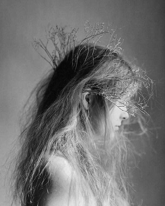
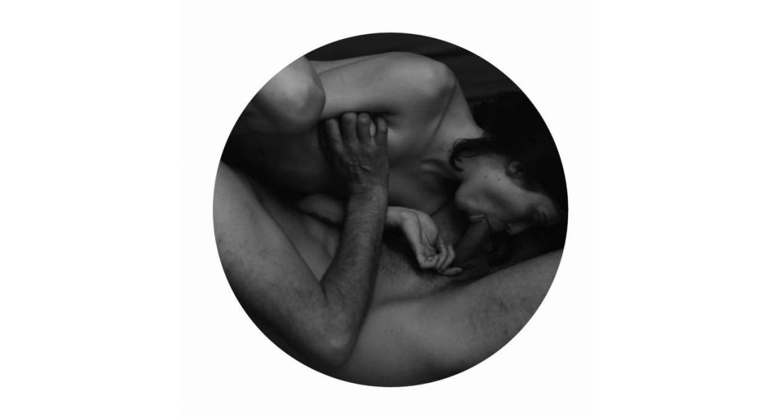
Julia Klem – Untitled (2014)
I’ve been thinking a lot about the difference between ‘good’, ‘better’ and ‘best’.
As with most of my mental tangents, it started as a digression; specifically, a friend was talking to me about their post-election anxiety.
They said: I feel gutted.
Gutted: a harsh word–the choked G, the clot of Ts; a former presence (I had guts before) and current absence (I no longer have guts); an implicit violence resonates.
Good/better/best?
Gutted: a word intimately connected with hunting and fishing–you gut the fish you caught, the deer you shot before you can eat it. Something dies so that something else might live on. If you’re gutted the benefit of your body is no longer something for which you may lay claim/benefit.
Eviscerated?
Like ‘gutted’ it conveys a similar sense of former presence and current absence, except presence or absence are connected more to uselessness of the presence. The word itself is violent but there’s a matter-of-factness to the treatment that feels sterile–the corpse on a slap with a Y incision and the visera packed into a plastic bag placed somewhere off to the side on a scale.
Hollowed out?
The former presence is downplayed to focus on the current absence. Did it happen slowly? Was it violent. Is it figurative or literal?
Good? Better? Best?
Initially, I thought that ‘gutted’ was good; ‘eviscerated’ was better and ‘hollowed out’ was best.
Now I’m not so sure. I think if I were speaking, ‘hollowed out’ would be the best choice. For someone else, it might be different.
I’ve been thinking about this in terms of artistic influences–that’s the prism through which I’m approaching Klem’s fucking FANTASTIC photographs.
Any schmuck who knows a bit about Internet famous photographers, can probably spot the overlap between Klem and Laura Makabresku. (And there’s almost no way that Klem doesn’t consider LM an influence–it’s much more than the repeated crow motifs.)
I don’t like LM’s work; it’s Brooke Shaden directing a Stabbing Westward music video based upon a little known Edgar Allen Poe short story aesthetic has always struck me as pure posturing (at best) or sycophantic contrivance.
Is it unique? Without a doubt. But does her gauzy, soft-grunge aesthetic compliment yearning and mournful–or is it yearning to be mournful– favors concepts and content.
It’s almost like hearing someone say they felt ‘gutted’ and then every time they find yourself in a situation that they think is similar they respond by saying they feel ‘gutted.’
And that’s not necessarily a bad thing. We learn what feelings apply to which situations through empathy.
Artistic influence is not unlike this. We find comfort and derive solace from work that moves us. So it’s easy to say: this moves me the most and therefore I am going to make this the example that I follow. Our heroes say they feel gutted and we are inclined to follow suit.
But none of us are our heroes. And part of being a gifted artist is knowing when to stay the course and part ways.
I’ve always felt that LM say she feels “gutted” when she might be better served by identifying as “hollowed out”.
That not a bad thing, inherently. Although in my experience is does limit the range, resonance and accessibility of the work. What frustrates me about LM is that her choices always seem to so completely undercut what I feel is the central tact of her work–slow dirge for new oneiric feminine; and she stands behind those choices with such bravado.
Why doesn’t that diminish the value of Klem’s work–I mean if she’s influenced by LM, then doesn’t that discount her work? I would argue no. There’s a way in which Klem’s work manages a unified aesthetic but the aesthetic expands outward to engage with concepts. (LM on the other hand tosses concepts like darts at the bullseye that is her aesthetic.)
In other words, Klem work is comparable to the person who says “hollowed out” because it’s the fullest way of expressing their own multiplicity of meaning even though ‘eviscerated’ might make her feel smarter and/or ‘gutted’ might appeal to her desire for visceral resonance.
The two other observations I can offer on approaching Klem’s work:
Bonus: Klem really knows when and where to preference vertical orientation over landscape. (It’s actually a subject to which I am considering the dedication of a future post .)

Sannah Kvist – Untitled (2008)
Sannah Kvist = newest image maker crush.
If you’re looking at this and thinking of William Eggleston’s The Red Ceiling, then you’re eye is totally on fleek.
And like Eggleston she’s doing fascinating things with color. (I’m still too blown away by her work to start processing my thoughts just yet.)
But what’s even more interesting is the way that she borrows heavily from Stephen Shore, mixing in some Paula Aparicio and Mathilda Eberhard to keep it fresh and on the bleeding edge.
These days it takes a lot to get me worked up over an entire body of work, but I’ve spent several hours looking through Kvist’s Flickr account and she really is effing amazing.
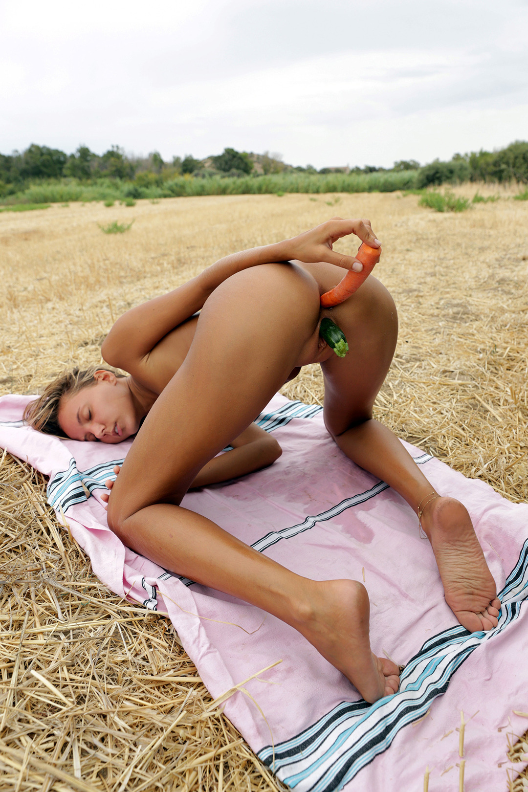
Katya Clover – Title Unknown (2016)
I’m of two minds about this image. It gets me painfully hot and bothered. So it at least has that going for it. The trouble is it’s a garbage image.
There’s no sort of compositional logic. It’s #skinnyframebullshit. There’s no rule of thirds, no golden mean; it’s merely the camera turned on its side as a means of most easily fitting the most information pertaining to Clover into the frame and (also the slimming effect that a vertical frame can impose.)
What makes the image attention grabbing is the super saturated skin tone, magental of the blanket and organ of the carrot against the bland straw and blah sky. (This is about as first rate an example I’ve ever seen of how faithful rendition of color does not guarantee a good image.)
I do like the concept–quite a lot, in fact. I’ve never seen anything like it.
Further, I love the giant wet spot on the blanket. If we knew a bit more about where she was, the image might be improved. Is she near a garden? Is that where the zucchini and the carrot came from? But there’s not enough of an indication to go anywhere with these questions. (Another short coming of the image.)
I’m not sure her pose works. It’s a little awkward but it does at least seam to be in service of what she’s doing. (I adore her expression.) Even though it is interesting, in that I feel most images like this would go for an angle more aligned with a straight on view of her vulva and anus. I always tell people that one can absolutely include graphic depictions of vulvas in one’s work, but if one want to know a general real for what’s objectifying vs what’s depiction, imagine the vulva is an eye lid, if the eye opens and is looking straight ahead is it making eye contact with the viewer? If so, there’s a good chance the image will end up being objectifying unless a good bit of other work is put in to avoid it.
Looking at this I’ve realized another thing about the difficult in using masturbation as a subject for art. It’s really a question of visual depiction of an experience versus staging the experience for a voyeur and by extension–due to the unfortunate white cishet male history of art–the male gaze.
If I can find someone interested in posing for it, I would actually very much like to reinterpret this concept as a fine art photograph–’cause I think there’s that sort of potential to the concept.

Patricio Suarez – Rachel_007 (2010)
Underneath all reason lies delirium, and drift.
— Gilles Deleuze, Desert Islands, p. 262

Arseni Khamzin – Untitled (2013)
…holy shit: this. is. FAN-FUCKING-TASTIC!
It’s a compositional marvel, really–the interplay between line, texture and shadow vs. light is exemplary.
The subject is slightly off-center to the right of the frame; allowing the top and right of frame to be counter-balanced by the much darker shadows cast by the subject and chimney.
There’s an intoxicating variety of sumptuous texture–poured concrete, mortar, corrugated metal, skin, hair and fabric. (It’s an especially inspired touch that the lines on the tartan print blanket reiterate the two point perspective of the composition, but in their slightly imperfect alignment, they server to further direct attention toward the subject.
Why does it all work so well? Two years ago I would’ve just offered the cop out of attention to detail regarding texture and balance but actually, the frame works off a simple 45 degree clockwise re-orientation of the rule of thirds.
And I’m not even to the best part–this is a Pietà! Yes, it’s oriented differently. Traditionally, Pietà present Jesus from head to toe starting with his head at frame left and his feet towards frame right. [Can someone with a little bit more comprehensive of an Art History background explain the relevance of such positioning? I suspect there’s something to it (sacred vs profane, which would be interesting given the fundamentally humanist trappings underlying the codification of the trope)–not unlike the direction Ganesh’s trunk curls having distinctly different meanings.]
Yes, it’s also short a figure and the genders are swapped–or so it seems to me. But there’s really some fascinating reinterpretation going on surrounding the trope. I can’t help but think the point of this variation has something to do with the loneliness of existence and a sort of embodiment of that notorious line from Donnie Darko: every living creature on earth dies alone.
Lastly, this was made on Impossible Instant Black and White Film with Hard Color Frame–which in my experience is not the easiest film to use if you want to produce a thoroughly luminous result such as the above.
Stunning and exceptional.
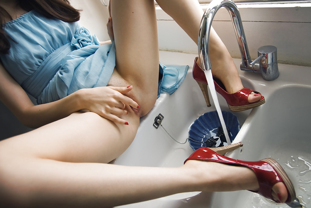
Okay… so I am 120% infatuated with this image even though I don’t think for even a second that it’s objectively ‘good’.
The light is nice and the limited palate–the white-white light falling through the window behind the sink with the white of the counters and sink, the red high heals and vermilion nail polish, the dark blue dish in the sink and the cerulean dress–are all extremely effective.
But the–what are those 3 inch heels–push things over the line into porn territory; while the carefully positioned right index finger seems less like an honest attempt to pull things back and more like a winking see-what-I-did-there?
(EDIT: a reblog called into question whether or not I’m implying that porn is objectively bad and suggested that I’m implying that based upon heel height. The suggestion is arguably missing the forest for the trees but I’ll admit that it’s possible to take things that way just based on the evidence that someone clearly took it that way. I was referring more to the porn trope where heels remain on in situations that are grossly unfit for heels. I mean I really can’t image climbing up on a counter wearing heels and not legit fearing about breaking my neck. So I was referring more to contrived artifice and less to the objective good or bad of porn. Alternately, I was absolutely imply that contrived artifice in image making is a godawful thing.)
And the framing is super problematic. The angle of view is awkward and the way her left knee, head and shoulders and right knee are cut out of the frame offers no suggestion that there exists a continuity extending beyond the frame edges.
But when I look at this I see the angle corrected so that the camera includes the entirety of the subject from head to toe and suddenly all the things that are problematic about it disappear and it’s a hauntingly perfect, narrative image.
Why narrative? Well, maybe not a detailed narrative but there’s a sense that the subject has masturbated to orgasm and is enjoying the post orgasmic afterglow. (The erotic is after-all the conceptual structure which most closely mirrors narrativity, i.e. attraction, arousal, negotion, climax, post-climax.)
I love the way that the water standing in the sink basin furthest to the right is poetically suggestive of ejaculation while the water filling the blue bowl in the sink suggests that the arousal has not yet been completely sated.
I’ve tried several times to recreate this image. None have succeeded. Largely because I can’t find a sink facing a window, partly because I can’t decide whether or not I want to take a picture of a friend and sometimes collaborator or if I want the same friend and collaborator to make a portrait of me like this.
Well see. Until then I hope you enjoy the potential of this concept as much as I do.
Madeleine Froment – Untitled from Accord/#1 DM series (201X)
I make a pretty solid effort when it comes to familiarizing myself with the work of the artists I post here.
Frequently, I find that while a particular image resonates it seemingly telegraphs to my eye that the I will end up considering the rest of the work an–at best–mixed bag.
It’s frustratingly rare to find work which truly fans the flames of my curiosity.
But when @reverdormir2 posted this drawing by Froment, I was immediately taken by it; I don’t know, I think it’s the obsessive and perhaps even a little awkward details of the hair–the way her hair obscures her face, the careful rendering of the hair on his back, arms and legs, the texture of his beard contrasting against her tightly cropped pubic hair.
I clicked over to her web site and promptly dropped into a sensual erotic K-hole for the better part of an hour.
For the record, not all of her stuff works. But unlike the majority of intellectually dishonest wannabe creatives out there, she doesn’t foist the work on her audience despite its flaws. Instead, she presents the work in a fashion that patiently bridges the gap for the audience between the impetus for the work, the details that drive and enliven it–all subsequently recontextualized in the final work.
It’s really goddamn ingenious. However, what makes it even more exceptional is the degree to which Froment understands her own aesthetic peculiarities and formulates her installations in such a way as to further compliment it, but to also enrich the complex relationship between the work and the world it inhabits.
If you think I’m being a pretentious blowhard and talking out of my ass, just browse through her website and notice how the work flows from documentary like snapshots, to more refined images which in turn provide prima materia for her spare, meticulous drawings. Note: also the holistic way each project is presented to emphasize how the work is supposed to be viewed–ethereal (representative) vs actual (representational).
This is extremely high end work. And it’s thrilling to see an artist this young and this preoccupied with the sort of topics that I think are all too often excluded from artistic discourse–much to the detriment of Capital A Art, unfortunately.

Lucian Freud – And the Bridegroom (1993)
Can you believe a decade ago I detested Freud’s paintings? Like really super hated them–I think it was something about their stretched, obtusely rendered perspective.
I do not feel the same way these days and I’ve become borderline obsessed with his work. His use of color–minimal around the edges and growing more layered/nuanced the closer the eye draws to the subject(s).
It’s almost as if everything in the work is designed to draw attention to what can only be inferred–i.e. the psychological state of the subject(s).
It’s a brash maneuver to have everything function solely to the end of conveying something that can’t really be fully communicated through visual depiction.
That Freud manages it so frequently and with seemingly so little effort is so improbable, there’s only one way to accurately encompass it: unmitigated genius.
Here’s to being wrong–and the growth/evolution that arises from being willing to admit it.

June Canedo – Various Untitled (201X)
I shouldn’t be as completely over the moon about Canedo’s work as I am–almost without exception she composes vertically, she’s all about Kodak Portra and she’s exploring the currently trendy no man’s land between portraiture, fashion/editorial and so-called lifestyle photography.
But, contrary to everyone else hanging out in that space–her sensibility comes across as generally curious and engaged instead of being just another cookie cutter hipster affectation.
The above photos are my favorite and they fit the theme of this blog. However, I do feel a little conflicted for focusing solely on photos featuring nudity to the exclusion of some of the other work.
For example: Canedo has a bunch of what appear to be medium format film portraits of people in Wal-Mart parking lots. That these images are luminous and enduring is one thing; but as someone who frequently feels a desperate urge to make something against the odds and my own personal stagnation–I can’t tell you how many times I’ve thought about doing something similar in order to run some film through the camera. It’s never something I do–because I’m convinced that there’s no way the ends will justify the means. It works for Canedo, though. And the results are noteworthy.
She also does fashion/editorial work.Yet, although it fits the expected mold for that sort of thing, her work always features a distinctive personal style–low angles re-envisioning the customary tropes into towering and statue-esque abstractions, rendering a cool and detached view of something that is fundamentally unreachable; or a stunningly humane flicker between subject and photography, the splendor of which the viewer sees without ever being fully able to decode the entirety of the context surrounding what they’re seeing.
