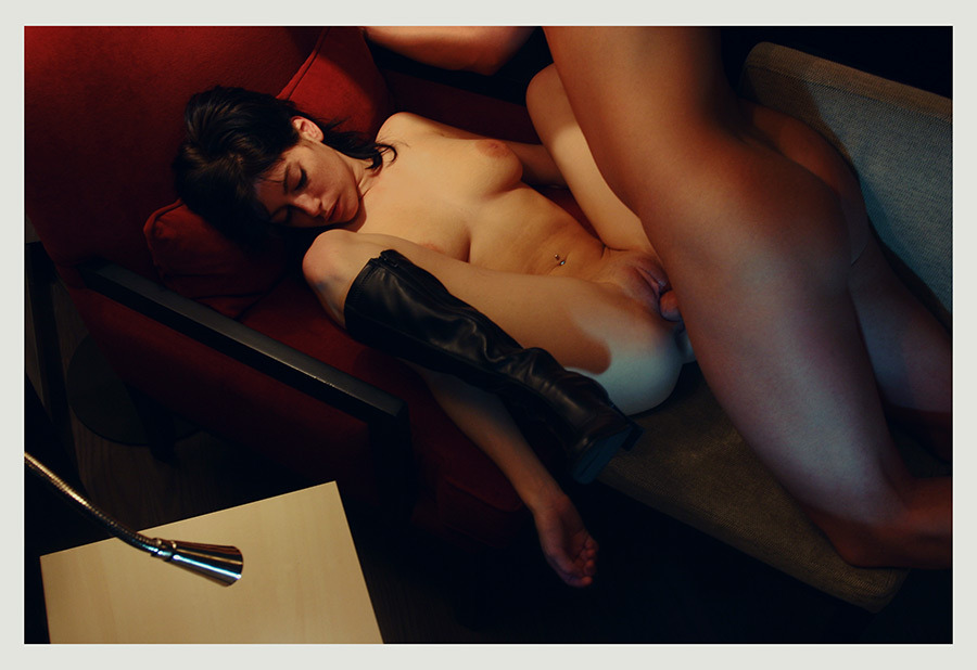
vextape:

fourchambers:

oviduct

(support more projects)

I am gross and I love putting my fingers in things they don’t belong and I dooooon’t careeeeeee 

Awhile back one of my followers advised me that Duke University was attempting to start a Porn Studies PhD program.

I flipped my shit a lil. I mean what I’m attempting with this blog is a less formally academnified version of exactly that premise. And as much as I feel alienated from academia these days–there is a part of me that knows that if nothing else I function exceedingly well in that framework.

I looked into it and turns out the information was only about 10% true. A professor of Film Studies and Rhetoric at UC-Berkley named Linda Williams published a book called Porn Studies through Duke University’s press in 2004.

But Williams’ notions are absolutely fascinating. Via Wikipedia:

[S]he argues that horror, melodrama, and pornography all fall into the
category of “body genres”, since they are each designed to elicit
physical reactions on the part of viewers. Horror is designed to elicit
spine-chilling, white-knuckled, eye-bulging terror (often through images
of blood); melodramas are designed to elicit sympathy (often through
images of tears); and pornography is designed to elicit sexual arousal
(often through images of “money shots”).

Two things about this relate directly to what Vex and Four Chambers do and do with beauty:

So-called “body genres” tend to be relegated to a default subset I’d term not-art. (Alien would be an exception but note that it’s first a sci-film and only secondly a horror piece; and so the skillful genre fusion allows critics to sidestep the horror isn’t art prejudice.)

The work being made by Four Chambers isn’t just of an exceedingly high production value, I would argue that it’s capital-A Art.

And as much as I’d like that argument to take a form similar to the Buddhist monk who when tasked with passing wisdom to those gathered to hear him speak, merely held up a lotus leaf for all to contemplate–in other words, I’d just point to this image and say: duh, of course this is Art; there is something else that applies.

The fantasy that the majority of porn sells is centered on cishet white male pleasure. It’s formulaic and sterile–the only mess pertains to the money shot.

But, in reality, sex–at least when you’re doing it right–is hell of messy. I swear there’s a dissertation for a Porn Studies PhD just waiting to be composed about how Four Champers represents sexuality as messy and rich with fluids. (Literally pick one of their videos at random and you’ll see what I mean. The one I happen to have handy is this image that I was going to save for a future post.)

You can call it gross or more honest or both even but whichever way you cut it, there is a subversive push to decentralize the fluid mess of sex from cishet white male pleasure. Not only is that hot as fuck, its importance and absolutely vital.

photominimal:

There and Back. With Suspended in Light: Montreal / Polaroid Automatic 100 / Fuji FP3000b

I am absolutely dead-to-rights, head-over-heals for this ‘Polaroid’.

Yes, the tonal variations are effing exquisite. Note the gradual grade from right to left–reversing the convention set by Dutch Golden Age (that’s been more or less continued uninterrupted ever since).

And the light slides into the frame in such a way as to imply a right triangle. There are so many grace notes: the way the sunlight accentuates the curve of the bottle like a hand that can’t quite decide whether to lift the object or merely luxuriate in the cool press against its palm. The two plants–how they are just illuminated enough to separate them from the background, rendering them legible. The way the brightest point in the image is the echoing right angle formed by Suspended In Light’s left forearm the sink edge and the side of her top.

Oh, and the way the light from her left thigh pops against the gloaming darkness. And the second bottle to the left of the mirror with the sprig of something standing at attention. And the light on her reflected face…

Instant film stocks tend to provide an unpredictable softness of focus. It is used to masterful effect here were the paneling, sink pedastal and skin all appear to have visual texture that almost seems as if were you to touch it, it would feel like wood, porcelain and flesh.

But I think what I love most is the washing machine and dryer nudging in along the lower left edge of the frame. Not only does it balance out what would have otherwise between a frame leaning decidedly off balance to the right, the inclusion renders a greater degree of interest in the frame as a whole. There is a timelessness feel to the image but it is clearly anchored in the present.

I especially admire this image because in my own work, I am generally loathe to work indoors. I always tell myself that one day I’ll be able to afford to live in a place like the apartment in Mirror. This image serves as a reminder that even if I had that apartment, I’d still struggle to shoot in it because when you’re working in close confines, at a certain point you have to play it as it lays. I’m too much of a control freak to do that–and I think my work suffers as a result.

Peter HujarBruce de Sainte Croix Triptych (1976)

The central image here served as my introduction to Hujar’s work. (I posted about it 2.5 years ago–misattributing the subject and excerpting just the one image from the grouping.) But, I recently discovered that I was familiar with another of his photos well ahead of that–probably the photo most commonly associated with Susan Sontag was made by him.)

I keep coming back to his work, though. I guess the reason I do is due to his patently even handed approach to all subjects. From portraiture, to landscapes to erotica, he invariably affords his subjects a calm dignity which more often than not edges over into a flash of stubborn pride.

As if in the mid-to-late 70s and big bad eighties in Manhattan with the specter of HIV and AIDS stalking the gay community, there was a camaraderie and joie de vivre that you just don’t really ever see. (And to be clear, I have no intention of romanticizing. It just strikes me that the romanticization of much of the work emanating from the downtown scene possesses an openness an candor that was bred as a result of surviving, the creation of which was clear eyed and unpretentious and for those who didn’t live through those years in that climate read as charmed in a way that was never intended by the creators.)

His tone and frank presentation of ‘high’ and ‘low’ subject matter with the same, quietly incisive approach are things I would very much like to achieve in my own work.

Igor PjörrtDying Star (2015)

My first thought is how this is riffing on Lina Scheynius.

And I say riffing on as opposed to ripping off with intent–the distinction is the same as the difference between stealing like an artist and mere mimicry.

Where Scheynius is interested in documenting light specifically and this frequently manifests as attention to the relationship of light to her body, self-portraiture is less destination than familiar landmark along the pathway.

Pjörrt, on the other hand, seems from the outset more interested in portraiture. Light, or more correctly low-light, does figure prominently in his work–and you should seriously browse his archive because the way he uses minimal ambient light is exquisitely masterful.

The only criticism I have is the erotic works tends to diminish the formal considerations of the more cinematic images by adopting awkwardly, contrived poses. Consider this self-conscious tangle of bodies vs a more legible and evocative image which retains a sense of oddity about the mechanics of how the body’s relate to one another.

Kelli Connell – Convertible Kiss (2002)

Honestly, I am too profoundly moved by this body of work to offer any sort of worthwhile commentary–it’s just effing exquisitely devastating.

So beyond begging you to spend some time with this work, I’m going to let the artist speak in her own words:

These images were created from scanning and manipulating
two or more negatives in Adobe Photoshop.  Using the computer as a tool
to create a “believable” situation is not that different from accepting
any photograph as an object of truth, or by creating a story about two
people seen laughing, making-out, or quarreling in a restaurant. These
photographs reconstruct the private relationships that I have
experienced personally, witnessed in public, or watched on television.  
The events portrayed in these photographs look believable, yet have
never occurred.  By digitally creating a photograph that is a composite
of multiple negatives of the same model in one setting, the self is
exposed as not a solidified being in reality, but as a representation of
social and interior investigations that happen within the mind.

This work represents an autobiographical questioning of sexuality and
gender roles that shape the identity of  the self in intimate
relationships. Polarities of identity such as the masculine and feminine
psyche, the irrational and rational self, the exterior and interior
self, the motivated and resigned self are portrayed.  By combining
multiple photographic negatives of the same model in each image, the
dualities of the self are defined by body language and clothing worn.
This work is an honest representation of the duality or multiplicity of
the self in regards to decisions about intimate relationships, family,
belief systems and lifestyle options.

The importance of these images lies in the representation of interior
dilemmas portrayed as an external object – a photograph.  Through these
images the audience is presented with “constructed realities”.  I am
interested in not only what the subject matter says about myself, but
also what the viewers response to these images says about their own
identities and social constructs.

Anna Grzelewska – Selections from Julia Wannabe series (on going)

I’ve had this post from Magenta Magazine sitting in my drafts for months now.

Part of the reason I haven’t posted it is because I am hesitant to place it side-by-side with some of the material this blog features.

Part has to do with Grzelewska’s artist statement–which I’ve made a point of excluding.

It’s not that it’s a bad statement–I mean once you come to terms that Artist’s Statements are more or less equivalent to an algebra teacher’s demand to show your work, it’s easy to tacitly acknowledge the utility.

In some ways it’s actually revelatory since it skips over the dissimulation you get from folks like Sally Mann and Jock Sturges. But even that is a slight of hand, in that it draws undue attention to the proverbial elephant in the room–the experience of between-ness intrinsic to adolescence.

But what’s actually at work here is something far more universal and double-edged–the agency of the subject standing in relationship to the perversity of bearing witness.

Grzelewska is like someone with a sore tooth. She can’t stop touching it. She clearly has a great deal at stake in the proceedings–and there is something undeniably transgressive in that act. Yet, the illicitness of the compulsion dulls when offset by the realization that what makes culture blame Lolita for Humbert’s crimes is the same tendency that drives the urge to avert the eyes, to not bear witness to the between-ness, to not acknowledge and shroud with shame.

This is hand’s down the strongest, most vital and completely fearless bodies of work I’ve seen in the last half decade I am head over effing heels for it.

Evgeny Mokhorev – Girls from Teenagers of St. Petersburg series (1996)

This is edgy in all the ways I crave for photography to be edgy.

Beyond that I’m not sure what else I can say about it. Except, except… OMFG, it reminds me of Myroslav Slaboshpytskiy’s The Tribe. (TRIGGER WARNING: if you are a person with any sort of trigger, this film will unquestionably be a problem for you; proceed with caution.)

If you haven’t heard of it’s the story of the seedy underbelly of a Ukrainian boarding school for deaf teens. There is zero spoken dialogue; everything is in sign language and subtitles are intentionally withheld.

It’s riveting and brilliant and unconscionably brutal.

It’s also ballsy as fuck–almost every scene occurs in a single uninterrupted long take, which if not up to the standards of someone like Béla Tarr you are pretty much required to overlook the sometimes less than perfect framing by virtue of the fact of how completely batshit fucking crazy camera tai chi several of the scenes are.

Pixoom PhotographieTitle Unknown (2015)

If you’ve followed this blog for any time, you are most likely painfully aware of my aversion to portrait orientation in lens based image making.

I refer to it–with profound contempt–as #skinnyframebullshit.

It’s a term I use a lot and I’m always linking to the same article I wrote more than two years ago. So–with the notion in mind that someone seeking to determine counterfeit from legitimate currency always studies the real item instead of the fake–it occurred to me that being as this image is not only stunningly gorgeous but also in no way shape or form #skinnyframebullshit, that it might be time for me to create a positive reference instead of a negative one.

It’s maybe not the best place to start but one of the things that doesn’t directly relate to my hatred for portrait orientation but does inform it is the increasing ubiquity of digital imaging technology. (Again, if you’ve followed me for any time you’ll know that I am obsessively anal about differentiating between digital and analog processes. Yes, they are built off the same chassis but their respective functions are vastly different in practice.)

By now, you all are familiar with shitty Youtube videos wherein due to the shape of and interface of our smart phones you get a preponderance of video with vertical frames. It’s ugly, sloppy and I would maintain a poor reflection of the author’s basic intelligence.

I’ve been pretty active in Internet photo communities since 2006. Back then, folks making work were basing it off the history of lens based image making up to that point. Yeah, you had vertical oriented images but whether or not there was a reason for them to be vertical (i.e. an internally consistent compositional logic) they were the distinct minority.

Of that minority, a plurality featured this sort of self-conscious flipping the physical camera body on its side makes me look more like a photographer. When you do it, you feel a little rebellious.

Now, if you’re a person shooting on film, then you drop what you shot at your lab (or better yet, process yourself); and then you pop your slides or negs down on a light table and have a look-see. The thing you note immediately is that your vertically oriented frames break the flow of your reading your slides. You end up having to flip the filmstrip, contact sheets or whatever. Invariably, this causes you to favor either the landscape or portrait images due to the fact that it’s easier to read images that are in line with however you have the page currently oriented.

I learned quickly that there really needs to be a compelling reason for a shot to be vertically oriented. And with my reluctance to deal with vertical oriented shots, I realized that almost categorically, image makers opt for vertical orientation as a compositional shortcut. Like: oh, hey…what I want to shoot won’t fit this way, I’ll just flip the camera and that’ll fix it. Makes sense. Except one small thing and I’ll state it as a truism–you will always get a better shot by moving your body in relationship to the object or by using a different focal length lens. It’s just a fact.

And if you apply that to the history of photography, it’s interesting to note that most images with vertical orientation are–wouldn’t you know it–within the architectural genre. Why might that be? Well, in relationship to an edifice there are few options with regard to moving in order to achieve the framing you want.

Thus, I maintain rather rigidly that in general, if you aren’t shooting architecture, you can go ahead and shoot that vertical but then maybe move around and shoot the same thing landscape from different positions. I’m confident that all things being equal, you’re going to find you prefer the landscape frames.

One of the first things a beginning photography student hears about is the sacred rule of thirds. As a rule of thumb, it serves–and ensures photography instructors cut down substantially on the godawful wawker-jawed, indecipherable images. But like any rule, it’s nothing more than a general guideline that you really have to understand before you’re allowed to start ignoring it as you please.

Yes, the rule of thirds is an abstraction of the Golden Ratio. And with the tendency to frame the subject at one vertical third line and then leave a great deal of negative space to the left or the right, it does produce appealing images. (Note: how images that are perfectly balanced within the framework of the rule of thirds tend to have the effect of leaving you confused about what you’re supposed to be looking at.)

My theory is that with vertical compositions, the rule of thirds is less useful as a guideline; the expectation of the eye is something more in-line with the golden ratio.

There is only one horizontal line in the above image–dividing the frame top-to-bottom roughly 60/40. Katjuschenka is ever so slightly off-center (consider the mid-line of her face)–balanced expertly by her right knee opening what would’ve otherwise been a repetition of the angle of her arms.

There’s essentially only two colors in the frame–red (hair, skin tone) and blue. Everything falls in line with those tonal hues. Focus is sharpest on her eyes. (And as a dizzying bonus, check out the texture in her stockings. Dayum.)

A creepier photographer would’ve focused on the nipple or at least increased the depth of field so that it would remain in focus. But the decision to do that makes this image about the color and framing. The eye contact is neither coy nor pouting. It’s not flirtatious but it does convey a sense of knowing a great deal that the viewer does not.

This image is breathtakingly exquisite. If you’ve got to go vertical, this is the baseline. Either make it clear that the composition was the only thing that would’ve communicated the magic of that moment or go home with your weak ass #skinnyframebullshit.