
[↑] Rikki Kasso – Untitled from Trouble in Paradise series (201X); [↓] Source unknown – Title unknown (201X)
[↑] Rikki Kasso – Untitled from Trouble in Paradise series (201X); [↓] Source unknown – Title unknown (201X)
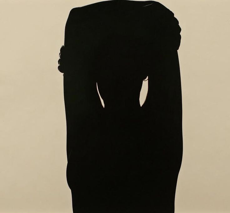
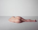
Harry Callahan – Eleanor (1948)
There are only a handful of photographers in the history of the medium with as roundly as exquisite a body of work over their lifetime. Callahan is absolutely one such photographer.
(In fact: if I was asked to name one photographer who one might through an especially thorough study of their work, glean the most extensive picture of photography as an art form, I’d probably insist that Callahan was the only consideration.)
My favorites are the photos he made with Eleanor and subsequently Eleanor and his daughter. But even with his minimalist landscapes and plants in the landscape–he is always magnificently attuned to nuance of light, tone and dimensionality.
I love everything about this photo. (I’ve somehow never seen it before encountering it here.) But what’s particularly revelatory about it is that silhouettes usual appear completely flat–as if someone cut out a shape in heavy cardboard and placed them between the camera and the light. (If you’re thinking of the scene in Home Alone with the cardboard Micheal Jordan cut-out… good call.)
The reason for that you’re dealing with something that is brightly backlit–thus, the object is blocking the light. The point at which the object blocking the light is the widest only has one dimension and there’s light that is blocked and light that is not blocked on either side of that object.
When I teach three point lighting to undergrads, we talk about the key light, the fill light and the back (or rim) light. The reason it has become customary to use this setup is because it a standardized approach to the stylized representation of natural lighting.
If you’re standing in the middle of a field on a sunny day–unless you’re facing into the sun (which doesn’t make for the most aesthetically appealing imagery–the sun is going to be bright on one side of you than the other. This is because the sun hits one side of you and by hitting that one side of you, it’s blocked from hitting the other side of you. (Unless you’re a ghost and then my apologies.)
The ground around you actually reflects light to a certain degree. So while one side of your face is brighter than the other, the ground helps fill it in so it’s still slightly darker but naturally and flatteringly so. (The key light is usually to left and the fill light to the right of the scene–you can do it however but as the convention is borrowed from Dutch Baroque painting, where the light almost categorically falls left to right.)
It’s the light behind you that actually gives you dimensionality. (A key light and a fill light will make the objects illuminated appear flat in exactly the same way a silhouette makes the subject presented in silhouette appear two dimensional.)
Notice how just the faintest of fills on the fingers of Eleanor’s right hand on her left arm–I’m reasonably certain that she’s is standing with her back to the camera–have dimensionality; and therefore create this strange since that she is and is not actually flat.

Tono Stano – Right-angle Flight (1985-6)
If I had to guess I’d say this frame has been inverted from its original orientation.
In other words: whereas the image appears as if the model’s legs are hanging off of something, more likely she’s laying on her back on the edge of a table with her legs in the air.
Not how the little dark edge of the table you can see in silhouette in the top left corner echoes the angle of the seem betwen the wall and the ceiling in the background behind her right foot.
Also: smart money would theorize that this filtered through a jugendstil funhouse mirror served as the impetus for the frankly ridiculous scenes from LvT’s Nymphomaniac where Seligman imagines Joe’s sexual education.
Stano would’ve been 25 when he made this. LvT was in his late 50s when making Nymphomaniac. (And that’s why everyone believes Bjork and no one believes LvT–plus if you’ve seen his films you’re automatically predisposed to believing Bjork.)


wonderlust photoworks – [top to bottom; left to right] Mx Incohate (2014); Homesick for the Distances (2015); 29:18 collaboration with Anonymous (2010); Map in the Maze collaboration with @camdamage (2015); A Dark Chant collaboration with @marissalynnla (2016); Baba Yaga collaboration with @suspendedinlight (2017); Hasp collaboration with @kyotocat (2016); Svartifoss (2015); Echo (2019); Woodland Cathedral collaboration with @marissalynnla (2016); Wombs + Tombs collaboration with @kyotocat (2016); Hold Me Now or Hold Me Never (2017); A Piece of the Sky collaboration with @suspendedinlight (2016); Coney Island, October (2016); Two Red Plastic Bags (2015); Samson’s Riddle collaboration with Kelsey Dylan (2016); Moxie (2016); Hold Me Like the Landscape Holds the Light (2017); Heart-Shaped Sunglasses + Helianthuses collaboration with Jacs Fishburne (2016); Emma collaboration with @kyotocat (2016)
Since I’ve been yammering on about it, it seemed only fair to share with the rest of the class. Above is the work I am submitting to MFA programs. (Apologies for some of the early formatting awkwardness…I had to trick Tumblr into letting me upload everything to a single post.)
The accompanying statement reads as follows:
I grew up in a Christian doomsday cult—an experience which forged a lifelong
preoccupation with the conceptual interpenetration of sin/transgression + salvation/
transcendence.
Storytelling figured prominently in this milieu—scads of Trojan horse fables secreting ideological payloads—but, also: beautiful, expansive conversations which were
less dialogue + more interactive sharing of stories not unlike a carefully curated anthology places various parts in implicit dialogue across the whole.
This effusive sharing sparked a strong sensitivity for wonderment which drew me
to music (something that saved me, continues to save me) + lead in turn to Johannes
Vermeer’s paintings, Andrei Tarkovsky’s oneiric long takes, William Eggleston’s impeccable dye transfers + Francesca Woodman gothic self-portraiture.
(Other artists to whose work I perennially return? Chris Burden, Duane Michals,
Rackstraw Downes, Ana Medieta, Peter Hujar, Kelli Connell, Aino Kannisto + Allison
Barnes.)
The enormity of experiencing beauty has always seemed a profound responsibility—as if in seeing there is a duty to labor in whatever way one is able to give something
back for what one have so undeservingly received.
My own art making process begins with the identification of a “visual problem” +
fits the form of a question*—e.g. How might a single, static frame imply a narrative
arc? (This question maneuvered me from cinematography to fine art photography.)
Any rendering of a person in an environment suggests narrative potential insofar
as the viewer asks who the figure is (characterization) + how she came to be in this particular scene (causation) + what she is doing there (context).
This introduces a second, more complicated conceptual problem. Given that photographing people is a minefield of political + ethical quandaries, how does one depict
identity, gender + sexuality while actively thwarting the art historical, dominant (hetero-partiarchal) gaze?
The only means I have found to ameliorate this is to conceptualize my photography as collaborative . I seek out + work with artists—sharing my questions with
them, asking each to bring their ideas + personal sensibilities to the proceedings.
When I am behind the camera, I refuse to allow myself to fixate on conceptual
considerations. Instead, I trust the preparation + planning that has led to the point of
making something. I proceed instinctively, acting less as author + more as a steward/midwife; the camera serves as a means of extending my capacity to feel outward—both
from the standpoint of sensory stimulus but also with regard to emotional resonance.
When what I see through the viewfinder feels like a response to the visual problem(s), I
snap the shutter.
My strategy for editing retraces the above steps from conceptualization to execution except in reverse order + with one notable exception: my collaborators receive “first
edit”, i.e. if they are uncomfortable with any aspect of their depiction they can opt to exclude any image(s) from further consideration—allowing for the exercise of personal
agency in expressing identity within the context of visual representation.
From what remains, I review the work with special attention to frames which
exhibit ‘good’ composition in tandem with unity between form + visual grammar. Work
which surprises me hints at subsequent avenues of exploration (whether by expanding
my understanding of one or more problems or suggesting more effective ways of addressing those problem). Time has taught me the photos which evoke a feeling similar to
what I felt when the shutter clicked are the ones that matter.
I am at a point in my life where it feels as if I am on the cusp of making a leap
forward in my work—the work is asking me to commit to it. The [REDACTED] program would allow me to dedicate myself to my work for two years—allowing me to take risks + experiment, e.g. I am fascinated by the ways my process
overlaps with conceptual + performance based modalities of art making; also: how might it possible to convey visually something of the feeling of gender dysphoria?
The [REDACTED] MFA would not only foster a richer understanding of art history,
it would also provide a in-depth interdisciplinary insight into the working practice of
cohorts + faculty in an edgy, forward thinking creative community
*Trial + error have shown me that a good question anticipates less an answer and instead suggests a better/more focused question.
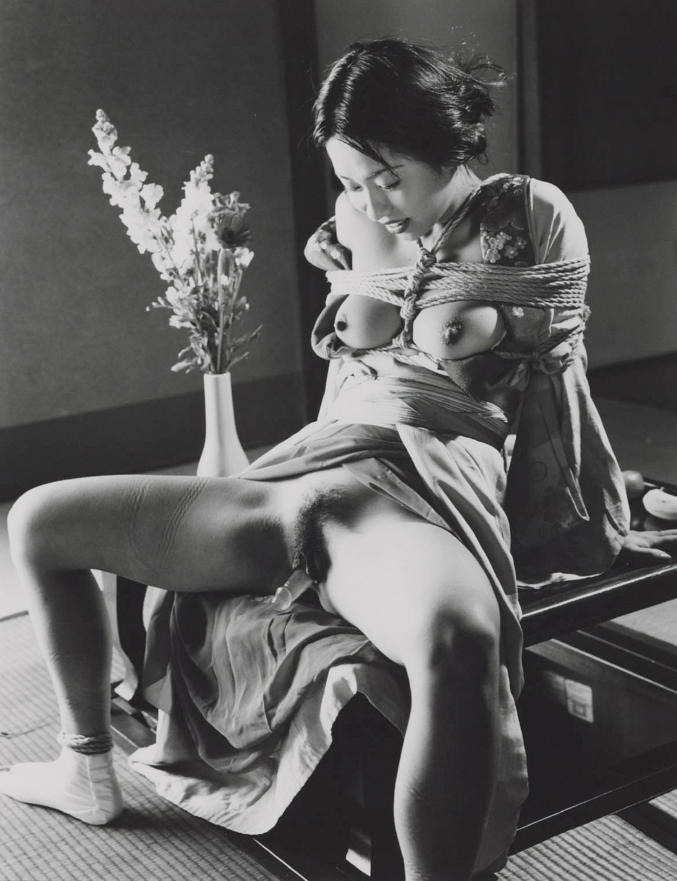
Nobuyoshi Araki – Untitled (1995)
This is almost certainly Araki referencing Hans Bellmer.
I am actually glad to see Bellmer getting some renewed attention. I’m seeing more of his work slide across my dashboard here. Also, @insideflesh did a cool photobook last year inspired by him.
I’ve also mentioned that I think Bellmer is really kind of an important figure given our current globalized socio-political shitstorm. I suggested that it might be a good exhibition notion to do a joint retrospective of his work alongside Ana Mendieta.
The plan is–knock on wood–to dedicate two weeks of posts to using this blog to stage such an exhibition. I can’t say when just yet. It’s slow going as much of the scholarship is heavily coded in Freud’s BS. But I’m about a 1/3 of the way through preliminary research on Bellmer. And then it’ll be on to Mendieta–on whom there is far less scholarly material.
Anyway–something to keep an eye out for down the line.

Cem Edisboylu – ANS3113 (201X)
OK, here it is the one image that is the exception to the rule that no one should ever use radial blue.
Now back to your regularly scheduled not ever using radial blur already in progress…
Duane Michals – Take One and See Mt. Fujiyama (1976)
It’s a bit difficult to read the text giving the low-res nature of this assemblage. And since it’s a bit of a challenge to find all the individual photos (presented legibly) in one place, I went ahead and transcribed everything:
I had never seen this until this morning–it’s superbly Lynchian (even if David Lynch would’ve been in the process of struggling to get Eraserhead made at the time Michals unleased this on the world.)
The interesting thing in putting this together is that there appears to be variances in the captioning based on editions? Also, there’s at least two versions of the 6th frame (v1, v2).
I actually think that v2 is probably better because the way it reads above, the frame 6 functions like an insert shot whereas and with v2 there’s a sense that the whole thing is covered in a single master shot.
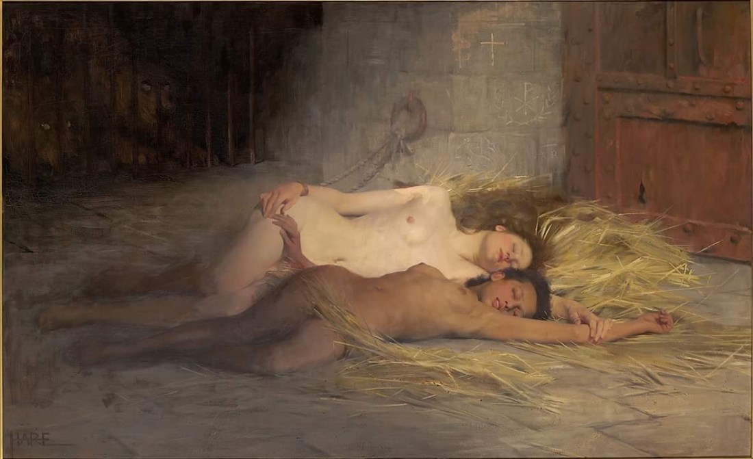
Saint George Hare – Victory of Faith (1889)
I missed the hungry lions lurking behind bars in the heavily shadowed upper left corner when I first saw this–as such my thought was Victory of Faith is a weird title for a painting that is ostensibly about lesbians, isn’t it?
As I’m looking into it now, I’m realizing my mistake and that it’s both a mistake and an insight into the work.
My instinct–that this is a work of erotica–is almost certainly true. Hare’s other work was rife with similar sorts of tableaux. However, the lions I missed initially are rather important.
This scene is ostensibly a depiction of a high society misstress and her maid who are discovered to have converted to Xtianity and sentenced to death by lions in the coliseum. They have been stripped and locked in the anteroom of the coliseum where the lions that are to eat them look on as they slumber.
As has been fairly well-established sex was a fixation within Victorian culture, even if no one really addressed it directly. There was apparently a tradition of coding erotica into work that seemed explicitly Xtian at first glance. The choice of martyrs as subjects would’ve been practically–many saints were tortured and otherwise humiliated/punished, thus them being clothed would been a vestige of protection. (See also: Saint Eulalia)
Additionally, apparently Xtian commentators saw the lack of clothing as proof of their freedom from sin.
Interestingly, I can’t help thinking of this image in terms of the trope of Daniel in the Lions’ Den–where Daniel is depicted as standing upright and prayerful through the night. It reminds me of the tired police procedural trope–which is factually dubiou–where the guilty are so relieved at having finally been found out that they sleep like babies; whereas the innocent are so consumed by their righteous fury at being falsely accused, that they cannot sleep.
Daniel was innocent and stood vigilant through the night; these women are guilty (of being Xtians) and therefore slumber.
The ways in which this is both Xtian allegory and work of Victorian erotic all at once are intriguing. Unfortunately, there’s also apparently racial connotations–namely: the painting can be read to contain only one woman, i.e. the dark skinned woman who in her martyrdom is purified and becomes white.
I think it’s a dubious claim and given that their are two lions, I just don’t see it. However, there was apparently a moral panic in the ‘woke’ Victorian world where slavery was considered to be morally repugnant but instead of working to right centuries of wrong headed thinking, injustice and inequality–a new focus centered on ‘white slavery’ (which apparently was entirely preoccupied with sex work, it seems–something I did not know until just now).
With this painting, Hare was apparently making very thinly veiled erotica designed to fool Xtians but to also give voice to his own interest in a sort of slave spectacle peddled by the likes of Boucicault.
The Victory of Faith is also the title of one of Riefenstahl’s Nazi propaganda films so again, I suspect there’s more unpleasantness to this painting than I’m even able to scratch the surface on.


[↑] Author unknown – Title unknown (201X); [↓] Cynthia Consentino – Open (2012)
Juxtaposition as commentary


Bill Durgin – [↑] Nude-8 from Figure Studies series (2010) [-] V with Plywood and Mosaic from Studio Fantasy series (2015) [↓] Untitled from Nudes and Still Lives series (201X)
Truth told: I don’t get nearly as much hate mail as other similar Tumblr blogs–but I do get it.
Lately there’s a theme which you can essentially summarize as follows: you think you are being ‘deep’ but really you’re just showing yourself to be an idiot.
This sentiment is usually appended with evidence of my idiocy–which 9 out of 10 times demonstrates the anon to be incapable of fifth grade reading comprehension. (Seriously, though: if I had a nickel for every time some fuckwit represented what I actually wrote as stating the opposite of what I actually wrote, I’d be dead.)
I swear I am bringing this round to Durgin, please indulge me a little bit longer…
I’ve spent the last 7 weeks or so pulling together materials and doing so writing towards the end of :::deep breath::: trying to see if I can maybe get my ass into a graduate art program.
It has been a very slow, largely unpleasant process. I’ve found that–while I would never say that putting comments together for these posts is “easy”, per se… it’s not something that usually stresses me out. (Sometimes it does but that tends to be the exception that proves the rule, honestly.)
On the other hand, it is ridiculously time consuming… but I digress.
Anyway, what working on these applications has shown me is that while I am sure there are more than just the two forms of writing I am now going indicate, for me, writing seems to come in two flavors: exploratory and clarifying.
Exploratory means something like following a path for nothing more than curiosity w/r/t where it ends up. Clarifying means something more analogous with showing your work while solving a math problem.
The first one is more or less what this blog entails. Grad school application writing prompts are my in line with the latter.
All five of the applications I am in the process of completing are fixated on the ability to clearly and concisely explain my creative process in writing. You’d think I’d be really goddamn good at that by now. Alas that’s not the case.
The difficulty I’m having–and it has taken a positively stupid amount of time to get clear on this–is, simply: as much as I am interested in process (hell, this coming from the girl who wants to travel all over the face of the earth and do video interviews with creators I fancy about their respective processes…), I am EXTREMELY resistant to the framing of process first-and-foremost in terms of questions-of-how and secondly (or, perhaps not at all) in terms of questions-of-why.
The best way to render this abstraction concrete is to think of questions-of-how like a recipe–say for chocolate cake. You have your list of ingredients with respective proportions for each, a summary of implements required to prepare it and instructions on how everything is combined.
And here I should stop and point out that this is an appealing notion from at least the perspective of inclusion–it makes art seem like something anyone can do. The problem with that is at the same time it makes art making seem easy: and that is a mistake of enormous magnitude.
Art making is damn difficult. And whereas you may go to make a cake and find out you don’t have eggs–there is rarely an equivalent in art making for getting in your car and scooting to the store to buy eggs.
That’s why questions-of-why matter–because it’s the answer to the question of why that’s going to sustain you when you see no possible route forward in your work.
The way I think of it is: the recipe is not the cake it makes and a recipe does v. little to fill an empty belly.
How does all this relate to Durgin’s work? Perhaps, I’ve been gazing at my own navel for too long with this applications but I feel like there is a way in which he has systematically fetishized his process in his product.
I mean any time you’re dealing with studio work, you are dealing with de-contextualizing environment in an effort to focus with less distraction on the subject. In a way this work is a deconstruction of studio practice–wherein the relationship of the subject to the studio is emphasized over and over. And the subject emphasized is frequently abstracted to the point of being a place holder or a suggestion of form.
Durgin is exceedingly adept in his use of color–it’s very different, however, than most of the folks I usually name check when on the topic. It’s not like Amanda Jasnowski’s impeccable sense of the interactions between colors or Laurence Philomene’s color as signifier (this is not entirely the way I want to say it but ‘form’ is too heavy handed and ‘tone’ is too innocuous) or Prue Stent, who is one of the few people I know of whose work seems to aspire to interrogate color as Platonic forms.
Instead, Durgin seems impressively attuned to the way the directionality and intensity of illumination affect color fidelity. (He straight up references this is several of his pieces by including those ubiquitous color charts in the composition.)
There’s all sorts of commentary on mass digital consumption, boundaries and glitches in the work. And this makes me think it’s perfectly suited to addressing questions-of-how with regard to process.
And not to slight the work, but I’m not able to grasp from reading the work, any sort of clue as to the questions-of-why. The work is exquisite and technically refined to a level that is extraordinarily rare. I just don’t understand the drive to get to this level merely to exercise mastery. There is something profoundly lonely about this work–all of it. That’s interesting and I think I for one would be interested in seeing what transpired when the work was allowed to interact with that emotional resonance in a less coded, more straightforward fashion.
But to circle back to where we began–the asshats who write in criticizing me for think I am ‘deep’ are correct on at least one count: more often than not I am being entirely superficial in my comments on here. I’d like to go deeper more often. And there’s not always the available time or energy to allow for that. Unfortunately, it’s also sometimes down to the fact that no matter how much I want to, my brain won’t cooperate.
