

[↑] Miranda Lichtenstein – Floater (2014); [↓] Feliz Paloma – Untitled from Forest Skin series (2013)
Juxtaposition as commentary
[↑] Miranda Lichtenstein – Floater (2014); [↓] Feliz Paloma – Untitled from Forest Skin series (2013)
Juxtaposition as commentary
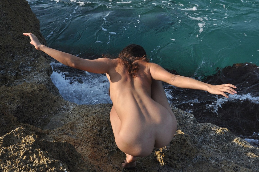
Gil Blay – Seagull (2016)
I’m not here to suggest Blay is a gifted image maker. Hardly.
However, as I’ve stated previous (and it bears repeating), like the old adage about monkeys and typewriters even crappy creatives get something right on occasion.
This probably would’ve caught my attention even if it didn’t come immediately after this image of Nicole Vaunt in Patagonia by Corwin Prescott.
My first thought was when the fuck am I going to Patagonia–got damn.
My second thought was that I would’ve really liked to have seen Vaunt in a less Den lille Havfrue and more like the above.
More often than not Tumblr is super frustrating–with the porn bots, shitty attribution striping personal aesthetic as self-definition blogs but occasionally the slap dash gumbo of seemingly randomized post aggregation results in seeing things in a completely different way.
It reminds me of David Bowie’s process–decoupage, which I found out about through the fabulous BBC series Luther, featuring the formidable (and hot as eff) Idris Elba.
Unlike most of my peer group–who are decidedly secular–I was raised in an ultra-conservative Xtian cult. Unlike my friends, my folks didn’t bestow a solid familiarity upon me with regard to the cornerstones of modern art rock. (I’ve had to blaze my own trail, in that regard.)
I began to learn about Bowie after he died–which meant discovering the allegations of rape and pedophilia that (as with most similarly aligned superstars in that day and age) never quite stuck to him because he was white, rich and male. (Jia Tolentino, who gets my vote for the best up and coming young writer and is my secret dream person to guest curate Acetylene Eyes, covered this negative legacy for Jezebel with an impressively clear-headed and thoroughly nuanced analysis.)
I’ve dipped my toe into Bowie’s oeuvre. It’s not all exactly my cup of tea–but what I like I like quite a lot.
This design by Daniel Gray turned up later and I think it fits a little bit too well here not to offer it as a summation:


Roxann Arwen Mills – Self-portrait with blue neon in bathroom from Influences of Blue series (1998-2004)
EDIT: Apologies. I completely fucked this one up. The above images have
been viciously de-saturated by some internet asshat. You can see the
full color originals here. (Thanks as always to @sporeprint for the eagle eyed correction.)
One of the things I was told very early on post-buying a 35mm SLR and focusing on shooting B&W stock was that to do B&W right/well I needed to invest in a bunch of color filters.
A yellow filter will famously make blue skies really pop. (If you understand the inter-relationship between the RGB (additive) and CMYK (subtractive) color models, then what filters do what can be easily decoded. If you’re like me and understand the theory inside and out but have a bit more trouble when it comes to practical application: here’s an indisipensible intro.
I knew all this but still one of the only things that’s every truly surprised me as far as how I thought something would would appear photographed and how it actually appeared on the film was a snapshot I took in The Met of Ellsworth Kelly’s Spectrum V. (Rendered in B&W, the panels are indistinguishable from one another.)
My suspicion is that this is one of the things Mills is up to with these images–interrogating the subtle ways that the color subtly shifts the way that a B&W emulsions registers light.

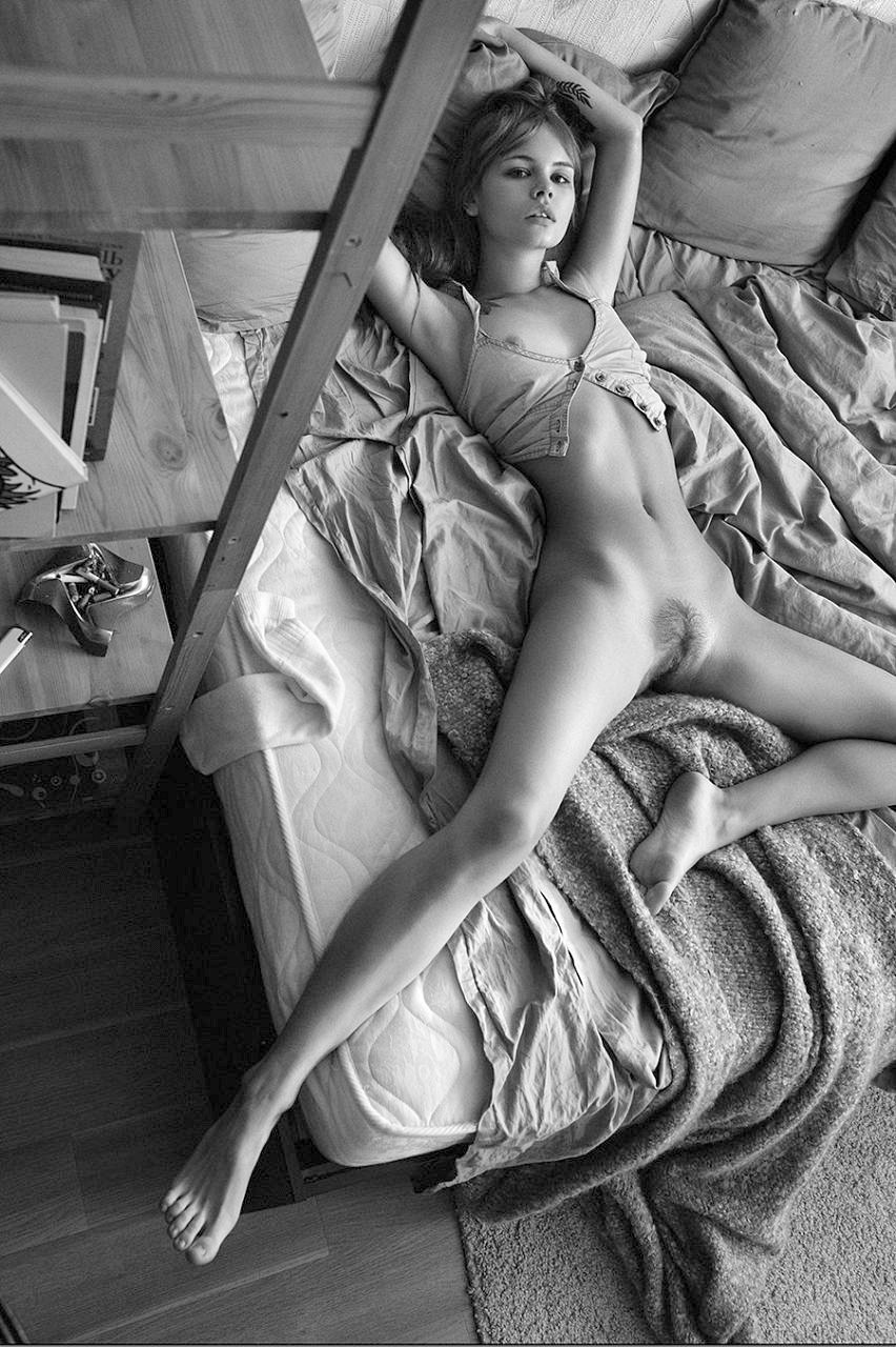
John Raphel – Chelle (2016)
I’ve been unofficial on Tumblr for like eight (8) years give or take. I’ve run this blog for 5+ years and I am honestly to the point where I spend about three times as long waiting for the next page of my dashboard to load than I do scrolling down each page. (The handful of images I like every day hardly even slow me down–it’s like toggle the heart and keep scrolling.)
But I stopped dead when this slid into view.
I read it left to right; eyes scanning until they reach her face and then in a reverse crescent downward–mirroring the curve of the center line of Chelle’s body.
The bit of her her right leg you can see in the lower left-hand corner is like a dead end that then returns your eye back up the same trajectory it descended.
On the return trip: you notice the black scarf around her neck and how her skin is a bit shiny–as if it’s warm and she’s just starting to sweat. (Also note: the color in her face compared to the pale of her skin. This is further emphasized by the scarf as dark dividing line.)
It’s a fine line but one could argue (and I would be such a one to argue) that her sternum, clavicles and shoulders are all edging towards overexposure.
Objectively great skin tone is probably somewhere halfway between her upper body and face. Yet, what I like about this is that with the shallow depth of field (which one notices as one follows the reverse trajectory of the the initial scanning arc), the contrast between her flesh and the background points even more attention towards the handling of color.
But although I wouldn’t call this good skin tone–it’s actually better than great because it shows me something in a way I’ve never seen it before. And the overall effect here is that light and color are being employed by a photographer to accomplish something more sculptural than photographic. (If you’ve ever spent any time digging through images of Michelangelo or Bernini, you’ll understand what I mean.)
There’s one other sort of meta thing I walked away from this image finally grasping. I’m always flummoxed that anyone bothers with this blog. I mean it’s very much a solipsistic reflection of my ego trying to referee the all-out, 24/7 melee between my id and superego.
But it occurs to me that the reason that people might respond to it is because underneath all that this is very much a personal act of resistance against unmindful consumption. (Frequently writing these posts is like pulling teeth–because my natural inclination is to take in and take in and take in, without every really stopping to dwell on what I’m taking in and how I feel about it. What it’s trying to show me and what it’s trying to show me are telling me.)
Perhaps, I’m giving myself too much credit. But I do think it’s important to resist unchecked, uncritical and unmindful consumption. If this blog manages that for even a handful of you, then it’s an unqualified success in my eyes.

Erotobot – Dinks (2014)
I have a outsize obsession with visible texture. When it’s done right–it is like I can almost feel that which I am seeing, sliding beneath my finger tips through nothing more than the act of maintaining an attentive gaze.
With its gooseflesh, dirt, the black mirror-like water, water droplets on goosebumps and even Dinks’ hair, this would’ve had less impact if it had approached me out of a crowd and broken a baseball bat in half over my head.
It’s unquestionably pornography. And honestly being somewhat familiar with Erotobot’s work–all of his photos feature a discomfiting edginess. Shot in abandoned buildings or seeming post-industrial wastelands. It’s dark and sinister; explicitly and graphically depicts sex–frequently of a rather rough variety. Like just looking at the work, I worry a bit that he’s another in a long line of perverts making beautiful work through sometimes questionable disregard for consent, boundaries or interpersonal respect.
But despite how over-the-top the obscenity is in this image, my reading of it leads me in rather the opposite direction. Straight up there’s no way getting this shot didn’t take time. Evidenced by the goosebumps and the fact that Dinks would’ve had to get undressed and roll around in the puddle and dirt for this scene to have come about.
Yes, it’s possible that there were degrees of unseen coercion. And I don’t know if it’s because I want so much to like this–if you feel I’m wrong, please chime in (consent is just about the most important thing to me and if/when I fuck things up, I welcome correction)–but this feels consensual.
The way it’s played toward the camera. Dinks’ expression speaks of wanting so desperate it actually feels like a kind of physical pain that can only be assuaged by sating the desire. There is something here the resonates with an honesty that I find entirely unnerving. (I relate to this so hard.)
But there’s also a way in which Dinks (and maybe that’s not her name but I hope it is because it’s awesome) is presented as seductive but also maybe a little bit dangerous–as in while the image is presented so that the viewer can station themselves between photographer and subject–and thereby presume the show is for them and them alone; standing in such a position carries a lot of potential risk for harm, violence or some sort of untoward resolution.
Beyond that I only know three things:
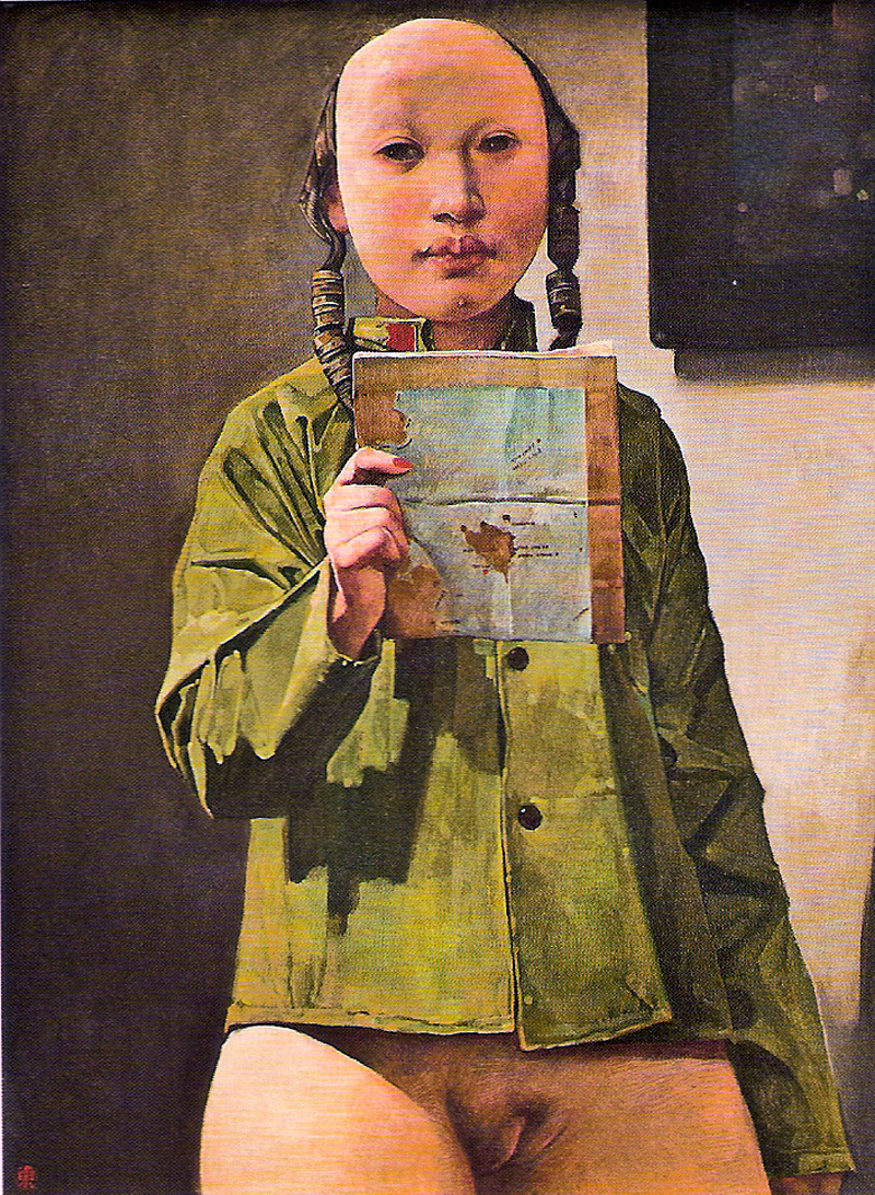
Wei Dong – Girl with Map (2007)
When faced with a situation wherein I am unfamiliar with the relationship between the position of my body and the world surrounding me, I say: I am lost and need a map.
When faced with a situation wherein I am adept and thoroughly familiar, I say: I know such and such like the back of my hand.
Dmitry Chapala – Anastasia Scheglova from La Mégère apprivoisée series (2015)
The composition here is so muddled and dunderheaded that I don’t even feel as if I can weighing in on whether or not it qualifies as #skinnyframebullshit–maybe, maybe not? What is even with this perspective? Are we supposed to interpret that bed as positive space and the Ikea shelf–why does everyone I know have this shelf, it’s ugly af–floor and rug as negative space? :::shrugs:::
Why am I bothering with this picture then? More specifically: why am I bothering with Chapala’s work at all? (It’s not like he’s especially good at what he does… he lacks the edginess/audacity of Giancomo Pepe and there are times when I effing swear he’s genuflecting in Marcel Pommer’s general direction. (Not to say he has never produced interesting snaps… he has a handful that are almost good. I simply feel his work is nearly completely derivative. He seems to be this breed of image maker that insists upon himself and his ‘fine art bonafides’ and folks just go along with it because the work superficially conforms to some arbitrary median threshold…)
Again, why bother? Well, in this case, there are two reasons. First, it seems as if every snap from this session is available online–a sure indication of less than adequate editing rigor.
I want to circle around to two of the more widely circulated shots from this series; both echo each other as far as composition–far more sensible but it still doesn’t entirely work. In one the woman has her eyes open, in the other her eyes are closed.
As far as order goes there’s a sense that the picture above preceded the other two. The falling trajectory of her left hand across the three images suggests that the subsequent order is eyes open then eyes closed. (You’ll notice–also–that the other two have had the contrast dialed up compared to the one above.)
The angle of view and the position of the ugly Ikea shelf contribute a feeling that the viewer of the image has walked into a room with which they are familiar and have found a beautiful, naked woman comfortably stretched out on the bed.
The second image is Playboy softcore-esque; the third is more unsettling given the first and second image. It suggests that either the woman is no coyly pretend as if she’s napping or worse–that this is sort of an on the fly revision, a sort of masturbatory fantasy change on the fly. (”I walk in and she’s stretched out on the bed, gazing coquettishly at me. Wait, no… she’s alseep…” Yeah, I like that better.”)
Point number two w/r/t why bother with this image is despite the litany of flaws with the above image, it does actually do something a lot of fine art nude work fails stupendously at: aligning a candid perspective with actually candid body language.
I recently realized there’s a way to describe this as long as you don’t mind a minor digression. Okay? Cool.
Mark Twain’s The Adventures of Huckleberry Finn is one of the few books I’ve actually had to read on three different occasions across years of schooling. As you’ll recall, Huck runs away, encounters Jim and then hears about a drowned body found on the river. He wonders if it’s his father so disguising himself as a girl, he approaches the abode of Mrs. Loftus to seek information.
Mrs. Loftus quickly puzzles out that something isn’t quite right and so she challenges Huck to three tests: she has him toss a lump of lead at a rat, thread a needle and finally the old woman tosses a lump of lead into his lap to note how he catches it. He fails each test. His aim is true with the rat, he thoroughly botches threading the needle and instead of opening his legs to let the material of his dress act as a trampoline to catch the lead, he slams his legs shut to avoid the potential of getting his gonads struck.
There’s a way in which supposedly candid shots always seem to have this demureness that undercuts the scene. As humans we carry and arrange our bodies different based on whether we are in public or in private. In public, we tend to favor decorum over comfort, in private, it’s the other way ‘round.
In other words: there’s a tendency with the sexualization inherent in the male gaze, frequently candid work features extremely stylized and self-consciously demure poses. In effect, there’s a tendency for the subjects in candid fine art nude work to make the same mistake as Huck–responding instinctively instead of naturally.
This doesn’t do that–which despite it’s numerous flubs–is actually to its credit. However, I will admit that the two subsequent images sort of screw with that by subverting the comfortable naturalness to the end of something that I can’t help by read as holding some sort of unsettling psychosexual implication.


Alexandra Von Fuerst – [↑] Celine (2016); [↓] Test (2016)
High end fashion/commercial images with an undertone of surrealism.
Exceptionally astute use of color. I prefer Prue Stent’s outside-the-box audacity and preternatural instinct but Von Fuerst is seemingly just as interested in texture as hue. (You can actually see the skin’s grain in both images, and in the lower one you can even see the fine downy hair around the lips.
Another interesting thing is despite working in a studio setting with more less even lighting, Von Fuerst is ridiculously good at giving her images a 3D, almost sculptural effect–in her frames that aren’t close-ups, it’s as if you’re staring at a scene staged in a diorama.
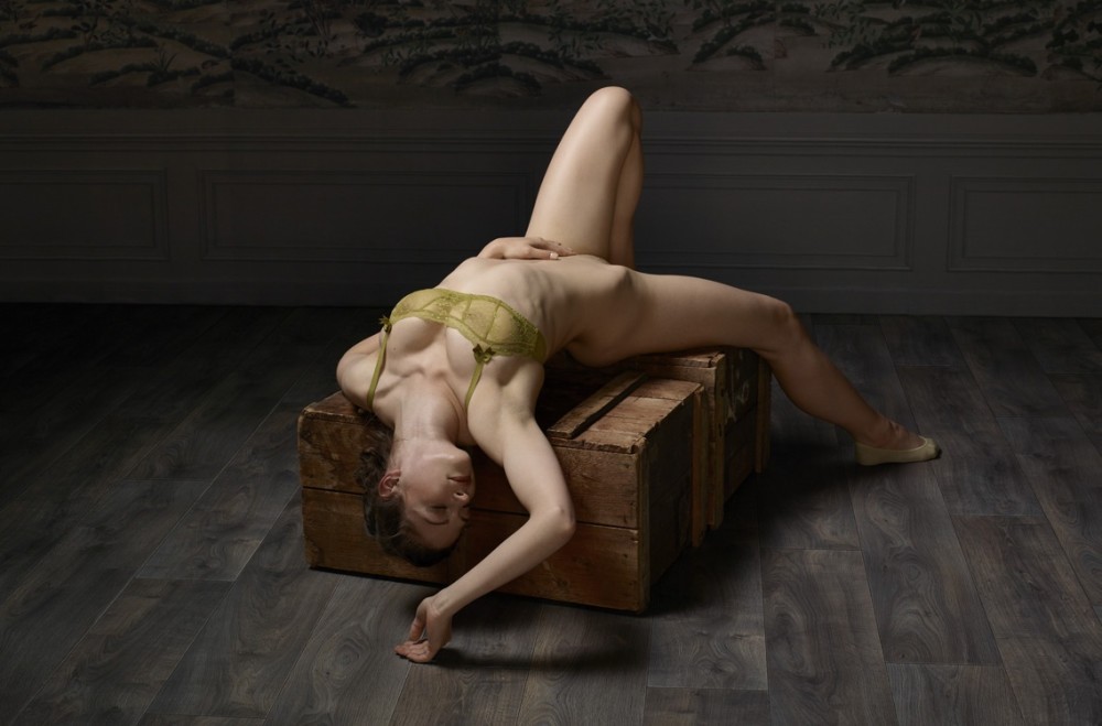
Erwin Olaf – Reclining Nude No. 6 from Skin Deep series (2015)
By all accounts, Olaf shouldn’t be someone I dig as much as I do. He works primarily in fashion & commercial photography–not typically my thing.
His sense of lighting, however, is always so damn inspired and well-executed.
But the Skin Deep series appeals to me more than his other work. First off, because I’ve found that there is something deeply satisfying about any work of art that is so pared down to its most essential elements, that you look at it and think: this is simple enough that this really could’ve been made by an especially studious begging photography student–which is not the same thing as saying it looks like student work. (For example: I’ll watch anything Kelly Reichardt puts her name on. And while I certainly can’t say I’m in love with all of her films, I do adore Wendy and Lucy and of her film it is absolutely one that any student with access to equipment could have made themselves.)
Yes, with Skin Deep, Olaf most likely had a crew of designers and set decorators and assistants. People to do the heavy lifting for him so he can focus on the nitty gritty details of getting the shot.
But this shot in particular is something just about anyone could have made. Yes, Olaf likely hand picked the floor, the paneling and the wall paper. But if you break it down to it’s component parts, it’s an interestingly textured floor, two boxes, crates and a single over head light up and over (giving the sense of a circular pool of light) but angled slightly to provide separation between the left edge of the model’s body at the darking background. (There’s almost certainly a flag blocking spill to her immediate left, too.)
The exposure is perfectly suited to accentuating even skin tone and to make the bra pop.
But there’s something else about Skin Deep that is v. very on-point: Olaf is gay. The project includes both male nudes and female nudes–in equal measure. And it’s clear from not only the rest of his body of work but these works that he’s more enticed by the physical embodiment by his male models. But fucking-A, he’s the only one I can think of who makes an effort to provide a cross section of variously gendered attractive bodies in his work.
And really, I can only think of a few photographers that routinely make work that is this sexy about folks they aren’t attracted to personally.


