

[←] Petter Hegre – Emily Soaking Wet (2014); [→] Nikos Stamatopoulos – Liam, Santorini (2016)
Juxtaposition as commentary
[←] Petter Hegre – Emily Soaking Wet (2014); [→] Nikos Stamatopoulos – Liam, Santorini (2016)
Juxtaposition as commentary

Michel Comte – Courtney, New York (2008)
As best I can tell Comte has presented this image as it appears above–you can apparently buy it as an archival inkjet print here–as with ever so slight variations (pay attention to her eyes and the position of her left leg) as the way it was originally made, i.e. in color and part of a fashion shoot.
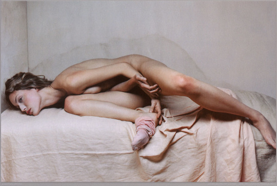
I am primarily interested in the presence absence of color but insofar as either image works it’s because of the way Herron’s pose mimics the water mark on the set wall behind her.
The B&W version of this has been in my queue for months. I have mixed feelings about it. As I’ve already mentioned the pose is exquisite. There aren’t any real highlights to speak of–if we’re using the Zone System, then I’d say we’re dealing with zones 0 through V only. This results in less than ideal skin tone but it works within the context of the image–drawing attention to the resonance between the pose and the water mark as well as giving it a vintage feel.
I can’t look at it without positing that whoever made it has a massive hard on for Weston’s nudes.
But it doesn’t quite work for me. There’s something off about it.
So in a way the color iteration makes more sense as a total package. The form pose as echo of water spot is de-emphasized. The color is meticulously controlled–what appeared to be a limiting in the B&W version now makes sense–the apricot top sheet and the beige grey of the wall and mattress offer just enough of a dash of color to keep the scene from going flat, cause’s the pink of her sock and the red in her skin to dynamically pop in the frame.
The acute angle of the corner where the two set walls meet is not vertical in either frame–however, it stands out more prominently in the color version. (Probably because the B&W version includes the entirety of her left foot–thus distracting from the odd angle, whereas the color one chops off her toes.)
This is really one of the prime reason I hate digital. An image that is intended to be in B&W needs to be approached with a completely different mindset and tools than a scene that is intended to be presented in color.
Now I don’t know that Comte used a digital camera. It’s entirely possible that he had two cameras set up side by side and triggered the shutter at almost the same time–one with B&W stock the other with Color. But I’m of a mind that this was one digital camera and the files were manipulated post process.

Corrado Dalcò – Title unknown (2011)
Igor Mukhin – L1041593/ Москва, сентябрь (2012)
Mukhin continues to be a source of boundless inspiration.

[←] Philip Werner – What does it mean? (2013); [→] Bael – Sebastyn 2 (2016)
Juxtaposition as commentary
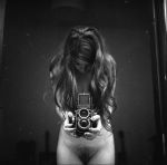

Victoria Baraga – [←] Self-portrait (2012); [→] Self-portrait II (2012)
I could’ve sworn I posted the Self-portrait II previously–but I’ve spent the last half-hour trying to find it and I see no trace, so…
It’s possible I had it saved as a draft and subsequently opted not to post it.
There’s not one but two layers of ubiquity working against these images. The TLR, waist level finder in the mirror trope deserves every bit of shit the bathroom mirror selfie gets. (Folks who pursue the former tend to get a pass they shouldn’t because they’re doing it the old-fashioned way and it’s not as straight forward was aiming the camera and pushing a button–but both tend to be devoid of any vivacity.)
There are exceptions of course. Laura Kampman does some exquisite things within very narrowly circumscribed margins–i.e. there’s a ridiculous degree of technical mastery at work in her better photos. Baraga, on the other hand, tends to fixate on capturing herself in the act of watching herself.
The result is conceptual satisfying–the viewer watches her watch herself, while she watches herself experience intimacy. It’s a clever deconstruction of the triad where the photography use the camera in an effort to parse time and space in such a way that the viewer of the resulting photo see much in the same way the photographer did in the moment of making the image. In this case, the mirror is an impartial arbiter allowing her to focus on one relationship in the triad–photographer to subject and subject to photographer in a fashion that presumes an empathetic response from the viewer.
There’s life an artfulness to these images that far exceeds 98% of comparable work out there.


Yulia Gorodinski – Titles unknown (201X)
Remember when Flickr was the primary hotbed of up-and-coming photo and image making talent? Well, the first wave of that milieu crested in what–early to mid-2006, if memory serves.
At the time, Gorodinski was studying History and English literature in Tel Aviv. Originally of Belorussian extraction, her family immigrated to Israel when she was 12.
She joined flick in the post-first wave low-tide around 2007 and built a reputation for the sumptuous color invigorating already dynamically composed, narratively insinuative frames.
By 2010, she was a fixture of the Flickr second wave–gaining the attention of Dazed. (Virtually everything written about her after that point–leans heavily on the content of this interview.)
It’s still possible to see a good chunk of her work–a Google search turns up a lot of them. A Tumblr search adds some other exquisite samples of her work. However, as far as I can tell, Gorodinski no longer circulates this work herself. (I won’t pretend to speculate as to the motivations for this…)
It would seem that she does still make images. The above attribution links to a Tumblr that shares a few images indicative that it is the same Yulia Gorodinski. The new work is more mannered, patient and quotidian. It’s not bad–still definitely artful. But I do have to say that I miss the dizzying audacity of these self-portraits.
I think there’s an argument to be made that although she would probably wisely resist such a label, I think you could argue that the problematic term “the female gaze” could be well applied to her work.
Honestly, though beyond the fact that her work insists upon the profusion of color it present (that should not be diminished since so few photographers and image makers treat color as anything more than a binary that contributes to a better meshing between the conceptual and compositional, meditation on the nature of how color affects perception and reaction to such perception being so intrinsic to these images), there’s also something else very special about these: an imagistic totality.
As someone who is ostensibly fixated on both the tradition of staffage and cinematic/narrative photography & image making, the line between a landscape with figures in it (a more painterly affectation) and something that seems more suggestive of composition through post-production layering–i.e. shooting someone in front of a green screen–it’s not always easy to pull off work like Gorodinski’s.
That she does it at all is impressive but that she does it so flipping well, so frequently is even more awe-inducing. This is impressive stuff and while I don’t feel as strongly about her more recent work, I am curious to see what her newfound restraint would contribute if she returned to a similar approach again. I suspect it would probably be the sort of thing that would make me feel like I needed to sell all my gear and leave the photo game to the real pros.
Sigurd Grünberger – Untitled (201X)
I’ve heard that you can recognize a photographer
by how they continually compose the edges of their frames,that each quarter-second decision to exclude, to define a boundary,
to say what will not be in the photographis as explicit as a thumbprint.
I watched Damien Chazelle’s Whiplash again several days ago. (If you haven’t seen it, I can’t recommend it enough–the storytelling is strong enough to compensate for the shit visuals.)
It got me thinking about how classical and jazz musicians are not unlike fine art photographers insofar as they tend to look down on those who embrace other quote-unquote genres of image making.
To perhaps push the analogy to its point of rupture: fashion photography is not unlike pop music; it’s not intended to be expansive so much a tick certain boxes at certain times in an effort to sell as many units as possible. (That’s not to say pop can’t be ‘innovative’ and/or ‘ground-breaking’, merely to point out that when such words are used–it is the exception that proves the rule.)
Historically, there are those who have pursued both pursuits. Annie Leibovitz and Helmut Newton come to mind; both of whom, incidentally, I don’t exactly hold in high esteem. (I mean Newton was a sexist pig and if you’re at all interested in how not to render those you photograph as objects instead of people, there are worse things to do than treating the man’s body of work as a cautionary tale.)
And I shouldn’t completely write off either–in both cases, there is some good to be found by attacking their respective body of works’ with a fine-toothed comb. For example: in Leibovitz’s case, I recently encountered her photo of Karen Finley in Nyack, NY in 1992 and consider it to be effortlessly immediate in a way that the rest of her work just isn’t; whereas, if you’re ever in Berlin and can somehow swing getting into the Helmut Newton museum without paying (the price of admission is too steep considering how little is on offer), Newton’s sequestered personal work (left and all the way to the back upon entering the museum) is not exactly good but it exudes a sort of stubborn melancholy that feels both more honest and astute than the rest of his work.)
However, to return to the analogy at hand: I feel there is a way that fashion photography has historically sought to sublimate the photographer’s thumbprint in favor of foisting the idea of the brand in its place. Or, a better way to put it is that fashion photography has always seemed to me to be more preoccupied with a look, with representing fashion as reliably and replicably about adhereing to strict design parameters–something not unlike what web developers would call a style sheet.
These days with scads of internet famous photographers and image makers blurring the boundaries between the genres of fashion, editorial and lifestyle, it’s nice to see folks who feel most at home in fashion actually honing their distinctive thumbprints.
This certainly applies to someone like Grünberger. (I’d place Maxime Imbert in the same category.) You can spot his work from twenty yards out without having to read any kind of plaque or search for attribution. There are elements of high-end design, sensitivity to color, sharpness, resolution, painstaking lighting design/post-processing and a focus on minimal distractions from the subject.
I think it might be time for so-called fine art folks to maybe start spending more time with fashion folks. I mean if you haven’t seen the latest Amish inspired Vogue Italy editorial by Steven Meisel, it’s maybe overly clever and precious but it’s also one of the best examples I’ve encountered of how to include both B&W and color within a single, closely circumscribed body of work.


Claudia Jares – [↑] El Jardin Prohibido #8 (2015); [←] 7 (2011); [→] Untitled (2006)
Remember how I’m always going on and on about how there must be something being added to the water in Poland because of all the top-notch work being made there at present?
South America seems to have something similar going on.
Jares, like Paula Aparicio, hails from Buenos Aires–a city I’m hoping to finally visit next year.
The first two things I notice about her work pertains to influences. It is impossible to look at the uppermost image here and not think of Nobuyoshi Araki. And you can’t browse through more than a handful of her color images without flashing back to the hyper-stylized, violent cacophony of color and garish production design as an aesthetic intended to question whether ugliness and beauty isn’t more of a cycle than a spectrum that is Floria Sigismondi’s oeurve.
But I’m not interested in doing more than pointing to those names, because–in truth–although Jares definitely shares with both the aforementioned artists what I’ve previous referred to an omnivorous eye, the point of her work is less about proving a point (which in the case of Araki might be seen as proving that the deviant and depraved desires of the flesh can be beautiful to behold; or with Sigismondi, that with the right attention and focus, the ugly may be rendered if not exactly beautiful then aesthetically compelling).
To put too fine a point on it perhaps, Araki and Sigismondi make work designed to get the viewer off–figuratively in Sigismondi’s case, more often than not literally in Araki’s.
And it feels to me like Jares is far more interested in those indelible signifiers–the way already taut muscles begin to spasm in winter light, a stray hair looped and plastered with sweat and spit against the spit below a trembling lower lip; that moment of unplanned, accidental eye contact that sends you plunging over the edge sooner than you expected. Those serendipitous moments when someone comes, and then the force of it causes a chain reaction where in response the other partner comes and them coming only makes the first partner’s orgasm intensify.
There are little miraculous moments in each image that Jares’ makes–the rain coating the woman’s skin in the first image (not to mention the stunning contrast between skin tone and tile); the way in the second image the shadowed side of her face both dips to where their is shadow without texture but you can still see her eye (and eyelight) in the murk; and in maybe one of the best examples I’ve encountered in at least six months of a vertical oriented composition that should 120% be a skinny frame but also consider how the parabola of light on the back of his neck and shoulders adds such dynamic dimensional to the frame. (Also, back dimples…I’m a sucker for them.)
Or, more apporpriately, here’s Jares on the relationship between the erotic and her creative practice:
My making erotic photography comes as no surprise to me: I’ve been drawn to the erotic since I was a teenager, drawn by the secrets and the mystery behind those images and its characters.
Back from school at my grandmother’s house I would step in the bathroom where, hidden between the towels, lay an old porno, filled with sensual and sensitive images, and romance. It must have belonged to my grandfather, and thus to later generations…
… I used to feed upon those pictures, wondering on the meaning and form of orgasm, masturbation… After twenty minutes my grandma would call out for me; the food was served.
I’ve always been into sensual images, objects, clothing, shoes, stockings, which triggered ideas. I cut and glued to my bedroom walls pictures of Brigitte Bardot, Jane Birkin, Claudia Sánchez, Marlon Brando, Robert Plant, Jim Morrison.
My music… was my kingdom, my shelter, the place where every feeling, every sensation ran through my body. It made my way into photography, and, considering my kinky teenage inclinations, it was only natural to combine the carnal with the power of creation.
I’ve always enjoyed telling stories through my pictures. Enclosed, in the dark, at night… I’m thrilled by the unknown, the unlit, the irrational, the supernatural.
The women that have worked with me know and understand that this sensitivity is with me in every job, be it a portrait, fashion, or an erotic shoot.
There’s always a sense of eroticism in all my pieces. I’ve been lucky enough to work with people that have allowed me to take a glimpse of their souls.
I often work with women, since there is a sort of symbiosis, of ease, encouraging, pleasantly gratifying for both of us. As a photographer I take pictures as I would take them to myself, which I frequently do. My strength lies in the artist, in what I am made of, a woman, a body of emotions.
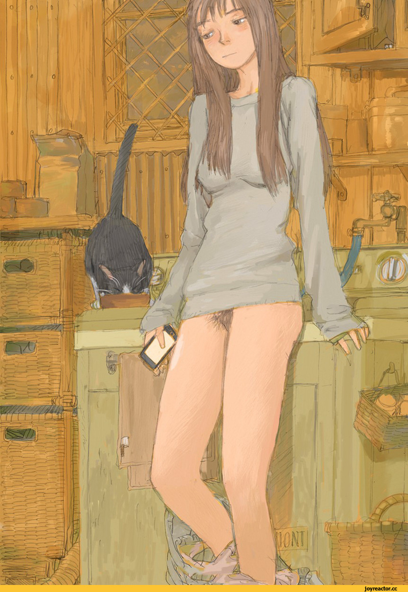
Kenji Tsuruta – futari no tenshi feat. hita hita (201X)
I know fuck all about manga. Either way: I like this quite a bit.
It’s mostly that the woman bears more than a passing resemblance to my dear friend Amadine.
Yes, Amadine is decidedly Team Bangs-are-the-worst. But the longer hair, the bliss-stoned expression edging slightly towards melancholic introspect and just the general body language is spot on.
There’s also the stylistic overlap between this and her illustration work. She studied Japanese in HS and college. And although she’s more in the thrall of Georgia O’Keefe and Kiki Smith these days, she was entirely enamored with Miyazaki when we were flatmates during my Junior year.
I used to draw, actually. I was never very good at it. I lack the necessary discipline and focus. But it does strike me that there are three ways to use lines: to define a boundary, to darken or lighten (aka give the illusion in two dimensions of three) and to suggest texture.
Both Amadine and Tsuruta employ lines to suggest fascinating things about texture.
In the above there’s the wood paneling on the walls, the wicker chest of drawers, the sink (or is it a washing machine?) are all intricately detailed; yet, at the same time, the edges defining distinct boundaries between objects in the mid-ground become blurry, as if suffused with a sort of dream like lighting.
It’s actually not unlike Degas except Degas renders texture in such a fashion as to accentuate depth whereas Tsuruta uses it to flatten the scene. Tsuruta does uses color to heighten that compression–not to uniformity of the walls, wicker cabinet and cupboards, vs. the falling dark outside the window and the color takes on great gradations as we move towards the frames point of focus–the woman and her cat.
I also appreciate the way that the nudity appears incidental. (With an eye on overarching context–the panels leading up to the above can be seen here; and the scenario, while not unrealistic, feels a bit of a male fantasy contrivance.)
This also reminds me of Amadine yet again. Our last conversation was about Sally Nixon–Amadine was singing the praises of this illustration where a woman sits in her robe and underwear while smearing jelly on a piece of toast.
Amadine felt that it was an incredible accurate depiction of being unguarded and comfortable while a woman–and that sometimes the assumption that you’re granted great intimacy because you see someone nude is crap because it’s usually far more intimate to see people when they are comfortable, uncomplicated and at ease.
So while I think this is overly precious and coy, I do think it’s fly-on-the-wall voyeurism is perhaps an upgrade from the default male gaze voyeurism.
