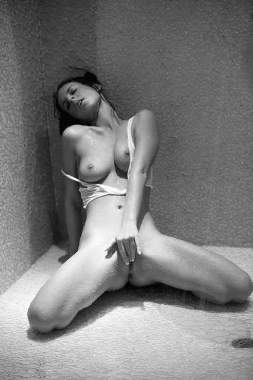
Andrew KaiserTitle Unknown (201X)

I dig Kaiser’s work. His B&W stuff is frequently good, sometimes great. (This image of Gwendolyn Jane from last year will hold its own against just about any other image made that year.)

He seems to prefer film and although I’m probably reading into it too much he seems to possess a better grounding than 95% of the quote-unquote fine art nude photographers out there–in that he appears to own that something isn’t just art because some schlep asked a a naked woman to stand on a bounder in a picturesque landscape.

I love this image, for example because there’s a stillness, a calming quiet around it. It feels uncontrived–the viewer is allowed to glimpse something that they probably wouldn’t otherwise be able to see. But the emphasis isn’t on the transgressiveness of the seeing but on documenting the immediacy of the experience. The current rippling around her fingers, the watery undulations of her reflection.

But the thing I like best about it is that her anonymity is preserved. No, it doesn’t look entirely natural–it’s clearly been burned in quite a bit. But the point is it is unequivocally bad craft/technique/etiquette to use the frame edges to decapitate a subject. It’s inherently objectifying, first off. Second off, it’s lazy and inexcusably sloppy. Yes, including the entirety of the body presents a litany of additional challenges that aren’t always easy to negotiate; but the result will always be superior to the alternative.

Natasha GudermaneRomy from Mademoiselles series (201X)

Mademoiselles feels like a complicated riff on Martin Gabriel Pavel’s Daily Portrait Berlin–probably better known as the naked Berliners 365 project.

Pavel took a picture of Elle and then gave the camera to Elle along with the challenge that she had to take a picture of a naked stranger the following day. Elle takes a picture of M and gives M the camera. And so forth.

As far as quality, the results are all over the place. I still love it because unlike the vast majority of stuff out there, there’s an fascination with context. You get to see not only Berliners but also a glimpse of them in their personal/private spaces. Since I feel an almost preternatural connection to Berlin and am myself so preoccupied with presenting bodies in context, I enjoy the project.

There’s a lot overlap between Daily Portrait Berlin and Gudermane’s Mademoiselles.

If you compare the two in terms of technical accomplishment, it’s not a contest: Gudermane wins hand’s down.

What’s odd is that while both projects feature inconsistencies, the inconsistencies of the Berliner project burnish the conceptual underpinnings. (Translation: of course, it’s gonna look different there’s a different person behind the camera each day.)

Whereas with Gudermane, there’s one person behind the camera but other than the content, I can’t say I’d necessarily be able to pick her images out of a line up.

One the one hand that’s suggests a more organic relationship between image maker and subject. Except there are a number of other disjunctions within the work.

First there’s quality. Some images are glossily picture perfect, others seem a little slap dash–like someone who knew their way around a camera took some OOTD pictures for a close friend.

Then there’s the ruptures between the subject acknowledging the camera and the subject depicted as if they are unaware they are being observed. And again, I think both approaches could probably fit within the parameters of this project.

They don’t though for two reasons: the edit is nowhere near tight enough and the discrepancy in approach and conceptualization through their inconsistency point to the fact that I can’t point to any sort of internal logic with regard to composition–for lack of a better way of putting it, it’s like Gudermane is less interested in how the frame is read by the viewer than that what the frame shows is deemed interesting by the viewer.

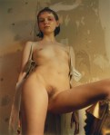
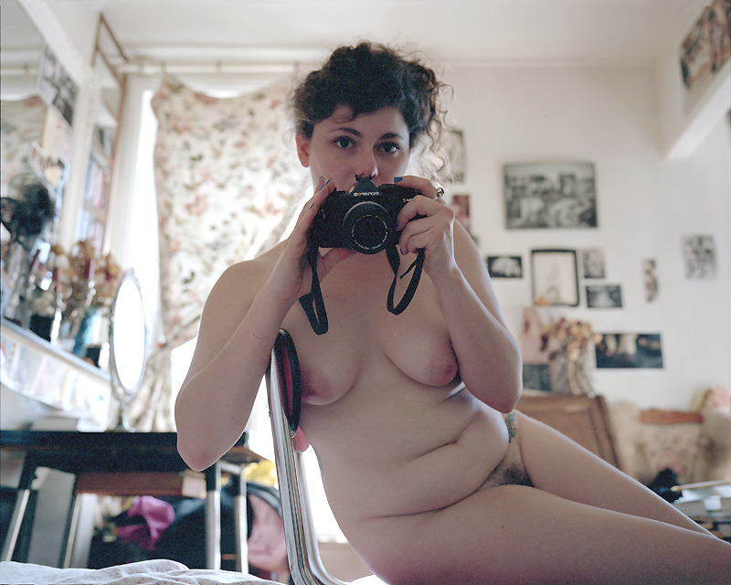
Take the above image. It’s designed to appear like a self-portrait snapped in a mirror where you can’t see the edges of the mirror. However, it’s really the the picture plane itself that is suggestive of a mirror due to how it’s arranged. (And here’s what I mean about the slight up-tilt in the frame. Yes, it’s clearly supposed to make you think of a large mirror sitting on a floor and leaned up against a wall. But the effect would’ve worked just as well without the tilt. There are little things in almost all of her frames that are similarly WTF? decisions.)

Yet, if you dive down to the most basic level of this, I do see her implicit removing of the image maker from the equation as a pretty precocious first step to addressing the objections I’ve listed here. If this wasn’t a one off–and unfortunately the rest of the images from Romy’s session appear to be just that–it would suggest that not only does Gudermane have a great deal of talent but she also has a keen understanding of her shortcomings as an image maker.

We’ll see. Her work has enough good to it that I’ll be checking in from time to time to see where she’s headed.

Penthouse – Presley Hart [de-saturated] (2014)

One of the most brilliant things I’ve ever heard about color vs B&W in image making was Mark Steinmetz’s observation that it’s like two sides of a street on a sunny afternoon: the side in the direct sunlight is ideal for B&W and the side in shade is ideal for color.

This image was originally in color. The former image is actually kind of heinous. The two tone cyan of the textured wall and the magenta skin tone–enormously overexposed by a strong overhead light source–renders the image positively garish.

However, some smarty loaded it into Photoshop, de-saturated it and the result emphasizes texture–falling water from the shower, water droplets on wet skin and the crater pocked wall. A simple edit that takes something that was crap and transforms it into something that is visually interesting as well as arresting.

Maxime Imbert – [↑] Untitled (2016); [↓] Untitled (2015)

There are three things that traipse through my brain whenever I see Imbert’s work.

  1. His use of color shows similarities to other London based editorial image makers–I’m thinking of Steph Wilson mainly but there’s an argument to be made that Harley Weir should be considered also; the unifying thread seems to be a sort of rediscovery of the super-saturated, lurid porn aesthetic of the 70s. (Imbert pushes it further than either, however; typically picking two of the primary colors in each scene and punching them until they bleed everywhere.)
  2. The top image here reminds me of June Canedo’s tendency to frame subjects from below so they they appear imposing/statuesque.
  3. The top image as well as the image below it re-contextualize perspectives more familiar to pornography in a fashion/editorial/lifestyle genre hybrid.

All that is enough to render me intrigued. And while I do not think Imbert’s unusual angles always work out as well as the top image, there’s a consistency to what he’s attempting that I really appreciate.

I think the best way to explain what I mean is that when I first got into film making, I was a huge Tarantino/Rodriquez fan person. I was always in awe of all the dynamic compositions. Specifically, I’m recalling seeing From Dusk Till Dawn in the theater. I watched it again when it came out on video and was very disappointed in it. The reason was it reminded me of a movie that didn’t choose what was important and thus showed you inserts of every little detail that did nothing to advance the story. It seemed sloppily and slavishly style-over-content to me.

And you can say that about Imbert, he clearly has some idea of what he’s doing because even when his images don’t entirely work, they make logical sense.

For example, take this image by another artist that is also from an usual perspective. I love what it implies but as an image, it’s kind of a failure since there’s no way for me to really see anything by which to engage the image; it’s not unlike a sentence fragment.

Imbert presents complete sentences. Occasionally he manages something quiet sublime. But even when his work doesn’t resonate it’s brimming with style, curiosity and creative bravura. And that goes a long way in this day and age where so much of everything is a shitty copy of a bootleg made from a deteriorated original.

Ronan CarreinEmma (2010)

One of the best songs–and I reference song instead of band because I’m not super into anything else they’ve made–I’ve stumbled upon in the last five years is the tune Nine by La Dispute.

It’s an amazing song that I relate to so hard I can’t even begin to articulate it. But, one line–in particular–resonates with this image:

I should’ve stopped to paint our picture
Captured honest pure affection
Just to document the difference between attraction and connection

I think that’s a distinction that the vast majority of Internet famous and wannabe Internet famous image makers fail to grasp. (It’s all about the former and rarely the latter.)

The above is an exception that proves the rule.

It’s imperfect–there’s the illusion of level in the foreground but not even close in the background. It works from the standpoint of the way the eye scans the image but it would’ve been formally superior had the level been maintained across the entire frame as that would’ve provided a sense of something halfway between a Mondrian-esque of backdrop and a frame that while not conforming to the Golden Mean actually parses information in a similar fashion.

Also, the way Emma’s forearm is cut off by the bottom of the frame is awkward at best and more likely appears unseemly. (And: the cinematographer in me desperately wants some sort of eye light.)

Yet when you manage to capture an image that exemplifies some sort of strong connection between image maker and subject that translates in an unmediated fashion to the audiences experience of the subject then there’s reason to perhaps prejudice that display over technical or formal considerations.

In other words: an image does not have to be perfect to be meritorious, it merely has to convey some sort of truth about the world and the ways in which that world may be perceived.

f2.8Title Unknown (2016)

This is a fabulous image.

If one were inclined one could comment on the diffuse lighting (how the viewer reads a window beyond the right frame edge even though it remains unseen; the directionality of illumination is opposite the Dutch baroque tradition–right to left as opposed to left to right, and etc.), the soft focus situates the scene very much in the room that feels both charmingly lived in, a bit cluttered by the decor but it does not detract from the primary purpose of the image–the woman standing in such an evocative yet ambiguous pose (does she have a headache, is she sad?)

The use of space and illumination is reminiscent of one of my all-time favorite paintings, van Eyck’s Arnolfini Wedding Portrait. Except van Eyck favors a much deeper focus. (If an apples to apples comparison, I’d posit the insanely talented Paula Aparicio.)

The antlers and marlin on the wall evoke associations with Artemis.

I’m a little worried about posting this. The image maker is fairly adamant that no one should add or remove anything when reblogging.

I have mixed feelings about such an admonition. On the one hand, I understand. With all the DD/lg blogs adding self-promoting links on other folks work or worse swine who feel by virtue of the fact of having a phallus that their opinion about women and their bodies’ is enough to make most decent folks more than a little gun shy.

Alternately though, I vehemently disagree with such prohibitions. It smacks of a sense of control-freakishness that I think is actually detrimental to work. You make the work. You edit the work and before you put it out there you do as much as possible to inform the eventual context. But once it’s out there in the world, it’s no longer yours. Not in the intellectual property way–it still very much is in that fashion; but the image takes on a life of its own that frequently becomes just as interesting for what the creator meant as what’s misunderstood and misconstrued.

I’ve done my best to be respectful in flouting the prohibition because I think this image deserves to be celebrated–and unlike the tens of thousands of self-same reblogs as a statement of personal aesthetic, I do curate here and with that comes a certain standard of admission (proper attribution where possible in a consistent form and commentary to the best of my abilities.)

I hope no offense is taken by the creator. None was intended. I just wanted to feature this image with proper credit–I’d really like to credit the model too, however I couldn’t find that information anywhere.

ZvaalNettie Harris, Philadelphia, PA (2011)

As someone who believes that whenever possible you should strive to present bodies in context, I very much appreciate Zvaal’s respect for the women with whom he makes pictures.

Like if you want to know when and how to employ the frame edges to crop out part of someone’s body without it being disrespectful or objectifying, you could do much worse than studying Zvaal’s work.

I’m much less fond of his use of vertical orientation. I don’t think I can successfully make a case that his work is #skinnyframebullshit; however, I do strenuously object to like 85% of his use of it. In other words: I won’t argue that it serves a logical compositional purpose but the use more often than not undermines the conceptual vivacity of the work.

I’m primarily posting this because there’s been a dearth of B&W images lately. (If you haven’t noticed I’m super OCD about alternating B&W and color images.) And counter-intuitively, I think the black pinstripe on white sheets are a fascinating texture in monochrome–look at how the sheets almost look white in places where there’s overexposure but how prominent the pin stripes are otherwise.

(Also: Nettie was the first Tumblr model I followed.)

Miro ArvaKyotocat (2016)

Has anyone else noticed how Kyotocat is absolutely slaying it on the modeling front lately? (The image above, this one, god, like everything she’s doing is effing fabulous.)

Evocative expressions, visceral poses–an ethereal presence in space and time (not like a fairy, more like the presence of the mystic).

Her tumblr is kind of incredible because it not only showcases her latest work–but it also gives you a kind of angle on the mechanics motivating it (passion for art, music and activism).

I think that’s many things that folks forget. Have a vision is one thing. But your vision is not unlike a second body that very much needs to be fed, watered and tended to much like your actual physical body. You have to read, you have to look at the world around you and continually explore what art teaches you about the infinite complexity of how the world is seen and how in being truly seen the world shifts under the gazes, expands, grows and changes.