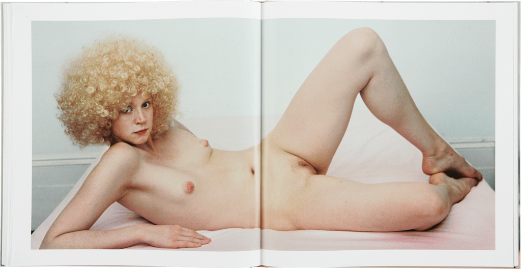
Mona KuhnClaire Obscure (2001)

I do not have an entirely positive opinion of Kuhn.

Viewing this image re-contextualizes my thoughts about her work a great deal, however.

The first major difference is clearly the question of monochrome verses polychrome.

This image predates the earliest image in my previous post on Kuhn by a year. There’s the same intense intimacy and the creative deployment of depth of field  marking the later work.

Conversely, it lacks the profound sense exemplified in the later work of being anchored to a particular place and time–this is after all just a nude woman, darkness and light.

I think I’m supposed to appreciate the increased complexity and variation of the later work. Though honestly, I skew in an entirely different direction.

To me: Kuhn’s later work demonstrates an innate and unnerving sense of the interplay between colors. But there’s an almost galling lack of consistency.  For example, consider the more painterly affect of this versus the were she a painter she’d be using cadmium pigments and then leaving the finished canvas in the sun for a couple months to give it that sort of summer, sun-kissed beach bleached effect that accentuates her insanely shallow depth of field and underscores the conceptual interpenetration of her process with her material (French naturalist communities).

I reminds me of the topic du jour when I was pursuing my MFA: the role of color in fine art photography. The purists will argue that the purpose of color in fine art photography is to demonstrate something about the nature of color and lens based visual representation. In fairness: that’s already been done to perfection–see William Eggleston.

Others maintain color is just another form. Yet, the objection I always had to this is suggesting that the same–and I’m hesitant to invoke such a word here but since I can’t think of a more operable one, I’m going ahead: rules govern monochromatic work as polychromatic work.

I’m not confident enough with the clarity of my thoughts on the subject to push forward with that line of analysis at present. But, what does occur to me is that given Kuhn’s conceptual underpinnings her interest in the optics of intimacy and using naturalist communities as a sort of ersatz synecdoche, I feel the color–although contemplatively orchestrated–actually works against the stated aims of the work. With the exception of the aforementioned more painterly image, I feel like most of Kuhn’s work would actually function better with the ‘abstraction’ offered by black and white.

Polly BorlandGwendoline Christie from Bunny (2008)

It’s been decades since high school yearbook, but as I recall an image printed like this is said to ‘span the gutter’.

Like anything with a fine line between doing it well and making a hash of everything, there’s an art to it.

When something spans the gutter well–as this does–and is subsequently re-documented, there’s always–at least to my sense of things–an intense physicality that the image takes on.

I mean this is a tasteful, well executed image. However, presented as it is here it shifts, becomes in its tangibility, almost illicitly salacious–and that intense ambiguity serves the image well.

Dmytro GurnickiUntitled (2016)

Strictly speaking, this frame is underexposed–the darkest shadow area should retain the vaguest insinuation of textured detail; and, as can be seen, along the lower right hand edge, there is zero shadow detail to distinguish from the frame edge.

In this case it’s not the end of the world, it’s easy to make out enough of the frame edge so as to interpolate and recreate the frame edge when making a print. (Note: that this isn’t the case with the left frame edge, which is actually very nearly perfectly rendered given the dim overall illumination.)

And while the rest of the frame is objectively underexposed, the effect is extremely flattering. (Ilford Delta Pro, at least in my mind, produces optimum results when you under- or over-expose it a smidgen.)

This is a strong image. But the main reason I posted it was because it exemplifies almost exactly what I was picturing in my mind when I was addressing the shortcomings of this Karel Temny image a couple of months back.

Source unknown – Title unknown (201X)

While I think this could probably be interpreted as an allegory of how to behave on the internet when given a front row seat to explicit content, i.e. drool appreciatively and keep your comments to your self.

But I’m gonna go a different direction. I saw this the morning after having a dream that was very similar in tone–look but don’t touch. I’m intrigued enough to want to track it down even though I suspect I’m going to end up turned off when I discover the original context.

Does anyone happen to know where it’s from?

Joan E. Biren aka JEB – Summmer, Morning, Meadow, Willits CA (1977)

Without a visual identity, we have no
community, no support network, no movement. Making ourselves visible is a
political act. Making ourselves visible is a continual process.

— Joan E. Biren (JEB), “Lesbian Photography – Seeing Through Our Own Eyes,” Studies in Visual Communication 9, no. 2 (Spring 1983): 81. 
(via @lesbianartandartists )

Fernando Schlaepfer#353: canoas – joana (2016)

Generally: 365 projects–where an image maker posts one image a day for three hundred sixty-five days–are something I give a hard pass.

I recognize and appreciate the motivation, I guess–learn, grown and become better through actively doing. That’s certainly valuable.

However, the entire premise strikes me as nonsense in exactly the same sort of way the Gladwellian 10K hours to mastery is a garbage idea; namely: emphasizing the destination over the journey.

If the goal really is to motivate someone to become a better photographer or image maker, then the 365 model is effective only insofar as you make pictures ever day. The impetus to share at least one image a day on some social media site or another undoes any good that making pictures every day enables. It makes it not about the quality of the work or even the work itself it makes it about the motivation to gain attention through doing the work.

The truth of photography and image make is you’ll go for weeks, months and even years without making a single picture that’s worth two shits. Taking the picture is only ½ the equation and it’s actually arguably the less important half.

You can be the best, most accomplished shooter in the world but if you can’t edit what you shoot, then you are nothing more than a resounding gong or a clanging symbol.

All this is a prelude to say that Schlaepfer’s nude a day for 365 days project is an exception. Yeah, not all of the images work but a third are good and he does manage to produce at least one great photo once every couple of weeks.

It’s easy to look at his work and start addressing influences–Ren Hang and Akif Hakan Celebi; Schlaepfer is less brusquely transgression-is-serious-business than the former and nowhere near as ostentatious as the latter. It helps that Schlaepfer has clearly studied the cadre of West Coast lifestyle-oriented image makers with some attention and that manages to leaven his material, giving it some range.

The above image of Joana isn’t the best in the project but even if I’m not fond of how dark it is, there is something beguiling about how unassuming it is in its simplicity.

Mysterious CC – Misungui (2016)

@misungui‘s alias apparently means “spirit of the wild cat” and was prompted by a genie appearing to her under the influence of ibogaine.

I’ve followed her with something not unlike reverence ever since I first encountered her after stumbling onto the photographs Plume Heters Tannenbaum–whom I consider to be one of the most jaw-droppingly talented, visionary and thoroughly fucking brilliant people making pornographic Art right now.

She identifies as a performer, model, queer feminist and pro-sex, anarcho-communist activist. I frequently gush about her work and the work of artists in her orbit as this performance art writ large as a medium for educating w/r/t kink, genderfuckery, public vs private and just general debauchery.

A video from her birthday party showed up over on Vimeo and reminding me more than a little of the spirit of Maria Llopis’ Public domain porn versionwhich may be my single favorite thing I’ve ever learned about running this blog–except where for Llopis’ the politics of the performance seems to be the point, Misungui seems to sublimate politics in favor of the transgressive glee of pure, unmediated experience. (Also, the birthday video is the first time I’ve actually understood the draw to shibari.)

But the other thing that I want to draw attention to besides offering an introduction, is to point out a leitmotif in Misungui’s work that I appreciate immensely.

Although it’s not as true as it was a decade ago, it used to be that one of the main things separating mainstream cinema from the art house was–for lack of a better term: poetry.

Let me try to illustrate what I’m thinking. Consider the following scene as it might be written in a script.

EXT. Train Station – DAY

A uniformed soldier embraces his lover. She is tearful. He his strong and stoic. The train whistle sounds, people push towards the train climbing aboard. The soldier picks up his suitcase and moves to the train.

INT. Train – DAY

The soldier boards the train, finds his seat and turns to look at the window as the train starts to move. He waves at his love as she walks and then runs along the platform as the train picks up speed.

Forgive the fact that this portrays the woman as nothing more than her relationship to the male character. I hate that shit more than most people but I did it to illustrate a scenario we’ve all witnessed in one film/TV show/Etc. before.

Now in a mainstream movie, this scene will be broken down into a number of setups. An establishing shot. The couple on the platform together. Close-ups of their faces. Perhaps an insert of him picking up his suitcase. A reverse shot of him moving towards the train with her unsure of whether she should follow him or stay where she is so he’ll know where to find her once he boards the train and finds his seat. Not to mention various close-ups of their faces to convey their emotional state.

You can show him boarding the train–the question of whether you show him boarding from outside or move the camera inside has profound implications with regard to how the director and editor envision cutting the scene.

Inside the train though it’s the same thing. Establishing shot to provide a sense of the place. Him finding his seat. Perhaps checking his ticket to be sure of the seat number. Sitting and looking out the window while the train begins to pull away from the station.

In other words, the mainstream way involves all the information being conveyed in a cleanly parsed, easy to digest fashion. There’s nothing to linger upon. Nothing left for the audience to imagine. You don’t sense the impending separation because you’re too busy readjusting to knew sensory stimulation.

The arthouse way of shooting this scene would be something closer to a one shot. The camera framing an empty seat inside the train, the camera focused through the wind as the couple embraces on the platform. We see him pick up his suitcase, he moves towards the camera passes and we are left watching the woman not sure what to do, her face a mess of conflicting emotions. Rack focus as he sits, turns to look out the window, rack focus again to see her follow the train as it begins moving. Droplets of rain fall on the window, thicken, the train picks up speed. The woman falls out of focus, her blurry form stops running. Focus racks back to show the main staring out the window as more and more rain falls.

In this second version you’ve conveyed the emotional resonance of the scene in a fashion that is conceptually resonant with the information you are trying to convey. It’s not parsed, it’s not clean but it is clear in the same way a good poem evokes far more than what the words describe/explain.

All this is really by way of saying that Misungui’s work always strives for a more poetic approach. How cliche is the pornographic trope of a woman masturbating and licking her fingers when she’s done. This conveys the same sense but in a much more kinky and visually legible way.

I’ve never seen anything like it and it’s extremely impressive and hot.