Lia Duran – Untitled (2017)

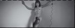
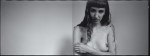


wonderlust photoworks in collaboration with @suspendedinlight – Assisted Self-Portraits (2017)
Over the last three years or so, I’ve dabbled a bit with street photography. Alas, the only camera I have that I’m fast enough with is a panoramic camera–which is not exactly well-suited to that task.
Really, though–what’s stopped me is that there are just issues of consent with street photography that I find increasingly disturbing.
The idea for these emerged partly from an urge for the challenge of street photography style work–quick thinking on your feet, rapid response, etc; the other part was I’m always looking for ways to reduce the amount of time I allow myself to over-thinking things; and, from the vantage of procedure, I’m interested in minimizing my imposition on the work.
The notion here was that I hand a cable release to the subject–in this case Lyndsie–and she chooses the moment the photo is taken. I merely have to keep her in frame and in focus.
It was such a revelation to work this way that I’ve actually instituted it as a sort of icebreaker every time I collaborate with someone.


[←] Tamara Lichtenstein – Untitled (2015); [-] Source unknown – Title unknown (200X); [→] Ashkat Bardynov – IMG-6XXX (2017)
Follow the thread

Vlastimil Kula – Untitled (2004)
Henri Cartier-Bresson famously admitted to staging many of his best known photographs. This? Staged. This? Same.
It’s ironic that as one of the first to pinoneer the genre of street photography, that his work pretty much flew in the face of many of the subsequently codified conventions of that genre.
Personally, I could take or leave his work. But I do think his staged photos are better for their contrivance–I think that’s why so many people revere his work: it unified the criteria for what made a good street photograph with what distinguished an objectively good photograph.
This image is staged as fuck–and not in a good way. (HCB, at least, staged his shots so that there was an easily apprehended logic to the blocking and composition of the shot.) This is… I mean… if she’s going to get into that tub, it’s going to overflow. Also, the way she’s pulling off her top is something you’d expect of the overly theatrical way you’d expect to see someone perform a striptease. (This runs counter to the placement and framing of the camera which logically suggests surreptitious voyeurism.)
What I did find interesting about this is that the level of water in the tub, immediately made me think of Archimedes and his Eureka! moment–wherein he realized that you can determine the volume of an object by the amount of water it displaces, i.e. buoyancy.)
I think conceptually it’s interesting that buoyancy tells you about what is there by what is not. (The displaced water indicates the volume of the object that displaced it.) Reflections show you what’s there but reversed–left is right, right is left.
This is also complimentary to Heisenberg’s uncertainty principle that states the more accurately we know the position of a molecule that less we know about it’s momentum and vice versa. It’s as if measuring things in terms of other more easily grasped things automatically becomes more difficult with the increasing complexity of the system being measured. (My feeling is this relates to Wittgenstein’s aim in Philosophical Investigations. And while I’m not in love with this photo–it’s kind of salaciousness for the sake of being salacious, and otherwise hollow–I do feel like it prodded my brain in an interesting direction.)


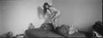
wonderlust photoworks in collaboration with @suspendedinlight – [↑] Loom; [←] Darkness Suspending in Light; [→] Baba Yaga (2017)
I have about a half dozen or so frames from this shoot I’m still in the process of editing–but I wanted to get these out there ahead of anything else.
This shoot was one of the most fun I’ve ever had–I love working with other artists but more than anything I prefer working with friends–and Lyndsie has become one of my nearest and dearest over the last year. (She’s so amazing talented and has this freaking magnificent mind and she totally gets *it*.)
The top photo was a riff on this. It’s a bit more inscrutable than I envisioned, but the more I’ve worked with it the more that is perhaps the point of the disorienting perspective. The title cemented it; I’m all about multivalent wordplay–it can be Lyndsie’s relationship to the viewer; or, the device used to weave materials into cloth (using such a device is not an inconcievable reason for her hand’s to be positioned in that way); or the part of an oar between the handle and the paddle (betweenness or, if you will: fulcrum as tool).
To me there’s something magical about it, something witch-like. (Truthfully the entire thing emerged out of me not being able to shake the fact that she’s playing a harp and the similarities between the harp and the loom and how Lyndsie as an visual artist and musician is on both sides of that.
The bottom left was totally making shit up as I went along. Lyndsie sat down and there was something powerful and playful about her demeanor that I wanted to document. I set up the camera and was so obsessed with getting her eyelight just so (check it out–so proud of myself for that!). I didn’t see the reflection until I first gazed at the slides through a loupe.
The photo on the bottom right was based on a dream I had. We played around until we got something that felt right and we took one frame. If you look close it’s not quite in focus–my 6×9 camera took a tumble in Iceland and the focus is just a touch softer now. But it gives it this very David Lynch like haze that makes it more obviously homage to Lynch then any of the half dozen other things in the frame I meant to specifically reference Lynch. So… sometimes I’m my own worst enemy, sometimes I’m looking out for myself against my own ‘genius’ ideas.
There you have it: a peak into my own creative process.
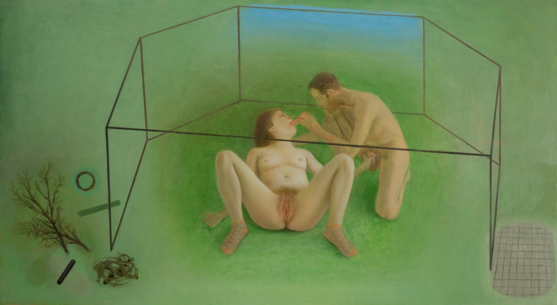
Marion Bataillard – Study of a Loving Couple (2015)
There’s more than a passing resemblance here to Beatrix Mira’s 2014 the normativity parchment.

Judy Dater – Self Portrait Salt Flats (1981)
One of my all time favorite photos by Dater is her Self Portrait with Snake Petroglyph:

I don’t know how I’ve never made this connection before but it’s entirely possible–quite likely, actually–that this is was intended as a sort of paean to Francesca Woodman.
After all, Woodman took her own life in January of 1981–the same year that Self-Portrait with Snake Petroglyph was created.
There are other similar features–the camera anchored firmly on a tripod while the photograph positioned herself in the scene. There’s the similar sort of motion blur Woodman deployed so often. (Although, it is important to note that: here it used much differently.)
A common critical and art historical question centers less on whether Woodman was an important artist–the interest in her work certainly continues unabated–but there is a lingering question of whether or not any of her mature work would’ve incited the intense reverie and devotion. With notable exceptions, her oeuvre (as it is), has been culled almost entirely from work produced before she was even 20. And there’s an argument to be made that after her year studying abroad in Rome, she never managed to rediscover the same sharpness in conception and execution again. Her foray into fashion photography was incalculably heinous. (Although in fairness, my favorite photo of hers was made during her last year of life.)
I adore Woodman. There’s only a handful of artists whose work I’ve spent as much time with as hers. (When I’m feeling especially full of myself I tell people that we’re involved.)
But I think that Dater’s work from from the year Woodman died–whether she meant it to or not–suggests that perhaps Woodman had, in fact, peaked and was past her prime.
Even in Self-Portrait with Snake Petroglyph, the framing is pretty much just about as wide as Woodman ever got. In her later work, in fact, she retreated–favoring the more intimate close-up style that prefigured the age of the instagram selfie by nearly three decades.
Dater very much went the other direction. Pushing the camera further and further back. (Anyone who is an actual photographer will appreciate the way this increases the difficulty and risk of the composition–the eye is more willing to forgive a composition that almost works if it’s shown something interesting in the bargain.
With the image above there’s also references to Wythe’s Cristina’s World as well as both a reference and a feminist critique of Edward Weston‘s strident male gaze-i-ness.
Also, it occurs to me that although we can with hindsight see the link between Woodman and Duane Michals now, plain as day: I feel like it was perhaps problematic for a straight, cis, white girl to be appropriating so whole cloth the work of a gay man?

Juan Stevens – Untitled (2014?)
I feel like I need to say about this upfront that while I think it’s deeply flawed, I do also think it’s a splendid image.
The points of criticism I have are that with the frame of the window in the background and the positioning of the woman, the composition does not suggest extension beyond the frame edges–thus her feet are essentially amputated, relegating her to the position of a signifier for both physical desirability and carnal accessibility. (I also love that the sharpest point of focus is slightly behind her head.)
That being said it is countered somwhat by the backlighting which controls what is concealed vs revealed (identity vs graphic depiction of erogenous zones). That aspect of the image is impressively sensitive and astute.
From the standpoint of visual grammar, this is a mess. The strident blue cast is beyond over the top.
Although that cast does contribute an undeniable tonal immediacy to what is depicted, it’s overly stylized in a way that isn’t justified by the context suggested from the frame.
It’s clearly full day-light beyond the blinds–pro-tip: as much as you think those standard issue Venetian blinds in your suburban cul de sac community can be made to recall Sin City, you’re dead wrong.
But let’s stick with the idea of Sin City for a minute because there’s something worth teasing out there. Sin City hinges on a visual conceit–a world embodying the overly stylized tropes of film noir.
Hollywood studios and backlots allowed filmmakers access to almost unlimited lighting and control over that lighting. So in most B&W movies through the early 1950s, you can tell whether a scene is happening at night or in the daylight just by how it’s shot. It’s not always convincing but it is consistent.
But as people moved towards shooting on location, this shifted. You can’t haul unlimited equipment all over town, obvs.
When I used to teach a crash course in lighting for cinema to undergrads, the question I always got was how to shoot exterior night scenes. And that’s a good question that lacks an adequate answer.
I think when people ask that they mean: how do I shoot something so it looks like Taxi Driver or Blade Runner or Collateral? And the truth is: you don’t shoot something like that because only Scorsese, Ridley Scott and Michael Mann are going to be able to command that kind of perfection in craft–and they can’t even pull it off every on every project they complete.
The prevailing idea has been based off the notion that moonlight is blue–it’s not really but it is perceived as such. Thus you had a period of shooting day for night where you shoot something in the middle of the day, underexpose by 2 stops and use a special filter–if you’ve seen an American B movie with exterior night scenes from the 1970s, you’ll know this because while it’s clear that they mean for you to think it’s night, it’s all very heavy handed.
I’m pretty sure it started on TV but the first time I remember seeing it was in an early Guillermo del Toro movie where a lot of bright lights were gelled blue and the scene was flooded with light to suggest night.
Film stocks and sensors have improved dramatically since the early 1990s, though. The issue is that with the move toward digital and the fact that digital formate fundamentally does not have the dynamic range to render vivid much less true black, the blue as indicator for night has become more or less codified.
I’m willing to give this a partial pass, however. I think that you could actually selectively darken the window so that the bed linens are brighter. Point is: that as a sketch this is top notch. I see high end fashion shit that costs thousands of dollars that doesn’t have a tenth of the diamond-in-the-rough insight as this. I just think that a great idea deserves to be revisited until you do the idea justice in execution.
As far as what I told those beginning filmmakers. How important is it that the viewer knows that it’s night. Is that all that matters? If so, then you can absolutely steal a page from Chantal Ackerman’s eternally underappreciated Jeanne Dielman, 23 quai du Commerce, Bruxelles–where mother and sun go walking every day after dinner in the pitch dark night. Or, with the improvements in film stocks you can go murky available light like Kiarostami’s Where Is the Friend’s House? Whereas both David Fincher and Paul Thomas Anderson deploy tactics similar to noir to different effect–the former is all about including practicals in the frame to suggest the source of the light and then using that a means of distracting from the staged lighting that is meticulously pieced together; the latter uses only just enough light to carve the scene out from shadows. (You won’t ever get quite the same effect, but it’s absolutely possible to improvise something in keeping with the principles guiding both of their decisions in your own work.)
Also, although I personally loathe his aesthetic, Hype Williams is someone with nearly endless versatility in his approach to low-light shooting.
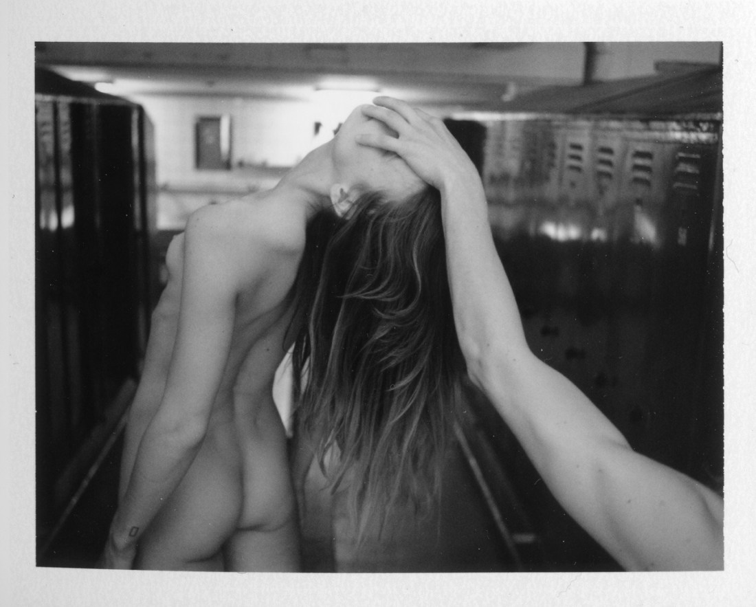
AdeY – dependency (2015)
I think it was in third grade where we learned about the five questions a good reporter always answers when relaying a story: Who? What? Where? When? And How?
This isn’t exactly a shabby mode of approaching art, come to think of it. Except, there’s perhaps a proscribed order (at least as far as visual art goes).
I suggest you start by asking: what is this, what am I looking at?
In this case, it’s a stereotypical locker room–rows of lockers on either side of a central bench running along an aisle. A woman (nude) is standing on top of the bench leaning backwards in a manner that has to be both uncomfortable and precarious as far as balance goes. A male arm extends into the frame from the lower right corner; its hand holding her face not unlike a basketball superstar slam dunking.
The lighting in the locker room indicates that it is currently unoccupied and the lighting on the interaction in the foreground has a sort of cinematic flare that is suggestive of a nightmare tableau or horror film. (I can’t look at this and not think of the penultimate scene in It Follows–where they fight the monster at an indoor pool.)
What is seen speaks to viscerality/physicality but in a fashion that is unsettling/menacing/sinister.
Now–if this we’re in hanging in a gallery–there would be some placard someone explaining that the artist’s name, the title of the piece (if there is one) when it was made, where the nationality of the artist, perhaps (I’m pretty sure he hails from Sweden). Astute galleries will address the how with notes on media (in this case medium format Polaroid), the size of the work, provenance and ownership/bibliographical information).
And here’s what I think people who think art is dumb mean when they criticize it. If you’re going to understand what you’re looking at, you often have to conduct the same operation multiple times. In this case, when you get to the title, i.e. ‘dependency’, you are forced to ask yourself what that means in the context of what you’ve already figured you’d gotten super clear about.
The first thing I think of is that dependency can indicate something suspended–like a pendulum or the Sword of Damocles hanging by a single hair from a horses tail. (The position of her head to his hand is in keeping with this reading and it further strengthens my original notion that there’s something malevolent happening here.)
The second thing that pops into my head is this woman I walked by two mornings ago. She was speaking loudly on her phone to someone and I heard her say: I’m not going to waste my time on you, ‘cause I can’t depend on your ass for nuthin’.
I think there’s a tendency to view dependence as a bad thing. But I’m a dependent upon food, water, shelter and clothing (alas, we have not yet returned to the naked idyll of Eden). I depend on my job to pay me for the work that I do so that I can trade the money I earn in order to survive and exist in the world. I–personally–am also dependent upon a steady stream of illicit substances to counter the stress of functioning somewhat normally in this completely fucked world.
In other words, there are degrees of dependency and degrees of acceptability of various forms of dependency which general relate to whether they serve society or the individual.
Yet, my gut is that the sinister tone is a projection I’m placing onto the image–and it’s a strange feeling. I’m not used to it. And when I poke at it a bit more things shift for me.
My BFF and I have been talking recently about how depression–despite being awful and numbing–is actually sometimes beneficial. When you’re numb the generally awful stuff has a muted effect and things need to be really horrendous to register. That’s a defense mechanism, of sorts. I think this photo functions similarly.
For me it’s about the fact that her face isn’t so much held as covered–the proceedings the viewer witnesses here are reasonably anonymous. And anonymity is a concept without a point unless the one who wishes to be anonymous is likely to be seen.
It feels to me like this is–in a fumbling way–trying to get at the dichotomy wherein the voyeur watches in order to see/understand and the subject wishes to both be seen and unseen at once.
And if this is more than just pedestrian hearsay, which equivocation muddles meaning more–that of the voyeur or that of the subject?