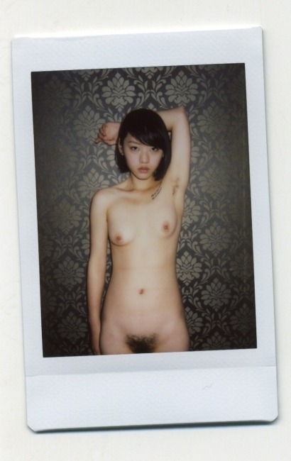
Evgeny Mokhorev – [↖] Marina near the forest bath, Lagoda (2013); [↑] Anna (2016); [↗] ***, Baltic Sea (2017); [←] Anna and Yuri, Tichino, Italy (2015); [+] Katya, Kronstadt (2016); [→] Yuri and Anna, Tichino, Italy (2015); [↙] Alexandra (2010); [↓] Anna, Crimea (2015); [↘] Anastasia from The 26th Element series (2001)

I’ve featured Mokhorev’s work at least once before. (I’m almost positive it’s twice but since Tumblr now hides NSFW content blogs, I have to rely on my own tags to find anything. Alas, I haven’t always been vigilant with regards to tagging, so…)

In the 1990s, Mokhorev was focused on youth culture in St. Petersburg. It was a rather different species than the bohemian, hipster rock n roll rebellion of his compatriot Igor Mukhin; There’s none of the trappings of counter culture and things seem to prosaically orbit the fact that it’s one of the most heavily populated cities nearing the Arctic Circle. Winters are bitterly cold and summer is a time people revel in. As I understand it, getting blitzed on vodka, stripping down and swimming in the Neva is a fairly commonplace occurrence.

There’s a sort of feeling of everlasting summer, of primordial pagan sunworship to his work. It also frequently features folks unabashedly cavorting around in the buff.

Some of his earlier work was a bit disconcerting–frequently featuring nude pre-teens and teens. I’ve spent the morning revisiting his work and what impresses me is that although it is ostensibly interested in nudism, it avoids the trappings of the other two prominent artists interested in nudism, Mona Kuhn and Jock Sturges (in the case of the former, the works remain antisepctic and are less concerned with the conveyance of an sort of concept beyond a sort of idyllic reverie and instead pivot upon questions of form, representation of space and color; whereas Sturges is a perverted hack who dresses up his pedaphiliac ideation in the trappings of fine art legitimacy–I was at one time a fan of his work but increasingly it creeps me out and the work itself relies more on the perception of technical mastery, while demonstrating no such acumen in point of practice.)

I’ve been wary of his work before. Unlike Sturges, however, I have always been fond of it–and suspicious of that fondness. These images make me feel more justified in my admiration.

Here’s some things I noticed about his more recent work. [↑] bears more than a passing resemblance to Mark Steinmetz’s Jessica, Athens (1997); Steinmetz is objectively the better photo, but it feels as if Mokhorev only fell short because he was more ambitious in attempting to convey a similar feeling but also opening up the frame more. (I’d bet $20 that he’s very familiar with Steinmetz.) [↗] I like this because it’s a fundamentally intriguing image but also I’m curious what it is he’s holding and he looks a bit like a hedgehog; [+] between the watch on the necklace and the smoke stack behind her (which reminds me of the scene in Mark Romanek’s music video for // | /’s The Perfect Drug, where there’s a funerary urn that has crushed someone leaving only a pair of legs in riding breaches reminiscent of the Wizard of Oz; [↘] this might as well be channeling Rodchenko from beyond the beyond.

The last thing is a technical note. I am certain Mokhorev favors Ilford film stocks. And I am reasonably convinced he uses HP5 pretty much exclusively. While it is absolutely better than the comparable Delta 400 Pro–which is garbage, fwiw–it’s a finicky stock. It’s impressive that he’s getting these kind of results from it. Damn impressive actually. I’d have said that it wasn’t possible prior to seeing these. Also, another little known analog tidbit, there are subtle differences in the emulsion between different formats. The grain is usually more or less the same but there are differences in contrast, dynamic range and tonality. But the backing is always different–especially with Ilford. All the above are medium format except [↓], which is 4×5 sheet film–it’s possible this is not HP5 but in my experience 4×5 has a completely different feel to it than the 35 and 120 formulations of the same stock.

Dan KitchensChanty, NYC (2014)

This is quite nice.

As far as light’s concerned that’s a balanced gamut from shadow without detail (beneath Chanty’s hands), shadow with detail (the lower left edge of the frame), midtones, effing fantastic skin tone, highlights with detail (her shirt) and highlight without detail (most of her left sleeve).

If this were any other image on Tumblr, you’d see the white edge of the window that’s illuminating the room. Compositionally, it would be a terrible decision, distracting from the dynamic tension between light and dark. Instead, the window is excluded and instead the only hint of it besides the light it’s introducing and subsequent shadows cast, is the left arm of her top. Along with the chair favored slightly to frame left and angled ever so slightly toward the window, the frame is well balanced. (I can’t remember ever seeing this before but it’s a great notion–in traditional photography, if anything too near the edge of the image is blown out, you actually have to increase the amount of light it gets when making a print in order to burn it in so that it does not appear to be the same color as the paper.)

I’m pretty sure this has been edited post-capture–the left chair arm appears to have been dodged and the right chair arm appears to have been burned in to increase the sense of dimensionality.

Taken together, this creates an aesthetically pleasing image that is rich with texture: carpet, chair, wallpaper and curtains–not to mention Chanty’s hair and skin.

I’m not 100% sure about the lampshade behind her head. The shadow cast by the lampstand is super obvious and I think that distracts. Also, her expression seems less expression than transitory shift between expressions.

My gut instinct if it were my image and I was editing it, would be to go back and try to pull some texture out of the lamp shade, or just darken in in a fashion not unlike the lower left corner of the frame has been burned in

Source unknown – Title unknown (201X)

I think this video may be the porn clip that I have watched the most in my entire life.

Technically, it’s flawed. But the technical doesn’t matter so much when the sex is so thoroughly and legitimately haute.

From their seemingly coordinated ink: his Judge me, her Justice; to the inversion of the porn trope where the starlet furious rubs her clit while a muscle-bound stud uses his erect cock more like a gas powered chisel than a tool meant (among other things) for providing sexual pleasure; and–my personal favorite, the way she licks his semen off his tummy and then gives him a sample of the mess he’s made.

Unffff. (Also, this clip gave me a thought for a performance piece I’d like to enact at some point. I think it could be positively scandalous…)

Author unknown – Catherine from Summer Stream series (2013)

This features a solid concept. Like I’m fairly certain anyone who has spent any kind of time behind a camera, would’ve absolutely seen this as a shot if the tableau were unfolding before them in the moment.

And I don’t actually have any of my usual #skinnyframebullshit qualms with the vertical orientation here–you want to emphasize the way her pose is echoing the shape of the branch onto which she’s holding. (A horizontal frame would necessarily privilege the fallen tree.)

The extremely shallow depth of field recalls Mona Kuhn–except she’s working analog (which features an automatically shallower DoF, with much better lenses, and you know uses bokeh to dimensional effect).

The bokeh in the above is super digital artifact-y and not especially flattering; I’d also argue given the frame that it’s a mistake as the lighting being as it is, the eye would naturally bestow a much larger DoF on the scene since Catherine is clearly aware of being seen and the expression on her face makes it clear that even if she is a wood nymph, she’s being witnessed by a human watcher).

So while I don’t think this is exactly well-executed, it still fundamentally works based on the premise it conveys.

That feeling that causes a photographer or image maker to raise the viewfinder to their eye and try to feel what they did when they saw something that captivated them is something I’ve been thinking a lot about–usually while high as fuck on extremely potent marijuana edibles.

I’m not a linguist–not even close. But it occurred to me that ‘optical’ and ‘option’ feature the same root: opt-.

Optic is from the Greek by way of Medieval Latin; Opt would’ve been emerged in Latin about 50 years after optic.

I’m not sure how to rigorously go about it, but it seems to be that there is likely some conceptual underpinning of language that understands seeing and choosing as related and frequently overlapping processes.

So yeah, those are my cursory notes for a future first day as a beginning photography teacher lecture.

9mouthUntitled from Instax Love series (201X)

The Sino photographer identifiable by the moniker 9mouth is hugely problematic. (I won’t repeat myself: you can read my previous thoughts on his process here.)

Still he does manage to produce some truly breathtaking photos–seemingly in spite of his galling misogynist bombast.

Here the interplay between the flash and the semi-reflective wallpaper renders an incrementally overexposed skin tone–not only flattering but also steeped in an almost tonal patina of late night in a seedy love motel vibe.

The model’s expression is an inscrutable defensive wall–is she bored? annoyed/impatient? judgmental (of the photographer? Or the viewer? Little of column A, little of column B?)

I get the sense that this is very much front loaded with ambiguity. There is a very compelling feeling of intimacy; yet, also a sense that the intimacy is forced–not exactly contrived or coerced but conditional somehow.

That conditional consideration and that it is effectively what makes this image so successful is more than a little discomfiting. (At least to me.) So while I am willing to acknowledge that this is an astute image–I think it functions in a fashion that operates in a sort of beyond good and evil approach to broader issues of consent and visual representation. Another way to say it might be to say that if mainstream porn shifted its model to produce art, it would likely come off much like this.

[↑] Adam MillerFallout from Compositions series (2012); [+] Akseli Gallen-KallelaBy the River of Tuonela (1903); [↓] All Fine Girls – Vika (201X)

I save things as drafts thinking to myself: self, this belongs here.

Unfortunately–often when it comes to composing some sort of accompanying text, my thoughts scatter like roaches when you flip the light switch.

Dredging through drafts, trying to figure out items to post–it occurred to me that it’s the expressions in these that appeal to me.

In the top image, the woman has an expression which–independent of the title–comes across as mismatched with her surroundings. She looks wild-eyed and terrified except at the same time she’s more engaged than those around her. When I discovered the painting is titled ‘Fallout,’ something finally clicked for me: she’s one of those people who only ever feels fully alive responding to and thrilling in abject chaos and catastrophic tumult.

The second painting is based on a the Kalevala–roughly like a cross between the Aeneid and the Icelandic sagas except being fundamentally Finnish (as best as I can tell). The subject of the painting consists of the hero being tasked with completing three difficult tasks, the third of which is slaying a swan on the river Tuonela.

In the painting, the hero (Lemminkäinen) departs in his canoe.

Additional context: this painting was a sketch for a fresco in a mausoleum dedicated to the memory of the daughter of a prominent businessman who died at age eleven. It’s presumably her with the braid trailing down her back and her budding breast exposed, invisible to the other gathered onlookers.

Everything about her suggests that although she does not know what she has lost, she understands what the loss has cost her in a way that no one else can or will.

I am unbelievably conflicted about posting this image. It’s porn and not even good porn. Further, I think it is unspeakably heinous when grown ass men refer to women they are attracted to or wish to pursue romantically as ‘girls’–it’s gross and a huge red flag. (And I absolutely judge men I hear do this as total creeps.)

In my experience, to achieve orgasm, you have to stop thinking, stop trying to get off, let go and surrender to an unmediated experience of physical sensation.

By letting go, you can just kind of float there and wait for it like a wave rolling in from the sea. But in letting go, you can also reach for something.

I won’t presume to know what this young woman is experiencing but she is reaching–and with this stunning, febrile desperation. It’s breath-taking to stare at, honestly.

When it comes down to it, these expressions are all unusual to witness in person–let alone in visual media. What impresses me and caused me to eventually put them all in the same place is that they are all expressions I’ve seen in the mirror, especially Vika’s desperate reaching. That’s so close to home, I have trouble fighting to urge to claim this as an ersatz self-portrait.

Dejan Dizdar AKA CDAstudioD0215 (2013)

If
not exactly a good image, it does feature several noteworthy facets: it
bears the blanket blessing bestowed by dwindling golden hour light, the
pose imposes an intriguing sculptural form against the sand, sky and I
suppose you’d term that grassy mass ‘a tuffet’.

What is extremely
cool is that the camera is essentially pointed up hill–giving a view of
both the ground sloping upward as well as the clouds strewn all about
overhead.

However, unless I’m mistaken, part of what makes this work is a feature of optical distortion–specifically what’s
termed barrel distortion; basically, horizontal and vertical lines only
run truly side to side or up and down, respectively, at the center of
the frame. The further you are from center frame the more they bulge
outward. Like so:

Not how this visual aberration creates and illusion of bringing the model closer while pushing the sky further back: