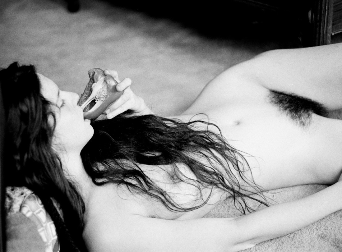
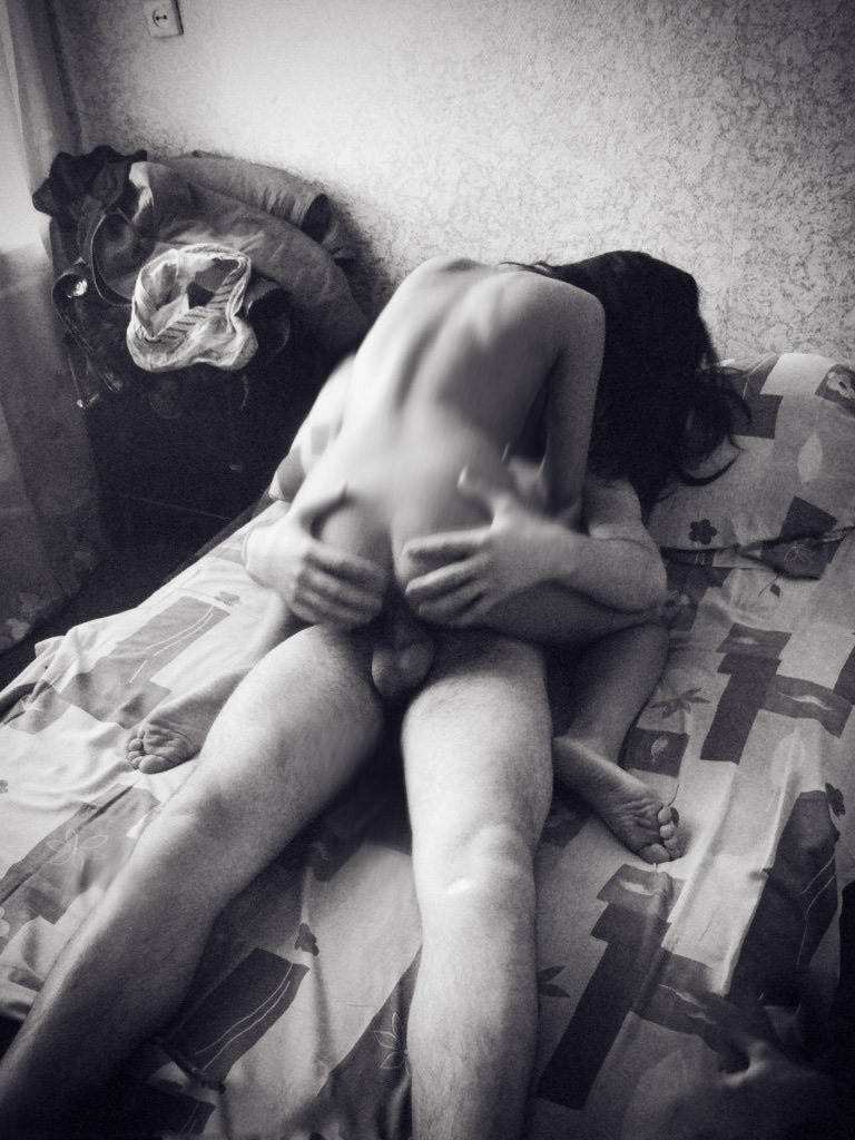
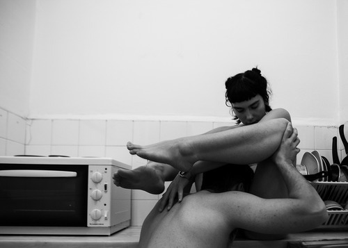
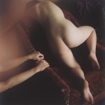
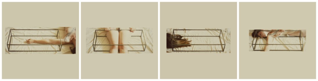
Andrés Castañeda – Untitled (2014)

I see a lot of Castañeda’s work featured on a lot of the blogs I follow.

Until the set of images from which the above image emerges (and is the best), I’ve liked a handful of his images but have remained mostly ambivalent about his work.

Encountering this made me realize that what makes one image and breaks another is Castañeda seemingly pathological obsession with capturing raucous colors.

The difficulty–at least for me–is given the more explicit focus of the majority of these images, the lush profusion of color for the sake of color, or colorlust, if you prefer is inconsistently (at best) and haphazardly (at worst) applied.

In the case of the above, the riot of colors cause the orange stockings to pop. However, in popping they compliment the diminished range of skin tone which actually shifts attention to the unspoken focal point of the  the image: the suffused, milk-white light.

In other words, the fixation on color in this image is less raison d’etre and more conceptually unifying than most of the work.

Also, I was reading something on typography a few days ago and it observed that the best typeface choice is the one you don’t notice. I haven’t quite worked out the corollary but I have a feeling this suggestion also works when considering notions of composition. Too often, Castañeda is (Stephen) Shoring when he should be (Jeff) Walling.

Henry Gaudier-GreeneEdward Weston and the Origin of the World (iii) featuring Kelsey Dylan (2014)

Early this year Gaudier-Greene was asked whether he had any New Year’s resolutions; he announced his desire [t]o develop a better working relationship with midtones.

It struck me as an odd self-deprecating joke–coming from someone virtually unrivaled in the using color photographically to claim controlling B&W midtones to present a challenge after he’s used them to stunning effect (thinking specifically of his collaboration with Tanya Dakin: The Beginning of Mod, emphasis on this gem).

I suspect it is largely just that but it’s also an interesting and probably entirely unconscious framing device. Let me see if I can show my work for that assertion.

Looking at this gorgeous photo oblivious to the title recalls Goya’s La maja desnuda and Modigliani’s Reclining Nude.

Now, when I look at the title I dart in the opposite direction–away from painting as a means of transcending the ephemeral one-to-one nature of sensuality and towards the physicality of father shot/son printed green peppers and graphic nudity, i.e. the visual documentation of explicit bodies as a means of exploring the erotics of metonymy.

I don’t think such misdirection is misplaced. But I also don’t think it’s accidental. I’m not quite sure how to ground a further explanation of what I mean in Gaudier-Greene’s work, so let me take the half-assed route of the intellectually disingenuous: I see a number of parallels between Gaudier-Greene and Edgar Degas. But for the purposes of this explanation, I’ll limit myself to one. Degas set out to be a historical painter, he is now lumped in with the Impressionists–despite wide variance and in some cases outright antagonism to their practices.

In truth he was both a historical painter and an Impressionist; at the same time, he was never truly either. He was more radical and subversive than any category. It seems to me that in an effort to fit within the photographic tradition, Gaudier-Greene tends to point to the less obviously discernible influences he’s pinned to his sleeve while the audience fawns in awe over the calm and stubborn purity of beauty in the work.

Gaudier green is a photographer par excellence and a capital A artist. He has on at least three occasions made me swear to give up photography and on half a dozen others caused me to swear eternal fealty to it.

Source unknown – Title unknown (XXXX)

Here’s an example of a vertical frame that isn’t #skinnyframebullshit.

Why? You ask, Isn’t it just echoing form of the subjects?

Well, it is doing that but in this case a landscape orientation contributes little additional context to the image. As it is we can tell it’s a small bedroom, demonstrating exactly how small it is–if anything–belabors an already clear representation.

The trick that makes a skinny frame work here is the narrow triangular form of the overexposed motion blur adorning his hands and her left side would–in a wider frame–be subject to de-emphasis. Further, the vertical framing draws attention to the discarded clothes piled on the bedside table and likely Russian electrical outlet.

Mathilda EberhardUntitled (2014)

Mathilda EberhardUntitled (2014)

Flickr retains little more than a ghost of its late aughts glory.  In fact, it’s pretty much a completely clusterfuck.

There are some notable outliers whose photostreams’ always showcase bona fide next level shit–looking at you: im_photo, chill and 3cm.

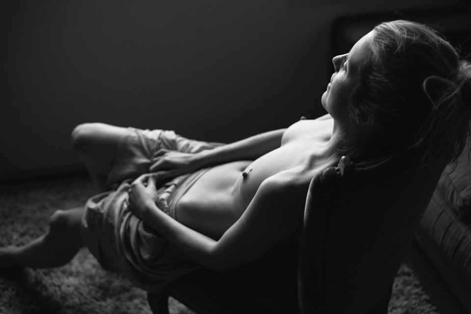
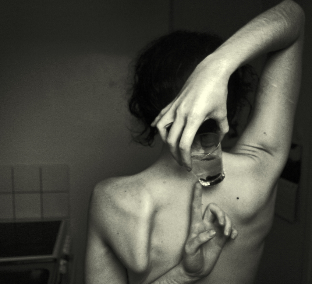
I’d include Eberhard to that list except well although I wouldn’t ever suggest that her work is better than those guys, I am just flat out enamored with her work.

This should surprise no one having followed me for any period of time–after all this is the fifth image of hers I’ve posted.

You’ll notice I tend to favor appending quotes to her images instead of commenting on them–partly because I am so awed by them that my fumbled attempts at expression seem entirely cross juxtaposed with the work and partly because I get self-conscious about the fact that I tend to compare things that move me to the very limited set of work I adore (at least initially) instead of come to terms with them on their own ‘ground’.

For example: for as many image makers as will either claim or accept the critical assignment of overlap with Francesca Woodman’s work, Eberhard is probably the image maker who most completely takes up Woodman’s mantle.

But to state that and consider the matter settle is intellectually dishonest. There’s more to it than that it and leaving it there does a disservice to both image makers.

Unfortunately, it’s not something I can express in the positive–i.e. I can say this is what makes Eberhard’s vision singular. However, it did occur to me that there’s a way I can, for the time being, point in the right direction.

Think of the word ‘desire’. We use it primarily as a noun–to describe a visceral wanting. It’s also a verb. I can say to a friend: I desire a delectable brie.–Although grammatically correct it sounds to the ear unbalanced.

In actuality when we desire, there is a tendency to express desire with metaphor–’craving’, ‘hunger’ or ‘thirst’.

Now, consider the qualifications we add to these metaphors when we use them non-metaphorically. We might say her appetite was ‘insatiable’ but we would be much less likely to say his hunger was insatiable unless we are using ‘hunger’ in some metaphorical sense. One eat until one’s hunger is sated.

I’m not sure if it’s just my pushing the point to reach a satisfactory conclusion, but it seems that we speak of thirst differently. Thirst isn’t sated, it is ‘slaked’–implying satisfaction. The space between ‘hunger’ and ‘being sated’–when measured in time–is less ephemeral than the space between ‘thirst’ and ‘slaked’.

I think when you extend this realization of the tendency in the literal to the metaphorical–desire when expressed via a thirst metaphor is more insistent than desire as expressed via a hunger metaphor.

What makes Eberhard’s work so singularly compelling is the way it methodically charts the terrain of thirst as a metaphor for desire.

Libby Edwardsthere are no boundaries anymore/just purity/just us (2012)

You know that smart ass quip that there are two types of people in the world: normal folks and then those who separate the world up into two types.

Yes, there’s certainly a kernel of truth there–things in the desert of the real rarely divide cleanly or suggest such neat polarity with easily navigable spectra between.

However, as long as either/or dichotomies are invoked as a genesis point (a means to an end instead of an end in and of themselves), I think they can be useful.

Take this image. It’s crossed my dash probably several dozen times in the nearly two years I’ve run this blog. Technically, it has a heavenly choir of problems: the camera’s slight up tilt combined with counter top reinforcing the lower frame edge draws attention to the asymmetry of the corners where the walls meet on either side; I would wager this was taken with some sort of matrix metering setting–resulting in the skin tone being what I’d call a Zone IV instead of halfway between Zone VI & VII.

In other words, it’s technically flawed.

Now, I’ll be the first to admit that the technical interests me. I would even go so far as to say I consider quality of craft a major turn on. Still though all the technical know how in the world doesn’t count for fuck all if there’s no mojo.

What do I mean by the oh so technical term ‘mojo’; heart, honesty, integrity. For example: I can’t fucking stand Monet but you’ll never hear me question the importance of his work. Just because it doesn’t appeal to me doesn’t mean I can’t be convinced through and through that the way he painted was a painstaking effort to share the wonder he say in the world.

But back to my original notion–for the sake of argument: let’s say that there are two sides of the image making equation; namely, the technical and the spiritual.

This image is off-the-goddamn charts in terms of presenting the truth of a discrete moment. It’s technique could be improved but there’s enough merit to it as it is that it sort of diminishes any potential criticism that can be leveled here.

Vladimir Nechiporenko – [above] *** (2011); [↖] *** (2013); [↑] *** (2014); [↗] *** (2014); [↙] *** (2014); [↘] *** (2014); [below] *** (2014)

“Before I take my last breath, before my last flower withers, I wish to live, I wish to make love, I wish to be in this world close to those who need me, those who I need, in order to learn, comprehend and rediscover that I can be and I want to be better at every moment.”

                     –Ahmad Shamloo

Marcel MeysLeda and the Swan (1920)

I have a very long list of scholarly essays I have half a mind to write. I know I’ll never write them but I think the concept is vital enough that someone should write about it–even if it’s not me.

One such essay has to do with understanding the mechanics or artistic influence using figurative painting as a microcosm. I think it’s interesting that it starts out as a system of patronage–artists accept assignments to depict certain stories and thereby practice their craft.

If you’ve ever spent any time studying 13th through 18th century painting–or spent an afternoon ambling drunkenly around the Gemäldegalerie (have done; plan to do again)–you know that regardless of historical merit, a fair portion of it is BORING AS FUCK.

Yes: there are exceptions wherein the practitioner’s craft is so clearly some next level shit that it shifts the way that myth is depicted henceforth. (Giotto and Masaccio being goddamn exemplars.)

Then there’s those that add not only staggering craft but who also manage to strip away any sort of superfluous decoration and get to the dynamic core of the image. That’s abstract… think of it this way given the established trope the artist finds a means of not only presenting the subject in a new, dynamic way but they do so in cuh a way that the render the title unnecessary. You look at the image and you know down in your bones, the story behind it.

My favorite example of this visionary work is Bruegel‘s Landscape with the Fall of Icarus.

But there’s also work that alludes to mythology in order to clarify or enrich itself. I had an example that was a painting but as I’ve been writing this I may have been drinking rye whiskey and now I’m just blasted enough that the only example I’m able to summon to mind is the fact that Ellen Page’s (who is fucking incredible, by-the-by) character in Inception is named Ariadne.

As with this example, the majority of such efforts end up knee jerkily hipster. But there’s the further complication when we are dealing with analog photographic or digital imaging processes. Joel Sternfeld did a a great project called On This Site: Landscape in Memorium that commented on how text informs images and images inform text.

I find this image to be an example of this last kind of image. I’m not the title necessarily detracts from the work… if you know anything about the history of the depictions of the story of Leda and the Swan then you can appreciate it’s cleverness.

My trouble is that I think the harkening of the title back to mythology diminishes the fact that this image is more than ninety years old but still looks as if some analog fetishist Tumblr photographer collaborated with an up and comping Tumblr model to make it.

[↑] Igor MukhinUntitled (2010); [←] rule of thirds (overlay); [→] rule of thirds + 18° (overlay); [↓] grain density & depth of field (magnification sampling)

I talk to much and say too little. I decided to show as opposed to telling you the genius-tier visual math shit going on here.

Igor Mukhin has forgotten more about the photographic craft than most of us will ever hope to know.

Daniel KlaasJoanna (2014)

The part of my brain that thrills in voyeurism enjoys portraiture. It’s a bit like a two-way mirror: I can watch without being seen.

But something about it is vaguely unsettling. I’ve been trying to work it out and I think it boils down to conceptual concerns over the negotiation of identity via depiction in visual representation.

That’s an annoyingly academic, overly verbose way of saying: at its most fundamental level portraiture establishes a thorny, four-way intersection between how the subject sees them self, how the subject wishes to be seen, how to photographer sees the subject and the how the photographer’s work is seen by the viewer.

Portraitists walk a razor wire tight rope between bearing witness and trading in what is effectively undeserved intimacy–i.e. the objectifying tradition of thinking I know because I have looked closely and seen.

Off the top of my head, Ryan Muirhead and Lynn Kasztanovics are the two photographers who manage to re-contextualize portraiture into something that testifies to the truth in the transaction of at once being, seeming, being seen and the politics of depiction while fostering subjects enigmatic non-object-ness. Muirhead does it with a mastery of craft and attention to the holy moments between defensive pretense and unguarded openness to the world; Kasztanovics collaborates with those she knows and trusts–her informality and the proximity to her subjects creates something not unlike the discomfort of someone sitting too close on public transit whom, contrary to all reason, you find yourself fighting the urge to reach out and caress their face.  (Lina Scheynius and Traci Matlock also fuck with portraiture in fascinating ways but both seem less interested in working within the form than transgressing it’s boundaries.)

Back to Klaas: he’s a Melbourne based photographer who favors analog photographic process. And I am not overly fond of his work but this image is quite unlike his typical milky exposures and rendering pose as contrived sculptural element. Instead, it reads as a sort of record of a moment in which the confluence in a body of subject and objective experiences of reality was quietly observed.

So there’s that. But also, there’s also fascinating technical considerations: the mid-tones are relegated to the background wall, couch and Joanna’s face. Everything is super contrasty with either deep, rich shadows or highlights pushed to the edge of blowing out.

Depth of field dictates the way the eye scans the image–It reminds me of mrchill, in that regard– and emphasizes her enigmatic expression, as if she is calm, comfortable, perhaps even a bit contemplative. (Note: the grace notes in her hand placement; probably my favorite part.)