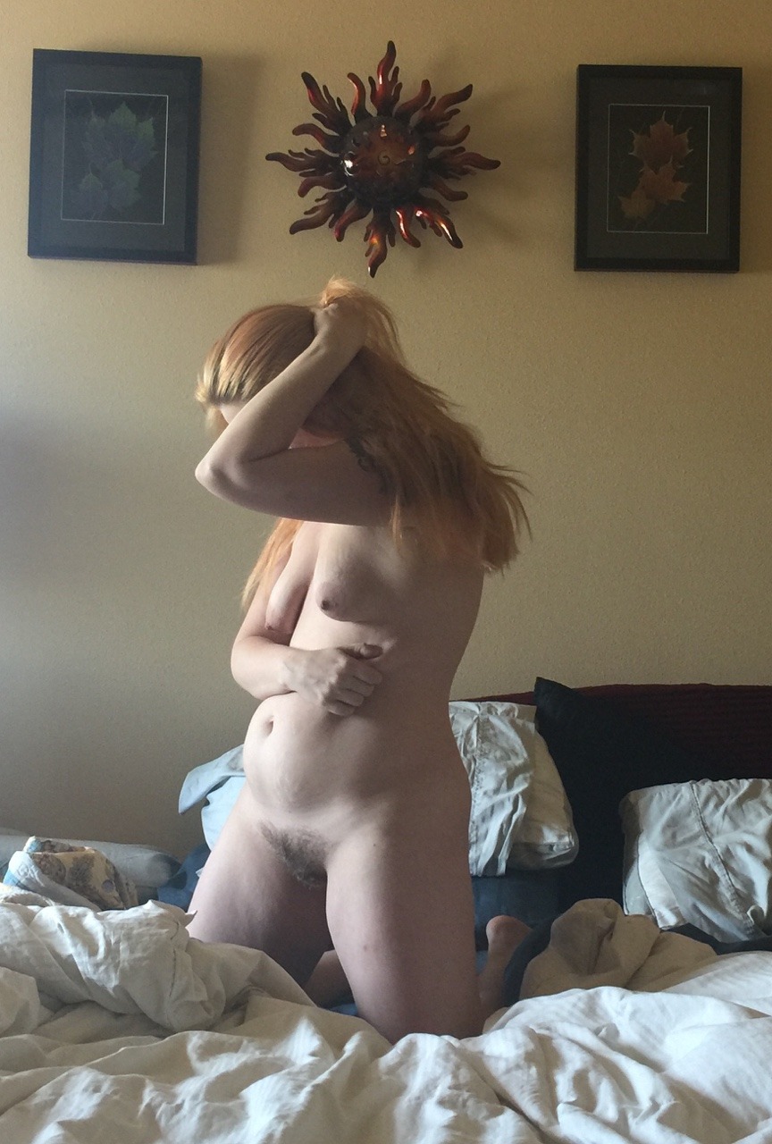
muse-of-maestroI’ve been lost in my own skin lately. The season is about to change and so, to, must I. (2017)

I see literally hundreds of boudoir selfies and self-portraits slide across my Tumblr dash every damn day–the idea is painfully self-same; the execution is almost universally shitty.

This, though? This is effing intriguing.

Yeah, you’ve gotta ding some points for the camera not being exactly level–but neither are the frames on the wall, so it could feasibly be that. (I’d bet that it’s both, fwiw.)

Also, it’s overexposed by more than a stop–the adage for analog being expose for shadow, develop for highlight gets reversed with working with digital; in other words: expose for the highlight by making sure the brightest area of the frame is what your exposure (when something digital is overexposed it leaves you zero data to work) and then add shadows back in post. (I’ll never be an adherent when it comes to digital but having just returned from Iceland where I shot an equal amount of film and digital for the first time ever, I can say that if you abide by this dictum, you’ll be able to correct things enough to get a usable shot in post.)

I actually copied this image into the iPhone editing interface–which is infuriating until you realize that the engineers have built out the workflow in such a fashion to teach the user through repetition how each adjustment interacts with the base image and subsequently applied adjustments. (Getting the hang of this will actually sharpen your Photoshop chops immeasurably.)

But yeah, I corrected the overexposure as best I could. (The rainbow artifacting along the left edge, near the middle is a result of the lack of data from overexposure.) Adjusted for a more balanced skin tone–added some shadows (if I was doing it in Photoshop I’d have gone back and selectively dialed back the shadows on the right most frame–which go too dark in this edit.)

Pushed the color just a little and then added a bit of a warmer cast.

And viola! You can see that although it’s imperfect there’s a bit of the feel of a Flemish oil painting to this–which is likely what I responded to upon seeing this.

image

Prue StentUntitled from Four (2015)

I’m enormously fond of Stent’s work; although–I have to admit–the image above surprises me.

I think of Stent as working exclusively in color. Almost by definition, fine art photographers tend to work in B&W or color, rarely both.

Perhaps that’s not an entirely fair characterization: most fine art photographers make a name for themselves as a color photographer (i.e. William Eggleston) or B&W (i.e. Mark Steinmetz). [If Eggleston has worked in B&W, I haven’t seen any of it. Steinmetz does have color work but I tend to agree with him that it’s nowhere near as accomplished as his B&W work. The only photographer I can think of who I’d be hard pressed to pick just B&W or just color from their oeuvre is Jeff Wall–and I might end up picking the B&W with him, actually.]

That’s why Stent working in B&W surprises me: one would expect the results to be more of a curiosity; whereas her B&W tends to be audacious in it’s formal innovation as well as incisive in scope and execution.

What’s even more impressive is that–unless I’m mistaken–Stent is working with digital exclusively. I took the above image and parsed it according to Ansel Adams’ Zone System (much as I did with this image by Davide Rossi).

The way she’s using light and shadow to create depth and dimension is straight out of classical oil painting. (For example: I’ve only been a photographer for eleven years now. It’s just within the last year that I’ve begun to understand the interplay between light, shadows and depth of field used in combination to create the illusion of dimensionality in otherwise 2D representational spaces. In other words: Prue Stent is actually a good bit more brilliant than I initially assumed.)

Yan BertoniEmma #3 (2017)

This is a visually arresting image–without a doubt.

Were one so inclined one might talk about color (The palette of red hair to ochre lichen to the brackish algae tinged lake) or about texture (the lack of texture in Emma’s skin and the surface of the water vs. the abundance of texture in the wooden dock).

I–for my part–can’t look at it and not compare it less than favorably with Chadwick Tyler’s effing exquisite image of Cora Keegan from back in 2014.

The fact that I prefer one to the other probably won’t surprise anyone who has been following this project for any period of time. The reason why I prefer one over the other almost certainly will: I think the above image is over-composed to the point of sterility.

What do I mean? I mean this isn’t strictly governed by the rule of thirds. I charted it for you to peep:

What is interesting is that if you zoom in a bit and ignore the water the dock conforms to the rule of thirds:

This sort of nesting of for frames within frames reminded me of the Golden Ratio. So I diddled around with that for a bit. The image in no way conforms to it but imposing the spiral in on particular way does illustration something about how the image is arranged to cause your eye to track back after it has moved all the way from left to right:

Well, I mean… that all sounds pretty sophisticated when I lay it all out there. So why do I prefer Tyler’s image?

Well, I don’t think the golden ratio overlay is a function of calculations in the making of the image. More: I think that the golden ratio is everywhere. Yes, it’s rare to find an image that conforms to it to a T but I think the rule of thirds works because it takes the ordering principles of the mean and parses them in such a way that you can achieve a similar effect without measuring with painstaking exactness. I’d wager there’s very few thoughtfully composed images that can’t be argued demonstrate some implicit reliance on the golden ratio.

What makes Tyler’s image better is that well–there’s little if anything to stop someone with a decent camera, time and a little bit of money from recreating Bertoni’s image. While I will grant that the model will be slightly older and the reflection of the sky and the weathering on the dock might have changed slightly–it’s not a question of whether or not it can be done, more a question of whether or not the person doing it has the patience to do it.

How would you even begin to go about recreating Tyler’s image. Go ahead, I’ll wait.

When I say sterile that’s partly what I mean. Bertoni’s image has been so rigorously balanced it has no life left to it and as such there’s nothing distinguishing it as singular or unique. (Also, I’ve seen other pictures from this series and the dock here is like six feet off the water–which you can’t tell given the image.

Also, what is Bertoni’s image about? A model posing for a photographer. There’s little else as far as suggestion of a narrative.

Whereas with Tyler’s image: why the hell is she smoking with her head hanging off the dock? Does she not want her face int he shot. Is her hair in the water? Is this a model posing for a photographer or is it two friends hanging out one with a camera and another just fucking around and then there just happened to be this wonderful accident of a masterpiece of a shot.

teendreamsAnjelica (2013)

From the top: this is 100%, Grade A #skinnyframebullshit–there is literally no justification for this frame. (Yes, the image maker was probably thinking the top-to-bottom echoes and as such ‘enhances’ the sense of visual dynamism surrounding the act of anal penetration; I do not agree–since the downward slide on the thrusting phallus is damn near primal in it’s archetypal formation.)

Otherwise this is a reasonable well-exposed frame. Typically, for something so porn-y, there’d be a surfeit of light. And there sort of is–with the strong backlight coming through the window behind them. Still the light falls off in more or less the way you’d expect it to. (Unlike most porn, the dirtiest part of the act is not flooded with the most light… so that the viewer can discern all the graphic details. Not that you can’t see graphic sex but the image maker here trusts the viewers ability to read the image on their own without any unnecessary added direction. I like that.)

In effect, what’s been done here is this is probably still some high-end rented property in The Valley. But it’s set up to look more like a random capture from the head cheerleader and the quarterback fucking on her parents couch–while her parents are on vacation in the French Riviera or some other such shit.

I’d have preferred a wider frame to firmly ground the proceedings in a sense of place and time. Further, I think her left knee and his left knee–when not amputated–create an implicit triangle which I feel is much better at emphasizing the act of penetration.

This image also made me stop to think about the relationship between stylization in art-making vs. fueling a fantasy in pornography. Perhaps, it doesn’t really work but I feel like in any form of art making there is a degree of stylization in representation. Things are included, other things are excluded. Of the things included, there are questions about how it appears and how it will be read by the viewer, e.x. is it easier to see what he’s doing if he’s seated like this or would it be better if he were standing and turned slightly away from the viewer?

Porn on the other hand seems to universally and to a fault prioritize the presentation of the specific sex act as the top priority. And ultimately what I like so much about this image is that although I definitely do not agree with all the creative decisions–and certainly think it can be better. It does seem to at least be driven by an interest in how the image is going to be read on more or less an even field with making sure the sex act is clearly presented.

Marcel van der VlugtPassion Flower 4 from The Women series (1999)

There are so many things I dig about this that I kind of don’t even know where to begin…

I guess since it was made using analogy processes, it’s an actual instance of photography–so maybe let’s start with light.

When you’re Dutch–and van der Vlugt is ostensibly a Dutch surname–and as such, you hail from the same rich environment that produced Rembrandt and Vermeer, then there’s a decision to make: whether you continue the tradition of illuminating your scene with light traveling from left to right (the same way the eye is inclined to move over items that are intended to be ‘read’) or whether you try a different tact.

That’s why the layout of this is so intriguing. The light and the position of the model all push left. Look at the above image. Now I want you to close your eyes but before you close them I want you to remind yourself that you’re going to pay extra close attention to the details that jump out to you based on how your eyes scan the photo. Go for it.

Now: I want you to do the same thing only with this variation of the image.

To my way of seeing, this variation is nowhere near as effective as the original. The light and push of the pose in combination with the natural inclination to read images from left to right, makes the variation very much right side dominant. You notice the sublime lighting on the back of her head, the crown of flowers, the silhouette of her lips (which is my favorite part about this) but you lose the holistic totality of the photo that the original offers. (Like in the variation, I don’t notice the is it carpet covering the top of a table or is this something that was taken in a carpeted stairwell where the model is leaning against those intolerable Dutch staircases? I like to think it’s the latter; also, the light on her back and the tonal nuance in the soft gradient of the key light on the wall behind her.)