rosewatergoats – cramps (2017)

There are so many things that are extraordinary about this, I really don’t even know where to start.

I guess you really have to start with the lighting. I’m not fond of the glut of photographers & image makers who pose models right next to the freaking windows.

Yes, it contributes about an extra ¾ of a stop to your exposure. And if you’re shooting handheld, that can mean the difference between a usable shot and something ruined by motion blur.

Frequently, that light is rather hard and unflattering–plus: there’s rarely any sense of the context. Like why this room? Why is this person in the room? What’s the motivation? It’s all just so lazy. It’s like if you want to shoot studio-esque shit, set up a daylight studio or rent studio space. Doing it like you’re doing it is just inexcusably unimaginative and lazy.

This differs greatly from that tendency. First of all the light is at least somewhat diffuse. We see the curtain not the window. The frame is a bit over-exposed but on a partly sunny day with high, rapidly drifting clouds, the exposure can shift drastically in several seconds. This is clearly within an impressively controlled range.

And the richness of detail: the radiator with the shelf topper (I did not know such things existed! this new awareness will almost certain inform further nesting endeavors), the dried flowers, the armchair demonstrating heavy wear, the faux antique lamp, the table and the ottoman. (Note also: the textured wall; yes, I’m a sucker for texture but you can’t look at this and argue that it adds a captivating extra layer of visual intrigue.)

The light comes left to right, after the Dutch tradition. (I’d wager the author is familiar with Vermeer–in this case, this photo suggests a hybridization of The Procuress and A Girl Asleep.)

Initially, I didn’t like the fact that the subjects left leg is amputated by the frame edge. I’m still not 100% convinced it was the best decision but I can’t posit a better alternative.

And the way that it is presented–i.e. a 35mm negative has eight perforations per frame. The image we’re presented includes 8 frames, but with 2 from the leading frame and then two perf are amputated from the primary frame the viewer is show. It’s self-consciously preoccupied with truncation. But what I think is interesting is the mise-en-scene suggests an implicit continuation between the boundary of the frame edge; what we’re shown speaks not only explicitly but implicitly–there’s a feeling of being more that the viewer can probably guess reasonably accurately at given the available contextual clues.

I’m generally against cropping. Primarily because precious few people add anything interesting to the work by doing it. But this? This is freaking ingenious. Definitely, check out this woman’s blog. A lot of it is grimy and lo-fi but her conceptual chops are mad on point.

EDIT: Apparently, she’s been accepted to the ultra prestigious photography program at FAMU in Prague and is trying to crowd fund her tuition. If you can consider donating to her GoFundMe campaign.

Linn Heidi StokkedalHaunting Hertevig (2017)

I have all sorts of #feels for Stokkedal’s work.

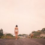
She hails from Scandinavia–specifically northern Norway. She favors film. (The above is Kodak’s ubiquitous Portra stock.)

In the course of this project, I’ve encountered her work on three separate occasions, each years apart.

My impression upon first seeing her work was–to borrow from Minkkinen’s ingenious Helsinki Bus Station theory–that she’d returned to the station a few too many times.

At first, her work was a mix of the sort of thoughtful but not necessarily innovative work of initial exploration upon picking up a camera for the first time. (What I’m beginning to refer to as the honeymoon period of learning the art of photography.)

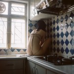
Her work was a mix between fashion/glamour inflected editorial, portraiture and travel photography. The conceptual facet of the work was far more interesting than the execution–the fashion/glamour work evincing an unusual empathy, her portraiture suggesting a beginner conversant in both canonical luminaries like Robert Frank and Richard Avedon as well as crucial outsiders like Catherine Opie.

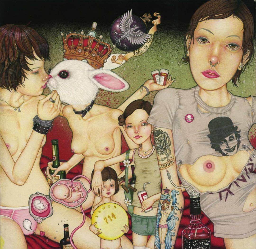
I browsed on–more or less forgetting about her until I stumbled onto some of the photos from her Felipe’s Cabin series. And while I’m generally not one to prop up the trying-too-hard-to-actually-be-a-thing notion of The Female Gaze ™–not because I don’t like the work that’s come out of such consideration, more that the notion is recursively self-justifying and as such tends to produce work that is limited in vision, execution, scope and impact. (Another way to say it, might be to note the work to which the term is applied and notice what artists reject it and which wear it like a gold medal–the former are almost categorically the only work of any lasting merit or consequence.)

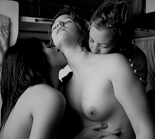
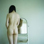
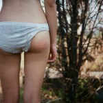
There was a way in which Stokkedal growing interest in female nudes came across as authentic and ingratuitousness in a way that I’d not really seen before. Almost as if nudity wasn’t so much the point as just another possible fashion decision–I’d say another outfit but that would seem objectifying in a way that clashes with that to which I’m trying to point.

Her editing was super off kilter, ; with a fixation on self-conscious awkwardness. A diminution of technique and form in favor of immediacy of mood and tone.

Returning to her work now, I’m struck by a number of things. Her editing is still something I consider so endlessly bizarre as to be counter-intuitive. However, I’m beginning to see hints that there is a method informing the madness–a rejection of accepted norms with regard to posing, gesture and expression. (Something I relate to as a photographer who always wants the people I make photos of to act normal, not always point their toes and maybe even slouch a little–being themselves instead of stand in for some arbitrary at best socially accepted ideal.)

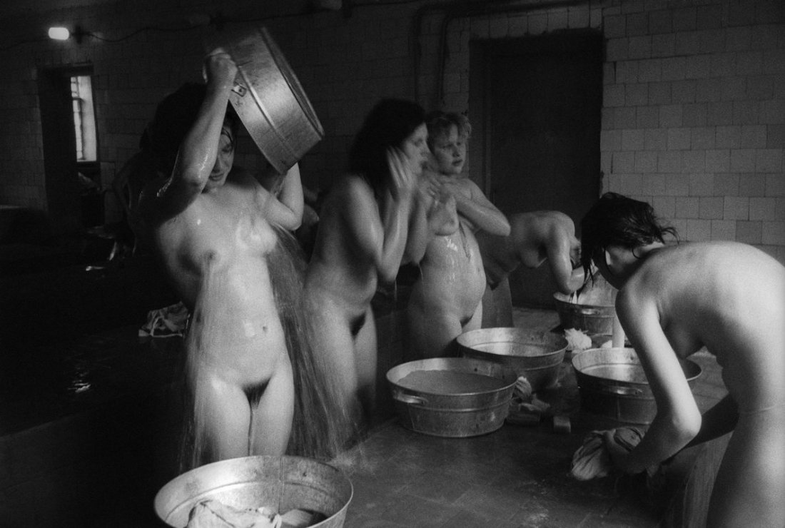
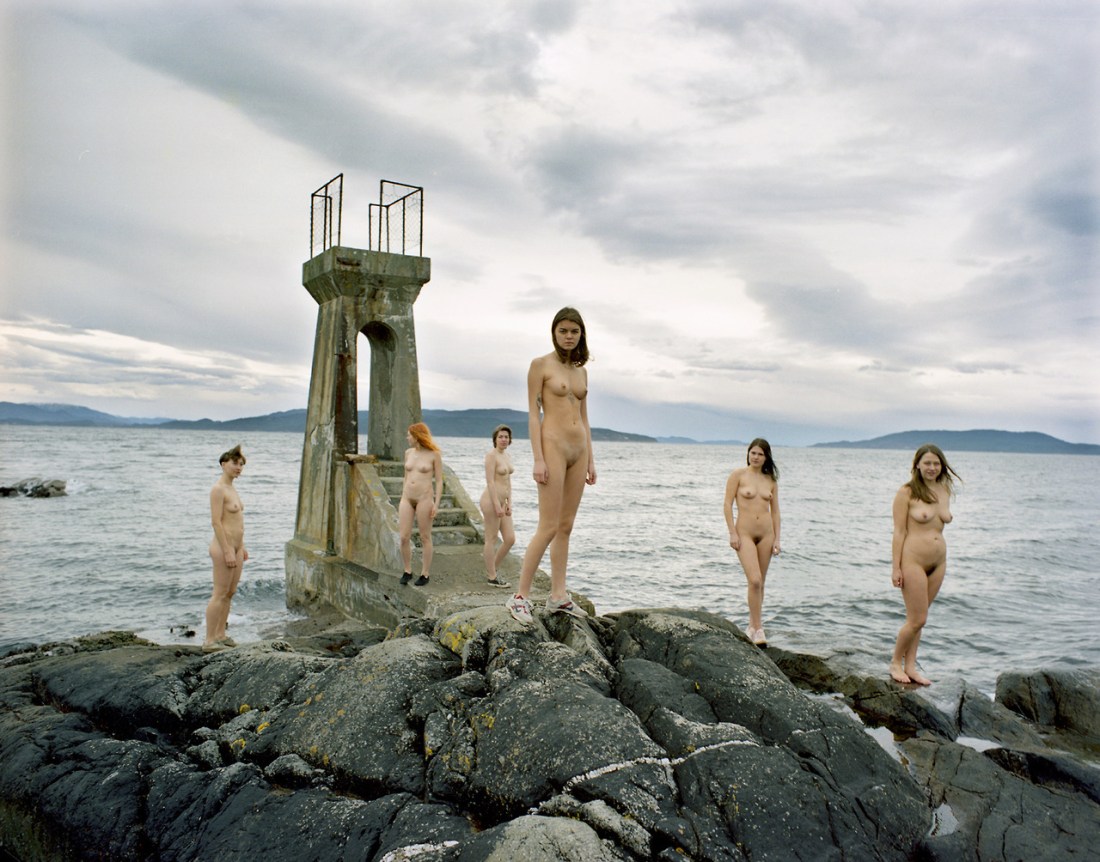
Stokkedal also has a rare knack for posing groups. (The above is a stroke of genius, actually–clustering the three women farthest from the camera together with the structural element in the background and then spacing the three other women who are more in the foreground closer to the camera, against the more prominent negative space of the landscape. Whereas normally you’d by more inclined to group the three women who are closer together more in the foreground to balance against the dominant concrete structure. This works partly because of the line of the clouds which drives the viewers eye left to right; also: there’s an understanding of the way the eye naturally interprets the six figures in different triangular relationship groupings given where the eyes is within the frame. It’s an attention to detail that very few people possess.)

Further, I’m intrigued by the fact that Stokkedal has an advanced degree in art history. I’m not surprised. No one with this level of attentiveness is ignorant of art history. But whereas most folks slavishly recreate the wheel–it seems as if she’s striving to strike out in her own direction.

Of particular interest is the fact that the title of the image Haunting Hertevig, as best I can tell is a reference to Norwegian painter Lars Hertervig. The difference in spelling seems like a deal breaker until you actually consider the paintings. In which case, there’s definitely overlap.

Here my brain sort of jumps the tracks a bit. Because I actually sort of dig Hertervig’s work. It reminds me of the Hudson River School (especially Thomas Cole) with a great big old caveat: the Hudson River School bores the crap out of me. Hertervig and Stokkedal are captivating.

This has been an issue with my own work. For years, I’ve resisted the label of my work as landscape–simply because landscape work tends to be an eyes glaze over rapidly, immediate turn off.

I think Stokkedal’s work has actually showed me a bit of why that is. It has to do with the argument John Berger makes in the first part of Ways of Seeing, where he talks about how there’s the first time seeing the Grand Canyon. But that for someone who has been there, in fact, lived there their whole life–it becomes mundane, regular and every day and the only way to reclaim that experience of seeing it for the first time is to watch someone else share it for the first time.

I’ve always struggled with this suggestion. The metaphor doesn’t completely work. It’s great for illustrating the relationship between the maker of a work of art, the subject of the work and the audience. Yet, watching someone else experience something for the first time is something in so far as we replacing seeing the thing with seeing someone else’s reaction to the thing–which is hardly the same.

Yes. That seeing for the first time–seeing as it were with the Eyes of God is indispensable. We need it for the total experience of art. But I’d rather go for a hike than look at paintings hanging in some stuffy gallery. I’d rather see it myself than experience it via mediated forms.

And I think that’s what Berger misses and I think why landscape work made by non-Americans does hold a big more interest for me: there’s a way in which boredom and the tomb of habit are an obstacle to my own creativity. The work that I make that means something to me is the work that manages to harness some bit of the initial magic of seeing with my own eyes for the first time. And it’s something I see in both Hertervig and Stokkedal’s work, actually.

(Lastly, writing this post has been the first time in years I’ve missed the peer mentorship of studying photography in academia. I’d do just about anything to have someone who made work like Stokkedal’s in my cohort–straight up.)

John John JesseCradle to the Grave (2005)

I feel like John John Jesse takes the worst bits of Klimt (the tendency to over encumber his paintings with decorative elements) and Ernst (decalcomania) filters them through the lust, depravity and mania of drug-fueled debaucherous punk rock themed orgies.

It’s like the first reaction to any painting is to move beyond the improbably ripped (and oft-ineffectively safety pinned shirts) revealing even more improbably perfect breasts and shift into a sort of Where’s Waldo spot the drug references–in this case: five (5) bottles of booze (Jameson in the right hand of the rabbit headed lady, some sort of cognac between the legs of the pink knickered woman at frame left, a bottle of wine in the knapsacke of the woman in the tank top, the Budweiser in her hand and then a bottle in the style of Jack Daniels of Die Young (presumably whiskey) that has been turned into an 80 proof alcohol IV), a big old Bill Cosby’s Secret Ingredient and two prescription bottles.

I’m going to completely gloss over the ghost/homunculus/fetal alcohol syndrome fetus with umbilical cord. (Like WTF-even?)

Now, by all accounts I’ve done more than my fair share of drugs in my life. Hell, I continue to enjoy a number of illicit substances. And really the in-your-face punk-rock flavored transgressive nihilism that Jesse trades in is unquestionably seductive to me.

But it’s easy to point to the sex, drugs or rock and roll-ness of the work as being what attracts and repels the viewer in equal measure.

What I keep coming back for is honestly the way he depicts women. It’s been noted repeatedly that most of the folks he paints are his friends. And to me that feels like the most important take away from his work.

I’m not sure what it says about me–probably more about my being born in the wrong time (New York’s Lower East Side in the 80s would’ve absolutely been my scene, you have no idea), but the way the women he paints can look simultaneously self-possessed, stoned to the gills, standoffish, available and maybe like they aren’t sure whether they are trying to feel something other than numb or numb their feelings, resonates with me in a way that leaves me entirely unnerved.

Wingla Wong – [↖] Untitled (2015) ; [↗] Untitled (2015) ; [↙ ] Untitled (2015); [↘] Untitled (2015)

Usually when I reference other photographers/image makers, the implication is two-fold:

  1. Art does not come about ex post nihilo, from a void;  work is understood–or, misunderstood (you can’t have the possibility of comprehension without the equal and opposite possibility of confusion)–as a result of context, i.e. how the work is displayed (captions, artist’s statement(s), etc.); also: historical (art and other) positioning and theoretical conscription/rejection.
  2. Typically, I’m pointing to artists who was–in effect–the progenitor.

Things are a bit different here.

Wong has clearly drawn extensive inspiration from the catalogs of Akif Hakan Celebi (the fuss and bustle of post industrial Hong Kong, confrontational interrogations between notions of public vs. private), Yung Ching Lin (oneiric surrealism wed with a sublime perversity) and Ren Hang (the beauty of bleak sky lines in Asiatic megalopolises.)

And although she lacks the technical acumen of these artist’s (she never manages to juggle super saturated colors with anywhere near the aplomb of Celebi; tonally her work not only lacks the winking coyness of Lin, it very much heads in quite the opposite direction–alighting closer to symbolic coding than the fevered logic of a Jungian sex nightmare; and there’s a celebratory awe to Wong’s work that is absent from Hang’s sacred cow slaying provocations), she does create work that has some uncanny observations about feminine desire and physical embodiment.

Also, it’s interesting to me that all these easy influences that I’ve named use affect to concerted effect; whereas Wong adopts the effect in hopes that you presume an affectation, allowing her to hide in plain site.

It’s all rather clever and for that reason, I’m incredibly fond of her work.